What are design tokens?
Glossary · By Utkarsh Dhairya Panwar · Updated
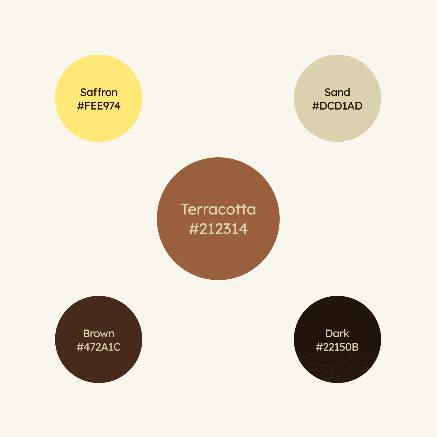
Design tokens are named values for the smallest design decisions (a colour, a font size, a spacing step, a corner radius), stored once and referenced everywhere. Change the token and everything that uses it changes too, in the design file and in code.
A token is a name with a job
The palette at the top of this page, from the E-Summit identity I designed, has names and hex codes. That gets you about halfway to tokens. The rest is naming each value by its job instead of its appearance. Brown #472A1C is a value; text-primary is a token that happens to point at it today.
| Layer | Example name | Points to |
|---|---|---|
| Raw value | brown-900 | #472A1C |
| Semantic token | text-primary | brown-900 |
| Component token | button-primary-bg | a brand or accent token |
| Spacing | space-4 | 16px |
| Radius | radius-md | 8px |
Most startups only need the first two layers. Component tokens start to pay off later, once a single component has to look different from the rest without breaking them.
Tokens in Figma and Framer
In Figma, tokens live as variables, grouped into collections (colour, spacing, radius) with modes for light and dark. Framer has the same idea as colour styles and variables, and every page section reads from them. When I build a SaaS site in Framer I set up the colours and type sizes before designing any section, so the marketing site and the product share one set of names.
Why they matter
Without tokens, every screen hard-codes its own grey, and six months later there are eleven of them and nobody is sure which is right. Cleaning that up is slow, and without tokens it creeps back within a few releases. (How I did that cleanup at CodeAnt is in my guide to design systems for startups.)
Rebrands and dark mode get cheaper too. If every component reads text-muted, you change one value instead of hunting through a hundred frames.
Common mistakes
- Naming by appearance (blue-button, grey-2). The name breaks the first time the colour changes.
- Different names in Figma and code. If designers say surface-raised and engineers say bg-card, nobody trusts either.
- Too many tokens too early. A spacing scale with fifteen steps gets used like fifteen one-off values.
- Treating tokens as the whole design system. They sit underneath it; the rules for using components are a separate layer.
Related terms
A design system is the full set: tokens, the components built from them, and the rules for using those components. Design debt is what accumulates when there are no tokens to hold values in place.
What is a design system?: The layer above tokens: components and the rules that keep a product consistent.
Design systems for startups: Where tokens fit in a small first system, and what to standardise after them.
Questions people ask
Are design tokens the same as Figma variables?
They overlap. A token is the design decision and its name, and a Figma variable is one way to store it. The same token should also exist in code under the same name.
What are examples of design tokens?
color-text-primary, color-border-danger, space-4, radius-md and font-size-heading-lg are typical. Each names a role and points to a raw value.
Does a small startup need design tokens?
A small set, yes. Colour roles, a four to six step type scale and a spacing scale take a day to set up and prevent most of the visual drift that comes later.
Sources
- Design Tokens Format Module 2025.10, Design Tokens Community Group (W3C)
- Guide to variables in Figma, Figma Help Center
- Color Variable, Framer
Working on this?
Tell me what you're building and where it's stuck: book a 30-minute call, email work@utkarshdesign.com or send a brief.