CodeAnt AI - YC W24
- Brand
- CodeAnt AI
- My Role
- Founding Designer
- Timeline
- Jun 24 - Present
- Status
- Live Product
- Impact
- 800+ Companies | $60M Valued
Overview
CodeAnt AI is a code health platform for engineering teams: code quality, security, reviews, and developer visibility.
This case study focuses on the problem I spent the most time on as the platform scaled: onboarding and activation.
CodeAnt gives engineering teams visibility into their code health.
Code review, security scanning, developer metrics, quality gates. As more developers signed up, fewer were reaching any of it. Connecting a repository was the first gate and it was breaking at every layer.
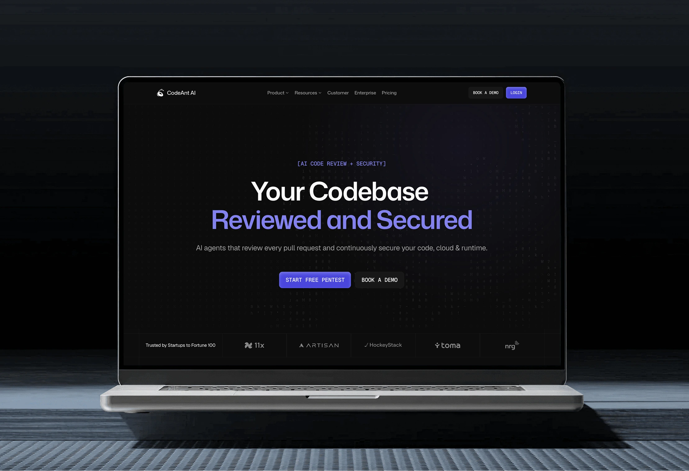
Product, website, brand. All designed from the ground up.
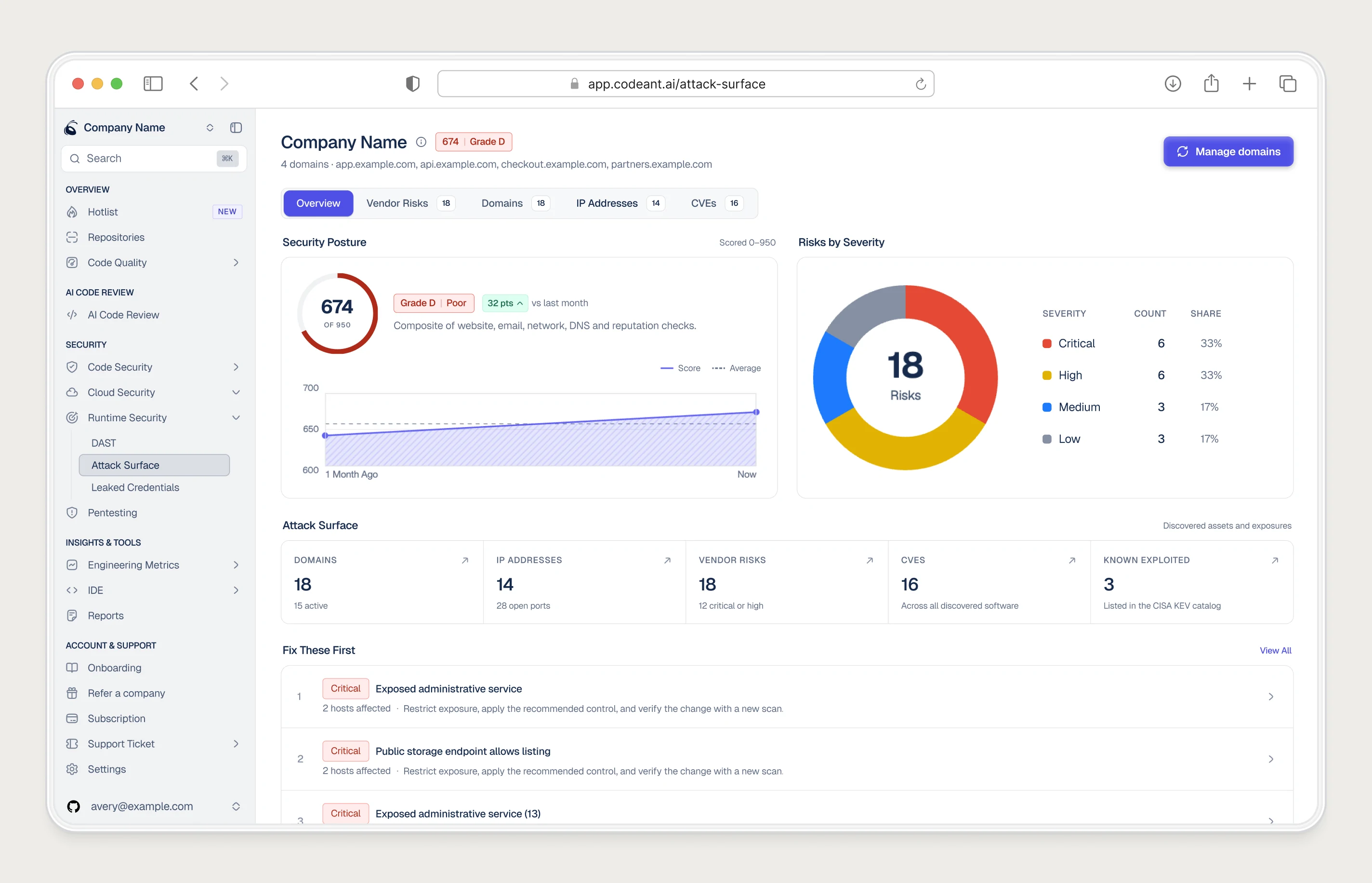
- Product Design: Onboarding, dashboard, scan center, code review, security flows, and developer metrics.
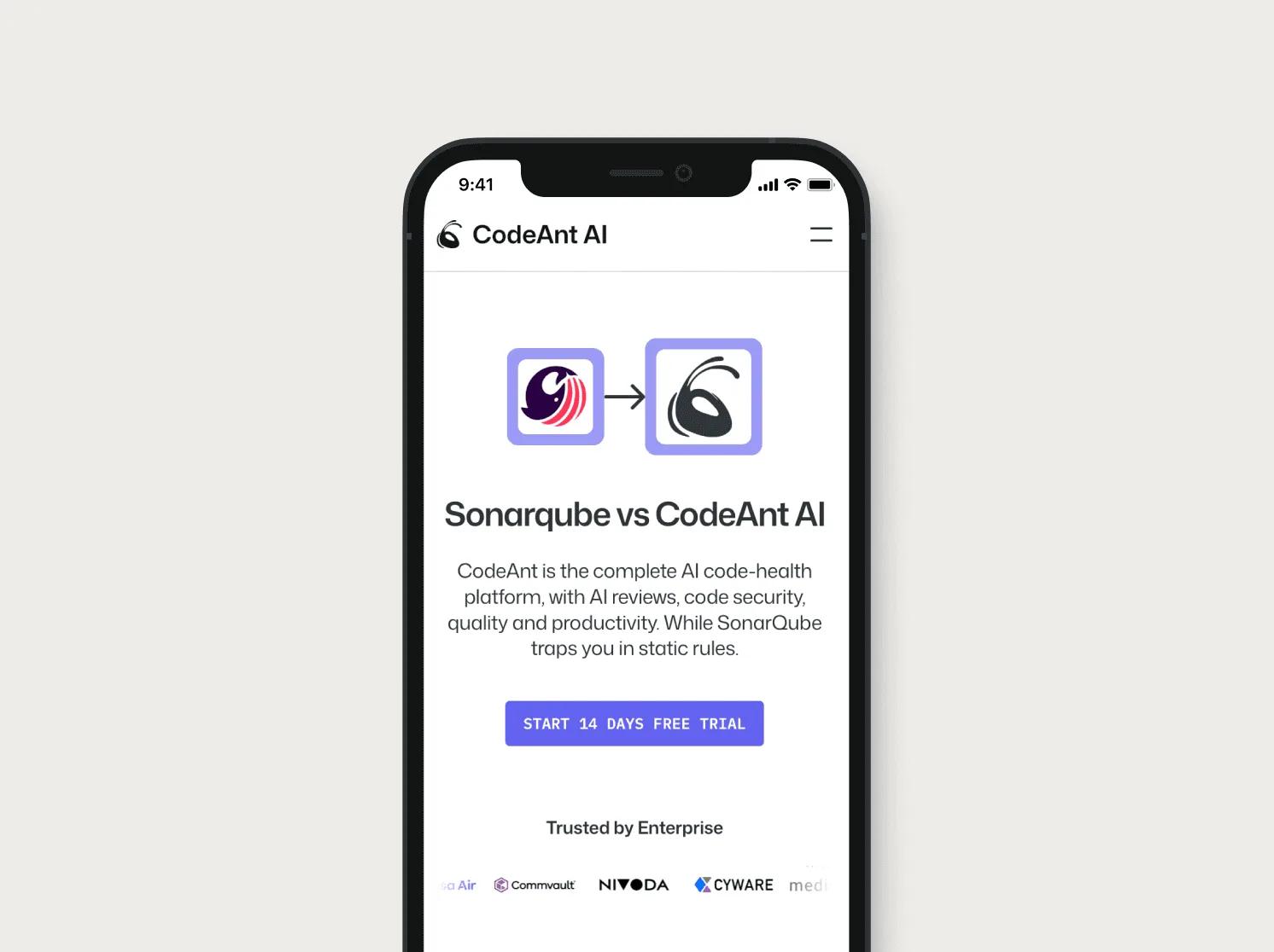
- Website and Marketing: Framer website, conversion-optimised landing pages, and ad creative. Conversion rate doubled since launch.
- Brand and Design System: Visual identity, component library, and design guidelines. Built in parallel with the product.
The flow looked complete. Users were dropping at the last step.
Sign up, choose a Git provider, connect a repo, move forward. The flow had four steps. Users were dropping at step three and most of them never knew why.

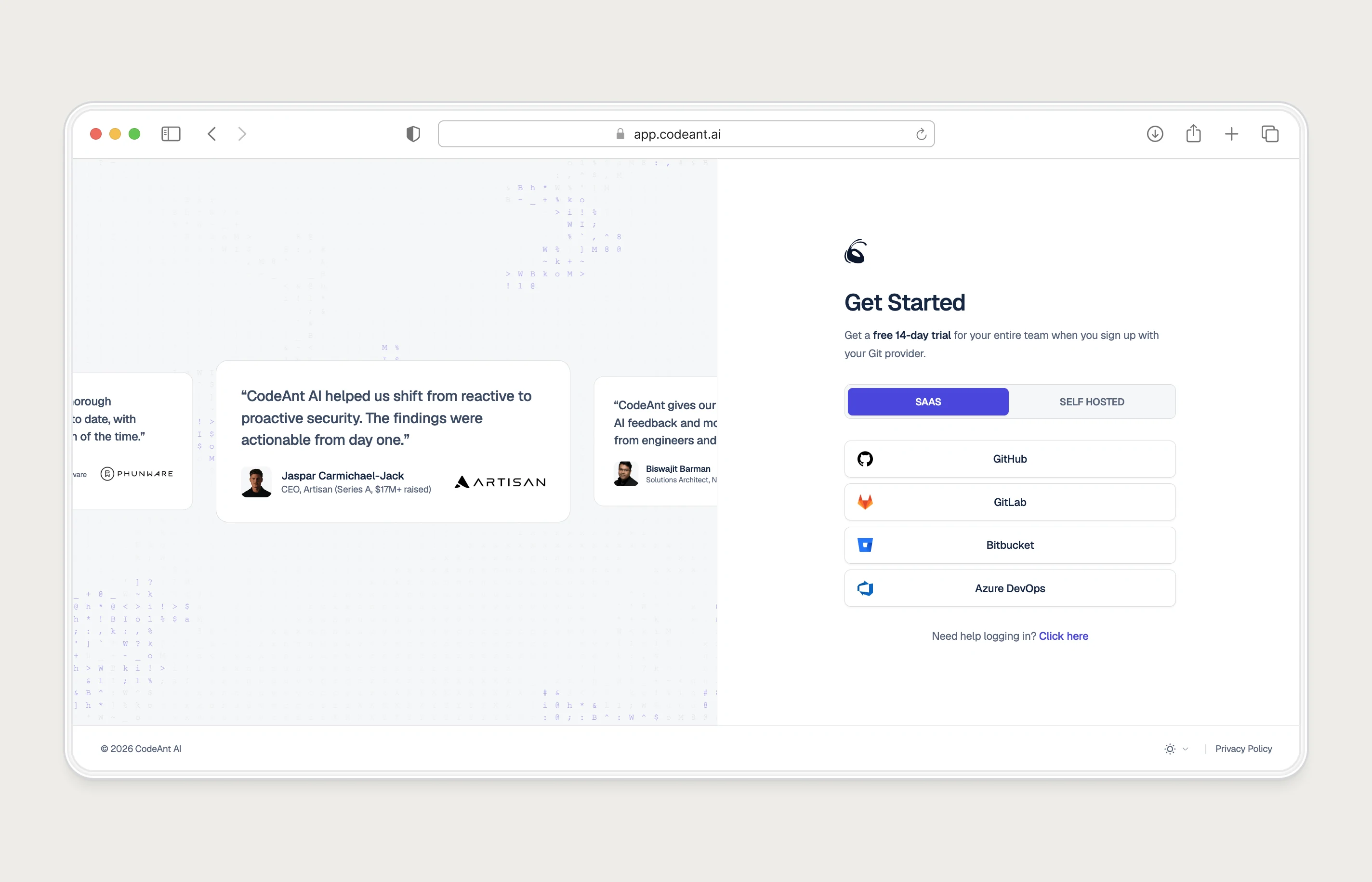
Connecting a repo requires admin access. Most developers do not have it.
In most engineering teams, the person who discovers a new tool is not the person who controls its installation. They hit a permissions wall and had no way forward.
“The person with intent had no access. The person with access had no idea CodeAnt existed.”
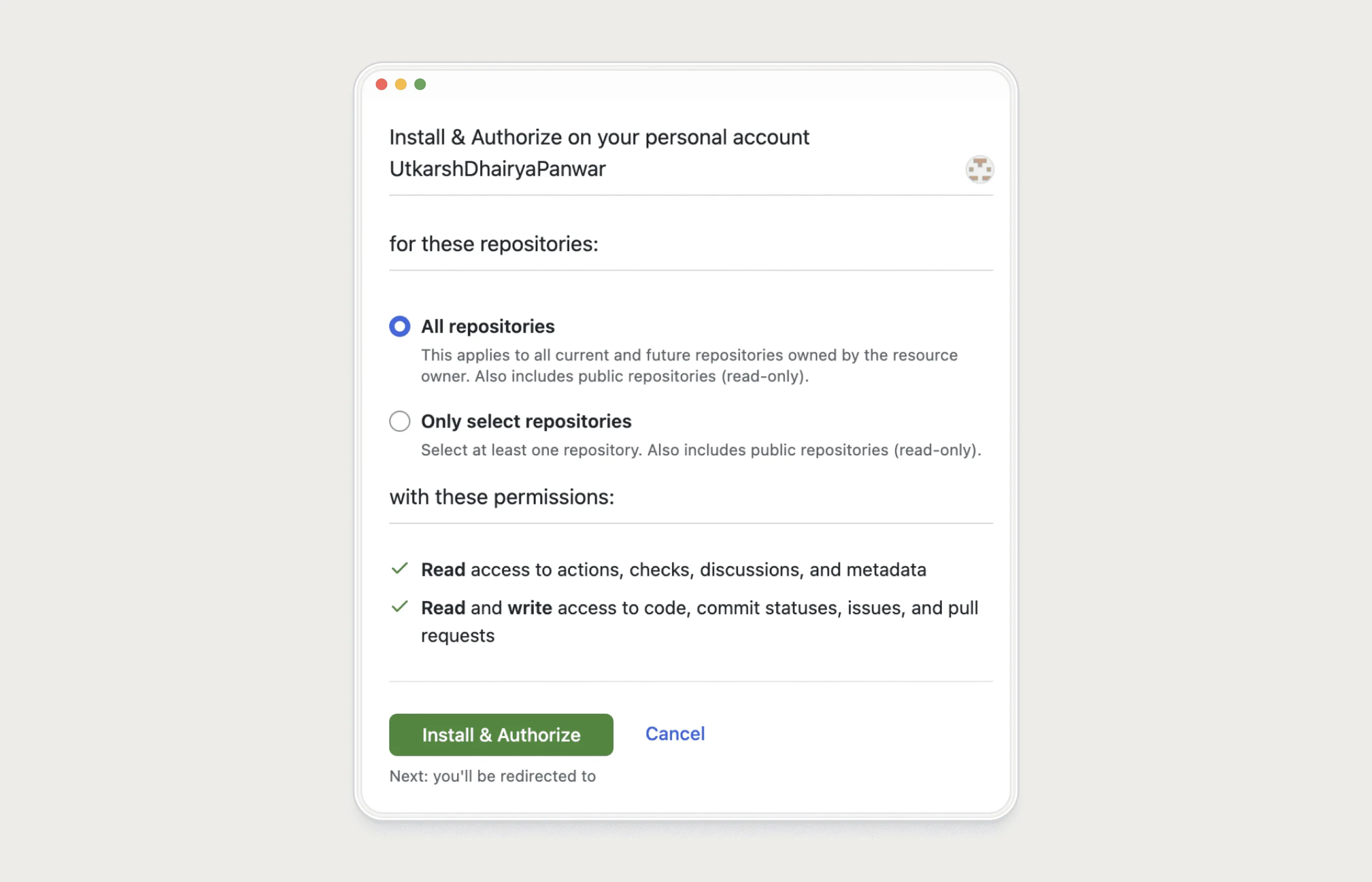
The install defaulted to the personal account, not the company org. Connecting the company account needs admin access
This was not a UX problem. It was an org structure problem.
We had designed onboarding for one user completing one journey. Enterprise tools do not activate that way.

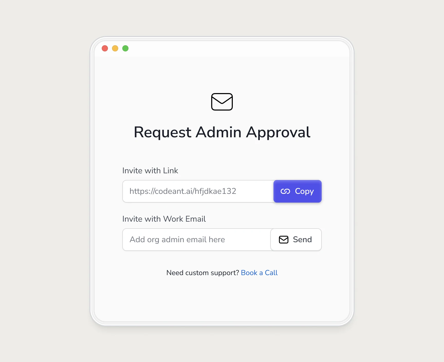
So we gave blocked users. a way to pull in the right person.
Instead of a dead end, the user gets two paths forward: email the admin directly, or share a link into the team chat.
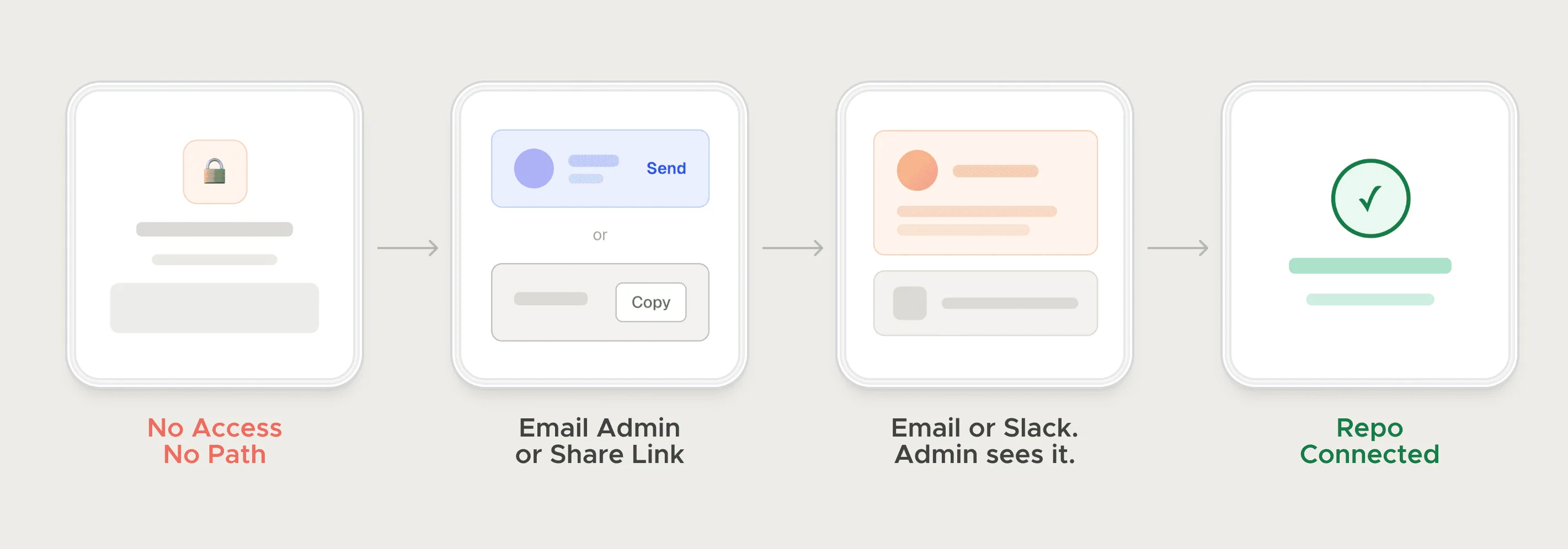
Self-hosted onboarding was also broke without hand-holding.
Instead of forcing users through dense docs, I turned setup into simple step-by-step flows with platform-specific videos, making self-serve onboarding much easier for developers.
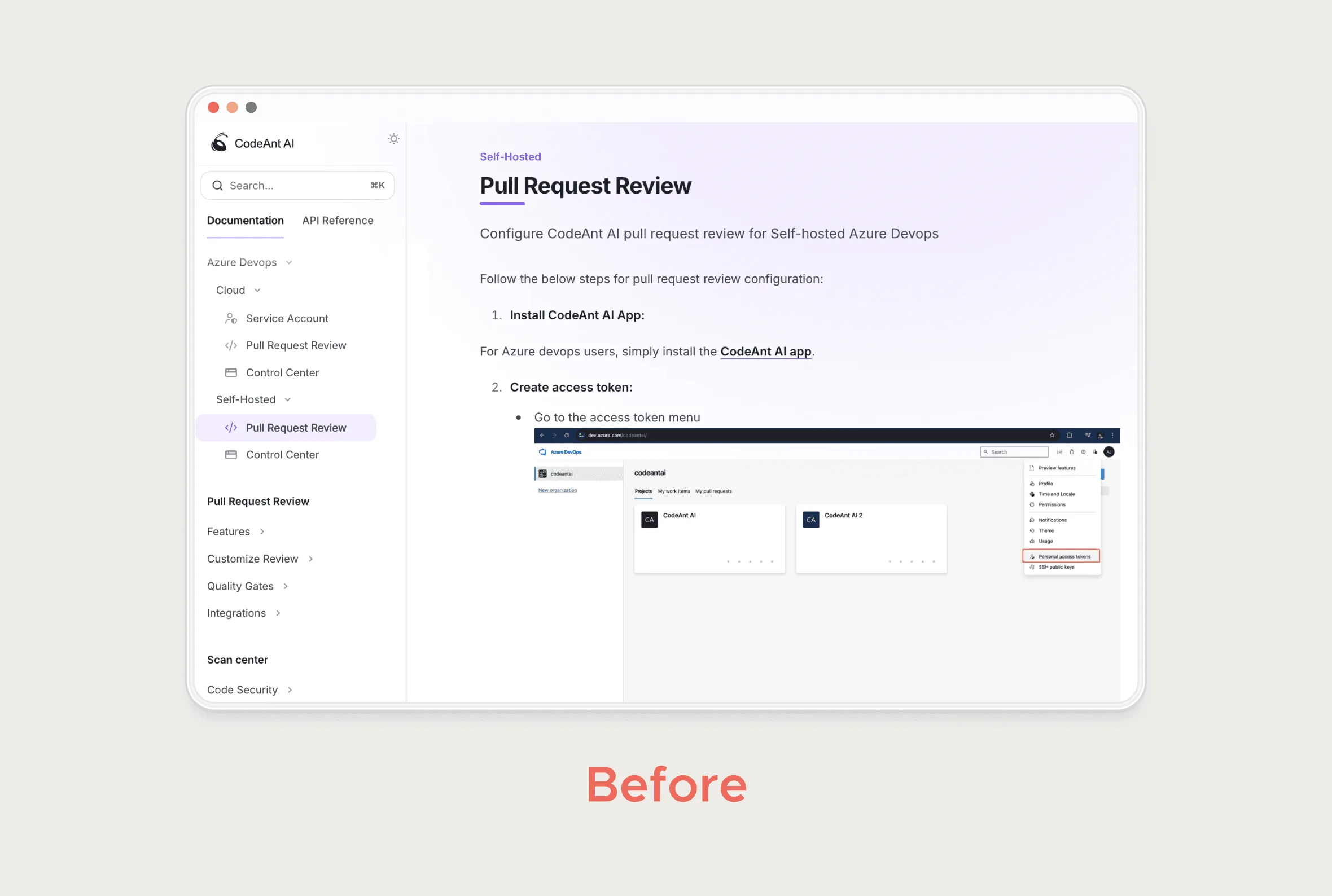
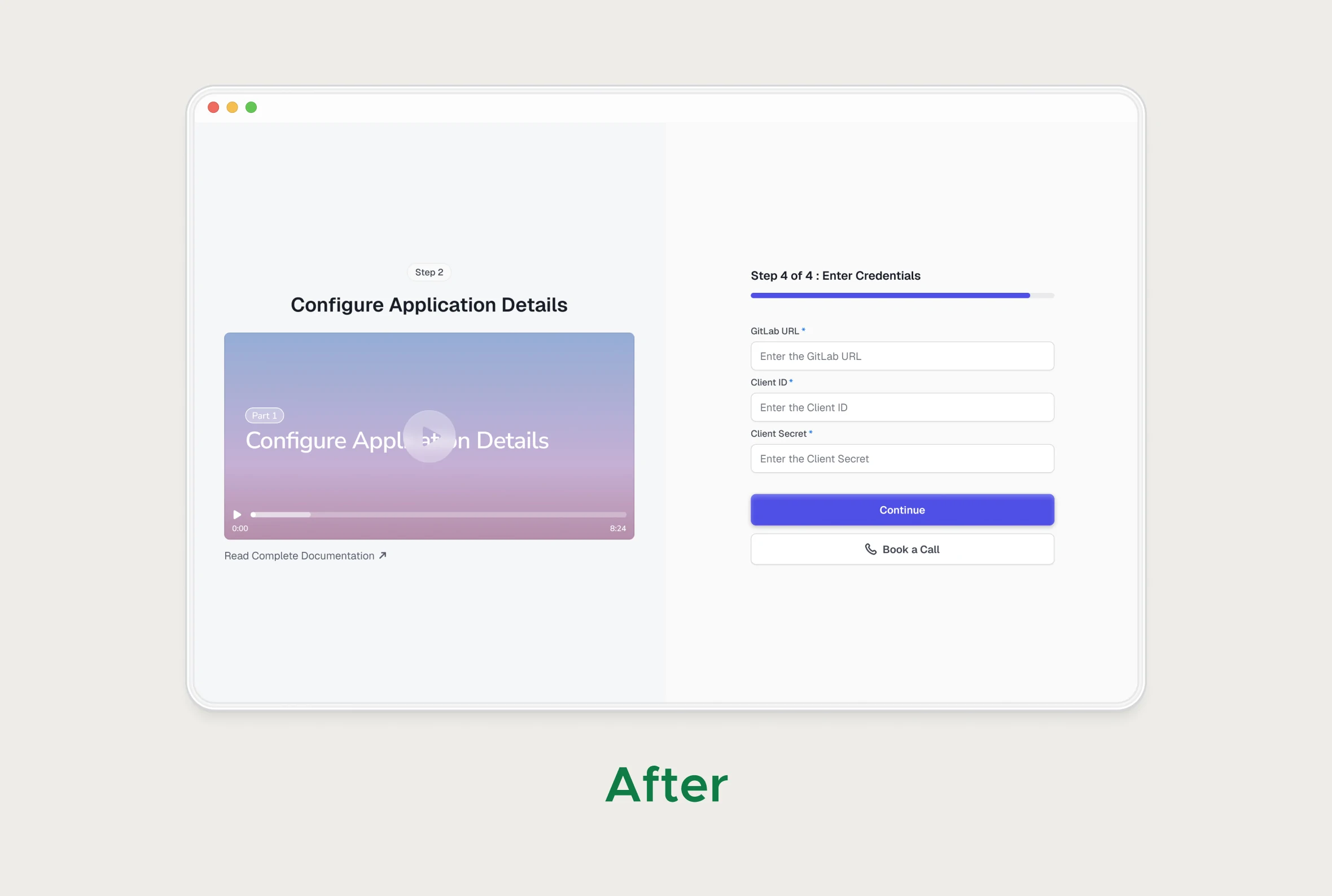
Getting connected did not mean getting value.
Instead of forcing users through dense docs, I turned setup into simple step-by-step flows with platform-specific videos, making self-serve onboarding much easier for developers.
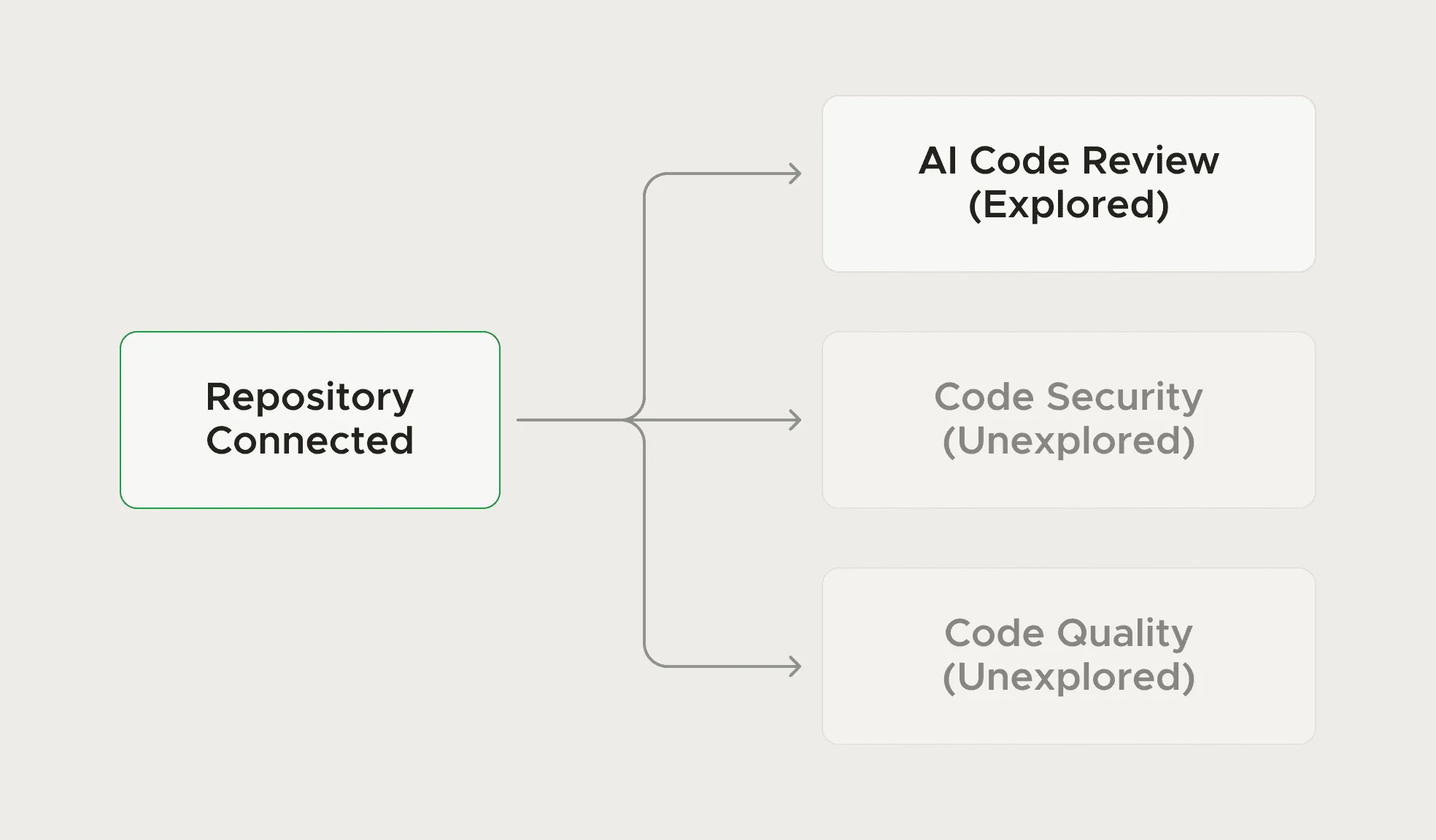
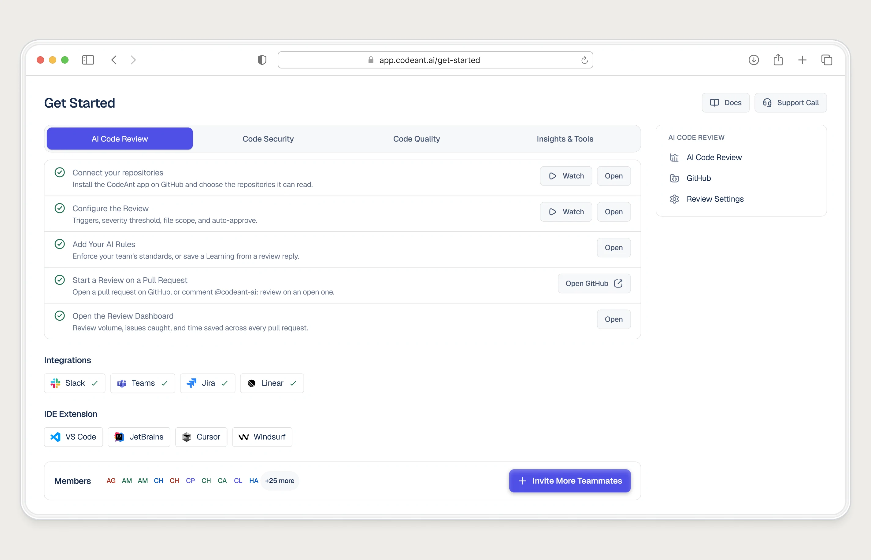
Surface what exists. Then nudge what they miss.
The Get Started screen gave developers a direct path to each product line. No tour, no forced sequence. Each item linked directly to setup, no reading required.
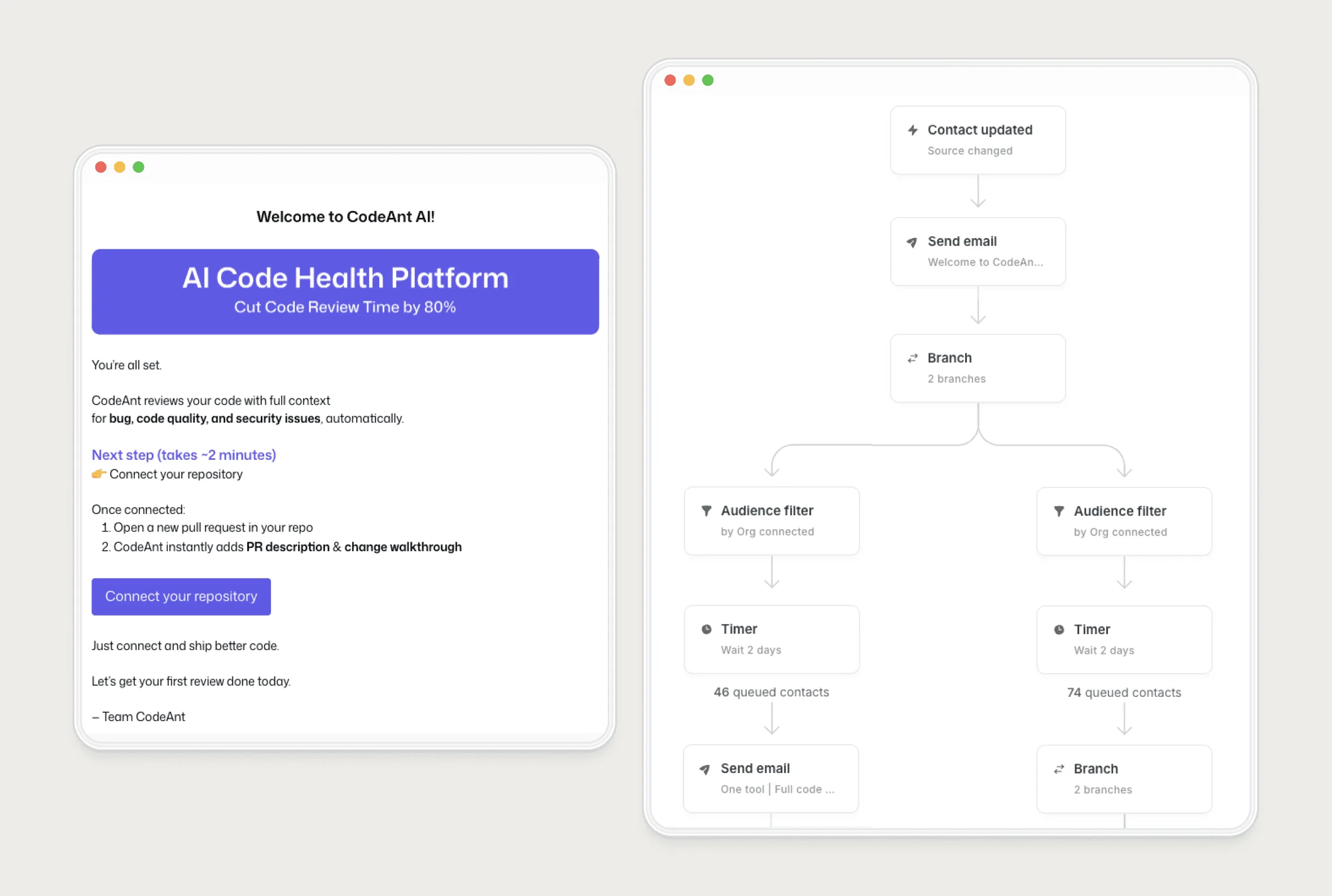
Also I built a communication layer that extended onboarding through the trial.
Each email was triggered by what that specific user had and had not done, not a fixed sequence sent to everyone. The same logic ran in-product as a contextual nudge. Together they surfaced what users were missing without interrupting what they were doing.
Impact
- 2× Trial-to-paid conversion
- 40% Reduction in drop-off at the admin wall
Working with Utkarsh is like compressing five years of design into a single month. His speed, taste, and craft consistently push our brand to new heights.
Next case study: <a href="/work/fampay">Next Case Study</a>