E-Summit, IIT Roorkee
- Brand
- E-Summit, IIT Roorkee
- My Role
- Design Lead - Branding & Website Design
- Team
- 5 Designers, 3 Developers, Organizing Committee
- Timeline
- Dec 22 - Feb 23
- Status
- Launched in February 2023
- Impact
- 11K+ Attendees ₹25L+ Sponsorship Raised 5M+ Impressions across Social Media
Overview
E-Summit is one of India's largest student-run entrepreneurship conferences. Each year it attracts founders, venture capitalists and thousands of students exploring startups.
For 2023, the organizing team wanted a theme that reflected India's entrepreneurial spirit while maintaining credibility for sponsors and investors.
I led branding, campaign design, sponsor collateral, website and event touchpoints to build a scalable system across digital and physical surfaces.
Context
E-Summit is IIT Roorkee's flagship entrepreneurship event, bringing together founders, investors, speakers and students from across India.
The 2023 edition was especially significant as IIT Roorkee completed 175 years. The identity had to respect that legacy while still appealing to modern founders and startups.
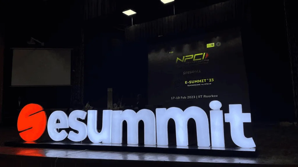
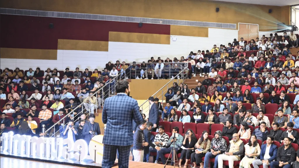
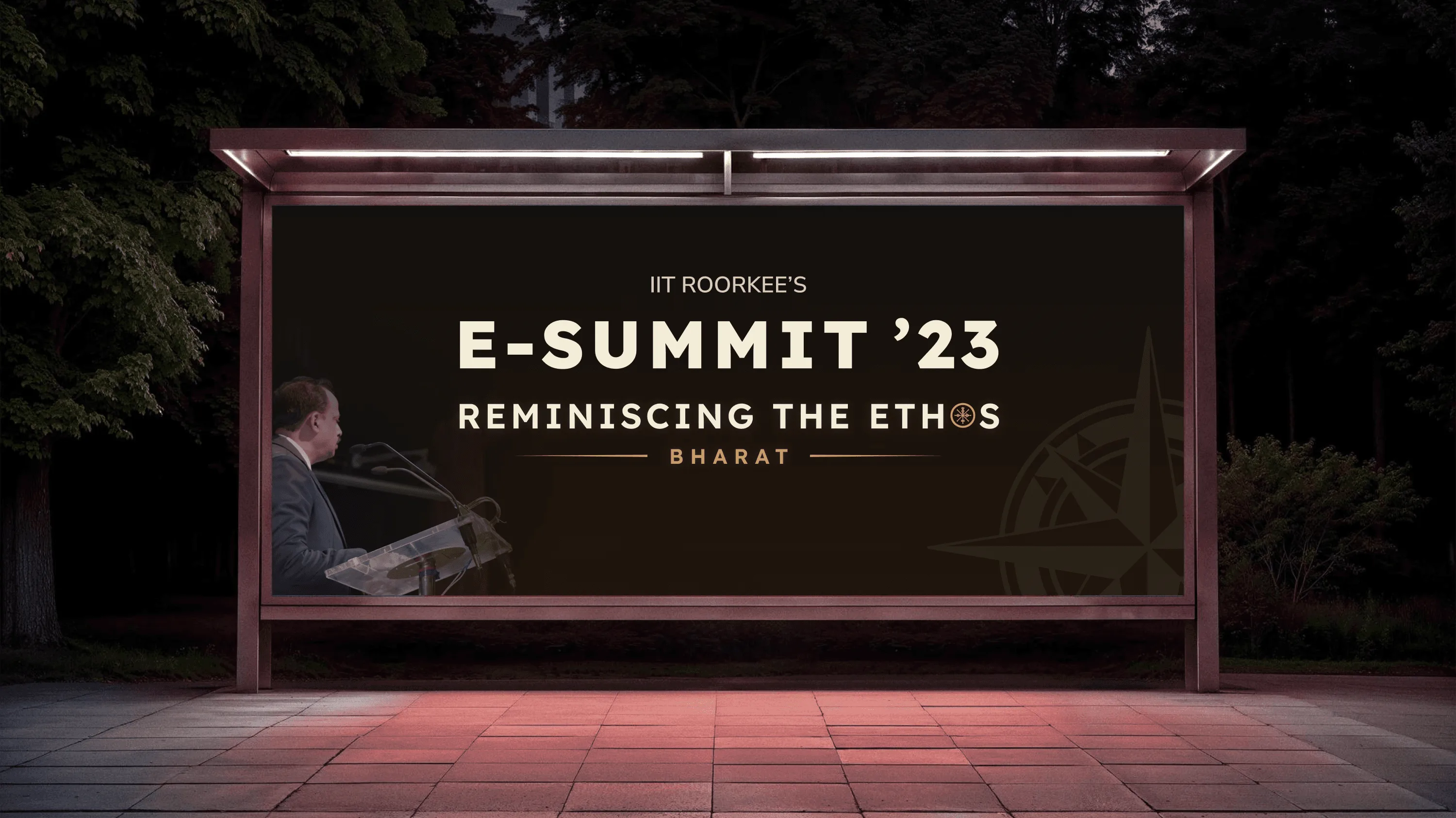
Theme - Reminiscing the Ethos: Bharat
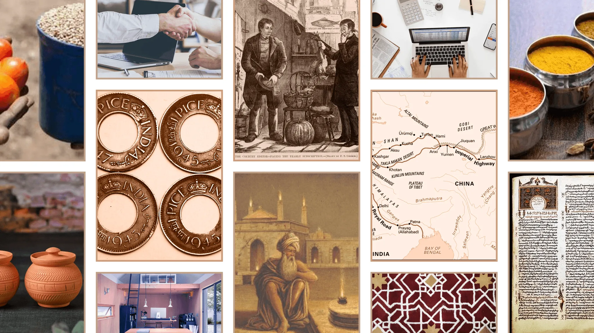
The challenge was translating theme into a visual language that felt authentically Indian. The direction drew from pre-industrial Indian craft traditions rather than modern startup design.
Design Considerations
- Scalable identity system: Works across posters, tickets, merchandise, website and event spaces without fragmenting.
- Respect legacy: Reflect IIT Roorkee's heritage while keeping the identity energetic and forward-looking.
- Avoid cultural clichés: The identity needed to feel rooted in Indian culture without falling into festival-style or ornamental visuals.
Visual Direction
The goal was to translate cultural cues into a system that felt contemporary, repeatable and unmistakably tied to the theme.
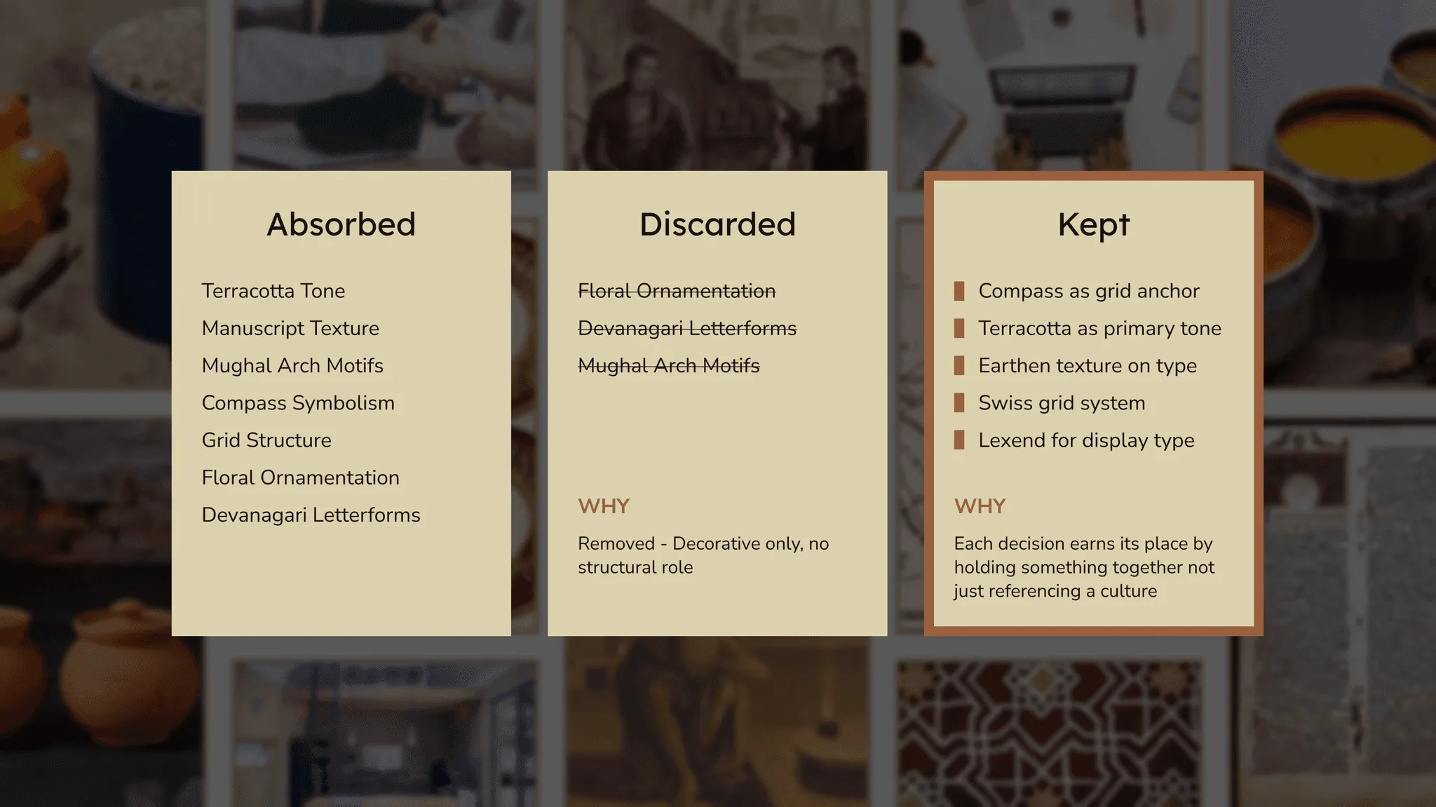
The Identity System
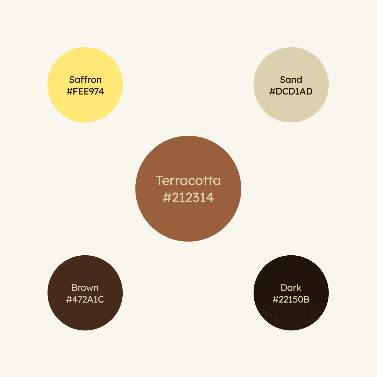
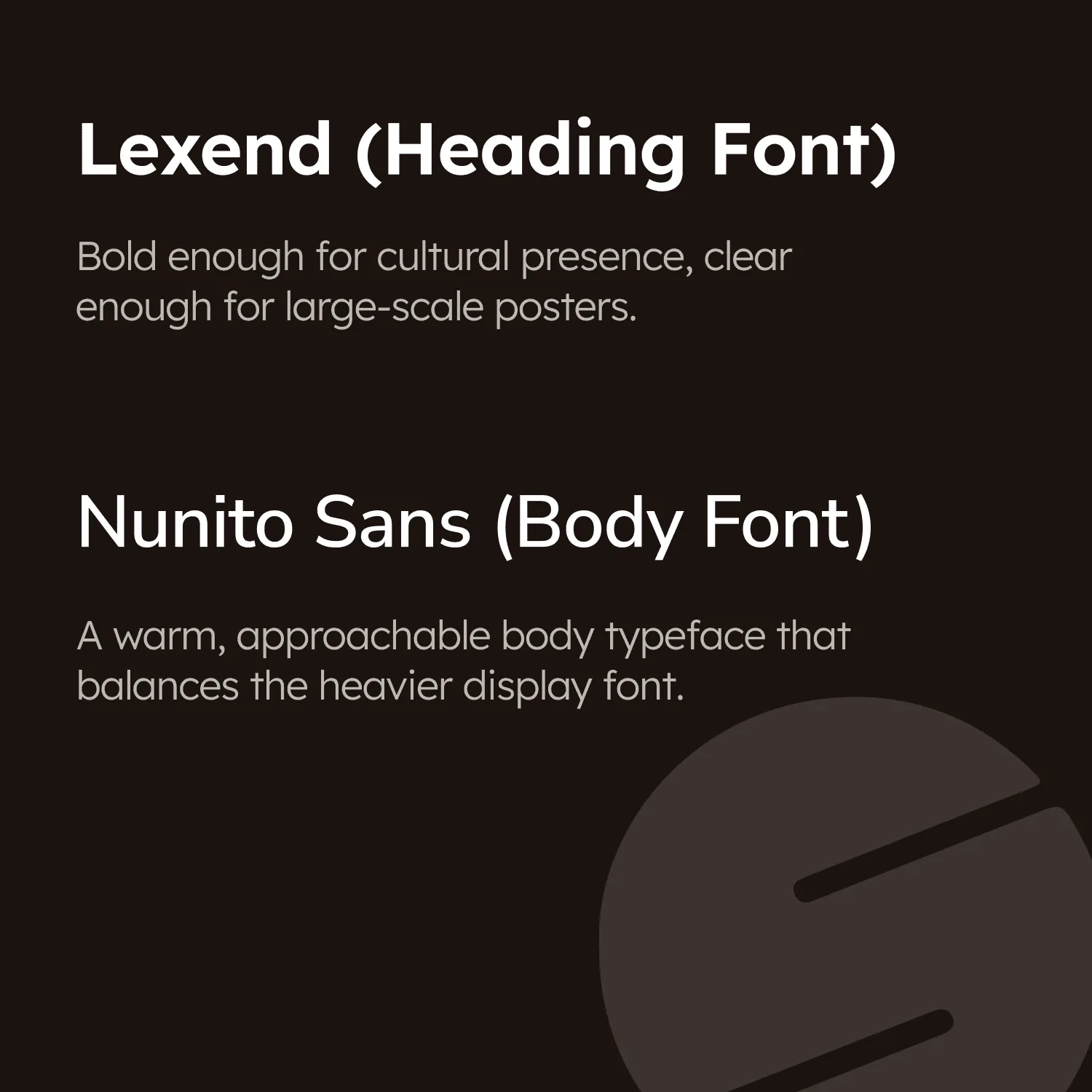
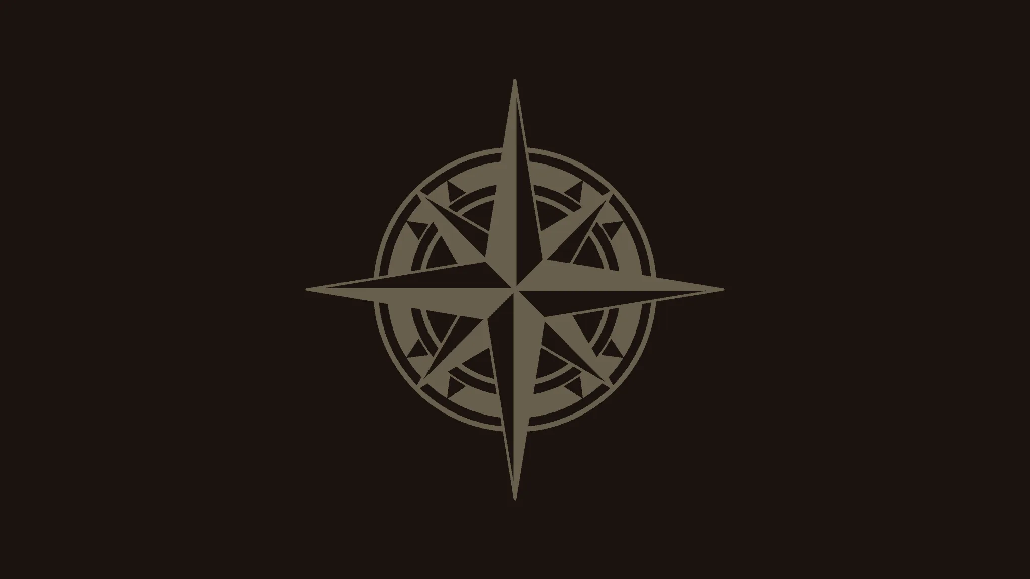
The identity system was built around a small set of elements that could scale across posters, merchandise, digital assets and event spaces.
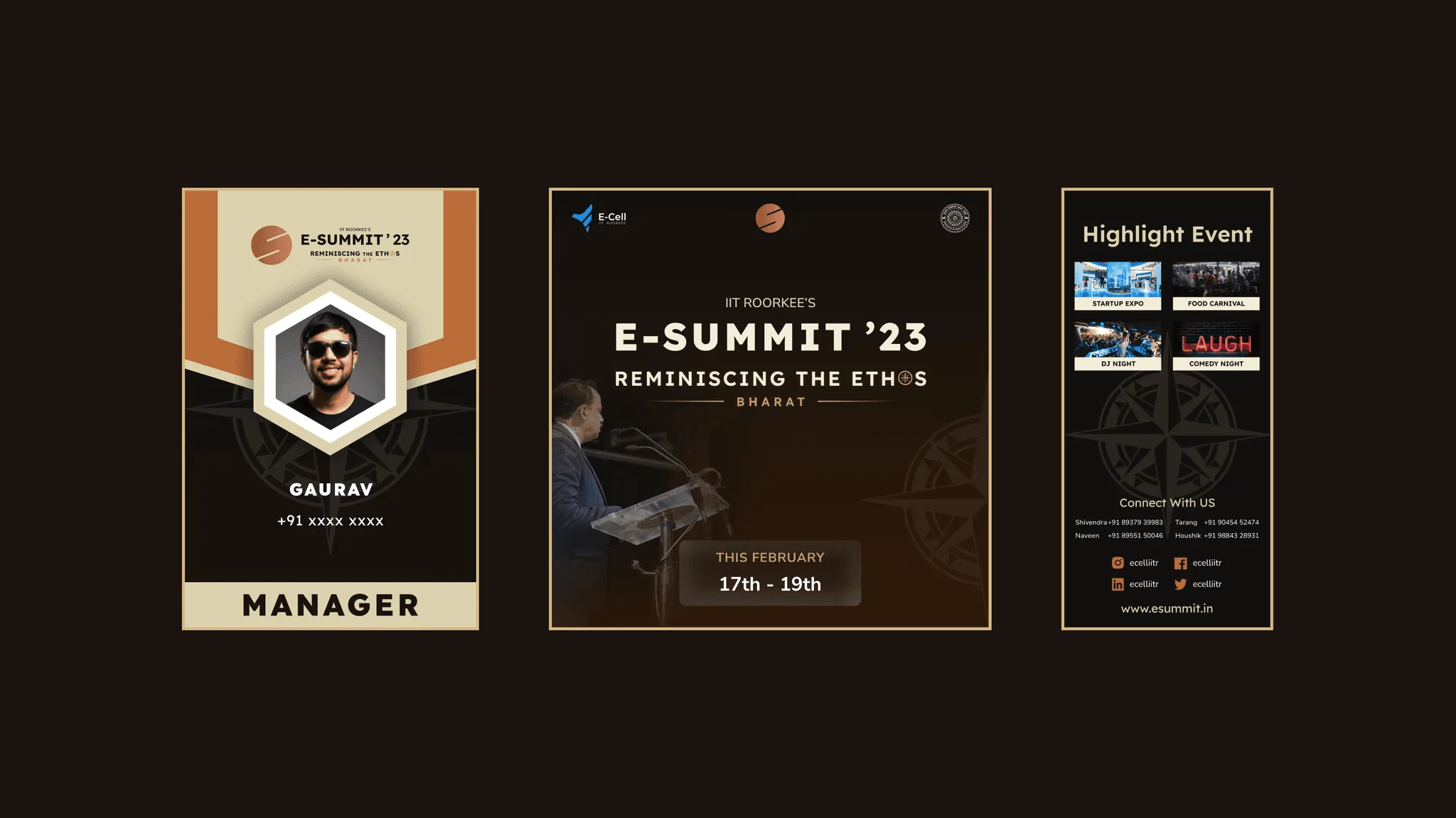
Logo
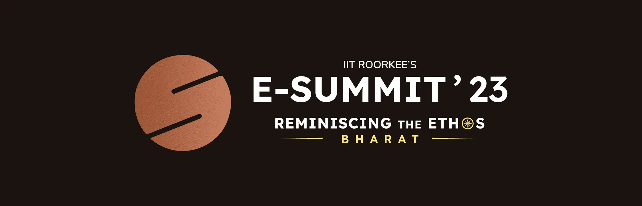
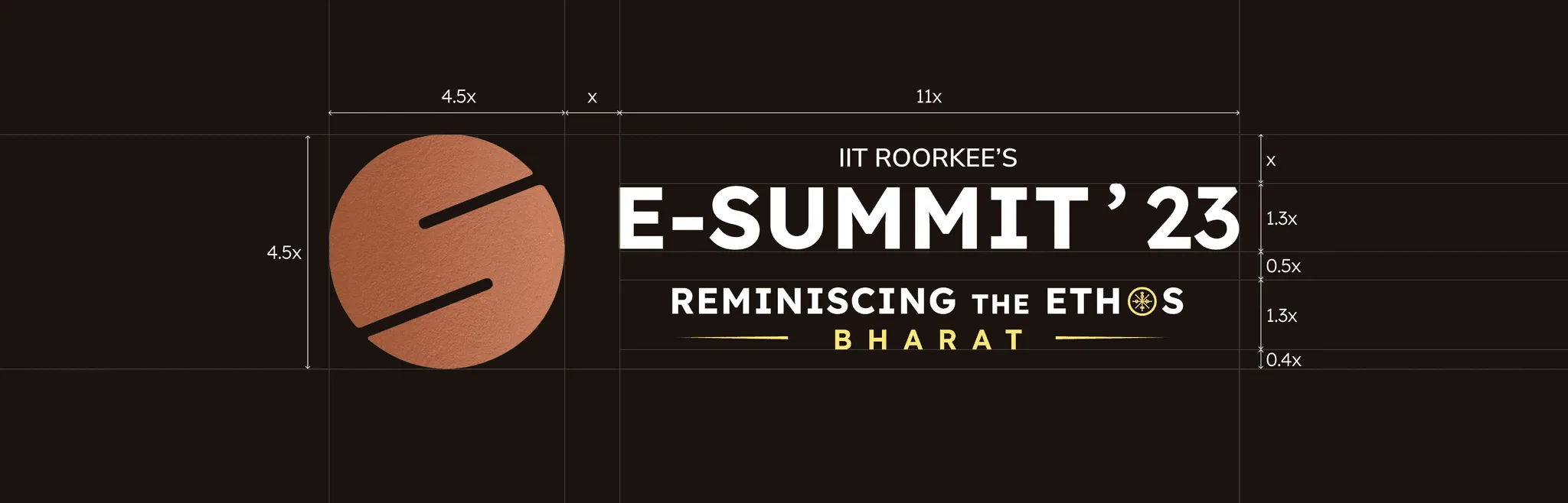
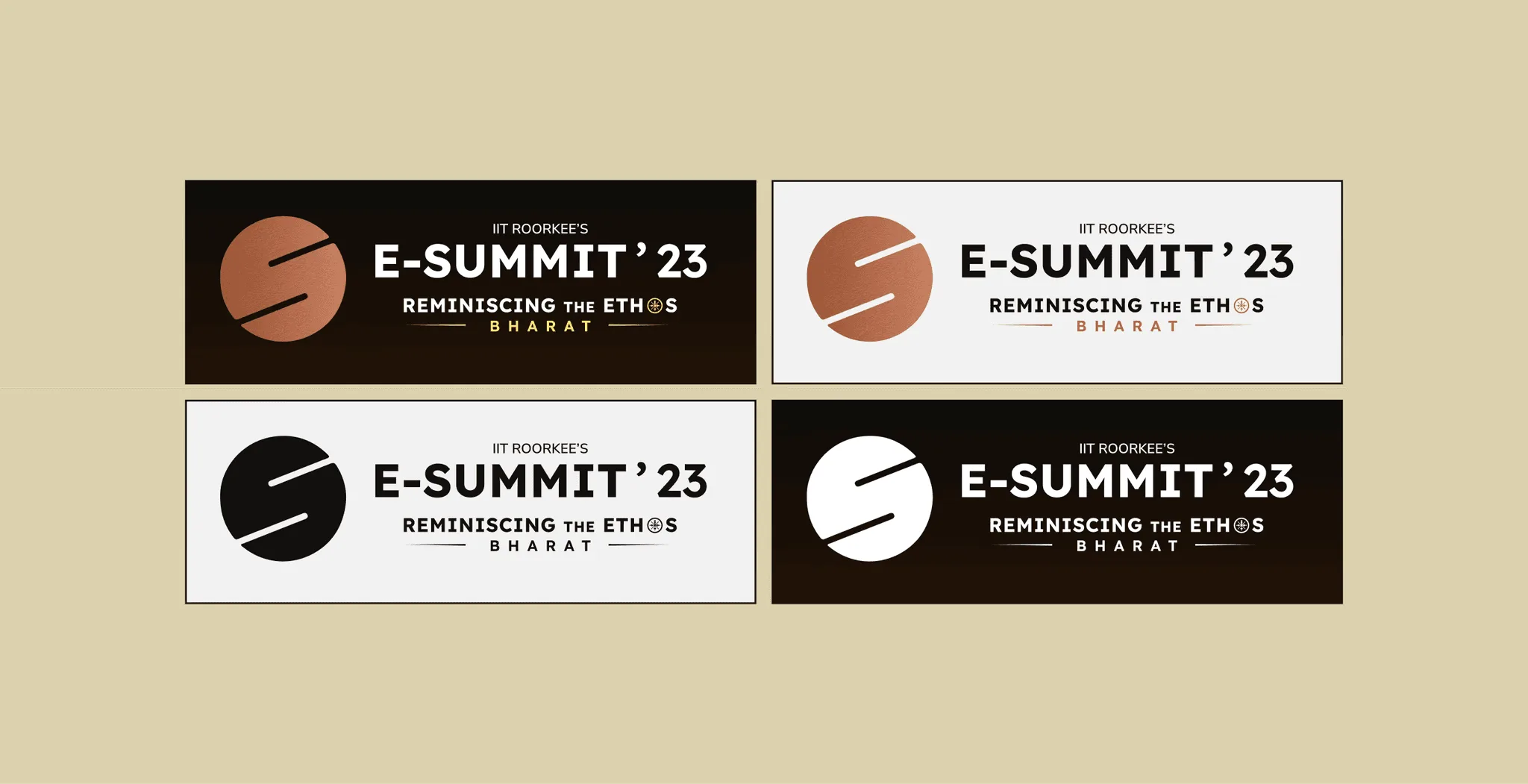
The standard logo for the E-Summit involves a combination of 'E' and 'S'. Only the colour of the logo changes in the subsequent versions of the summit.
Deliverables
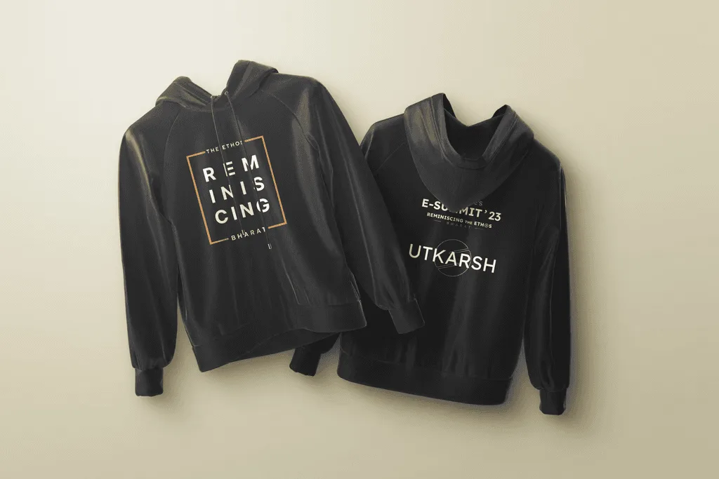
The identity extended across campaign assets, sponsor communication, merchandise and the event environment.
1. Campaign Materials
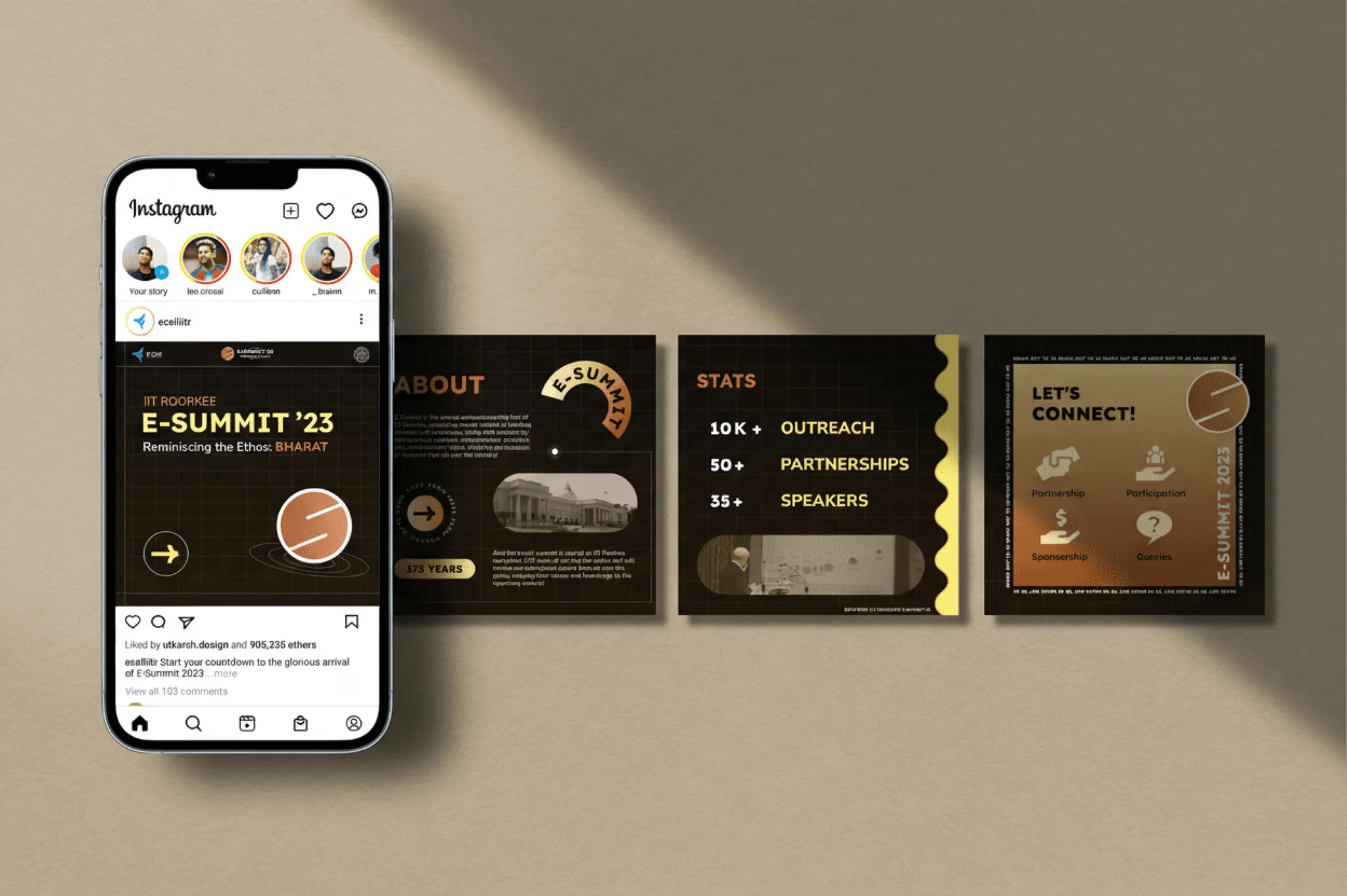
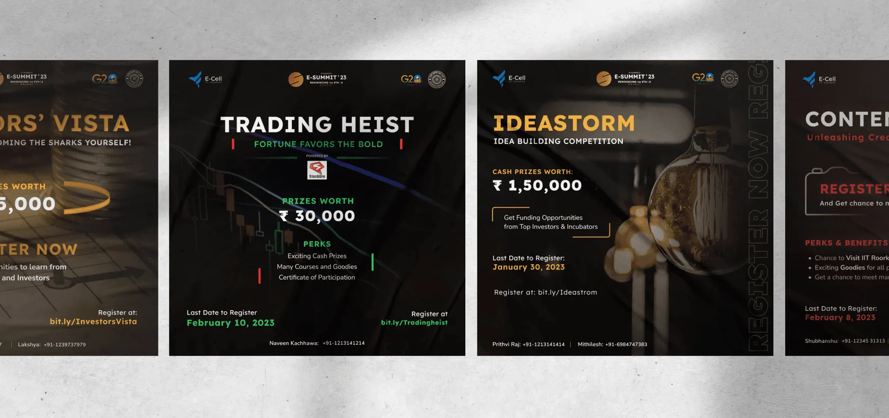
Instead of launching the entire identity at once, the campaign revealed elements gradually through teaser posts and event announcements.
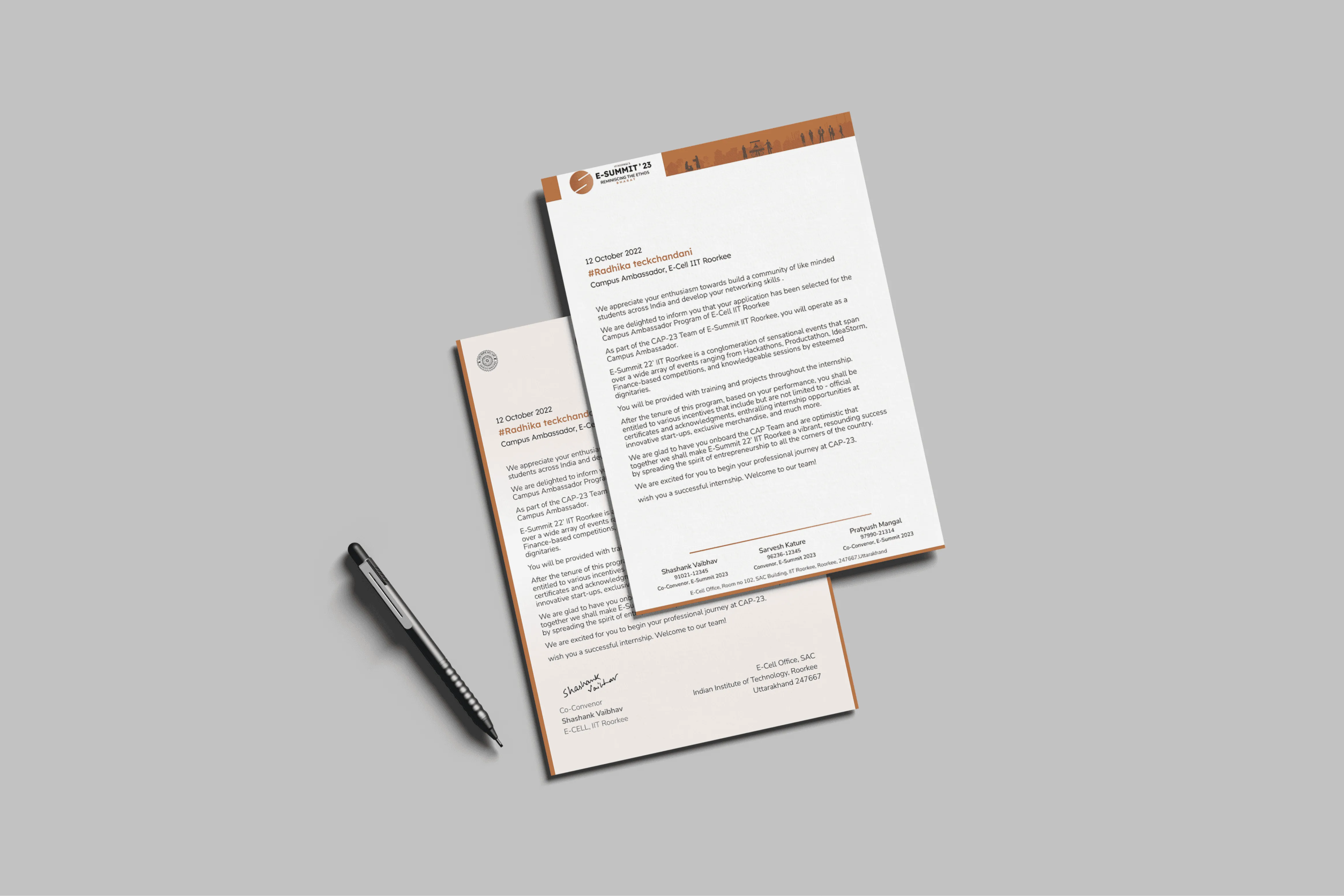
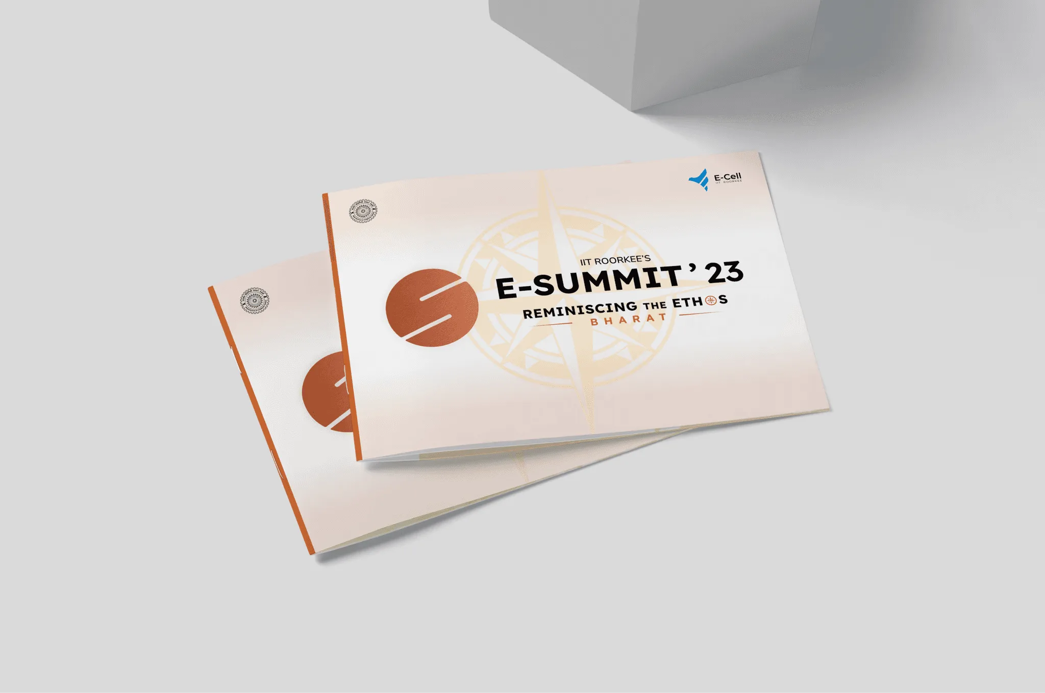
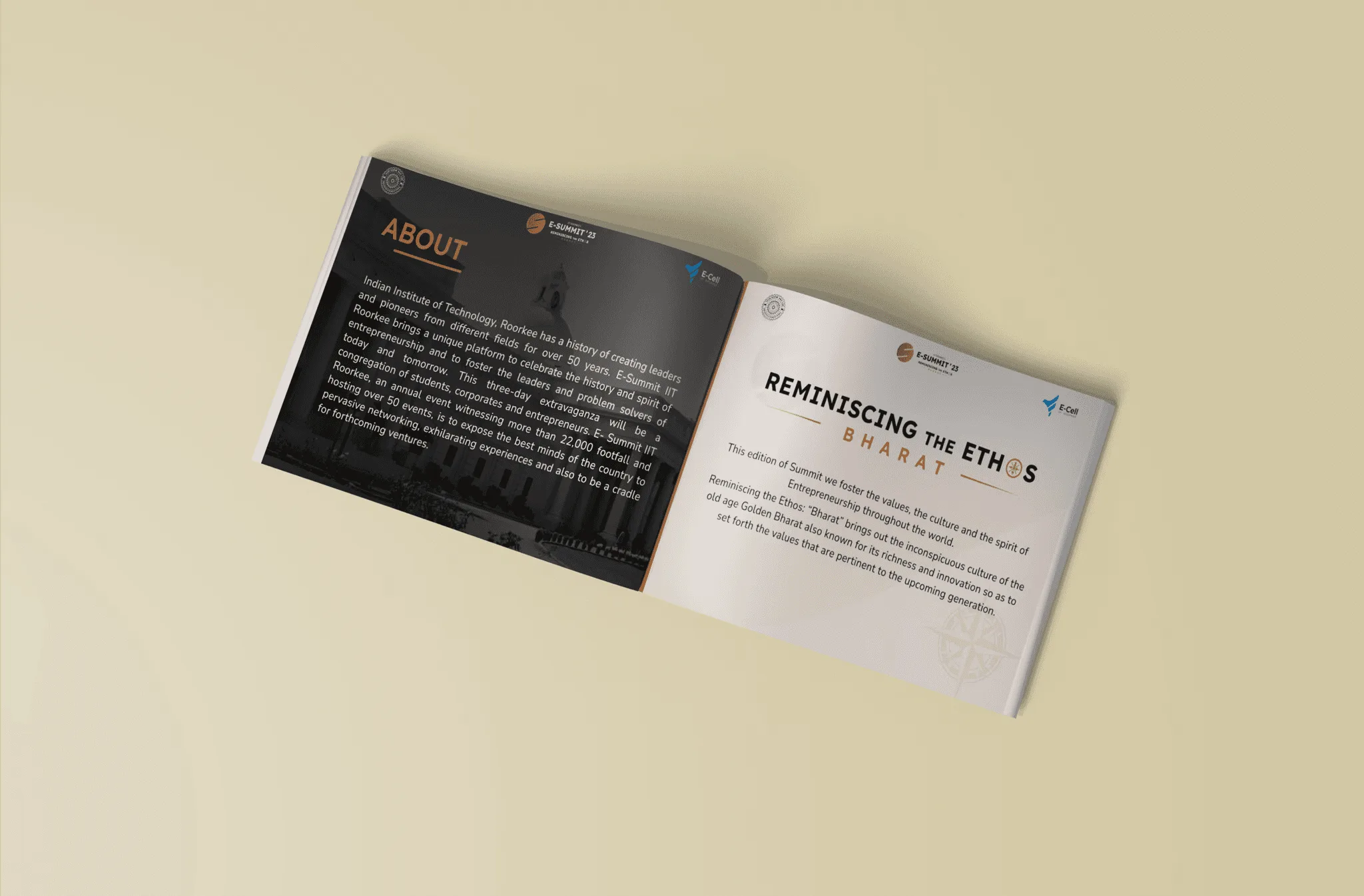
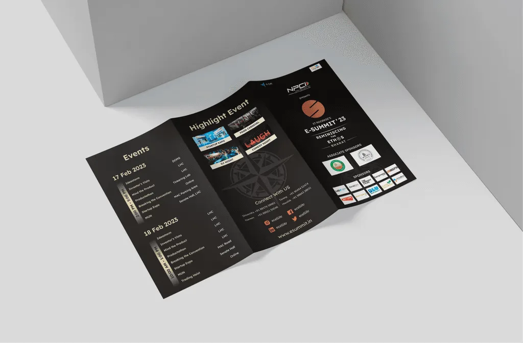
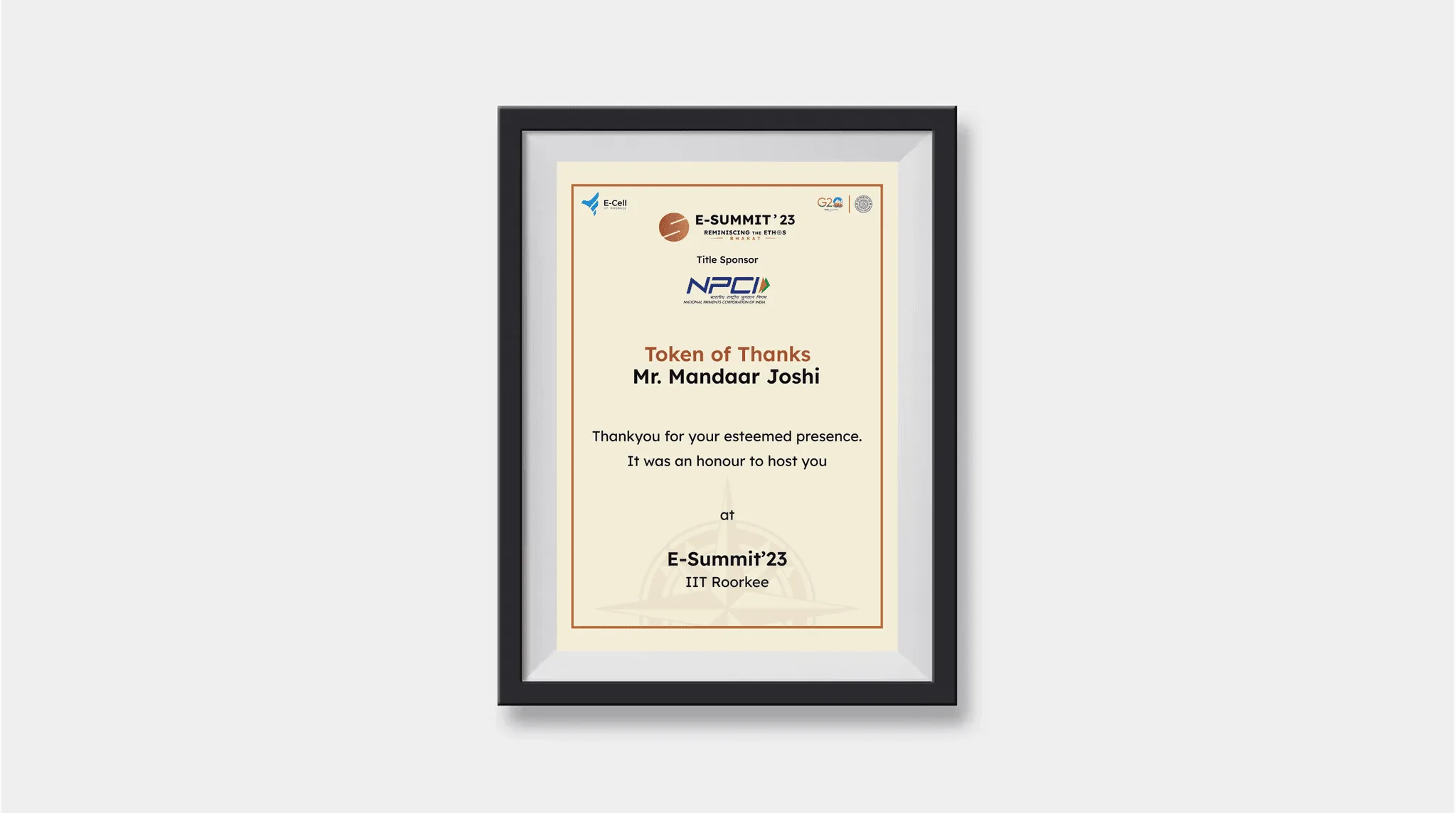
2. Sponsor & Communication
For many sponsors, this was the first touchpoint. It needed to make E-Summit feel credible, ambitious and worth investing in.
- ₹10L+ Sponsorship raised from a single sponsor
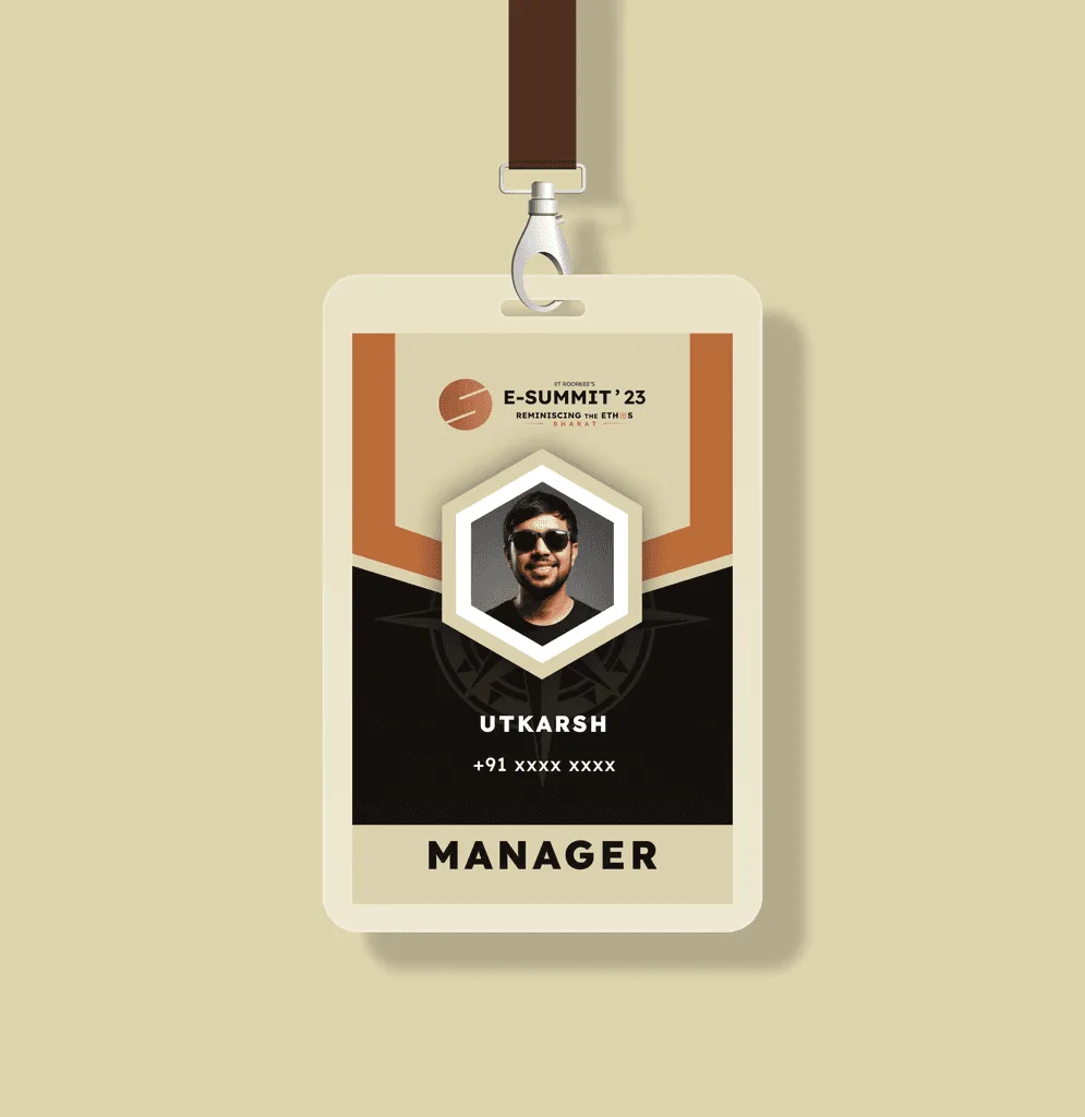
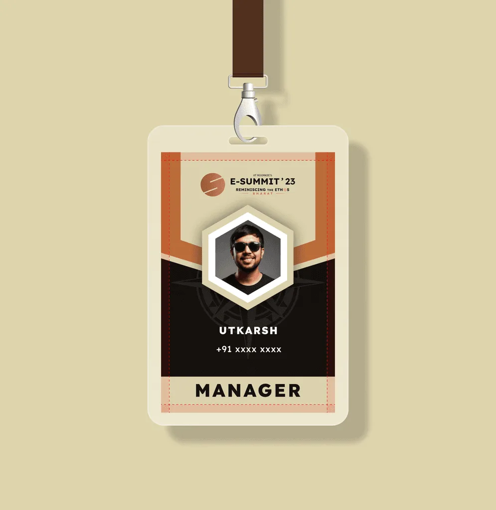
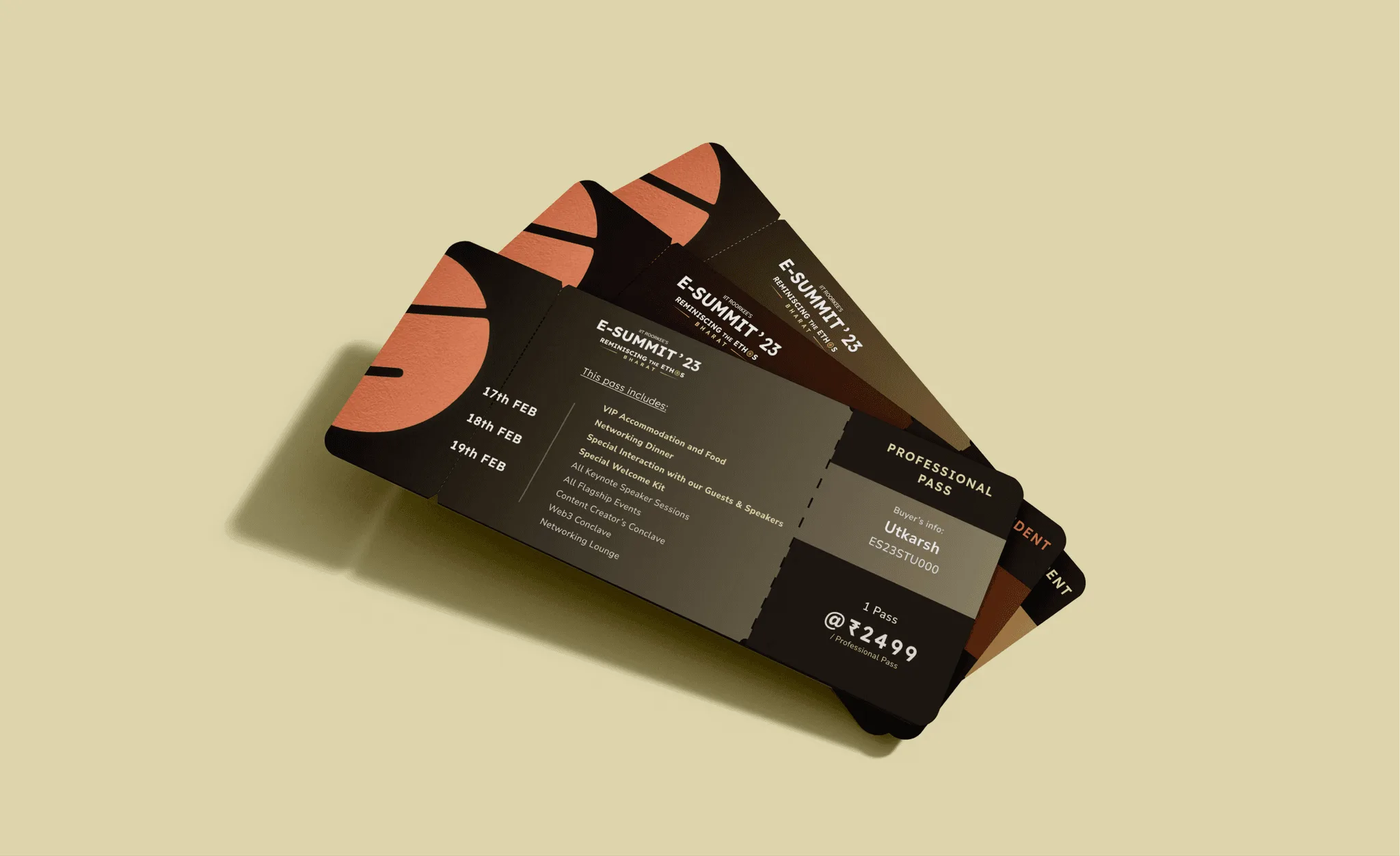
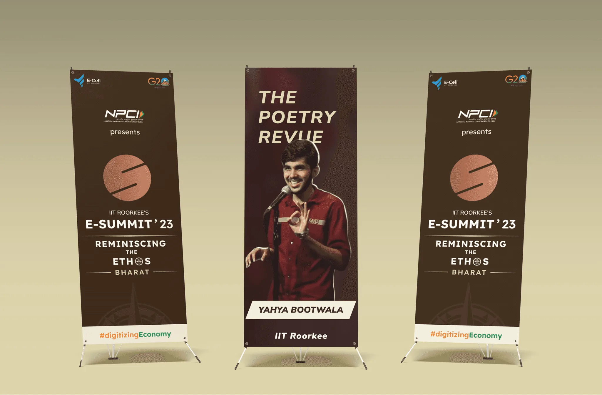
3. Print System
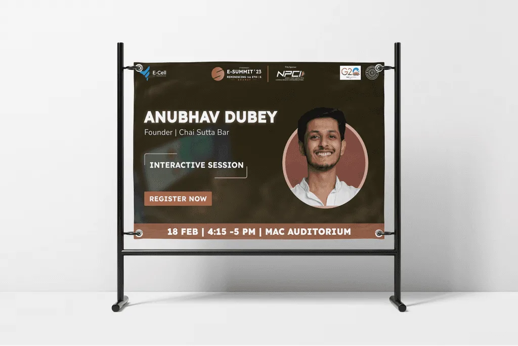
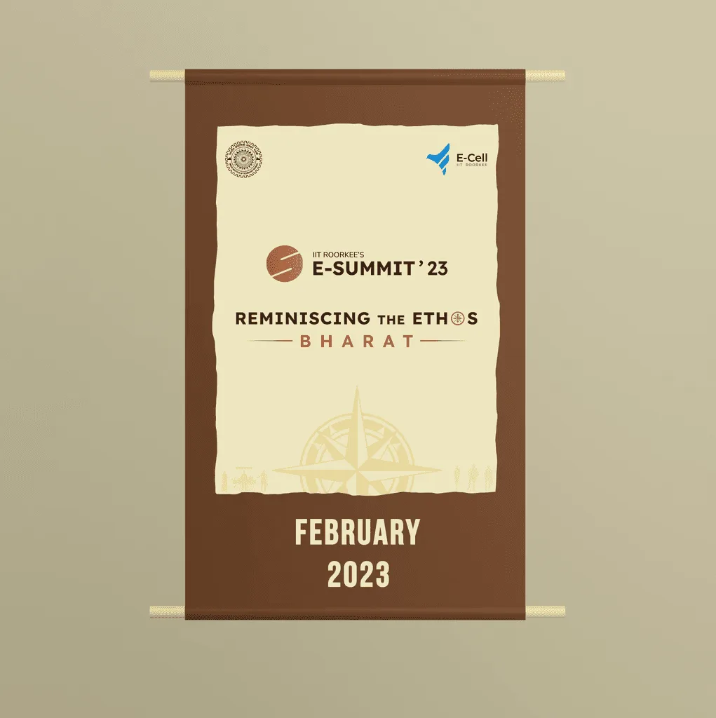
Whether it was a poster on campus, a ticket or the stage itself, every interaction needed to feel like part of the E-Summit journey.
Website Design
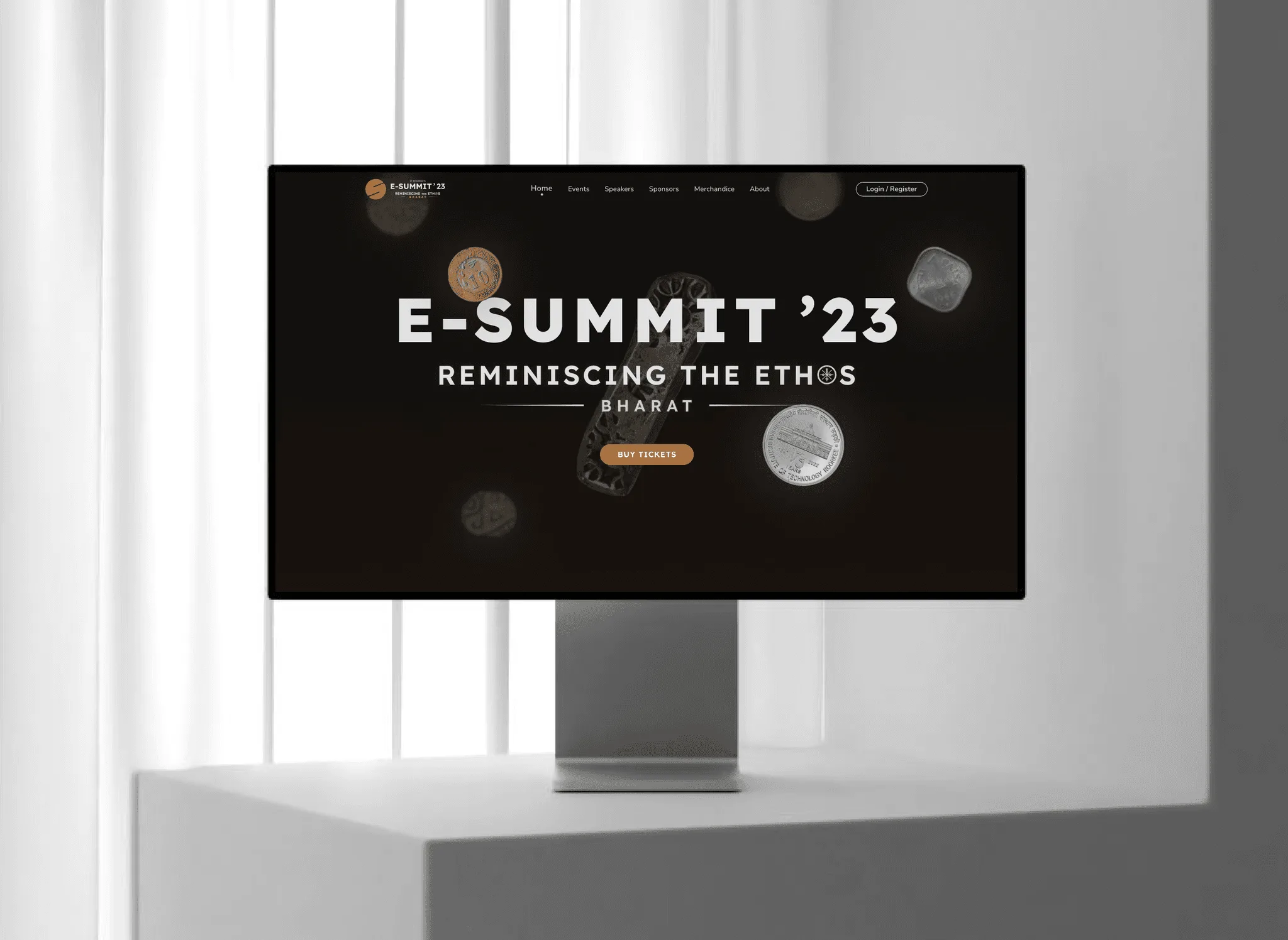
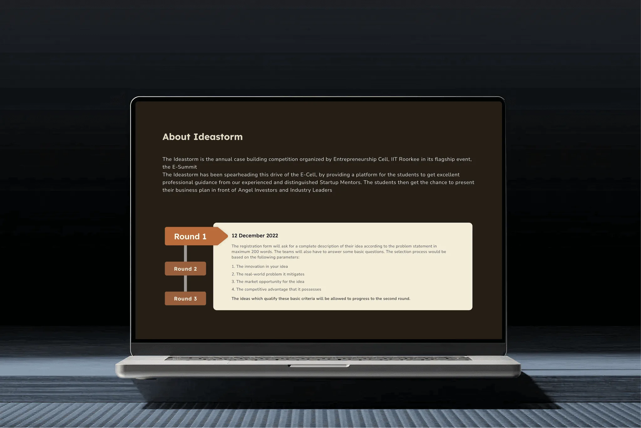
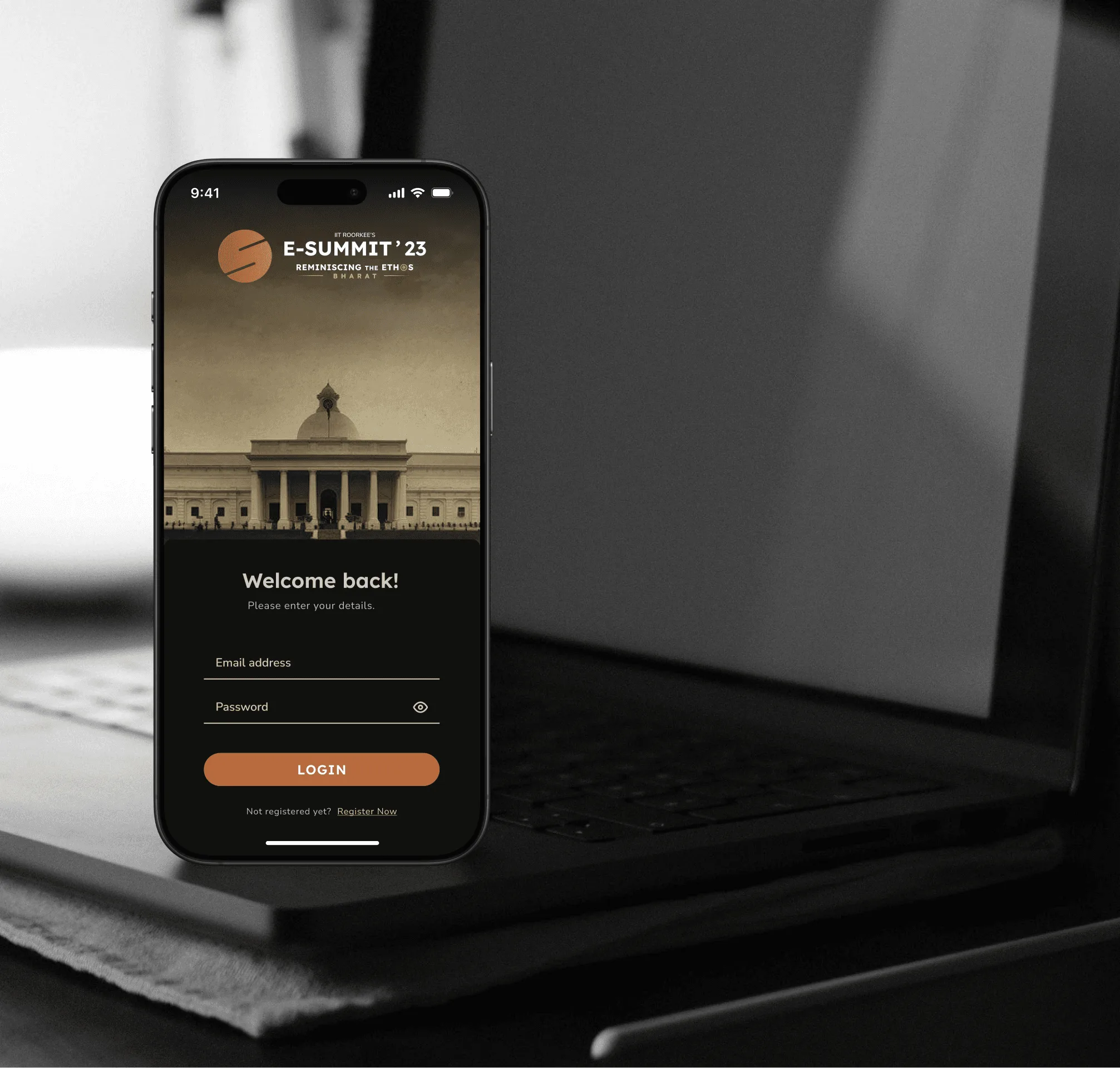
The website served as the primary information hub for speakers, events, and registrations. The layout prioritized quick discovery of key information like schedules, speakers and ticketing to reduce friction for first-time visitors.
Impact - Where design made a difference
Design influenced how E-Summit was perceived, communicated and experienced across touchpoints.
- 5M+ social impressions: Decision: Build a system that every asset shared felt like part of one story.
- ₹25L+ sponsorship raised: Decision: Design the brochure as a high-trust artifact not a print export.
- 11K+ attendees: Decision: Designed the system to be usable by the entire team.
Utkarsh combines design thinking with fast execution. For E-Summit he led branding, website design and graphics with precision, turning complex ideas into clear outcomes.
Next case study: <a href="/work/soundsphere">Next Case Study</a>