Fampay Cashback Store
- Brand
- Fampay - YC S19
- My Role
- Product Design Intern
- Team
- 2 Designers, 1 PM, 2 Engineers
- Timeline
- Sep 23 - Oct 23
- Status
- Shipped during Internship
- Impact
- 80% Reduction in one time voucher complaints 20% Support team bandwidth freed up
Overview
Preventing voucher value loss for teen users by making value-loss risk easier to understand before purchase.
This case study focuses on the Cashback Store experience inside FamPay, where users could redeem cashback for vouchers. The challenge was not simply making the flow look better. It was helping users avoid accidental loss of value while keeping the experience fast and intuitive.
Context
- What is Fampay?: FamPay is India's wallet built for teens learning to spend, save, and pay independently.
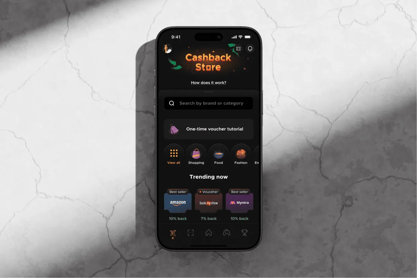
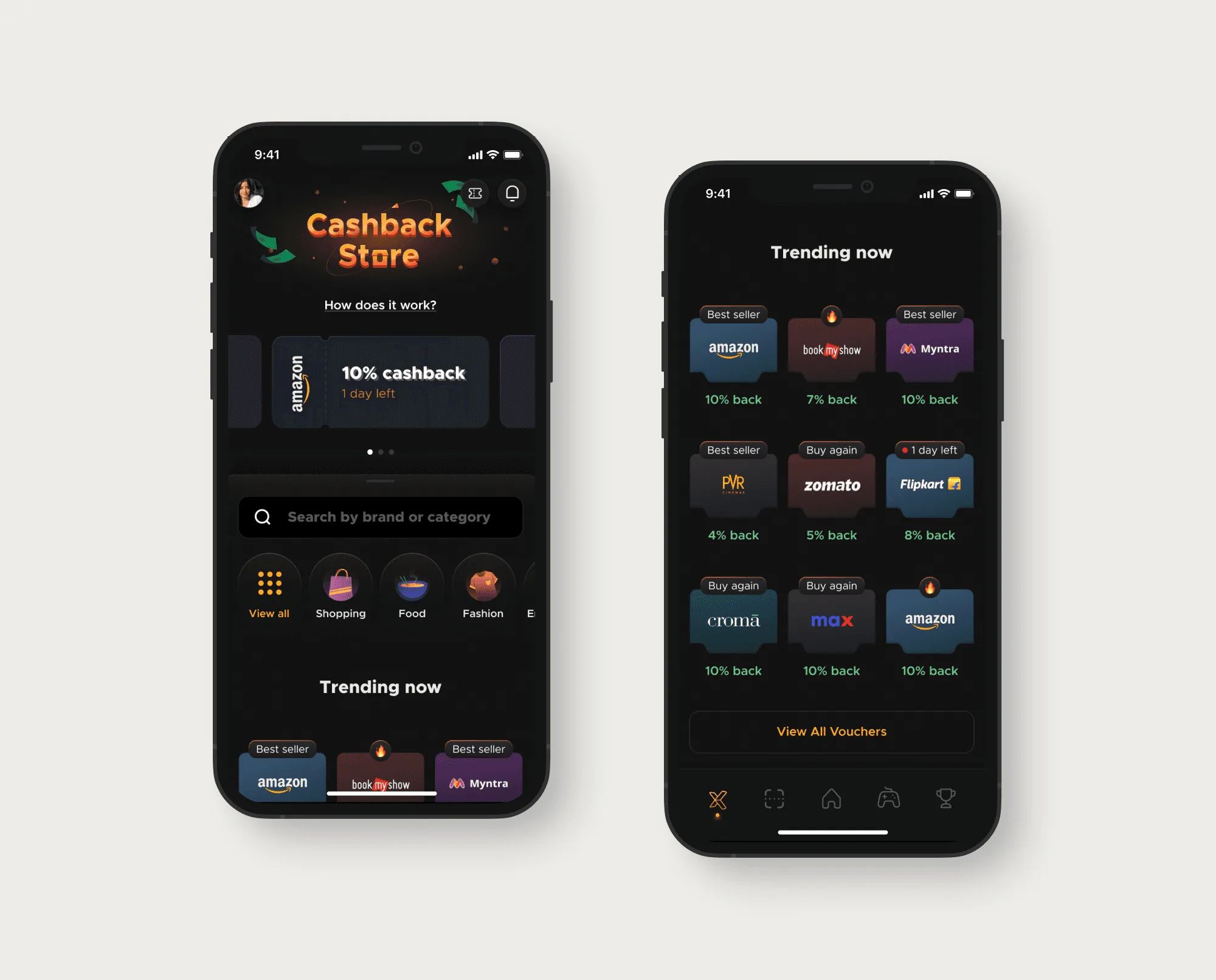
- What is Cashback Store?: Cashback Store is an in-app rewards marketplace where users can redeem cashback for branded vouchers and offers.
What was happening
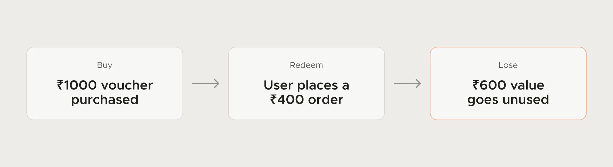
Some vouchers were one-time use. If users spent only part of the value, the rest could be lost. The mistake began before redemption, during purchase.
The same issue felt different on each side
Before designing anything, I mapped the tension on both sides.
- User Confusion
- One-time vouchers didn't feel different
- The downside showed up too late
- It felt like losing money
- Business Impact
- Support complaints kept increasing
- Trust in Cashback Store started weakening
- A revenue surface was getting harder to scale
How the experience worked
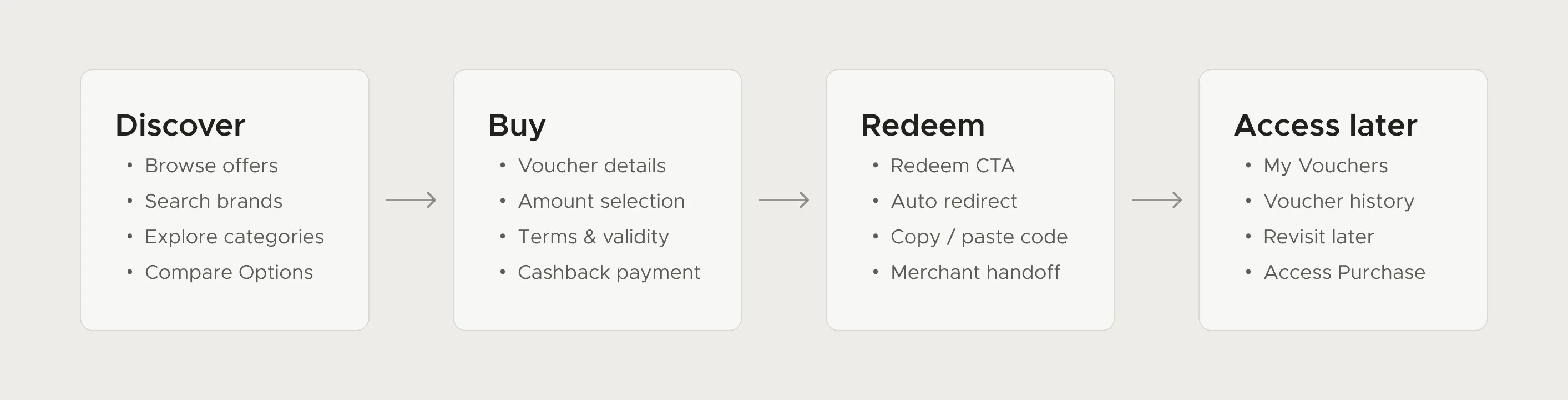
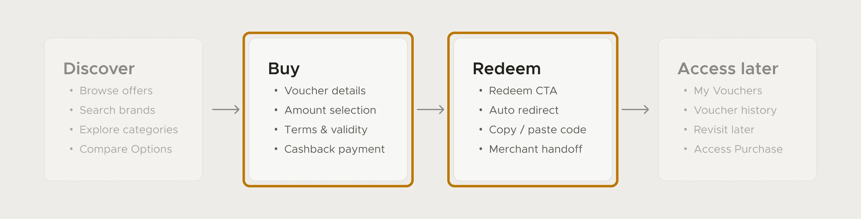
Cashback Store wasn't one screen. It was a connected journey across discovery, purchase, redemption and reuse. So I mapped the entire flow first, to identify key decision points and moments needing clarity.
North star design principles
- Clarity before commitment: Users should know how one-time vouchers work before buying.
- Keep flow lightweight: The flow should stay fast, simple, and easy to complete.
- Carry clarity forward: Users should still feel guided after purchase, not left to memory.
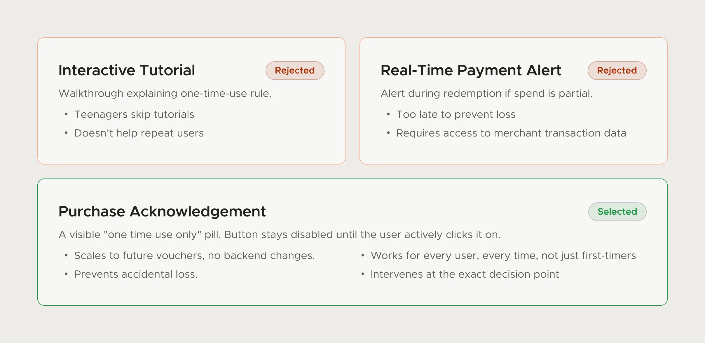
What we explored
Each direction was pushed far enough to find its real failure mode, not whether it looked good, but whether it would actually change behaviour under real conditions with a real teenager.
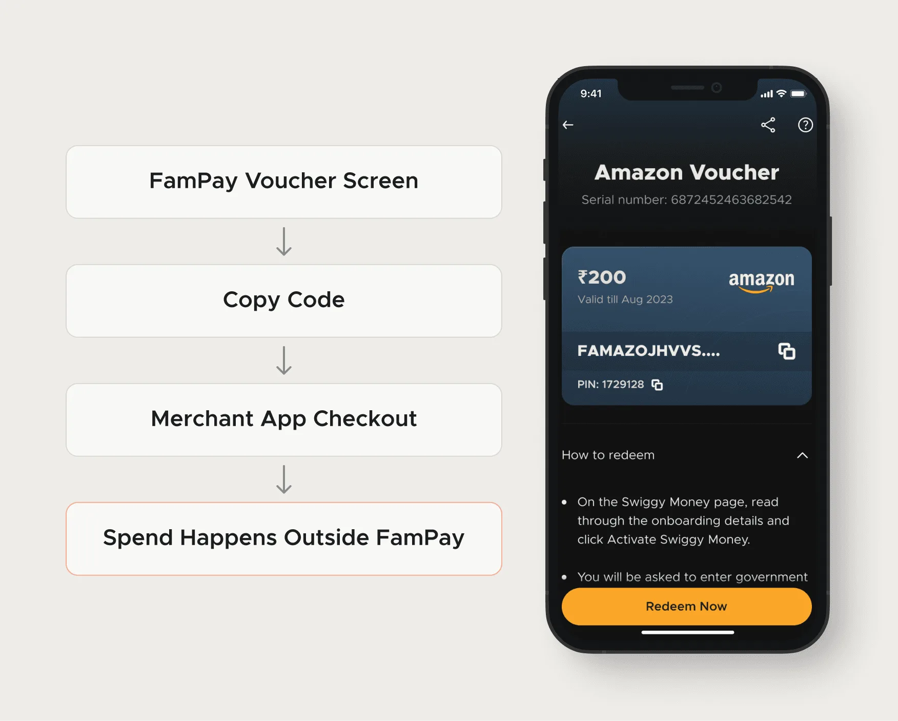
Redemption was outside our control
Once users copied the voucher code and moved into a merchant app, FamPay could no longer influence what happened next.
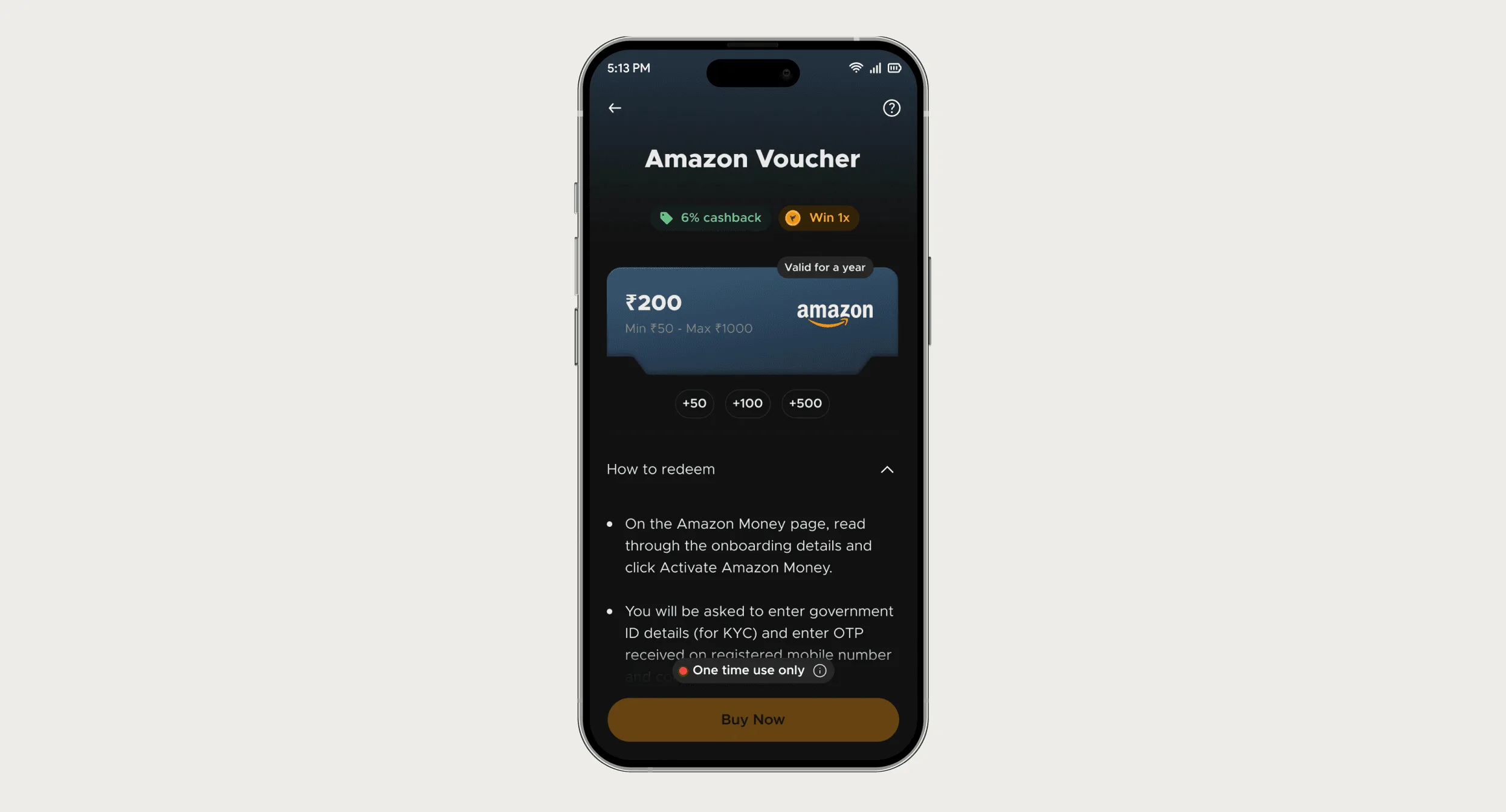
What changed in the flow
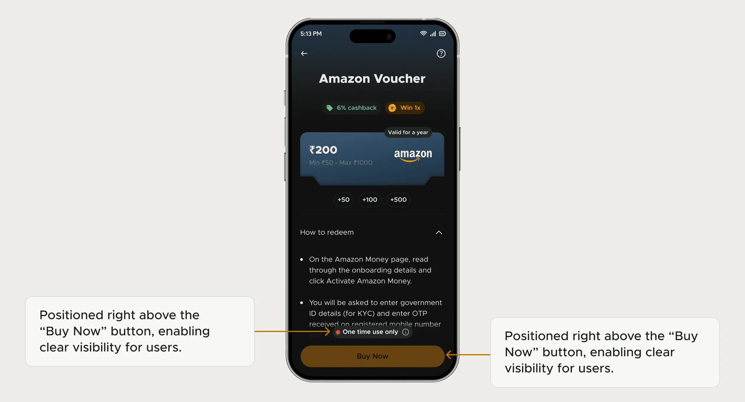
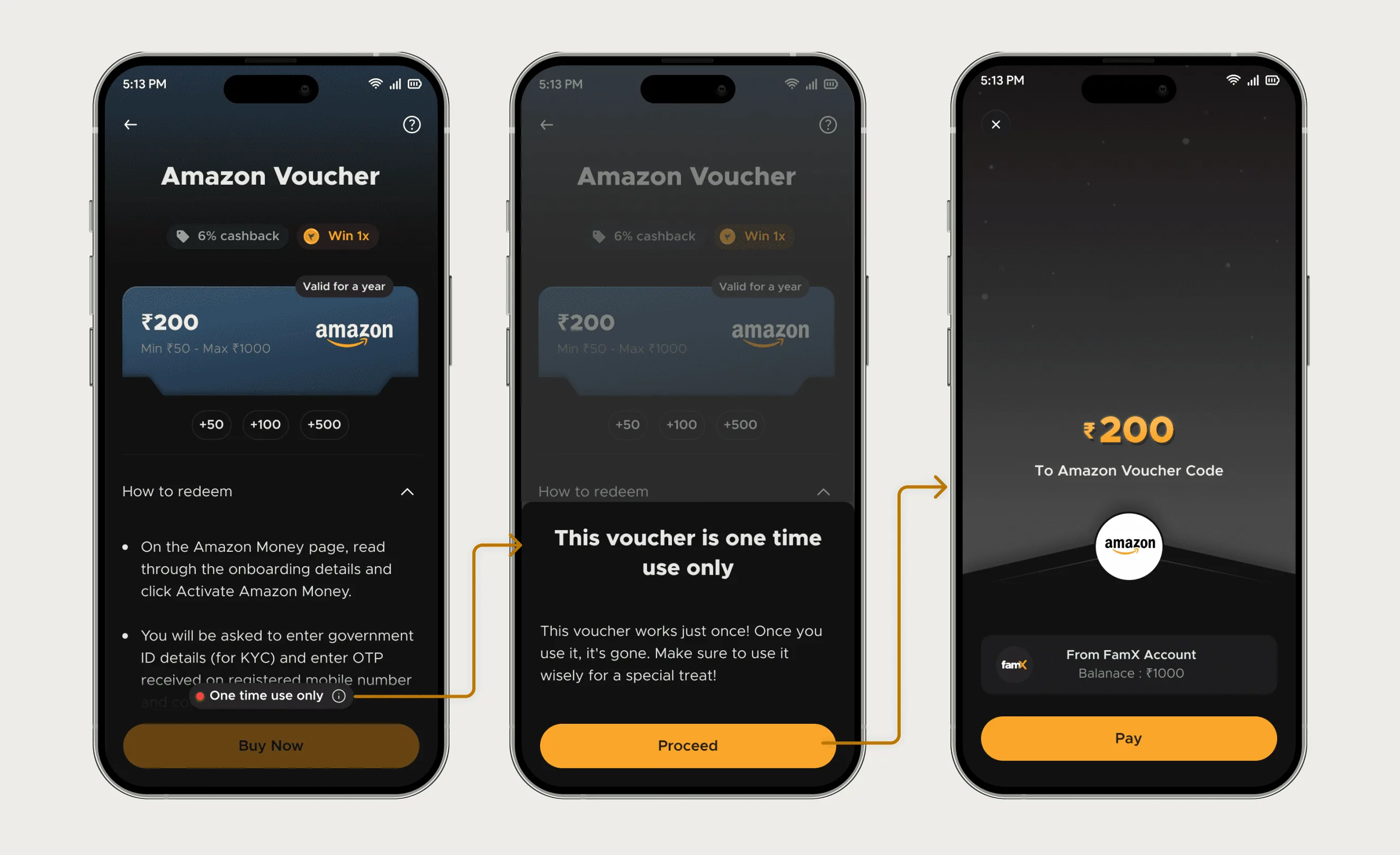
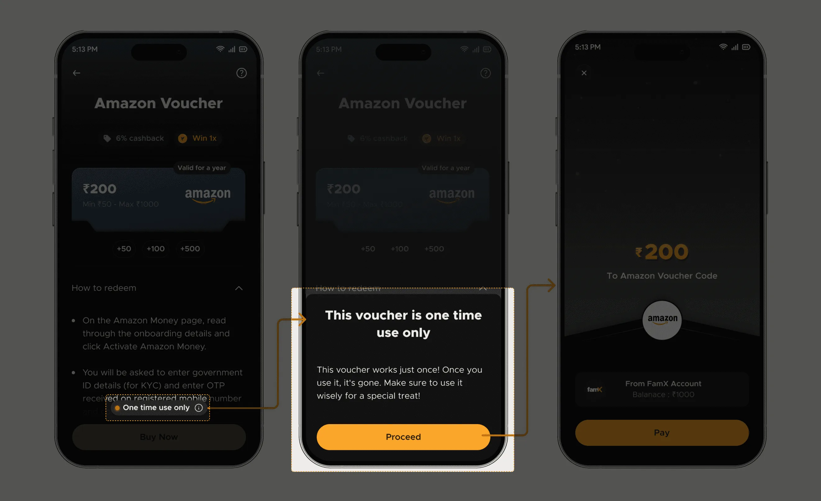
The redesign introduced clarity before purchase and again at redemption.
Clarity was introduced at the moments where users were most likely to make a mistake.
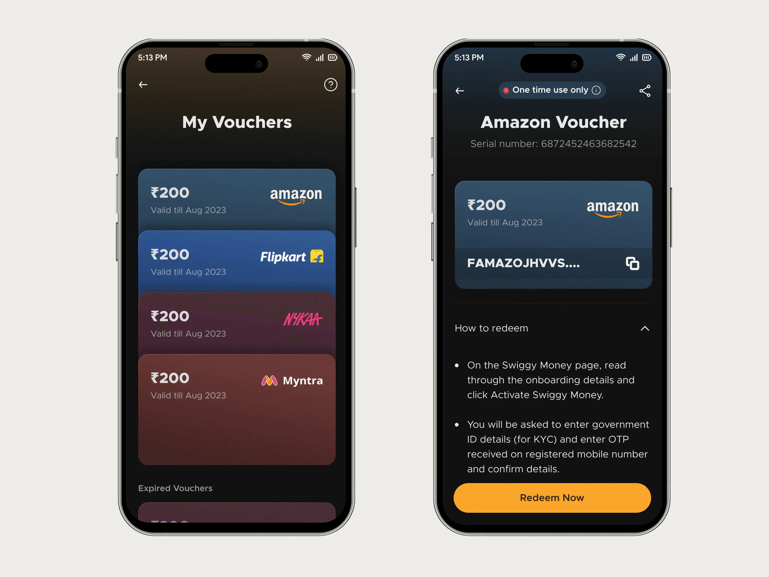
Carried the rule beyond purchase
Impact
The support team noticed the change before we pulled the data.
- 80% Reduction in voucher-related support tickets post-launch
- 20% Support bandwidth freed for higher-value user issues
Utkarsh brought clarity and structure to our voucher flow. His work reduced confusion and made the experience feel more reliable.
Next case study: <a href="/work/e-summit">Next Case Study</a>