Checkout UX best practices
Guide · 6 min read · By Utkarsh Dhairya Panwar · Updated
A good checkout explains itself. The total, the item and any rule that changes the deal sit above the pay button, the button says exactly what it does, and every outcome after it has its own state. At xPay, a checkout that needed no narration cut sales walkthrough time 30%.
The narration test
Most checkout advice comes from e-commerce research: fewer form fields, guest checkout, trust badges, express pay. All useful. I'd add a simpler test I picked up at xPay (YC W24), which works for any checkout, consumer or B2B.
At xPay I defined the checkout UX that sales used in live demos. In a demo, every unclear moment shows up immediately, because someone has to stop and explain it. A field nobody understands, a fee that appears late, a button that doesn't say what happens next: each one is a sentence the salesperson has to say out loud. After the redesign, buyers followed the flow without that narration, and sales walkthrough time dropped 30%.
Walk someone through your checkout and write down every sentence you find yourself saying. Each one is a piece of copy or layout missing from the screen.
Before the pay button
- The full total, including fees and taxes, visible on the same screen as the button. A fee that appears on the last step reads as a trick.
- What's being bought, in the buyer's words: "Amazon voucher, ₹200" or "Team plan, 5 seats, billed yearly".
- Any rule that changes the deal (non-refundable, one-time use, auto-renews) placed right above the button instead of in the terms.
- The payment method that's about to be charged, with a way to change it that doesn't lose everything else.
- Labels above fields, always visible. Placeholder text that vanishes on typing makes the review step impossible.
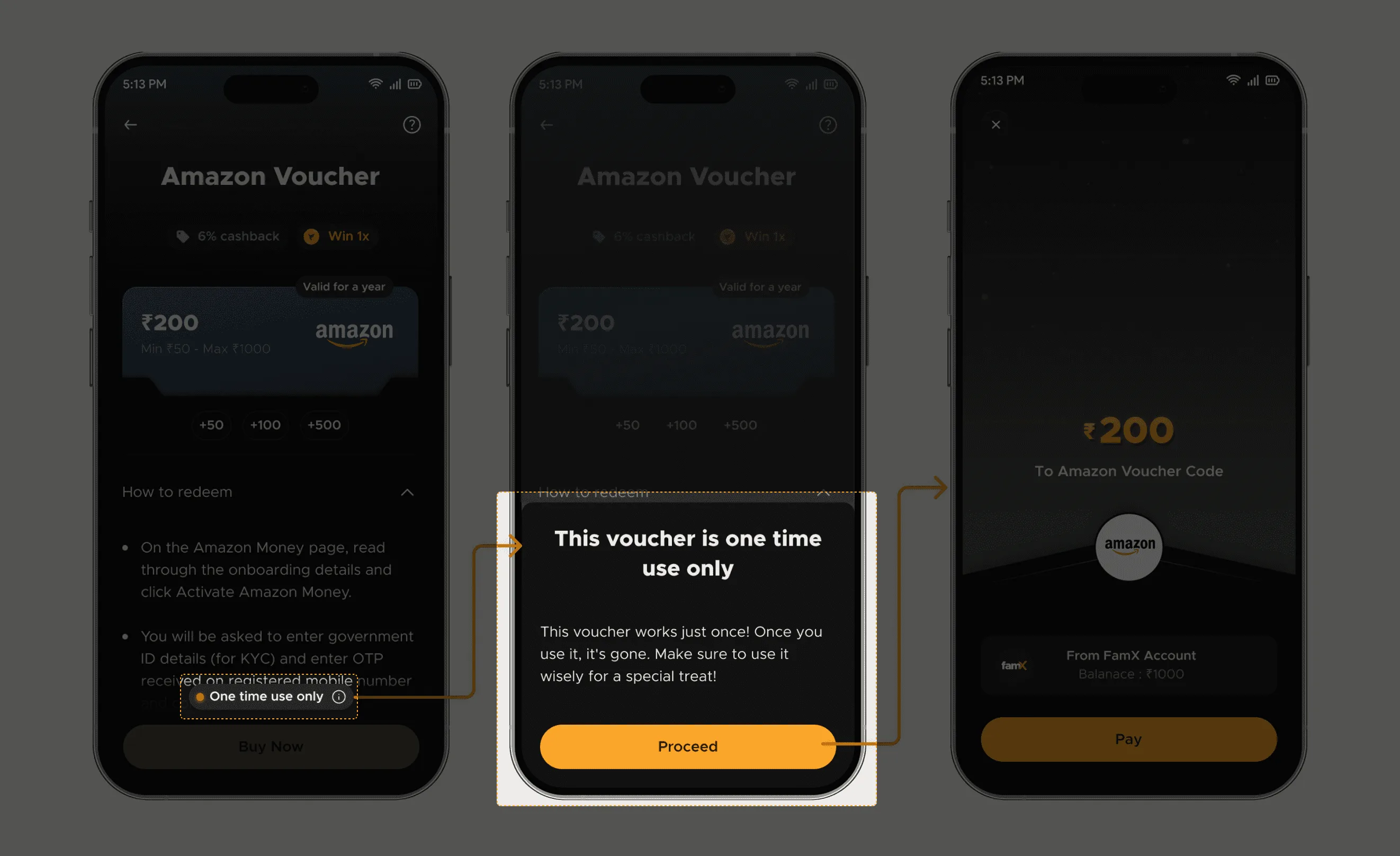
The rule point is where I've seen the biggest effect. At FamPay (YC S19), Cashback Store vouchers were one-time use, and users found out only after losing the unspent value.
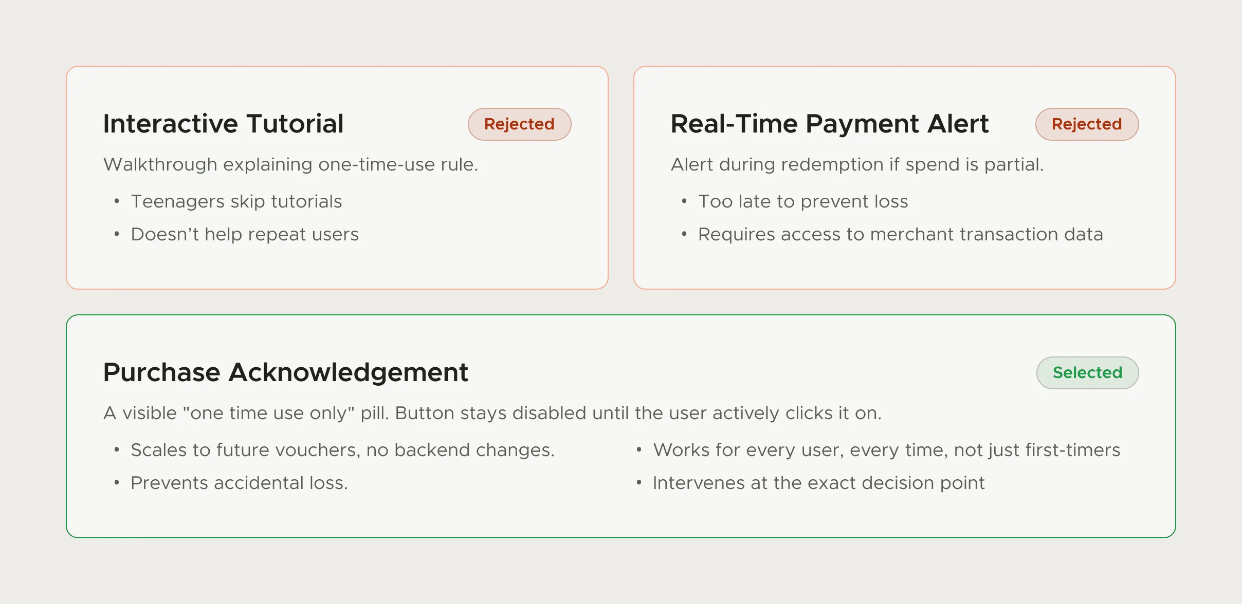
The fix was the plainest option: a "One time use only" pill above Buy Now and a short confirmation sheet. The full story, and what it did to support load, is in my guide to reducing support tickets with UX.
The button itself
| Don't | Do |
|---|---|
| "Continue" on the final step | "Pay ₹200" or "Start yearly plan" |
| A disabled button with no reason | An enabled button that points to the missing field when tapped |
| Two equally bold buttons (Pay and Cancel) | One primary action, a quiet text link to go back |
| A button that can be tapped twice during processing | A button that turns into a progress state on the first tap |
The double-tap row matters more than it looks. In payments, a nervous second tap during a slow network is a common way to create a duplicate charge, so the button needs its share of the fix (locking after the first tap) alongside the backend's.
After the pay button
A checkout has at least four endings: success, pending, declined and timed out. Most designs only draw the first. I redesigned the timeout, bank-decline and retry states for FamPay's iOS app (written up in my guide to payment failure UX). In brief:
- Pending: say whether money has left the account, and when they'll know. Don't offer an instant retry.
- Declined: say it was the bank or card issuer, that nothing was charged, and offer another method.
- Success: say what they got and where to find it, and what happens next ("Your voucher is in My Vouchers").
SaaS and subscription checkout
B2B checkout adds its own questions. Who's the buyer, and who's the user? Is it monthly or yearly, per seat or flat? Will there be an invoice with the company's tax details? Each unanswered one becomes a sales email.
- Show the billing period next to every price, and the total for the period alongside any monthly equivalent.
- Let the buyer add a company name and tax ID before payment, so it doesn't take a support ticket afterwards.
- Make seat count editable on the checkout page, with the total updating live.
- Say what happens at renewal, and how to cancel, before they pay.
A checkout review in 30 minutes
- Run the narration test: Walk a colleague through it and write down every sentence you say.
- Read the pay screen alone: Cover everything else. Can you tell the total, the item, the method and any rule?
- Force every ending: Use test cards or a staging switch to see decline, timeout and success. Plenty of teams have never seen their own timeout screen.
- Try it on a slow phone network: Watch for double taps and spinners with no words.
If your checkout, or the demo that depends on it, needs a person to explain it, that's the kind of flow I work on in SaaS product design.
Questions people ask
What are the most important checkout UX best practices?
Show the full total before the pay button, put any rule that changes the deal right above it, label the button with the action and amount, prevent double taps, and design every outcome after payment, failures included.
How is B2B checkout different from e-commerce checkout?
It adds billing periods, seats, invoices and tax details, and often a buyer who isn't the user. Those need answers on the checkout page, or they turn into sales emails.
Does a checkout need a review step before payment?
If the total can change (seats, add-ons, tax), yes, or keep a summary next to the pay button the whole time. For a fixed, one-tap purchase, the pay screen itself is the review.
Should checkout be one page or several steps?
Whichever keeps the total and the pay button on the same screen. For short purchases, one page. For longer B2B setups, clear steps with a persistent order summary.
Sources
- E-Commerce Cart & Checkout Usability Research, Baymard Institute
- 50 Cart Abandonment Rate Statistics 2026, Baymard Institute
- Placeholders in Form Fields Are Harmful, Nielsen Norman Group
- Idempotent requests, Stripe API Reference
Working on this?
Tell me what you're building and where it's stuck: book a 30-minute call, email work@utkarshdesign.com or send a brief.