Fintech UX and app design
Work · Updated
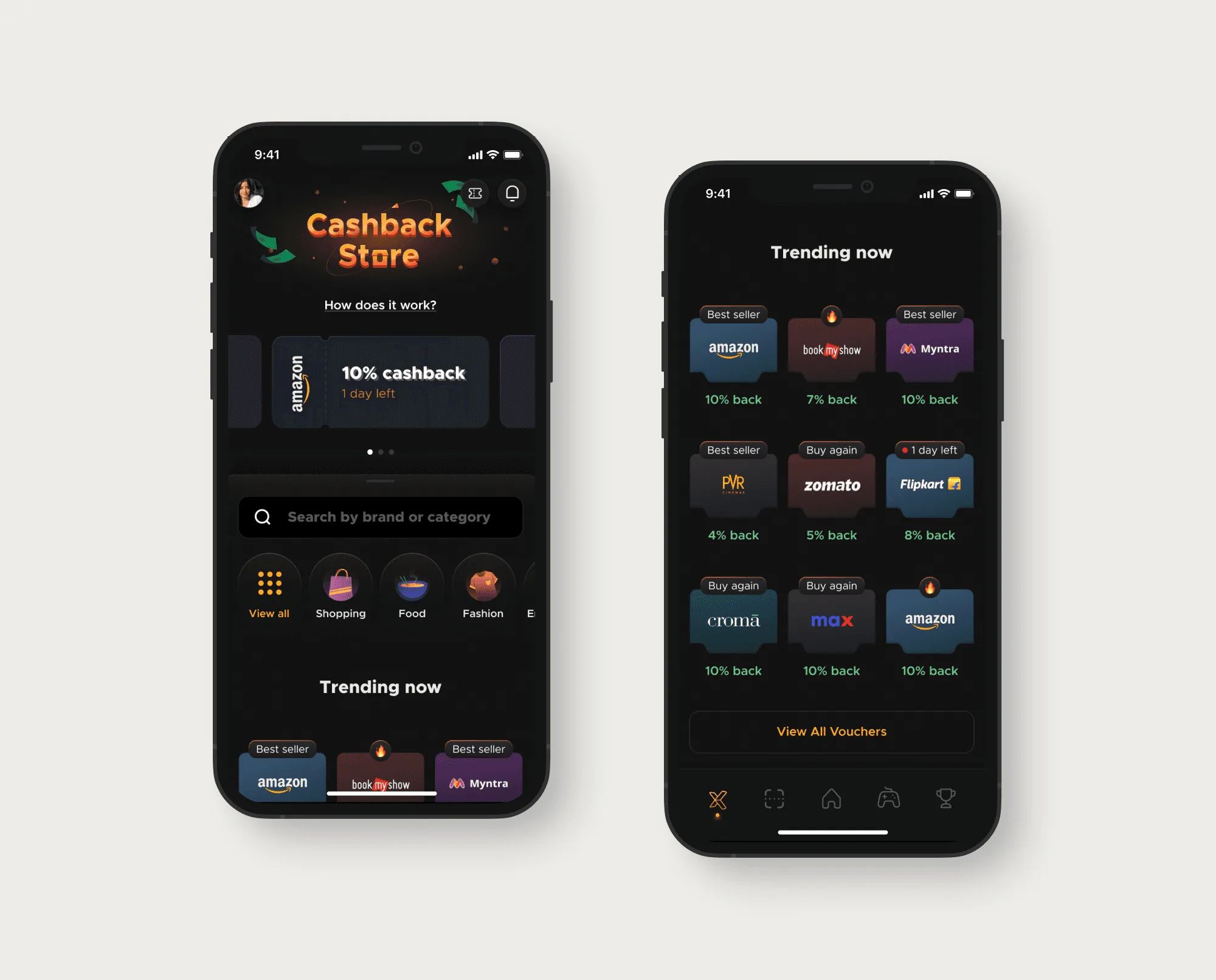
In fintech, expensive moments are when money is unclear: a payment that timed out, a rule learned too late, a checkout that needs a salesperson. I've designed for those moments at FamPay (YC S19), xPay (YC W24) and Bold Finance, and each result is a drop in failures or tickets.
Trust is decided on the bad screens
People don't judge a payments app by its home screen. They judge it the first time a payment hangs and the app says nothing useful. A timeout, a bank decline and a retry are different situations, and the user needs to know which one they're in before tapping Pay again.
Rules can do the same damage. At FamPay, one-time vouchers lost their remaining value once partly spent. Users found out at redemption, after the value was gone, and then wrote to support.
Payments and lending work
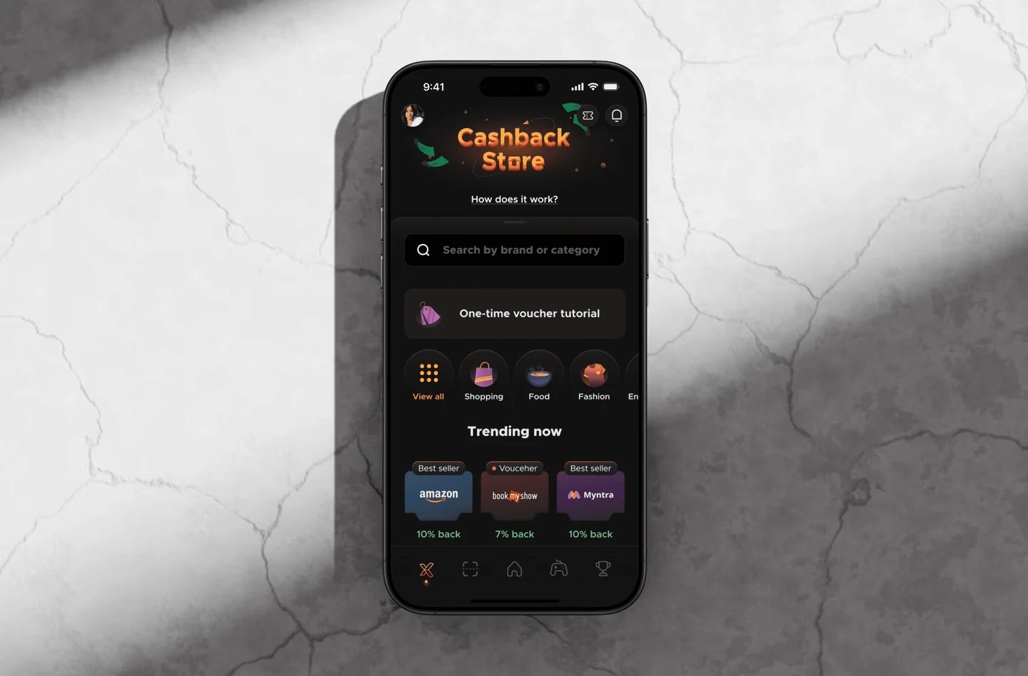 Fampay - YC S19: Improved voucher UX by making one-time-use rules clear and smoothing Cashback Store experience
| Company | What I designed | Result |
|---|---|---|
| FamPay (YC S19) | One-time voucher rule shown before purchase and again at redemption | 80% fewer voucher support tickets, 20% of support bandwidth freed |
| FamPay (YC S19) | iOS payment error states for timeout, bank decline and retry, tested on 15+ screens | 20% less failure-related drop-off, 25% fewer repeated mistakes |
| xPay (YC W24) | Checkout UX used in live sales demos | Sales walkthrough time down 30% |
| xPay (YC W24) | Reusable UI system of 25+ components | Feature delivery down 35% |
| Bold Finance | The website, the app and marketing creatives for a gold-loan business | The company has since closed, so there's nothing live to link to |
Bold Finance gave gold loans, and I designed its website, app and marketing creatives. Lending asks for a different kind of clarity than payments: the borrower has to understand what they're agreeing to before handing anything over. Bold Finance has since closed, so I can describe the work but can't show it.
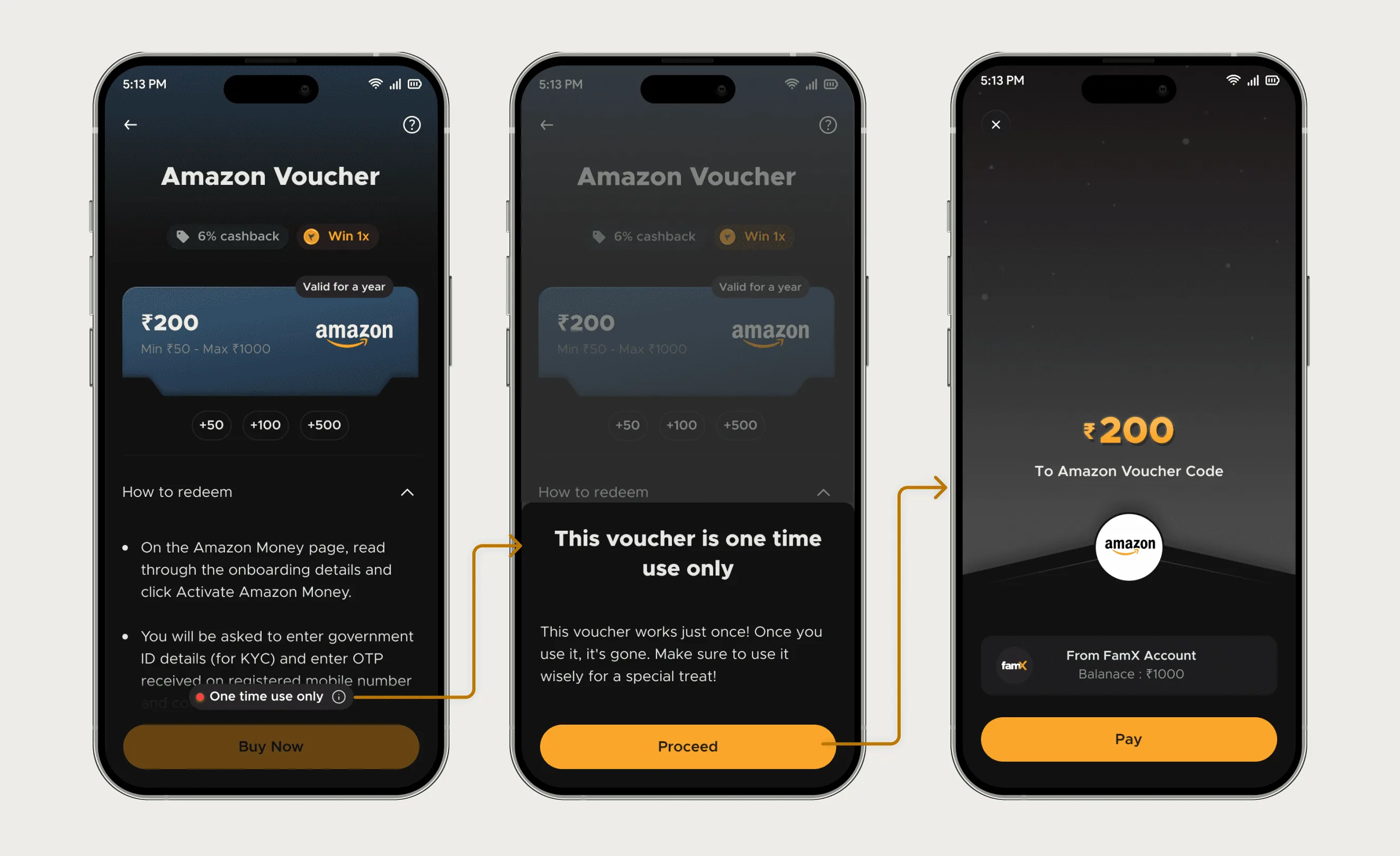
FamPay case study: How the voucher rule was made visible at purchase and redemption, and why two other options were rejected.
Utkarsh brought clarity and structure to our voucher flow. His work reduced confusion and made the experience feel more reliable.
What I check first in a fintech product
- Every failure state, one at a time, and what the user should do next in each. Most apps design the success path plus one generic error.
- Any rule that can cost the user money, and whether it appears before they commit.
- Support tickets tagged by screen, which are the cheapest research a fintech team already has.
- Whether the checkout explains itself without a salesperson or a help article beside it.
I leave compliance copy and regulator requirements to your legal team. My part is getting the required words to appear where the decision happens, in language a first-time user can follow.
Questions people ask
Have you designed a lending or banking app?
Lending, yes: I designed the website and app for Bold Finance, a gold-loan company that has since closed. I haven't designed a bank's core banking app, and I'd say so before scoping one.
Can you run usability tests on payment flows?
Yes. At FamPay I tested 15+ screens of the redesigned payment error states before they shipped.
Do you design fintech websites too?
Yes. I designed Bold Finance's website, and at xPay I restructured 10+ Framer go-to-market pages, which doubled indexed pages.
Start a project
Tell me what you're building and where it's stuck: book a 30-minute call, email work@utkarshdesign.com or send a brief.