Data table UX design
Guide · 6 min read · By Utkarsh Dhairya Panwar · Updated
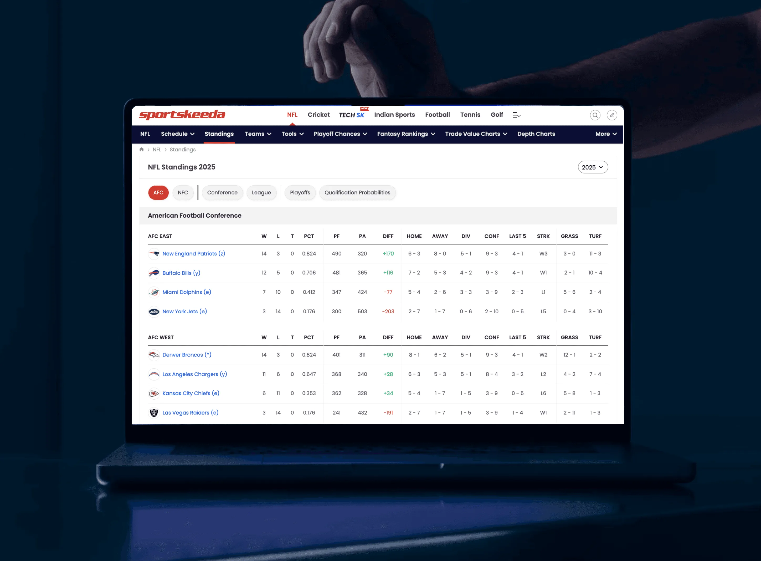
Design a data table for the one comparison people make most. Put the identifying column first and the deciding column second, right-align numbers, keep the header and first column sticky, and set row height by how many rows people compare at once. Add extras only when they serve that comparison.
Start from the comparison, before the schema
Most tables get designed by listing the fields the API returns and turning each one into a column. The order then follows the database, and nobody reading the table thinks in that order.
I've designed tables at two very different scales. At Sportskeeda I worked on NFL and IPL score and standings tables for 20M+ monthly users, who read them in a few seconds between plays. At CodeAnt AI it's lists of code and security findings that engineers and managers work through every week. The audiences have little in common, but each table existed for one comparison. Standings answer "where is my team, and who's close?" A findings list answers "what do I fix first?"
Write that question above your table before you design a single column. If you can't, the table is probably two tables.
Column order, decided out loud
| Table | Don't lead with | Lead with | Why |
|---|---|---|---|
| NFL standings | Team ID, conference code | Team, then W and L | Fans locate their team by name, then read the record |
| Cricket points table | Matches played | Team, then points, then net run rate | Points decide position; net run rate breaks ties, so it sits right beside them |
| Security findings | Finding ID, scan date | Severity, then title and location | Severity is the sort key and the first filter |
| Team members list | Internal user ID | Name, then role, then last active | Admins are looking for a person, then deciding what to change |
All four follow the same rule. The first column identifies the row, and the second is the one people sort or decide by. IDs, timestamps and metadata go to the right or into a detail view. If your sales team wants an ID column first because customers quote it on calls, add search by ID instead.
Density is a row-height decision
In a table, density comes down to three things: row height, how many columns are visible, and how much each cell says. Choose them by how many rows a reader needs to compare at once, not by how much fits.
- Compact rows (around 32 to 36 px) when people compare many rows at once, like standings or log lists.
- Comfortable rows (around 48 to 56 px) when each row is read on its own and acted on, like findings with a title and a path.
- Fewer columns by default with a column picker, rather than every column with horizontal scroll.
- Two lines in a cell only when the second line changes a decision, like the file path under a finding title.
Those pixel ranges are my working defaults, so treat them loosely. Test on the smallest, slowest real screen your users have, because a designer's monitor flatters everything.
Sticky context
Once a table scrolls, the reader loses either the header or the row label and starts counting columns with a finger. Keep both on screen.
- Sticky header on any table taller than the screen.
- Sticky first column on any table wider than the screen, especially on mobile, where a team name scrolling away leaves a grid of meaningless numbers.
- Group headers (AFC East, AFC West) repeated or pinned while that group is on screen.
- Filters shown as chips above the table, so the reader knows they're looking at a subset.
Numbers, labels and colour
| Do | Don't |
|---|---|
| Right-align numbers and use tabular figures so digits line up | Centre numbers because it looks tidier |
| Show units in the header (PF, PA, "Open days") | Repeat the unit in every cell |
| Use one severity scale and one set of colours across every table in the product | Let each team pick its own reds |
| Use colour for state and a text label next to it | Rely on colour alone, which fails for colour-blind readers and in screenshots |
| Show "0" or "None" when a value is zero | Leave a blank cell that might mean missing data |
The severity row matters most. Once a severity pill means the same thing on every screen, people stop re-reading the interface and get on with reading the data. That's a design system decision more than a table decision, so settle it once for the whole product.
Row actions without clutter
- Make the row the link: Clicking anywhere on a row opens the thing it describes. Don't make people find a tiny name link.
- Show one primary action per row: Pick what most people do next, like "Assign" on a finding, and put the rest in an overflow menu.
- Show bulk actions on selection: A bar appears when rows are ticked, so it isn't sitting there unused the rest of the time.
- Keep position after an action: After assigning or resolving something, the reader should stay where they were in the list instead of jumping back to the top.
For live pages read at a glance, see my guide to designing live score pages. For how tables fit into a wider dashboard, and how to pick density per reader, see SaaS dashboard design. If your users slow down at your product's tables, that's part of my SaaS product design work.
Questions people ask
What order should columns go in a data table?
The column that identifies the row first, the column people sort or decide by second, then supporting data. IDs and timestamps usually belong on the right or in a detail view.
Should numbers be left or right aligned in tables?
Right-aligned, with tabular figures, so digits of the same magnitude line up and can be compared down the column.
How do you make a data table work on mobile?
Cut to the columns that serve the main comparison, make the first column sticky so the row label never scrolls away, and move the rest into a tap-to-expand row or a detail view.
When should a table use compact rows?
When readers compare many rows at once, like standings or logs. If each row is read and acted on by itself, give it more height.
Should I use pagination or infinite scroll in a data table?
Pagination when people need to come back to a position or share it, which covers most work tables. Infinite scroll suits feeds where nobody returns to row 240. Either way, show the total count.
Sources
- Data Tables: Four Major User Tasks, Nielsen Norman Group
- Understanding Success Criterion 1.4.1: Use of Color, W3C Web Accessibility Initiative
- font-variant-numeric, MDN Web Docs
- Infinite Scrolling: When to Use It, When to Avoid It, Nielsen Norman Group
Working on this?
Tell me what you're building and where it's stuck: book a 30-minute call, email work@utkarshdesign.com or send a brief.