SaaS dashboard design for managers and contributors
Guide · 7 min read · By Utkarsh Dhairya Panwar · Updated
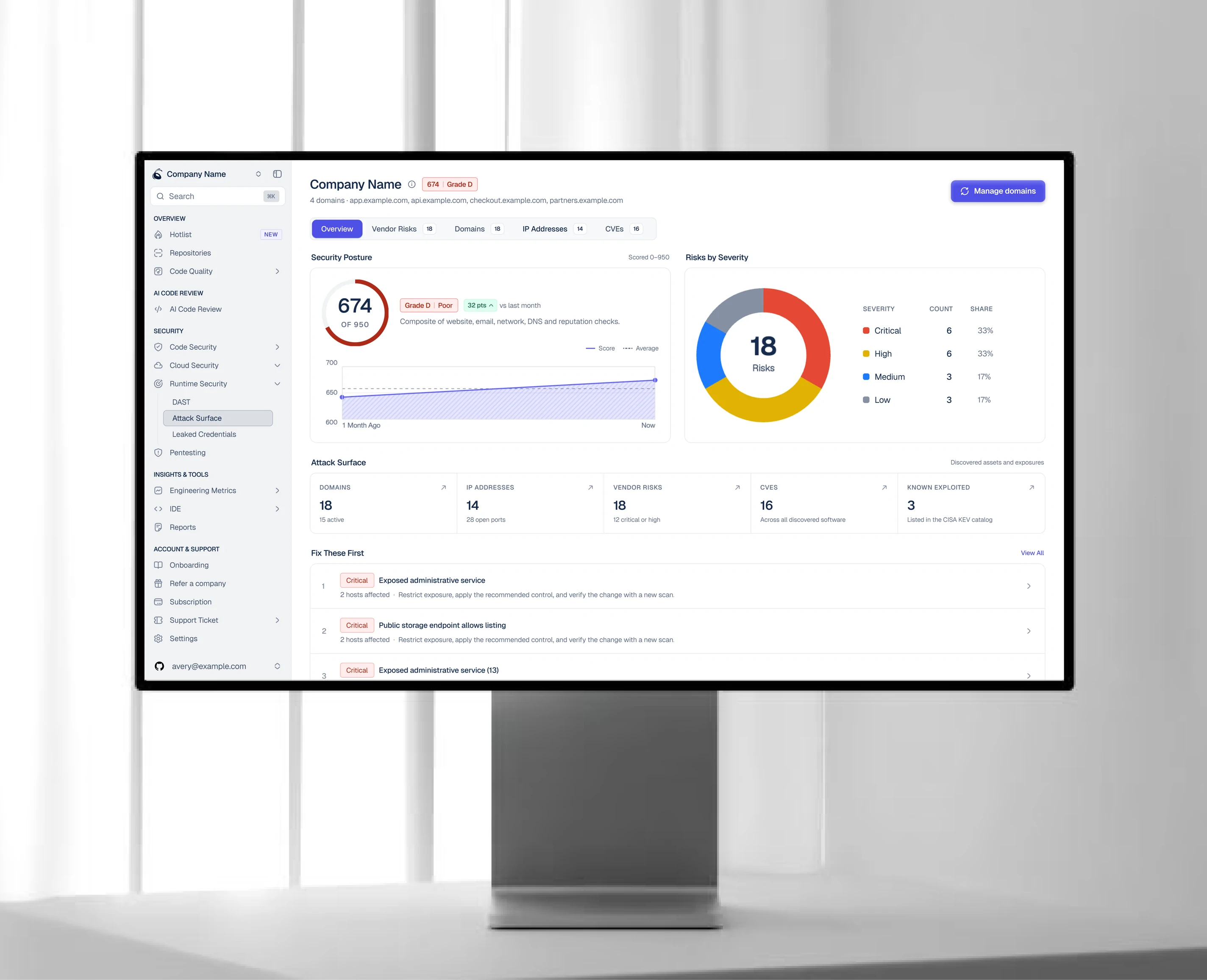
Design a B2B SaaS dashboard around the question each reader brings. Managers ask where across the org they need to act; individual contributors ask what in their own work needs fixing now. I put items that need a decision first and merge sources managers would otherwise check one by one.
Two readers, two questions
Most B2B dashboards fail the same way. They show everything the product knows, to everyone, in one layout. Nothing is missing, and neither of the two people opening it can find what they came for.
At CodeAnt AI the product dashboard covers AI code reviews, security scans and repo-level engineering insights. A developer opens it to find what's wrong in their repository or pull request. An engineering manager opens it to see which teams and repos need someone's attention. Same data underneath, different first question.
| Manager | Individual contributor | |
|---|---|---|
| First question | Where across the org do I need to act? | What in my work needs fixing now? |
| Unit of attention | Team, repo, trend | File, issue, pull request |
| Wants first | Ranked list of hotspots | The specific items assigned to them |
| Tolerates | Aggregates, less detail per row | Dense detail, fewer rows |
Merge views before you shrink them
When a screen feels overloaded, the first instinct is smaller text and tighter rows. The bigger cost is usually somewhere else: the other screens the reader has to visit and stitch together in their head.
At CodeAnt, code analysis results and secret leaks lived in separate places, so a manager checking org health had to piece the picture together before deciding anything. The manager dashboard I designed put both into one ranked view. The page got denser, and org-level triage time still fell 35%. It didn't need any new data.
A quick test for your own product: watch a manager do their weekly review and count the tabs they open. Every extra tab is a candidate for merging.
What to show first
- Things that need a decision: New critical issues, items past a threshold, anything someone has to act on. If nothing needs a decision, say so plainly, because that's useful too.
- Change since the last visit: What got better or worse. Managers in particular care more about direction than about the absolute number.
- Trends and breakdowns: Charts by team, repo or period. They help in the weekly review, but they're rarely why someone opened the page this morning.
- Reference and settings: Full lists, configuration and history. Keep them one click away and out of the main view.
A row of big vanity numbers at the top is the first thing I question. Total scans run or total users is nice to know and changes nothing about what anyone does next.
Data density is a default you pick for someone
Advice on dense UI tends to split into two camps: cut everything and add white space, or give experts everything on one screen. Each is right for somebody. Screens go wrong when nobody makes the call and the density is whatever the last stakeholder asked for.
So decide who reads the screen most and how well they know the data, set the default for them, and let everyone else move up or down from there. A security engineer wants every field. A VP wants five numbers and a direction. Use something you already know about the reader (role, plan, how often they visit) to pick the starting point, rather than asking everyone to configure it. I first had to do this on purpose at Sportskeeda, where live-score pages served newcomers and power fans with the same data.
Designing live score pages: How the Sportskeeda NFL and IPL pages handled readers who knew the sport and readers who didn't.
Five levers for density
- Rows shown: Top 5 with "show all", or the full list. It's the cheapest lever, and people understand it instantly.
- Columns shown: A standings table with W, L and PCT for newcomers, plus PF, PA and streak for experts. On a findings table: severity and title for a manager, plus file path and rule for the developer.
- Aggregation: One row per team instead of one row per finding. Managers live in this view; developers want it off.
- Text per item: A title only, or a title with a file path and a one-line reason. Add the second line only if it changes a decision.
- Spacing: Row height and padding. I pull this lever last, because tightening the spacing on a screen with the wrong content just makes the wrong content smaller.
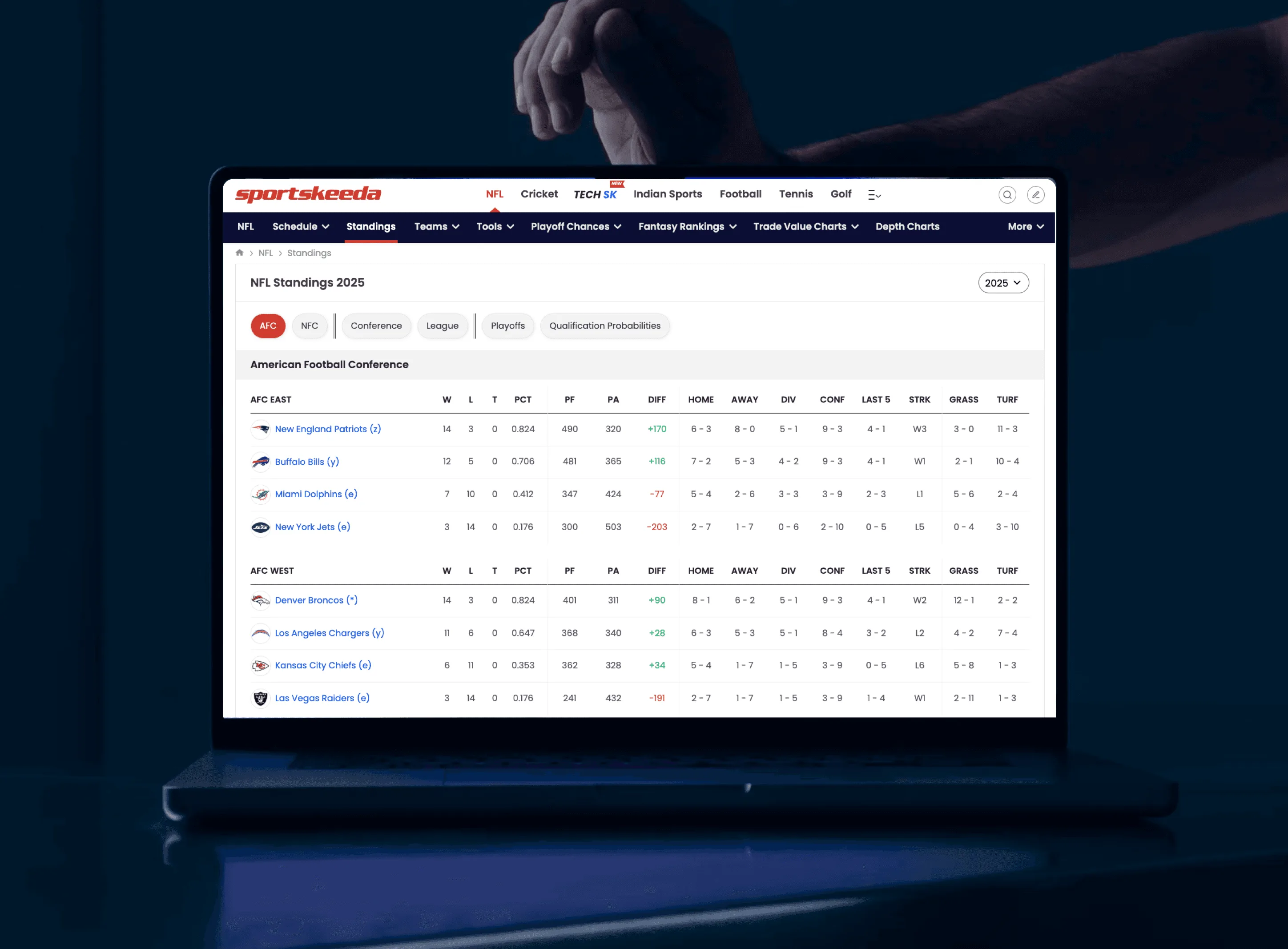
Whatever the density, give the eye one place to land first, such as the count of new critical issues. Use colour for state and nothing else; once everything has a colour, colour stops meaning anything. Tables carry most dashboards, and I've put the column order, row height and sticky-header rules in a separate guide on data table design.
Test it, then ship it
- Give each reader type one task: "Find the most urgent open issue in your org." "Find what's failing in your repo."
- Time the first answer, not the session: Measure how fast people find their first thing. A long session could mean engagement or confusion, so on its own it tells you little.
- Watch what they expand or hide: If most people expand the default, it's too light. If they scroll past half of it, it's too heavy.
- Change one lever at a time: Otherwise you won't know which change helped.
- Can each role answer their first question without scrolling?
- Does the page say clearly when nothing needs attention?
- Is anything shown that nobody would act on? Cut it or move it down.
- Would a manager still need a second tab to finish triage?
- Does a new account's empty state show what the page will look like once data arrives?
If you're designing or reworking a B2B dashboard, that's part of my SaaS product design work.
Questions people ask
Should managers and individual contributors get separate dashboards?
Usually they need different default views over the same data, not two products. One page with role-based defaults is easier to maintain and keeps everyone looking at the same numbers.
How many metrics should a SaaS dashboard show?
As few as it takes for each reader to answer their first question. Anything nobody would act on belongs further down or on another page.
Is a data-dense interface bad UX?
No. Dense screens work well for people who know the data and compare a lot of it. They fail when there's no obvious first thing to read, or when nobody chose the density for a specific reader.
Should users be able to change the density themselves?
Offer it, but don't count on it. Most people never open settings, so the default you pick for each audience does most of the work.
Sources
- Progressive Disclosure, Nielsen Norman Group
- Dashboards: Making Charts and Graphs Easier to Understand, Nielsen Norman Group
Working on this?
Tell me what you're building and where it's stuck: book a 30-minute call, email work@utkarshdesign.com or send a brief.