Designing AI features users trust
Guide · 7 min read · By Utkarsh Dhairya Panwar · Updated
People trust an AI feature when it helps with one specific decision, shows what its output is based on, and makes checking cheap. Pick the pattern first (reviews, condenses, drafts or acts), design the wrong-answer path as carefully as the right one, and judge it by what people do next.
Where this comes from
At CodeAnt AI I design the product around AI code review, alongside security scans, code quality and developer insights. The readers are developers looking at an AI comment on their own code, which makes them about the most sceptical audience an AI feature can have.
I also designed SoundSphere, a 4-week concept for a podcast app built around AI summaries. It never shipped and was never tested with real usage, so where I use it below, read it as design reasoning rather than results.
This page covers what applies to any AI feature. AI summaries and AI code review comments have their own guides.
Start from the decision, not the model
Weak AI features start with "the model can generate this" and then look for somewhere to put it. Strong ones start from a decision a person is already making badly or slowly. SoundSphere started from a line that kept coming up in interviews: "I don't know if it's worth starting." People sampled episodes, skipped and moved on.
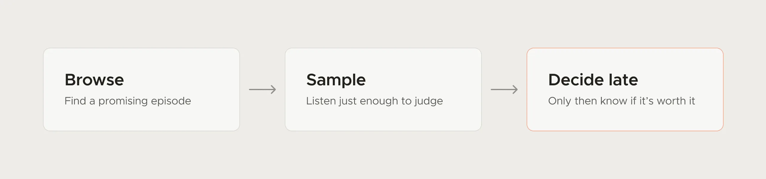
So the AI had a narrow job: help someone decide whether an episode deserved the next hour. That framing settled what a good output looked like and how to measure it. Before you design an AI feature, write the decision it helps with in one sentence. If you can't, you'll probably ship a sparkle button nobody presses twice.
Pick the pattern before the screens
Most AI features in products today fall into four patterns. Each one has a different main design question, and mixing them up is where a lot of confusing AI UI comes from.
| Pattern | Example | The main design question | What goes wrong |
|---|---|---|---|
| Reviews your work | AI comments on a pull request | Will the person act on this, or learn to skip it? | Too many low-value comments; trust drains fast |
| Condenses something long | A summary of an episode, thread or PR | Does it contain what the decision turns on? | Accurate, generic and useless |
| Drafts something for you | A first version of a reply or description | How easy is it to edit, and whose voice is it? | People send it unread, or rewrite all of it |
| Acts on your behalf | Opens a fix, changes a setting | Can the person see and undo what happened? | Silent changes nobody can trace |
The first two are where my experience is, and each has its own guide below. The last one needs the most care: anything the AI does without a human click should leave a visible record and an undo.
Let people preview before they commit
The most reliable AI pattern I know gives people a cheap version of the outcome before they spend real time, money or attention on the expensive one. In SoundSphere the summary was a short listening layer that led into the full episode instead of replacing it. In code review, a good comment lets a developer decide quickly whether a change needs a closer look.
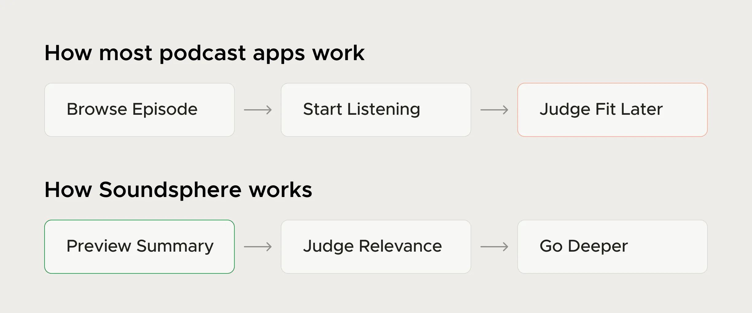
In both cases the AI output points into the real thing (the episode, the code). It doesn't stand in for it, and that's what keeps people from resenting it when it's slightly off.
Show the evidence and make checking cheap
An AI claim without a source asks for blind trust, and developers won't give it. Whatever the model says should point at the thing it's talking about: the exact lines for a review comment, the moment in the episode a summary line came from.
- Anchor every output to its source, so checking takes one click instead of a search.
- Keep AI output visually distinct from human or system output, so nobody mistakes a suggestion for a fact.
- Make it easy to dismiss or disagree, and treat that as signal rather than failure.
- Say what the AI didn't look at, because silence reads as "nothing found".
Design the wrong answer too
Every AI feature will be wrong some of the time, so I design the wrong-answer path with the same care as the right one. On a code health platform one confidently wrong comment costs more trust than ten correct ones earn.
- Match confidence to wording: "This will crash" and "this may fail if the list is empty" are different claims. Let the copy carry the uncertainty instead of a percentage nobody reads.
- Make dismissal one click, with an optional reason: "Not relevant" and "wrong" are different signals, and both are useful to the team tuning the model.
- Fail visibly: If the AI couldn't run, or only ran on part of the input, say so. A blank result looks like a clean bill of health.
- Keep the non-AI path: People should be able to do the task without the AI. If they can't, every model error turns into a support ticket.
Measure trust by what people do next
Asking users whether they trust an AI feature tells you little. Watching what they do tells you much more. For an AI reviewer, that's whether developers act on comments or dismiss them, and whether the ratio holds over weeks. For a preview, it's whether people go on into the full thing or stop at the preview.
A feature people use once out of curiosity and then ignore has failed, however good the demo looked. Track use in the second and fourth week as well as the launch spike.
Designing AI summaries: What a summary must include for each kind of decision, where it sits, how long it runs, and when not to summarise.
The UX of AI code review: The anatomy of a review comment developers act on, and what dismissals tell you.
If you're adding AI to a product and want it designed around decisions and evidence, my AI and developer tools design service covers that work.
Questions people ask
How do you make users trust AI output?
Make the output checkable. When verifying a claim takes one click, people check it, find it right often enough and start relying on it. When checking takes effort, they ignore the feature.
Should AI features be labelled as AI?
Yes, plainly. People weigh AI-generated content differently, and a neutral label is enough. A sparkle icon on its own doesn't tell anyone what produced the content.
Where should a startup add AI first?
Where users already make a slow or uncertain decision with information the product has. Avoid adding it where being wrong is expensive and the user can't easily check the answer.
Was SoundSphere a shipped product?
No. It was a 4-week exploratory concept covering research, product thinking and UI. The next step would have been testing whether summary-first listening helps people decide faster.
Sources
- Guidelines for Human-AI Interaction, Microsoft Research
- Explainability + Trust, Google People + AI Research
- Errors + Graceful Failure, Google People + AI Research
Working on this?
Tell me what you're building and where it's stuck: book a 30-minute call, email work@utkarshdesign.com or send a brief.