How to audit UI inconsistency with a UI inventory
Guide · 5 min read · By Utkarsh Dhairya Panwar · Updated
To audit UI inconsistency, screenshot every version of each element in the live product, group them by type, count the variants and pick winners. Then move winners into tokens and components as you touch each area, without pausing product work. That's how I standardised 18+ UI patterns at CodeAnt AI.
Signs the UI has drifted
- Design reviews turn into debates about which version of the filter bar is correct.
- Engineers ask "which button?" in pull requests.
- The same table exists in several versions with different paddings and sort icons.
- Error messages look different on every screen, so users can't learn them.
- New screens take as long as the first ones did, because nothing is reused.
Some drift is normal. Once a few designers and a dozen engineers have touched a SaaS product on deadlines, the same element gets rebuilt a little differently each time. The audit puts all of it in front of you at once, instead of one pull request at a time.
Run the UI inventory in a day
Brad Frost called this an interface inventory in 2013: screenshot the pieces, group them and look at them side by side. It still works, and it needs nothing more than a FigJam or Figma board.
- List the categories: Buttons, inputs, selects, tables, filter bars, modals, toasts, badges and status pills, empty states, error messages, icons, headings, colours, spacing.
- Screenshot the live product, not Figma: The Figma file shows what someone intended. Production shows what users get, which is what you're auditing.
- One frame per category: Paste every distinct version of an element into its frame, with a label saying which screen it came from.
- Count the variants: Write the number on each frame. A count of button styles persuades a team faster than any argument about consistency.
- Find the one engineering uses most: Ask an engineer which coded version is imported most often. That's usually your winner, because adopting it costs least.
The inventory sheet
Keep a sheet next to the board. The screenshots show the mess, and the sheet records what you'll do about it.
| Category | What to capture | Common mess | Decision rule |
|---|---|---|---|
| Buttons | Every size, colour and icon placement | Three primaries that nearly match | One primary, one secondary, one destructive, two sizes |
| Tables | Header style, row height, sort, pagination | Each feature's table built from scratch | One table component with density options |
| Filter bars | Layout, chips vs dropdowns, reset behaviour | Different order and reset on each list page | One pattern for every list page |
| States | Empty, loading, error, no-permission | Missing on half the screens | One pattern per state, written as a rule |
| Status pills | Colours and wording for each status | Same status, different colour | A fixed map from status to colour and word |
| Type | Every size and weight in use | Many sizes a pixel apart | A short scale as tokens |
| Colour | Every hex value in the CSS | Near-duplicate greys | Named tokens; delete the rest |
Engineers can partly automate the colour and spacing rows by searching the stylesheets for raw hex and pixel values. The visual categories still need screenshots.
Fold it into one system without stopping product work
Don't announce a two-month cleanup. It will lose to the roadmap. Fix the tokens first (colour, type, spacing), since they change everything at once without touching layouts. Then, whenever a feature touches an area, swap its components for the winners. Build first the categories with the most variants on the most-used screens.
What to standardise first, how to keep a small system alive, and what the CodeAnt and xPay systems did to turnaround and delivery time are in my guide to design systems for startups. This page stops at the audit and the cutover.
UI audit metrics that show it's working
Record two or three of these before you start, so the cleanup has a before and an after:
- Variants per category, from the inventory, before and after.
- Share of screens built only from system components.
- Design turnaround: time from brief to approved screens.
- Feature delivery time, or the number of frontend rework cycles per feature.
- Review comments about visual inconsistency, counted for a month.
The same audit works on a brand
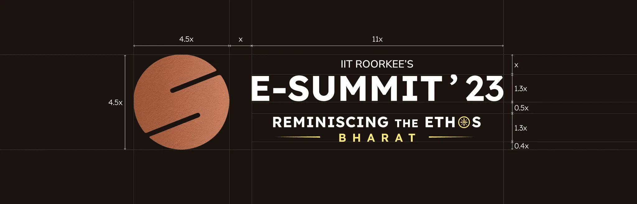
For E-Summit IIT Roorkee, five designers on deadlines made posters, tickets, merch, stage graphics and the website. Written rules for the logo, its clear space and its colour versions did the job a component library does in a product.
If you want help running the inventory or building the system after it, the brand and design systems page explains how I work.
Questions people ask
What is a UI inventory?
A board of screenshots of every version of each interface element in a live product, grouped by type. It makes inconsistency visible and countable.
How is a UI audit different from a UX audit?
A UI audit checks visual and component consistency. A UX audit checks whether people can finish their tasks. They overlap on error and empty states.
Should we pause features to fix UI inconsistency?
Rarely. Fix tokens first, then replace components as features touch each area. A freeze usually loses to the roadmap.
Sources
- Interface Inventory, Brad Frost
- Design Systems 101, Nielsen Norman Group
- Design Tokens Community Group, W3C Community Group
Working on this?
Tell me what you're building and where it's stuck: book a 30-minute call, email work@utkarshdesign.com or send a brief.