UX audit report template
Template · 8 min read · By Utkarsh Dhairya Panwar · Updated
A UX audit report needs six parts: the scope and the metric to move, a one-page summary of the top problems, method and evidence, a flow map, one card per finding (severity, evidence, proposed fix), and a backlog ranked by impact and effort.
The report, section by section
Copy this structure into Figma, Notion or a Google Doc, in this order. Someone who reads only the first two pages should still know what to fix.
- Scope and goal (half a page): Which flows were audited, from which screen to which screen, on which platform. The one metric this audit is meant to move, such as activation rate or checkout completion. What was out of scope.
- Summary (one page): The three findings that matter most, each in two sentences: what happens, and what to do. Then a count of findings by severity. No method talk here.
- Method and evidence (half a page): Accounts and roles used (admin, invited member, solo sign-up), devices, dates. Data sources: funnel export, support tickets, session recordings, heuristics. Say what you didn't have.
- Flow map (one or two pages): Every screen, email and notification in order, with drop-off numbers on the arrows where data exists and finding IDs pinned to the screens.
- Findings (one card each): Grouped by flow, sorted by severity. One problem per card, never two. The card format is below.
- Prioritised backlog (one page): Every finding in one table, ranked into Now, Next and Later, with an owner. Engineers will come back to this page more than any other.
- Appendix: Screenshots of every state you saw, raw ticket themes, the heuristics list. Useful for arguments, not for reading.
The severity scale
Severity is where audits lose credibility. If one reviewer's "critical" is another's "minor", the ranking means nothing, so define the scale inside the report and score against it. Mine is Nielsen's 0 to 4 scale rewritten for SaaS teams, minus the 0: a non-problem shouldn't get a card.
| Severity | Definition | SaaS example |
|---|---|---|
| 4: Blocker | Users can't complete the task, or lose money or data. No workaround inside the product. | A non-admin can't connect a repository and the product offers no next step. |
| 3: Major | Many users fail or need help. A workaround exists but most won't find it. | Trial users don't see the setup checklist after their first session, so they never come back to it. |
| 2: Minor | Users finish but slowly, or make recoverable mistakes. | Two buttons labelled 'Continue' and 'Next' on the same step; people hesitate. |
| 1: Cosmetic | Inconsistency or polish. No measurable effect on completion. | Three different empty-state illustrations across settings pages. |
Stuck between two levels? Check how many users hit it, whether they can get past it, and whether it happens every time or once. A rare blocker can rank below a frequent major.
The finding card: every field
| Field | What to write | Why it's there |
|---|---|---|
| ID | Flow prefix and number, e.g. ONB-03 | So tickets and Slack threads can reference it |
| Where | Screen name, step, user role, platform | Bugs that only hit invited members get lost without the role |
| What happens | One or two sentences, describing behaviour, not opinion | 'Users stop here' beats 'this is confusing' |
| Evidence | Funnel number, ticket count, recording timestamp, or 'expert judgement only' | Honest about how sure you are |
| Principle | The heuristic or pattern it breaks | Gives designers a shared vocabulary |
| Severity | 1 to 4, from the scale above | Sorting |
| Proposed fix | What to change, with a sketch or annotated screenshot | Without one, the team gets a problem and no next step |
| Effort | S, M or L, agreed with an engineer | Designers guess effort badly on their own |
| Metric to watch | The number that should move if the fix works | So you can tell later if it did |
| Owner | A name, filled in at the review meeting | Unowned findings don't ship |
A sample finding, filled in
This one is real: the main problem in the CodeAnt AI (YC W24) activation work, rewritten in the card format.
- ID: ONB-01
- Where: Connect repository step, after GitHub sign-up. Any user without org admin rights. Web.
- What happens: The GitHub app installs to the user's personal account. To add the company org, GitHub asks for admin approval. The product shows no next step, so the user leaves.
- Evidence: Funnel shows users dropping at this step, after showing intent by signing up and authorising GitHub.
- Principle: Help users recover from errors; no dead ends.
- Severity: 4, Blocker. The person with intent can't finish, and the person who could has never heard of the product.
- Proposed fix: Let blocked users email their admin or copy an invite link to share in team chat, from the same screen.
- Effort: M. A new modal, an email to the admin and an invite link.
- Metric to watch: Drop-off at the connect step; trial-to-paid.

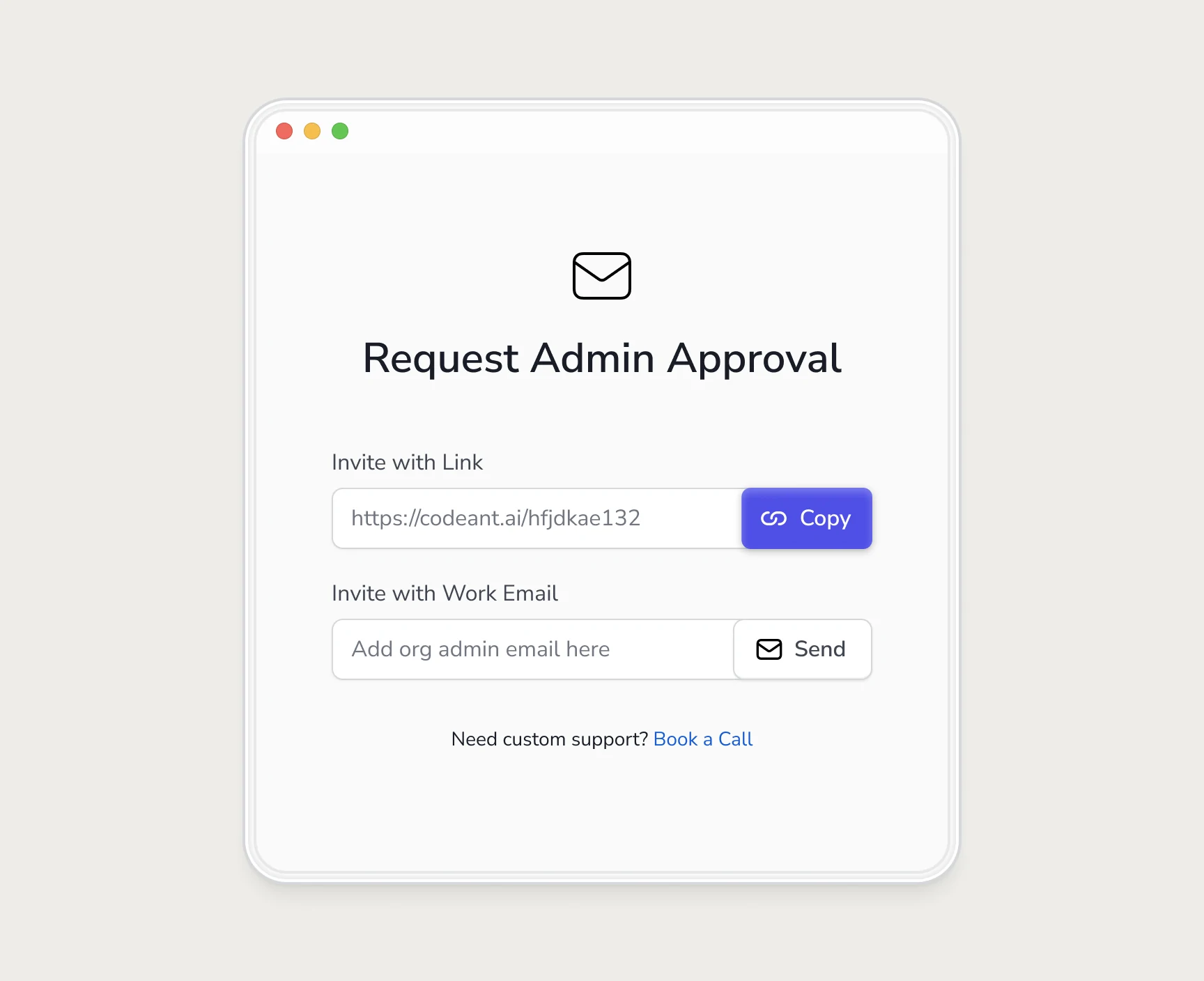
The card made the fix easy to argue for, because the evidence and the fix sat on one page. What it did to the numbers is in how we doubled trial-to-paid.
The prioritised backlog
It's the last page of the report: copy the columns and sort with the rule underneath.
| ID | Finding (one line) | Severity | Effort | Bucket | Owner |
|---|---|---|---|---|---|
| ONB-01 | Non-admins hit a dead end at connect repo | 4 | M | Now | Name |
| ONB-04 | Setup checklist hidden after first session | 3 | S | Now | Name |
| ONB-07 | Mixed 'Continue' and 'Next' labels | 2 | S | Next | Name |
| SET-02 | Three empty-state styles in settings | 1 | M | Later | Name |
- Now: every severity 4, and any severity 3 with S effort.
- Next: remaining severity 3, and severity 2 with S effort.
- Later: everything else. Revisit at the next audit, or delete.
Only ONB-01 is real. The other rows are there to show the format.
Setting it up in Figma or Notion
- Figma: one page per flow. Screenshots in order, left to right. A finding card as a component next to each problem screen, with severity as a variant so you can filter visually.
- Notion: a database with the card fields as properties (severity and effort as selects, owner as a person). One view grouped by flow, one sorted by bucket. Embed the Figma flow map at the top.
- In either tool, put the summary page first and link each summary item to its card.
Two habits keep the report honest. Audit with fresh accounts in every role, because the invited-member path is where most surprises turn up. And read the severity 1 cards together: one inconsistency looks minor, but twenty usually mean the product is missing a system. My UI consistency audit guide covers that case.
For what to check in each flow, use the checklist in my UX audit process guide. If you'd rather hand the audit over, that's my UX audit service.
Questions people ask
What severity scale should a UX audit use?
Four levels work well: blocker, major, minor, cosmetic. It's adapted from Nielsen's 0 to 4 scale. Write the definitions into the report so everyone scores the same way.
How long should a UX audit report be?
As long as the findings need, with a summary that fits on one page. Most of the length should be finding cards, one problem each.
How do we turn the findings into tickets?
Use the finding ID as the ticket reference and copy the fix, effort and metric fields across. Assign owners in the review meeting, not afterwards.
Sources
- Severity Ratings for Usability Problems, Nielsen Norman Group
- 10 Usability Heuristics for User Interface Design, Nielsen Norman Group
Working on this?
Tell me what you're building and where it's stuck: book a 30-minute call, email work@utkarshdesign.com or send a brief.