What is a user flow?
Glossary · By Utkarsh Dhairya Panwar · Updated
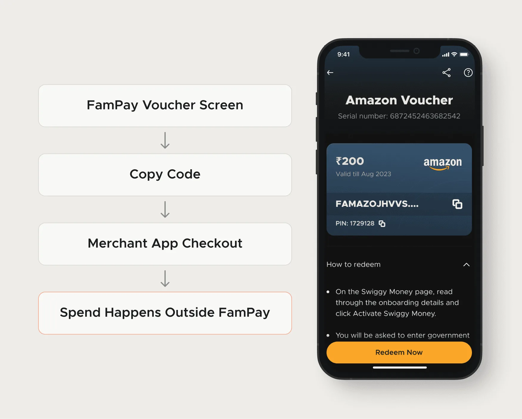
A user flow is a diagram of the path a person takes through a product to finish one task: where they start, each screen and decision along the way, and every way it can end, failures included. Draw it before screens, so the team agrees on the steps first.
What goes in one
- An entry point: where the person arrives from (a push notification, a search result, a home screen card).
- Screens or states, usually as boxes.
- Actions and decisions, as arrows and diamonds: taps, form submits, yes/no branches, system checks.
- Every ending, not just the happy one: success, error, abandon, hand-off to another product.
Most flows skip that last item, and that's usually where the problems are. A flow that only shows the happy path is a sales diagram.
Worked example: the FamPay voucher flow
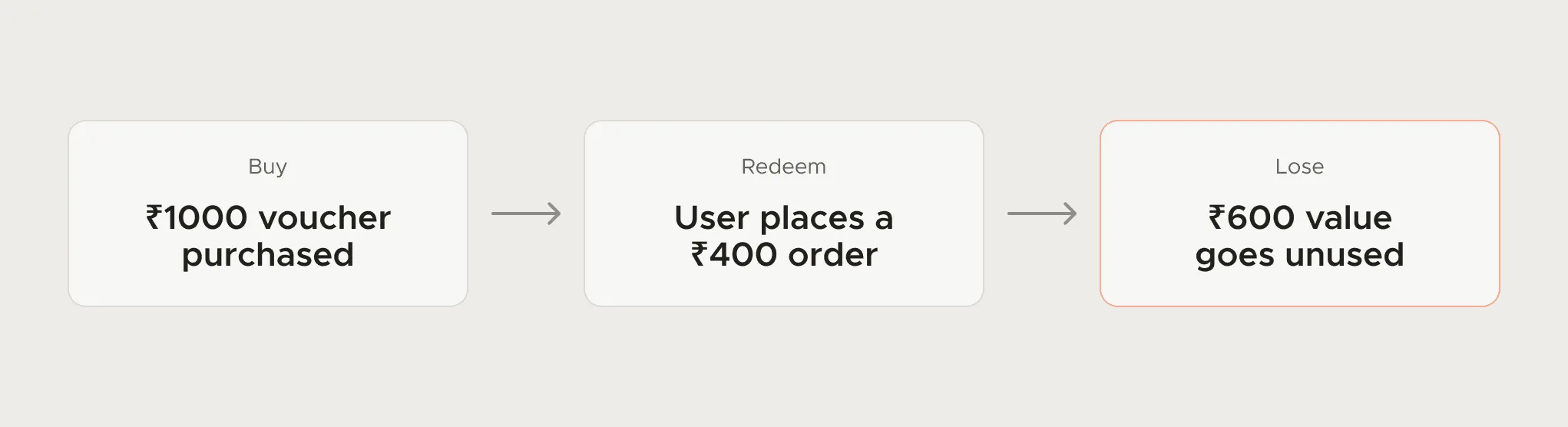
FamPay's Cashback Store sold one-time-use vouchers for brands like Amazon and Myntra. Mapping the flow end to end showed what no single screen did: the spending happened outside FamPay, in the merchant's app, and a partly spent voucher lost its remaining value.
- Discover: Browse the store and open a voucher.
- Buy: Pick an amount and pay. Decision point: does the person know it's single use?
- Redeem: Copy the code and leave for the merchant app, where FamPay can no longer explain anything.
- Access later: Find the voucher again in history, possibly after its value is gone.
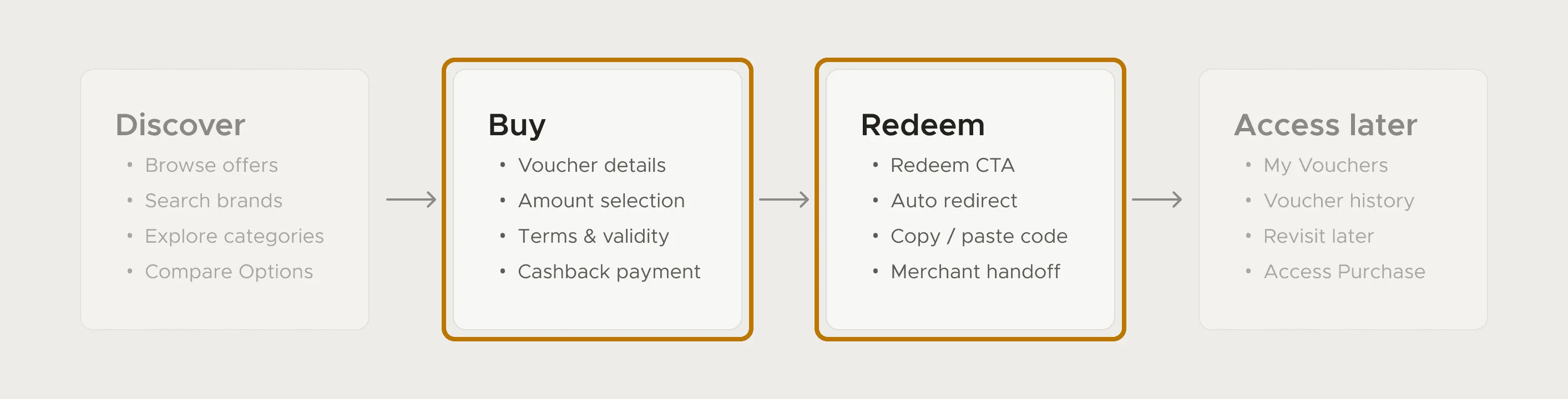
The fix put the one-time rule at those two points: a pill and a confirmation sheet before purchase, and the same reminder at redemption. What that did to support tickets is written up in my guide to reducing support tickets with UX.
Mistakes I see in user flows
- Drawing screens instead of decisions. If no box has more than one arrow out, it's a storyboard.
- Starting at the login screen. Real flows start where the intent started, often outside the product.
- Stopping at the edge of your product. The FamPay problem was in the part that happened in someone else's app.
- One flow for every user type. An admin and a first-time member rarely take the same path.
User flow vs user journey, task flow and flowchart
People mix up user flow and user journey most. A user journey covers the whole relationship with FamPay, from finding the app to coming back weeks later for a voucher. A user flow takes one stage, say buying the voucher, and shows every screen, tap and branch in it. I use the user journey to pick the stage that needs work and the user flow to redesign it.
| Term | Scope | Difference from a user flow |
|---|---|---|
| Task flow | One task, one path | No branches; a user flow includes the decisions and failures |
| Flowchart / BPMN | Any process, often the system's | Models the system or business logic; a user flow follows the person |
| User journey (user journey map) | The whole relationship: many tasks over days or weeks, across channels | Wider, and records what people think and feel at each stage; a user flow zooms into one task, screen by screen |
| User story | One need, written as a sentence | Says what and why; a user flow shows how, step by step |
| Information architecture | Where all content lives | The map of the building; a user flow is one walk through it |
FamPay case study: The full voucher story, from the loss diagram to the shipped screens.
Questions people ask
What tools do designers use to make user flows?
FigJam, Figma, Miro or a whiteboard. The tool matters much less than including the branches and failure states.
When should you create a user flow?
Before designing screens for any task with a decision point or more than a couple of steps, and again when support tickets cluster around one task.
How detailed should a user flow be?
Enough that every decision and failure has its own branch. If two boxes would always be designed together, merge them; if a box hides a yes/no choice, split it.
Sources
- User Journeys vs. User Flows, Nielsen Norman Group
- Journey Mapping 101, Nielsen Norman Group
Working on this?
Tell me what you're building and where it's stuck: book a 30-minute call, email work@utkarshdesign.com or send a brief.