How to reduce support tickets with UX
Guide · 6 min read · By Utkarsh Dhairya Panwar · Updated
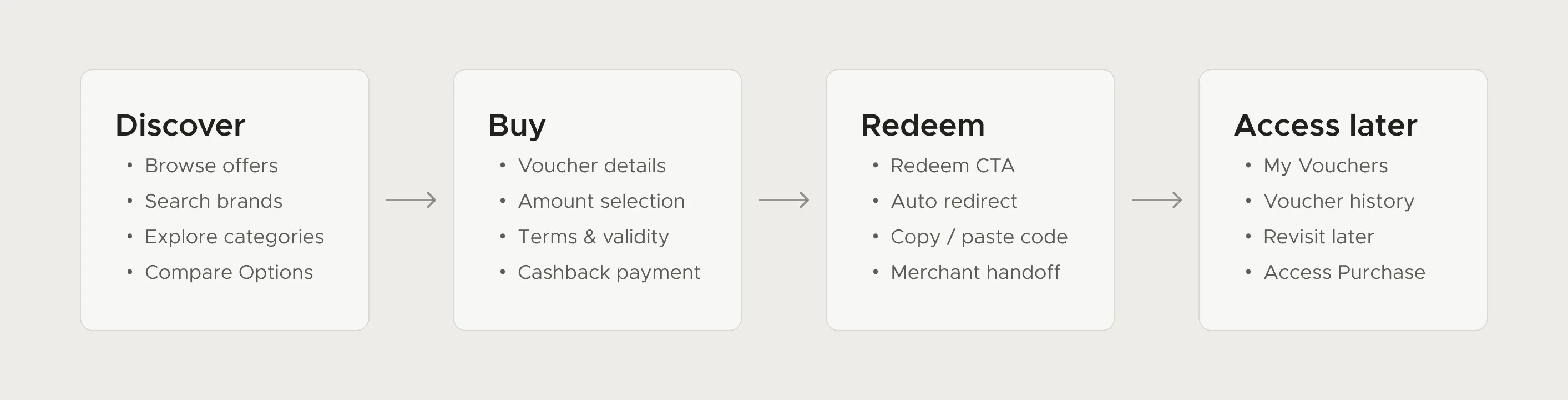
Trace each common complaint back to the moment the user's mistake began, usually earlier than the screen they complain about, and put the missing information there, before they commit. Repeat it once where they act on it. At FamPay this cut voucher-related tickets by 80%.
The ticket shows up where the problem ends
FamPay (YC S19) is a payments app for teenagers in India. Its Cashback Store lets users turn cashback into branded vouchers. In 2023, during my internship, one type of voucher was producing a steady stream of support complaints.
Some vouchers were one-time use, so if a user spent only part of the value, the rest could be lost. People wrote in after redemption, when the money was already gone. The mistake had started much earlier, at purchase, where nothing made the one-time rule stand out from any other voucher.
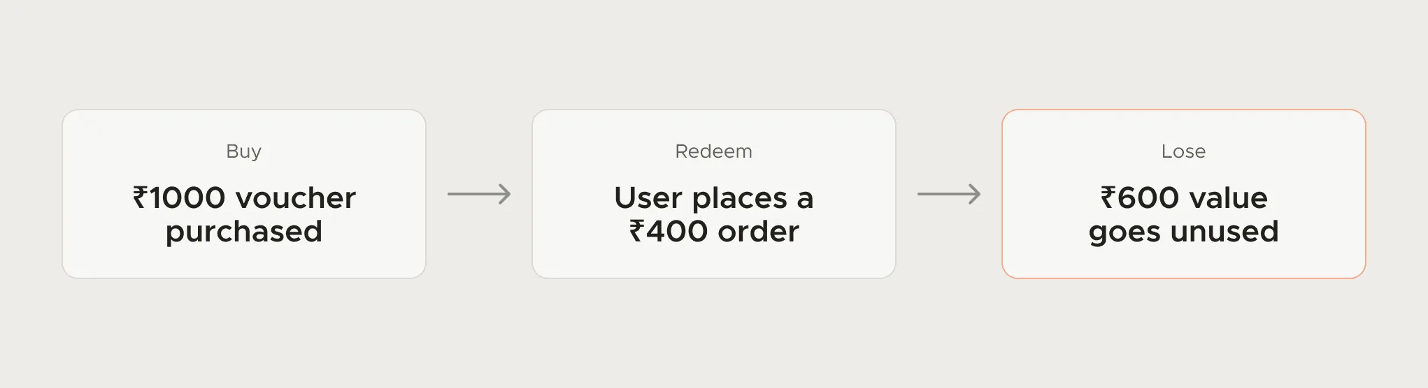
Everything here depends on that gap. Design at the complaint and you get a better apology. Design where the mistake starts and the complaint doesn't happen.
Map the costs and the flow before designing
Before touching a screen, I wrote down what the problem cost on both sides. Users couldn't tell one-time vouchers from the rest, and they found the downside too late, as lost money. The business saw rising complaints and slipping trust in a revenue surface. That kept the fix honest: hiding vouchers, or adding friction until fewer people bought, would have cut tickets and hurt the business.
The Cashback Store runs across discovery, purchase, redemption and coming back later, so I mapped all of it first (the map at the top of this page). Then I marked the moments where a user decided something without the full picture. There were two: Buy and Redeem.
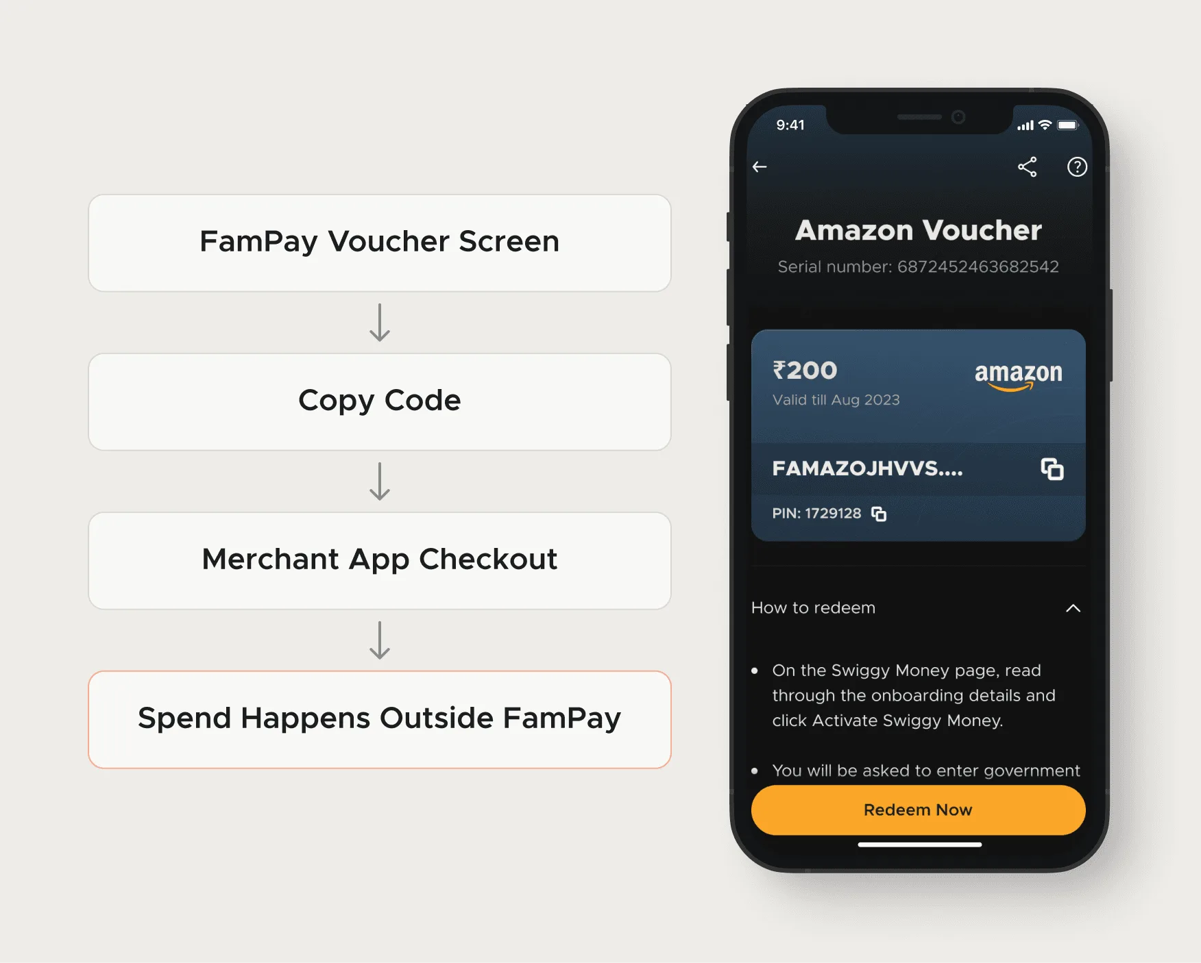
- Note what's outside your control: Once a user copied the voucher code into a merchant's app, FamPay had no say in what happened next. Anything they needed to know had to land before that hand-off.
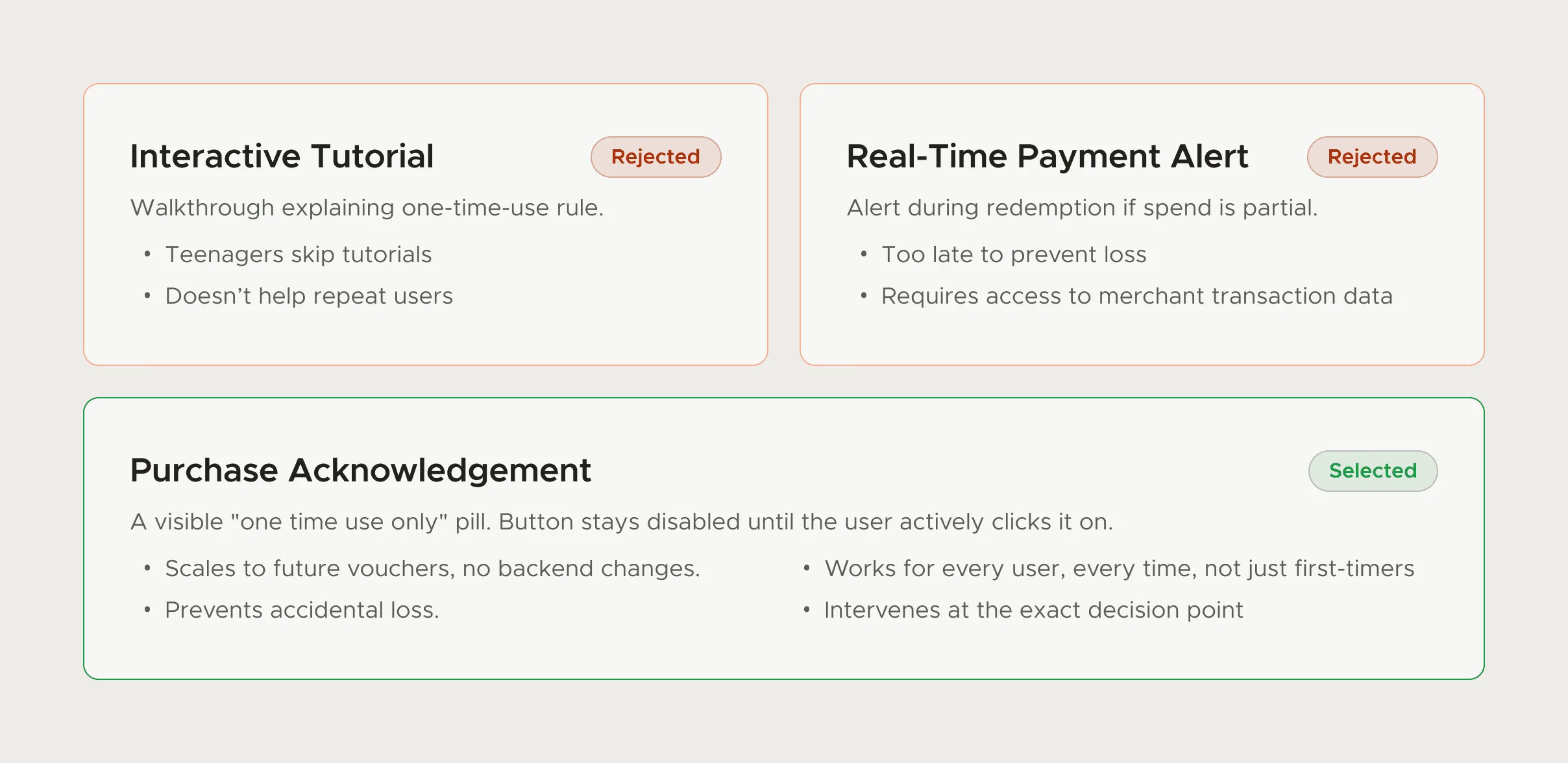
- Push each direction until it breaks: I explored an interactive tutorial, a real-time payment alert and a purchase acknowledgement, each far enough to see how it would fail with real users. Looking good in a review wasn't the test.
Clarity before commitment, then carry it forward
Three principles shaped the redesign. Users should understand how one-time vouchers work before buying. The flow should stay quick to complete. And after purchase they should be reminded, instead of having to remember a rule they read once.
In practice, the one-time-use rule was placed right above the Buy Now button, where it couldn't be missed at the moment of commitment. Then it was repeated in the redemption flow, the last moment before the user left FamPay for the merchant's app.
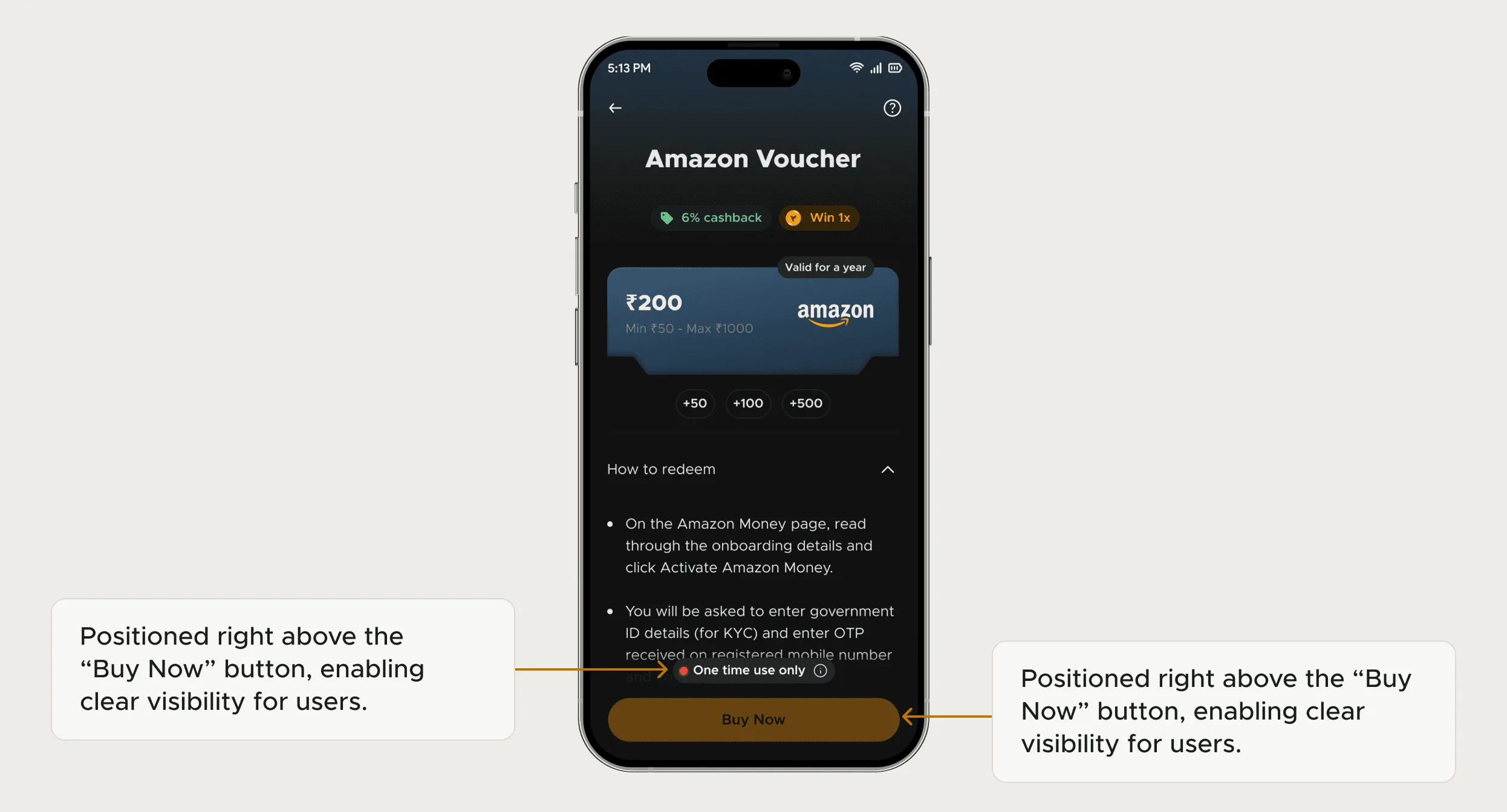
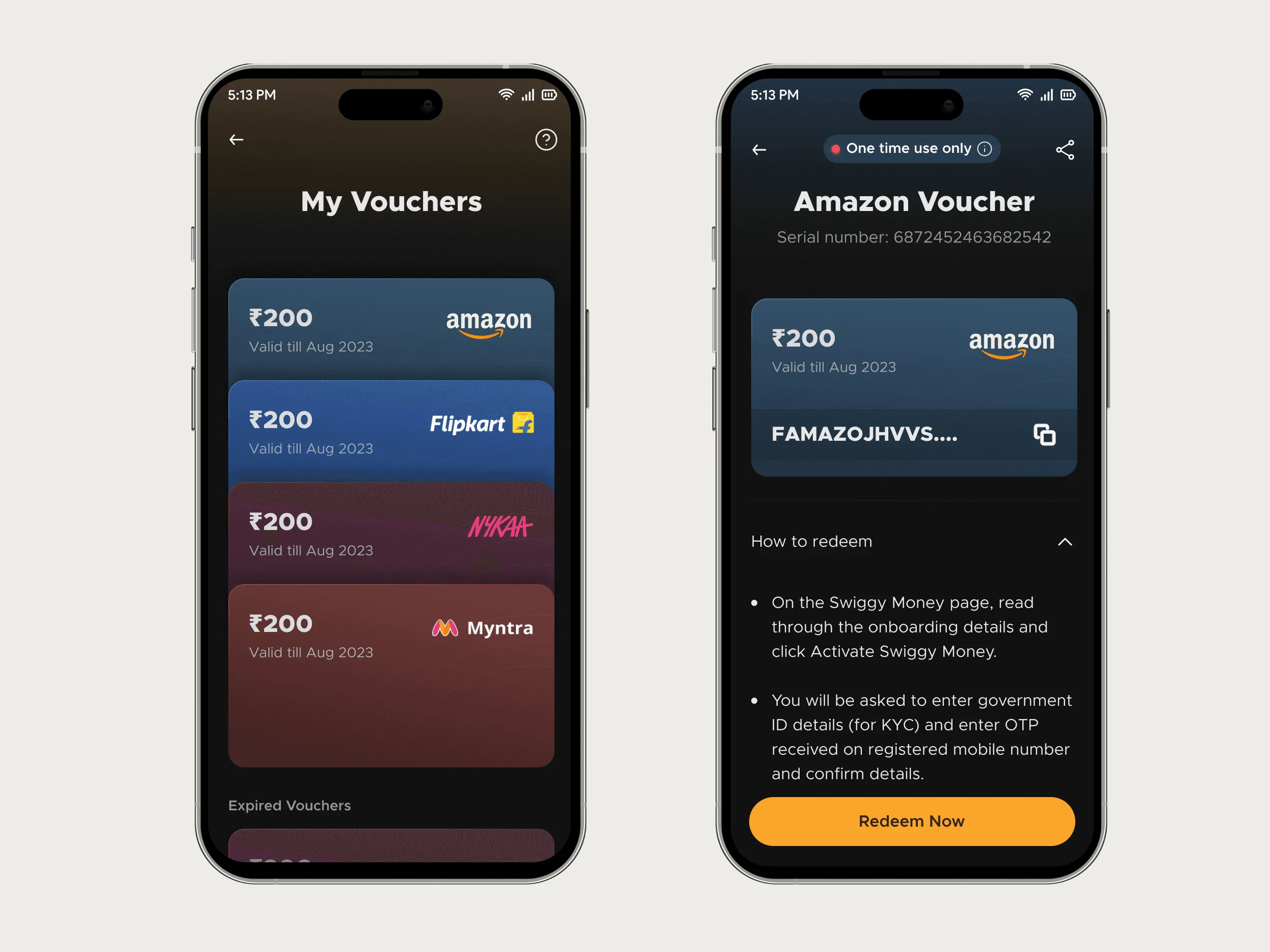
Most anti-ticket designs go wrong between the first two principles. A confirmation modal that everyone clicks through adds friction and changes nothing. Putting the message at the right moment does more than making it louder.
What happened
Support noticed the change before anyone pulled the data. Voucher-related tickets fell 80% after launch, and 20% of the support team's bandwidth went back to issues that needed a person.
- 80% Fewer voucher-related support tickets
- 20% Support bandwidth freed
Utkarsh brought clarity and structure to our voucher flow. His work reduced confusion and made the experience feel more reliable.
Using your own tickets as a design brief
Most products won't have a rule as tidy as FamPay's. The method still works because it starts from the tickets. Export a few months of them and tag each by what the user was trying to do when it went wrong, which is often a different thing from the feature the ticket mentions.
| Ticket sounds like | What it usually points to | Where to look |
|---|---|---|
| "I was charged but didn't get it" / "Where did my money go?" | A rule or limit shown after the commitment, or a status the product never displays | The purchase or payment screen, and the screen right after it |
| "How do I…?" | A feature people need but can't find from where they are | Navigation, empty states, the screen they were on when they asked |
| "It says I don't have access" | A step that needs someone else, with no way to reach them | Permission prompts and invite flows |
| "I did X by mistake" | An action that's too easy to trigger or can't be undone | Destructive buttons, confirmation copy, undo |
| "It's not working" | A failure with a generic message, so the user can't tell what kind | Error states, especially timeouts and partial failures |
- Take the top three tags by volume: Ignore the long tail for now. Three problems you understand beat twenty you half understand.
- Walk each one backwards: Start at the screen named in the ticket and step back through the flow. At each step ask whether the user could have known. The earliest yes is where the design work goes.
- Check whether the information already exists: Often it does, buried in terms, a help article or a tooltip nobody opens. Then the job is moving it.
- Put it at the moment of commitment, then repeat it once: Once where they decide, once where they act on the decision. More than that turns into noise.
- Agree the count with support before launch: Same tag, same time window, before and after. Otherwise nobody can say whether the change worked.
Design won't remove every ticket. Bugs, outages, refunds and account requests need engineering or a person, and the best design can do there is clearer status messages. The tickets design can remove are the ones where the product knew something the user didn't. In onboarding the silent version of a ticket is a user who leaves, which the trial-to-paid guide covers.
FamPay Cashback Store case study: The full voucher story: the flow map, the directions explored and the before and after screens.
Questions people ask
Which support tickets can UX design fix?
The ones caused by users not knowing something the product could have told them: a rule, a limit, a status, where a feature lives. Bugs, outages and account requests need engineering or a person.
Where should I start if support volume is high?
Tag recent tickets by the action that went wrong, take the top three, and trace each back to the earliest screen where the user could have known. That screen is your brief.
Won't adding warnings make the flow slower?
Only if they're everywhere. One clear message at the moment of commitment, repeated once where the user acts, adds very little friction compared with a modal on every step.
How do I measure whether the change worked?
Count tickets with the same tag over the same length of time before and after launch, and note anything else that shipped in that window. At FamPay the measure was voucher-related tickets.
Sources
- Confirmation Dialogs Can Prevent User Errors, Nielsen Norman Group
- Preventing User Errors: Avoiding Conscious Mistakes, Nielsen Norman Group
Working on this?
Tell me what you're building and where it's stuck: book a 30-minute call, email work@utkarshdesign.com or send a brief.