Design system examples for startups
Guide · 7 min read · By Utkarsh Dhairya Panwar · Updated
For a startup, study GitHub Primer's pattern pages, Atlassian's voice rules, Vercel Geist's small foundations, shadcn/ui's owned component code and Shopify Polaris's surfaces. Copy how they decide things, not their scale: a couple of dozen well-built pieces is plenty for a small team.
Read big systems for how they decide things
Most lists of design system examples rank Material, Carbon and Fluent by how much they contain, which isn't much use to a team of five. You can't maintain 80 components and you don't need to. What you can borrow is the way they made their decisions.
The two systems I've built, at xPay and CodeAnt AI, were small on purpose, and my guide to design systems for startups covers what each changed. Whether your system needs 25 pieces or 250 depends on how many of your screens repeat them. What Google ships has nothing to do with it.
Everything below comes from each system's public site, which I read in October 2026. The screenshots are from the same visits.
GitHub Primer: copy the pattern pages
Primer splits into Product UI (GitHub's app), Brand UI (marketing pages) and a Brand Toolkit, sharing Octicons and token primitives for colour, spacing and type. The part I send founders to is the UI patterns section: data visualisation, degraded experiences, empty states, feature onboarding, forms, loading, navigation, notification messaging, progressive disclosure and saving.
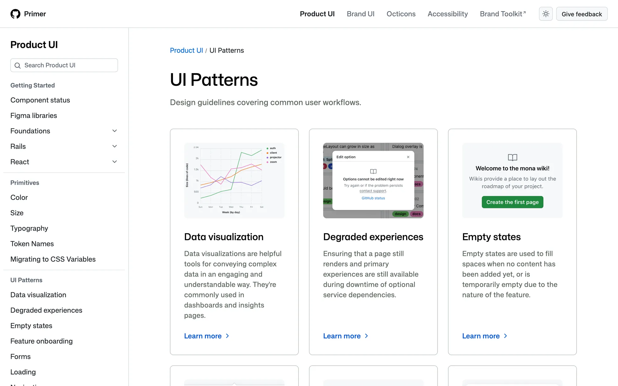
What I'd copy is the habit of writing a pattern for each state before you have many components. 'Degraded experiences' (what the UI does when an optional service is down) is a page almost no startup writes, and every startup needs one. I'd leave the separate Brand UI layer until your marketing site and product are big enough to diverge.
Atlassian: copy the voice rules
Atlassian's design system covers tokens, colour, typography, iconography and accessibility, and now has a section for AI experiences. The page I'd copy is voice and tone. It describes the personality as bold, optimistic and 'practical, with a wink', then gives six principles, each tied to where it applies. You inform in error messages, encourage when someone is frustrated, and save delight for success messages.
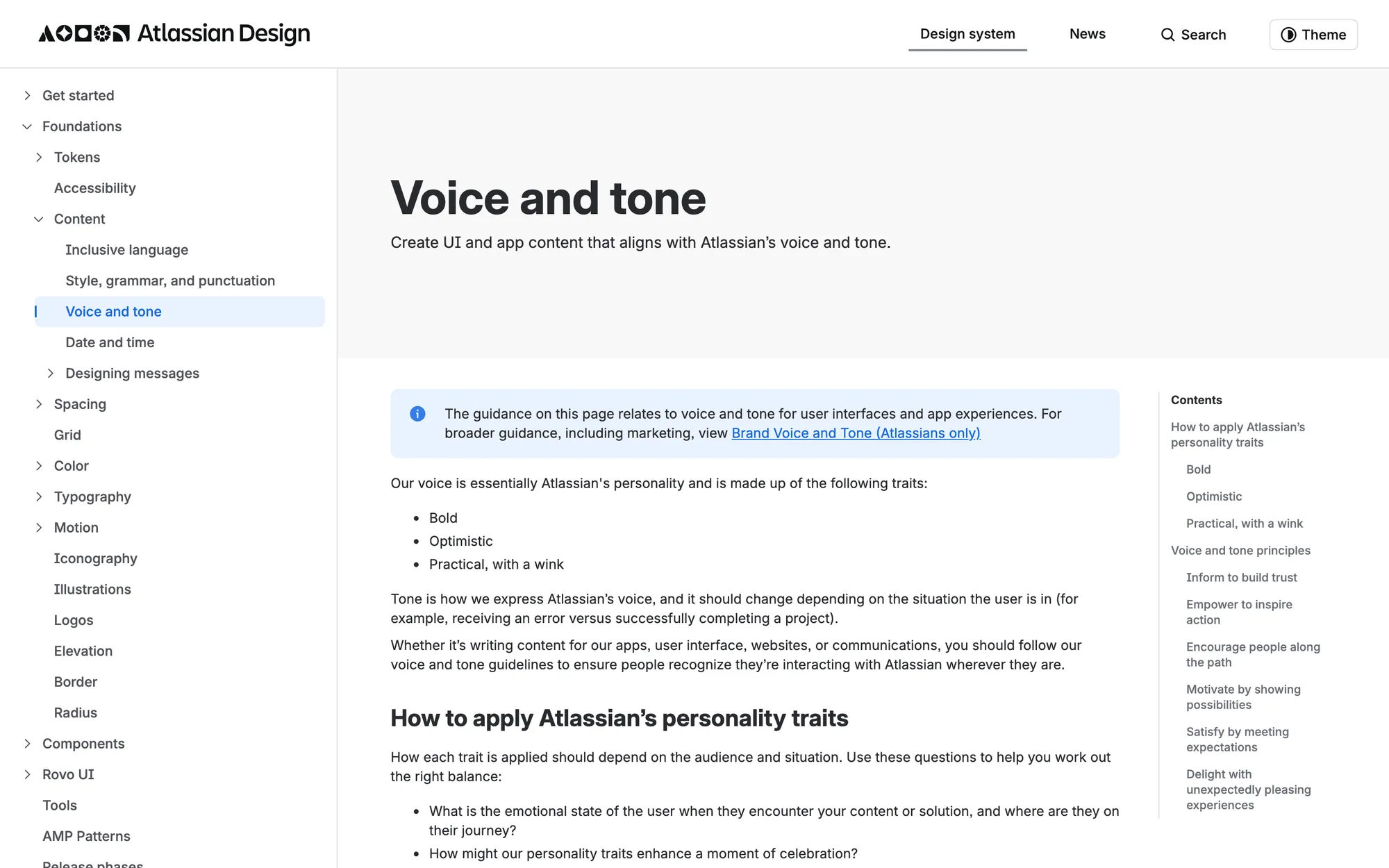
The part to copy is tying each tone rule to a component or a moment instead of a list of adjectives, and a startup can write that in an afternoon. The layers of product-specific guidance are for a company with many apps, so skip those.
Vercel Geist and shadcn/ui: copy the small foundation
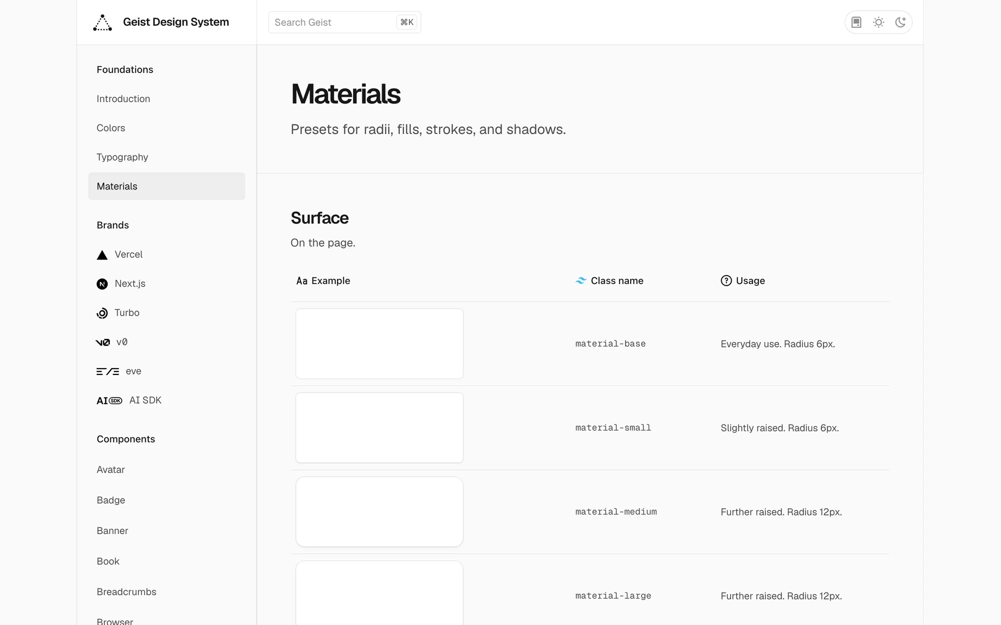
Geist's foundations are four pieces: a high-contrast colour system, typography on Geist Sans and Geist Mono, 'materials' that preset radii, fills, strokes and shadows, and a grid. Materials is the idea I'd take. You pick a material for a card instead of deciding its corners, borders and shadows separately every time.
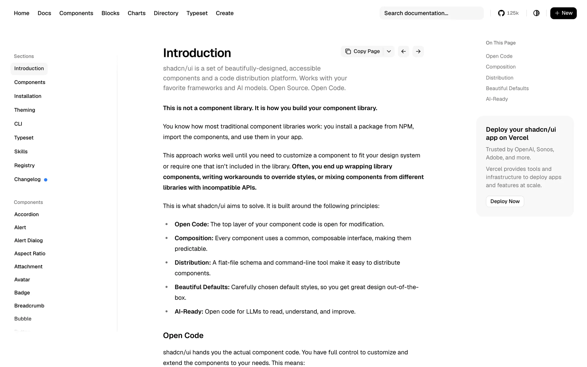
shadcn/ui describes itself plainly: 'This is not a component library. It is how you build your component library.' You copy the component code into your project and own it. For a startup that's usually the right base, since you get accessible behaviour you don't have to write and can put your own tokens on top.
Shopify Polaris: copy the idea of surfaces
Polaris is now documented as Shopify's UI framework built on web components, used to build app home pages, admin extensions, checkout extensions, customer account extensions and point-of-sale extensions. It's organised around where your UI will appear.
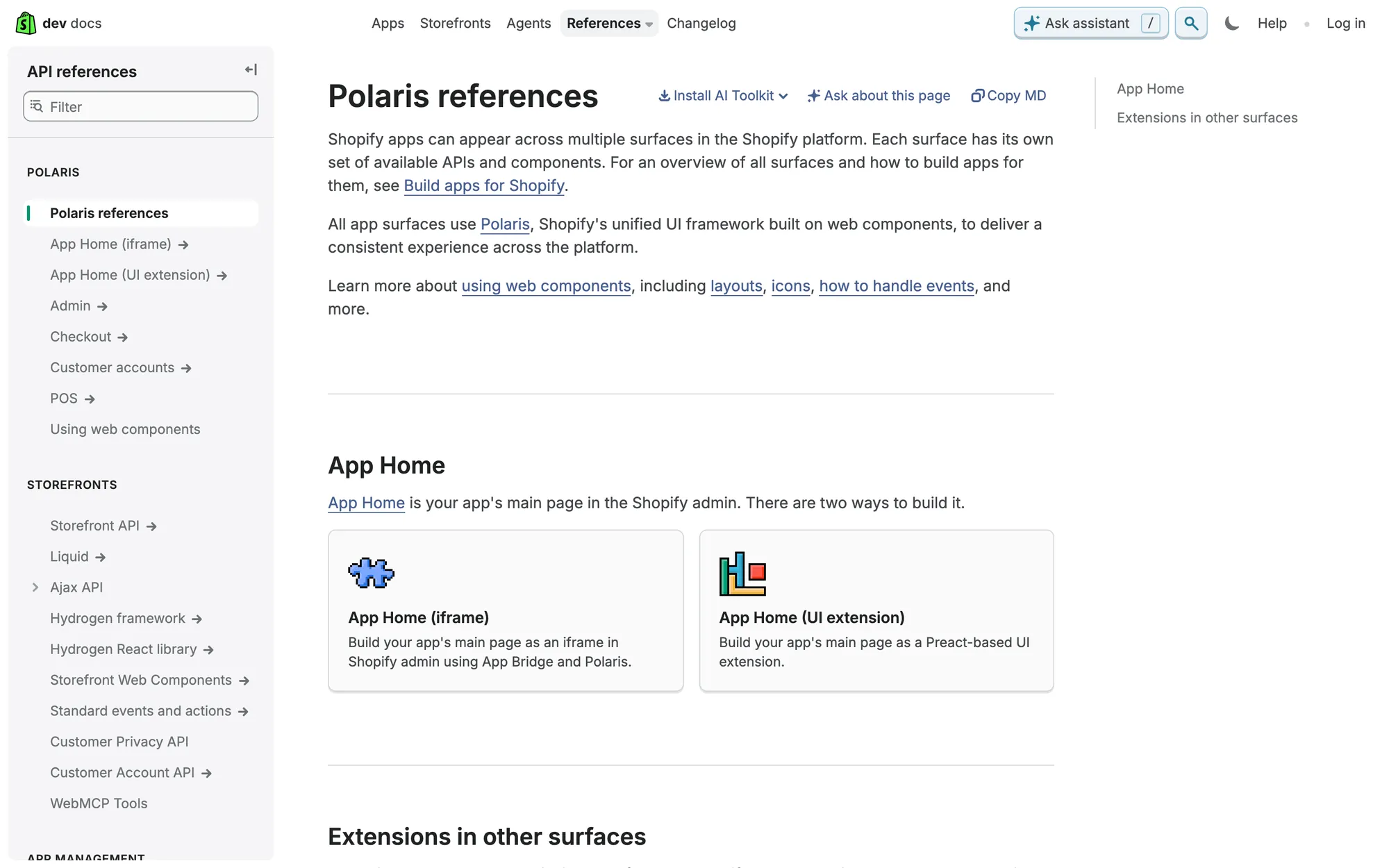
If your product has distinct surfaces (an app, an IDE plugin, emails, a Slack bot), copy the idea: list them and decide which tokens each one inherits. Building for third-party developers can wait. Polaris exists so other companies' apps look native inside Shopify, and you probably don't have that problem yet.
A startup design system, side by side
| System | Copy this | Skip this for now |
|---|---|---|
| GitHub Primer | UI pattern pages, especially empty, loading and degraded states | A separate brand UI layer |
| Atlassian | Voice rules tied to moments | Per-product guidance |
| Vercel Geist | Materials as presets; a sans and mono pair | Building your own typeface |
| shadcn/ui | Owning component code on accessible primitives | Installing every component on day one |
| Shopify Polaris | Mapping surfaces to tokens | Tooling for outside developers |
| CodeAnt AI (mine) | Standardise the patterns your screens already repeat | Components no screen uses yet |
How to use these examples without drowning
- Screenshot your own product first: Lay every screen side by side and circle what repeats, and you have your list. The public systems only help with how to write it up.
- Pick one system per question: Patterns from Primer, voice from Atlassian, foundations from Geist. Mixing three systems' components gives you a product that looks like nobody.
- Write the page, then build the component: A one-paragraph rule for empty states fixes more screens than a perfect empty-state component nobody knows to use.
- Review it in feature reviews: Check new patterns in the same review as the feature instead of a separate meeting. At CodeAnt the system was built alongside the product, so no pattern got built before a screen needed it.
CodeAnt AI case study: Product, website, brand and design system, built in parallel by one founding designer.
If you want a system sized for your team rather than for Google, I build those as part of my brand and design systems work.
Questions people ask
Should a startup publish its design system like these companies do?
Not early on. Big companies publish because outside teams build with their parts. A startup's rules can live in the Figma file and one page engineers know how to find.
Should a startup use Material Design or build its own system?
Use an existing open-source base for behaviour and accessibility, and put your own tokens and patterns on top. Adopting a big company's full visual language makes you look like them.
Do I need Storybook for a startup design system?
It helps once engineers outnumber designers, because it shows components in code with their states. Early on, a Figma library and a matching code folder are enough.
Sources
- UI Patterns, GitHub Primer
- Voice tone, Atlassian Design System
- Introduction, shadcn/ui
- Polaris references, Shopify Developer Docs
Working on this?
Tell me what you're building and where it's stuck: book a 30-minute call, email work@utkarshdesign.com or send a brief.