How to give feedback to a designer (a guide for founders)
Guide · 6 min read · By Utkarsh Dhairya Panwar · Updated
Tell the designer what you saw, who it affects and why it matters, and leave the fix to them. Send one numbered list per round, ranked by importance, review flows before visuals, and name one person who makes the final call.
Describe the problem, then stop
The founder note I get most often is a solution: 'make the button bigger', 'move pricing up', 'try blue'. Sometimes it's right. More often it treats a symptom, and then either the designer complies and the underlying problem stays, or the designer argues and you both lose a day.
Send the observation and the reason instead. The designer may still end up with a bigger button, or may find the button is fine and the copy above it is what confuses people.
| Instead of | Try |
|---|---|
| Make it pop. | On the demo call, the prospect didn't notice the Book a Demo button until I pointed at it. |
| I don't like the colours. | Next to the product screenshots, this green reads as a warning state. |
| Move pricing higher. | Three leads this week asked about price before reading anything. Can they find it faster? |
| It feels cluttered. | I can't tell what to do first on this screen. My eye goes to the chart before the setup step. |
| Add a product tour? | New users connect a repo and then don't know what to try next. |
Feedback that comes with evidence wins
The best brief I had at CodeAnt AI was a funnel chart showing people dropping at step three, connecting a repository. Nobody told me what to design. That one observation led to the cause, an org admin permission most people signing up didn't have. The fix is written up in how we doubled trial-to-paid.
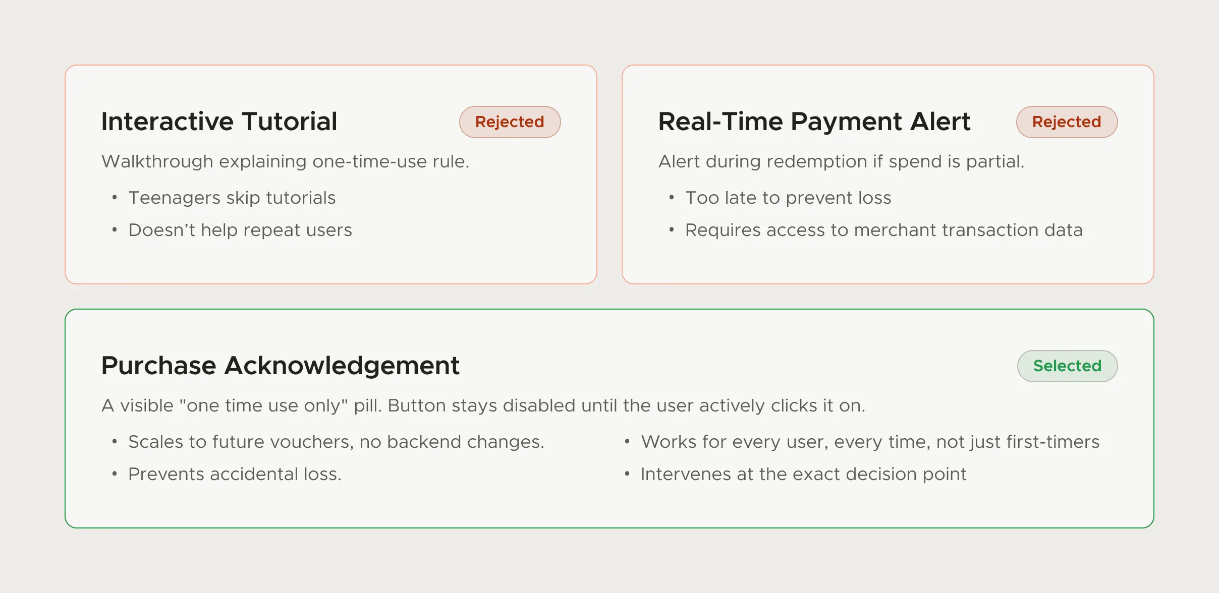
At FamPay, the clearest feedback on the voucher flow came from the support queue, because complaints about one-time vouchers showed exactly where users were surprised. If you have a session recording, a support ticket or a note from a sales call, send it. It's worth more than any adjective.
Match the feedback to the stage
- Problem and scope: Is this the right problem, and the right users? Push hardest here. A wrong problem costs weeks.
- Options and flows: Which direction, and does the sequence of steps make sense? Ignore fonts and colours; they aren't final yet.
- High fidelity: Now visuals, copy and edge cases: empty states, errors, long names, small screens.
- Built version: Check it in the product, with real data. Most of the surprises live here, not in Figma.
When a designer shares a file, ask which stage it's in. Commenting on button radius during the flow stage is how projects end up polishing the wrong thing.
What to send, and how
Written feedback is usually sharper than a live reaction, because writing makes you finish the thought. I share designs with a recorded walkthrough and ask for written comments in Figma or the team's tracker, plus one or two fixed calls a week for things that need talking through.
- One consolidated list per round, instead of a drip of messages over two days.
- Number every point, so replies can say 'done 1 to 4, question on 5'.
- Mark each one: must change, should change, or just a thought.
- Pin comments to the exact element in Figma instead of describing where it is.
- Say what's working too. Otherwise the designer may change it in the next round.
- If the team disagrees, settle it before sending. Contradictory notes cost a full round.
One round of comments, rewritten
A typical first-round message on a pricing page, and the same message rewritten so a designer can act on it. Both are written as examples for this page.
| Before | After |
|---|---|
| "Looks a bit busy, can we clean it up?" | "1 (must): I can't tell which plan people should pick. The three cards look equal." |
| "Make the CTA bigger." | "2 (should): On mobile, the Start trial button is below the fold on the middle plan." |
| "Not sure about the font." | "3 (thought): The headline font feels lighter than the product UI. Fine if it's on purpose." |
| (nothing said about what works) | "Keep: the FAQ under the cards answered two questions sales gets every week." |
The rewrite is longer, but it takes one round instead of three. Each point says what was seen, how much it matters and where it is, and the last line protects something that's working.
One decider, and a turnaround everyone knows
Every extra approver adds a round, and rounds are where schedules slip. Collect input from whoever you like, but name one person who makes the final call and agree how fast feedback comes back. A design that waits four days for comments has lost four days nobody gets back.
Saying 'I just don't like it' once is fine. After that, work out what it reminds you of, or what it fails to do, and send that. A gut reaction is real data, but it needs a sentence of explanation before anyone can use it.
For the step before this, choosing the designer you'll be giving feedback to, see my guide to hiring your founding designer.
Questions people ask
Should I tell the designer exactly what to change?
Describe the problem and why it matters. If you have a specific fix in mind, offer it as one option, but let the designer weigh it against what they know.
How often should a founder review design work?
Often enough that nothing goes a week without a decision. For remote teams, written feedback in Figma plus one or two fixed calls a week works well.
How many rounds of revisions are normal?
Two or three per stage is common. If a screen is on its fifth round, the cause is usually an unclear brief or more than one person deciding.
How do I give feedback on a logo or brand direction?
Judge it on real surfaces, like a product screen, the homepage or a slide, not on a white artboard. Then say which surfaces it fails on and why.
Sources
- Design Critiques: Encourage a Positive Culture to Improve Products, Nielsen Norman Group
- Guide to comments in Figma, Figma Learn
Working on this?
Tell me what you're building and where it's stuck: book a 30-minute call, email work@utkarshdesign.com or send a brief.