How to speed up design at a startup
Guide · 6 min read · By Utkarsh Dhairya Panwar · Updated
Startups speed up design by removing repeat work, not by drawing faster. Standardise the patterns you keep redrawing, use the cheapest fidelity that settles each decision, get written feedback from one decider, and automate the chores. At CodeAnt AI, standardising 18+ UI patterns cut design turnaround 30%.
Design velocity is time to a working answer
Design velocity usually gets measured badly. Counting screens per week rewards drawing, when what a startup cares about is the time from a known problem to a shipped screen that fixes it. Very little of that time is spent in Figma; most goes on waiting, redrawing and rework.
Where startup design time goes
- Redrawing things that already exist: the fourth version of a table, the third modal style.
- High-fidelity mocks for decisions a sketch could have settled.
- Waiting for feedback, and then getting notes from three people that contradict each other.
- Rework after engineering finds the empty, error and loading states nobody drew.
- Small production chores: exports, resizing, specs, print files.
Each fix below goes after one of these. Only the first comes with a number from my own work; the others are habits I rely on, not measured results.
Standardise what you keep redrawing
As CodeAnt's product grew across code review, security and quality, the same UI patterns kept getting drawn again for each new surface, and pulling them into one system was the biggest time saving I've had. That story, and xPay's, is in my guide to design systems for startups. Start with the parts you redraw most, and give each one its states from the start.
Choose fidelity by the decision you need
| Decision | Cheapest thing that settles it |
|---|---|
| Is this the right problem? | A written paragraph and the data behind it |
| Which flow, in which order? | Boxes and arrows, or a low-fidelity wireframe |
| Will users understand it? | A clickable prototype tested with a few real users |
| Does it look and read right? | High-fidelity screens using existing components |
| Does it feel right with real data? | A coded prototype or the built feature behind a flag |
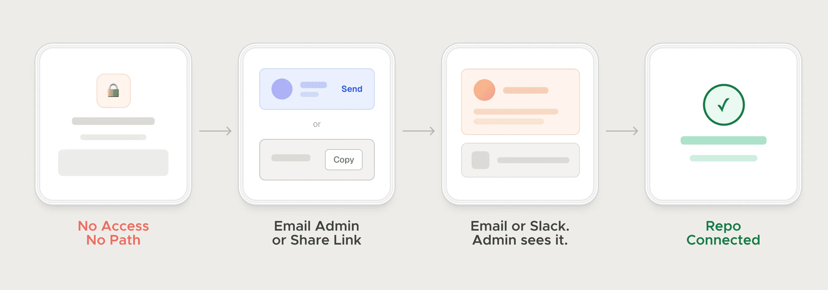
At CodeAnt, the path for blocked users to pull in their admin was sketched as four cards before any UI existed. The open question was the sequence, and a sketch is enough to answer that.
Shorten the loop around the designer
- One decider: Collect input from anyone, but have one person sign off. Every extra approver adds another round.
- Written, batched feedback: One numbered list per round, pinned to elements in Figma. A recorded walkthrough replaces most review meetings.
- States before polish: Draw the empty, loading, error and no-permission states alongside the happy path, before engineering finds them for you.
- Test early, on the risky screens: At FamPay, usability tests on 15+ payment screens caught retry gaps before they shipped, which was far cheaper than fixing them after launch.
For the founder's side of this, see my guide on how to give feedback to a designer.
Remove the chores, and the hand-offs
Some of the lost time is pure mechanics. The clip at the top is a Figma plugin I built that exports print-ready CMYK PDFs with bleed and DPI settings. Without it, every file needs a trip through another app. I use AI-assisted prototyping and n8n or Zapier in the same spirit, for the work around the design and never for the decisions in it.
Often the biggest saving is a hand-off you can delete. I design and build websites in Framer, so a landing page doesn't wait in the engineering queue. At xPay I picked up Framer in a few days and shipped landing pages, decks and marketing assets end to end.
What not to speed up
I'd leave problem framing alone. CodeAnt's onboarding fix came from slowing down on why trials were stalling at one setup step, and the cause wasn't visible on any screen. Designing faster on the wrong screen would have changed nothing. The full story is in how CodeAnt doubled trial-to-paid.
CodeAnt AI case study: Product, website, brand and design system as founding designer, and the onboarding work that doubled trial-to-paid.
If design is the bottleneck on your team, a fractional arrangement is how I usually help.
Questions people ask
What is design velocity?
How quickly a team gets from a product question to a shipped design that answers it. It depends more on reuse, feedback and hand-offs than on how fast anyone draws.
How do you measure design velocity?
Track the time from a product question being raised to a shipped screen that answers it, not screens per week. Note where the waiting happens: feedback, rework or the engineering queue.
Should a startup skip high-fidelity mockups to move faster?
For decisions about flow and order, yes, because a sketch can settle those. Keep them for visual and copy decisions, ideally built from existing components.
Can AI tools speed up product design?
They help with prototyping and the chores around design. Working out which problem to solve is still on you, and that is where most of the time is saved or lost.
Sources
- Design Systems 101, Nielsen Norman Group
- UX Prototypes: Low Fidelity vs. High Fidelity, Nielsen Norman Group
- Why You Only Need to Test with 5 Users, Nielsen Norman Group
Working on this?
Tell me what you're building and where it's stuck: book a 30-minute call, email work@utkarshdesign.com or send a brief.