SaaS pricing page design
Guide · 6 min read · By Utkarsh Dhairya Panwar · Updated
A good SaaS pricing page lets a buyer answer three things without talking to anyone: which plan is theirs, what the bill will be as the team grows, and what approval needs. I name plans after who they're for, state the billing unit and give enterprise a specific next step.
What the pricing page is for
Most pricing page advice is about layout: three columns, highlight the middle one, add an annual toggle. Those details matter less than people think. Someone on a pricing page has already decided the product might work and is now checking whether buying it will cause a problem.
- The developer wants to know if they can start without a card or a call.
- The team lead wants to know what happens to the bill when ten more people join.
- The finance or procurement person wants invoices, tax handling and a cap on surprises.
- The security reviewer wants to know where the code or data goes, and whether self-hosting exists.
Answer all four and the deal moves without a meeting. Answer only the first and every other question becomes a meeting.
Plan names and the unit of price
Clever plan names (Rocket, Galaxy, Universe) make the buyer decode which one is theirs. Names that describe the buyer do the work for them: Free, Team, Business, Enterprise. If you want character, put it in the one-line description under the name.
The unit matters more than the name. 'Per user per month' sounds simple until the buyer asks who counts as a user. For developer tools, spell it out: is it every seat in the org, every developer who opens a pull request, every project, or every unit of usage? An unclear unit is the most common reason a pricing page ends up in a sales call.
| Pricing model | Say on the page | Add to the FAQ |
|---|---|---|
| Per seat | Who counts as a seat, and whether viewers are free | What happens when someone leaves or joins mid-cycle |
| Per project or workspace | What a project is, in your product's terms | Whether dev and production count separately |
| Usage-based | The unit, what's included, and the overage rate | How to cap or get alerts before the bill grows |
| Hybrid | Base price plus the usage line, shown together | A worked example for a typical team |
How four developer tools handle it (checked October 2026)
I read the live pricing pages of four developer products in October 2026 and noted how each one frames price and the path to sales. Everything below is what the public pages show; I had no inside data.
| Product | How price is framed | Path to sales | What stands out |
|---|---|---|---|
| Linear | Free, Basic, Business, Enterprise; per user per month, billed yearly | Business shows both Get started and Contact sales; Enterprise is Contact sales, annual billing only | Free-tier limits are stated as plain counts, and the comparison table is grouped by product area |
| Vercel | Hobby, Pro, Enterprise; a base price plus usage across compute, data transfer and more | Enterprise routes to a sales contact page | Long usage tables grouped by category, and an FAQ about taxes, custom invoicing and going over included usage |
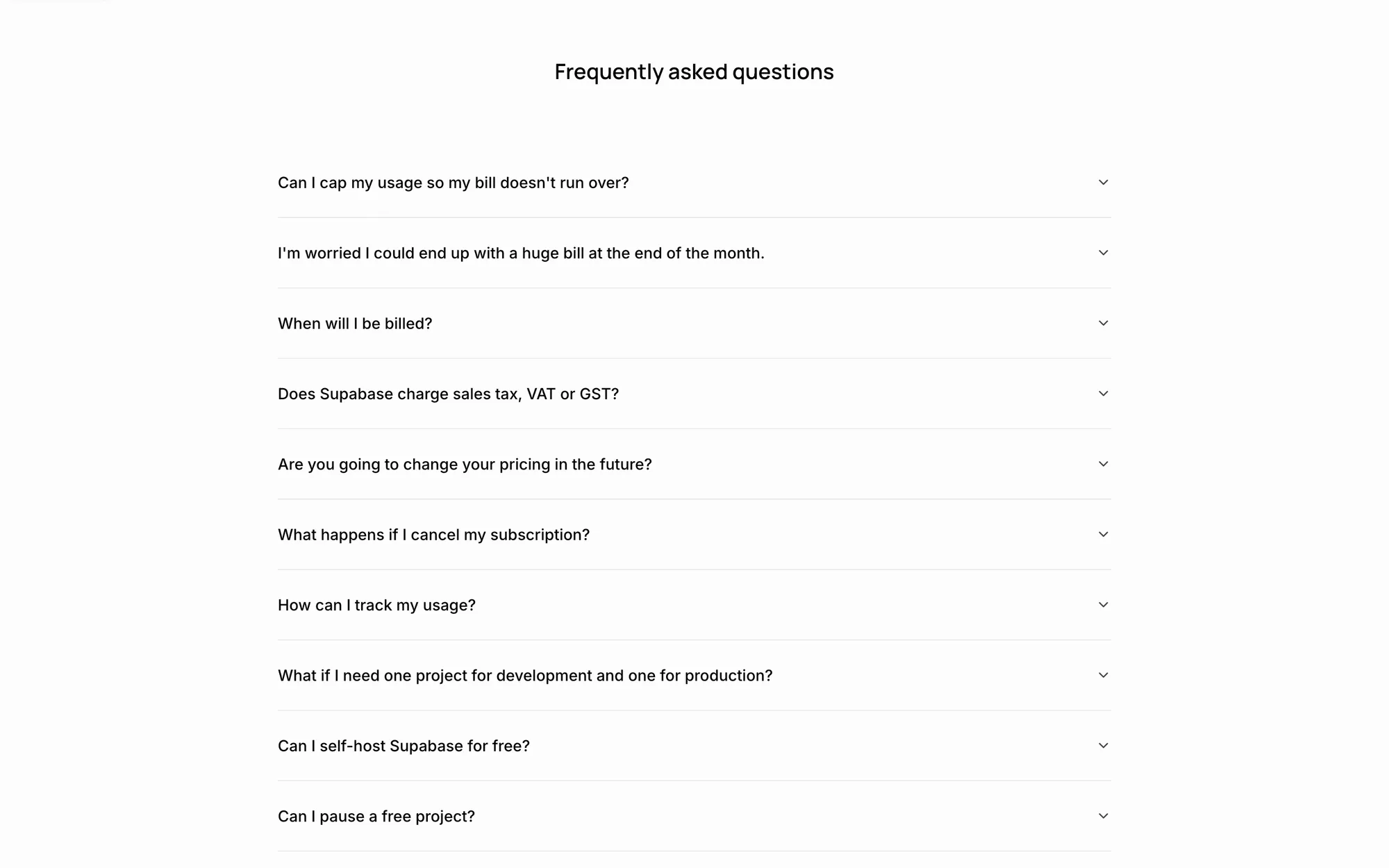
| Supabase | Free, Pro, Team, Enterprise; plan per organisation, compute billed per project | Enterprise and several security features say Contact us | The first FAQ asks whether you can cap usage so the bill doesn't run over |
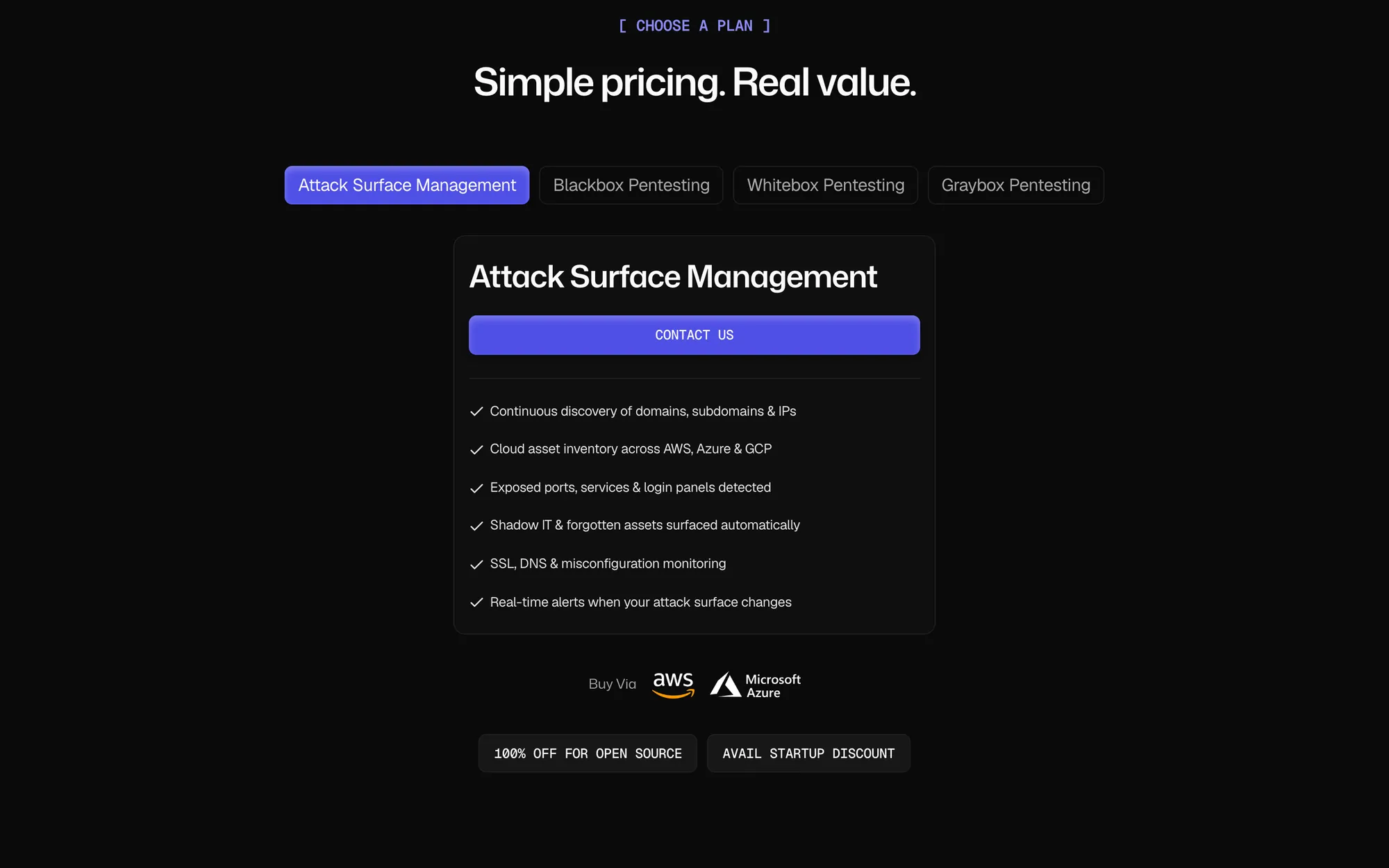
| CodeAnt AI | Product-by-product, with a free trial and no card required | Contact Sales, plus a startup discount | States that open-source projects can use it free, and offers self-hosting for teams whose code can't leave their infrastructure |
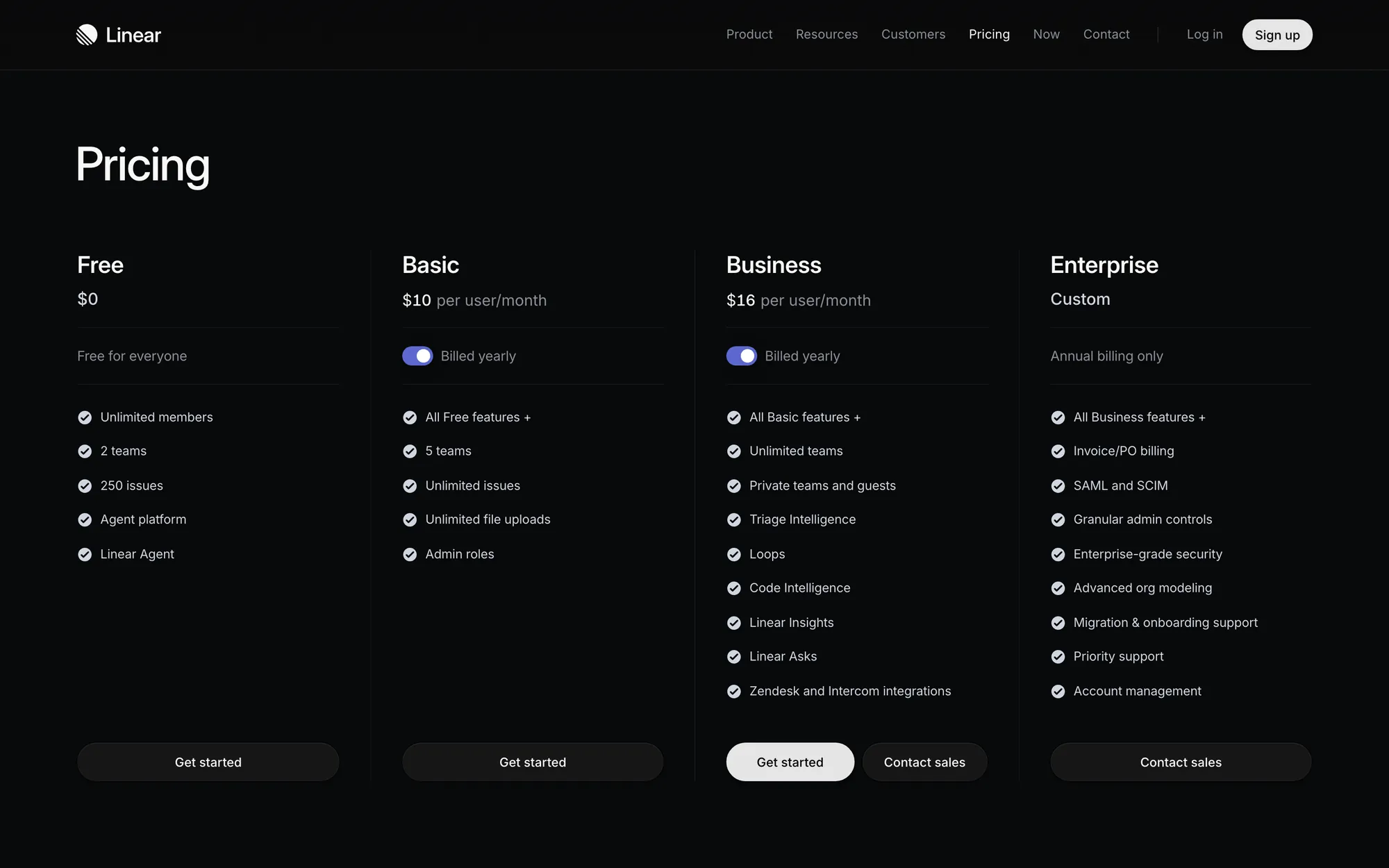
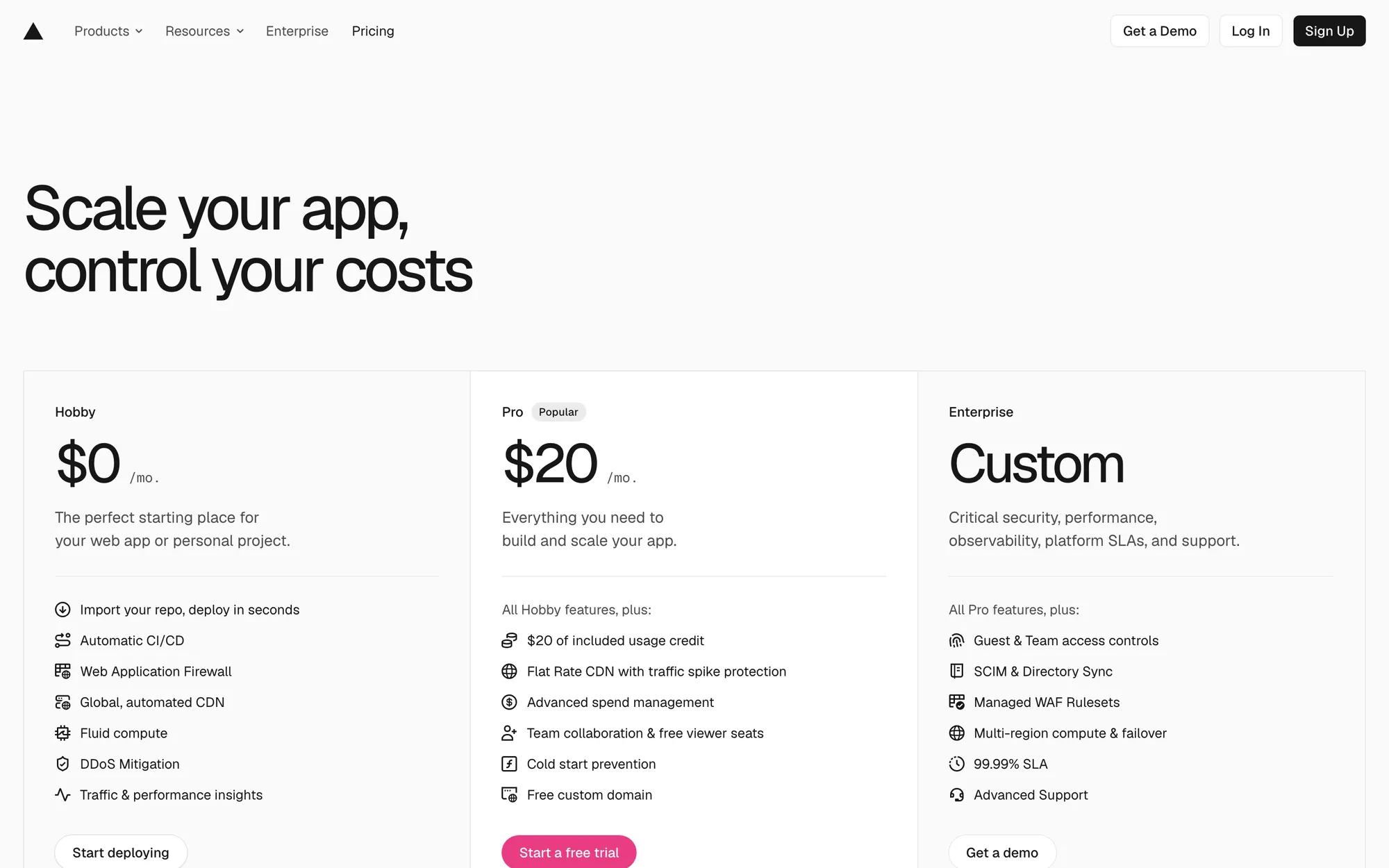
What I'd copy from all four: each page names the buyer's worry out loud. Supabase answers the surprise-bill worry before anything else. CodeAnt deals with the objection that the buyer's code can't leave their servers on the pricing page itself, because for a code security product it's the first thing a reviewer asks.
The talk-to-sales row
'Custom' with a 'Contact us' button tells the buyer nothing. The enterprise row should list what's different, so the buyer knows whether they need it: SSO and SCIM, self-hosted or private deployment, an uptime commitment, custom invoicing, a security review and a named contact.
- Label the button with what happens next, such as 'Talk to sales' or 'Book a call'. 'Submit' says nothing.
- Keep the self-serve plans buyable without that call. A team of five shouldn't have to talk to anyone.
- Link the security page or trust centre from the same row. It's what the reviewer opens next.
- Send the button to a short demo request flow instead of a generic contact form.
FAQs that pre-empt procurement
I fill the pricing FAQ with every sales-call question that has a short, true answer. If it came up in three calls last month, it belongs on the page.
- Can I cap usage or get alerts before going over?
- Do you charge sales tax or VAT, and can you send an invoice?
- What happens to my data and settings if I cancel?
- Can I move from the trial to a paid plan without losing setup?
- Where is the code or data stored, and is self-hosting available?
- Do you have discounts for startups, education or open source?
- Can I buy one product without the whole platform?
Keep each answer to two or three sentences, visible without expanding if you can. A collapsed accordion of twenty questions is a polite way of hiding them.
Layout decisions that matter
- Three or four plans, one highlighted: Highlight the plan most new customers should pick, and say why in a line. A 'Most popular' badge on its own explains nothing.
- Default the billing toggle honestly: If the annual price is shown by default, say 'billed yearly' next to the number, as Linear does.
- Features grouped by job: Group the comparison table by what the buyer does (review, security, admin, support) rather than by internal feature flags.
- A worked example for usage pricing: One line like 'a team of 20 developers on this plan usually pays…', built from real usage, beats a calculator nobody opens.
- Works on a phone: Plans stack in order of likely choice, and the comparison table scrolls inside its own container instead of breaking the page.
Pricing pages are part of the site I design and build in Framer, usually alongside the landing pages they connect to. The landing page structure guide covers what comes before the visitor clicks 'Pricing'.
Questions people ask
How many plans should a SaaS pricing page have?
Usually three or four, including a free or trial tier and an enterprise row. More than that and buyers stop comparing and start guessing.
Should a SaaS pricing page show prices or just 'Contact sales'?
Show prices for every plan a team can buy on its own. Keep 'Contact sales' for the tier with custom terms, and say what those terms are.
Should the pricing page default to monthly or annual billing?
Either works if the label is honest. If you show the annual price by default, say 'billed yearly' right next to the number.
Should an early-stage startup publish prices at all?
Publish them for any plan a team can buy without a call. If every deal is still custom, say how pricing works (per seat, per project, a starting point) so the buyer can tell if you're in their range before booking time.
Can you design and build a pricing page in Framer?
Yes. I design and build SaaS sites in Framer as an official Framer Expert, pricing pages included.
Sources
- Pricing, Linear
- Vercel Pricing: Hobby, Pro, and Enterprise plans, Vercel
- Pricing & Fees, Supabase
- CodeAnt AI Pricing, CodeAnt AI
Working on this?
Tell me what you're building and where it's stuck: book a 30-minute call, email work@utkarshdesign.com or send a brief.