How to structure a SaaS landing page
Guide · 7 min read · By Utkarsh Dhairya Panwar · Updated
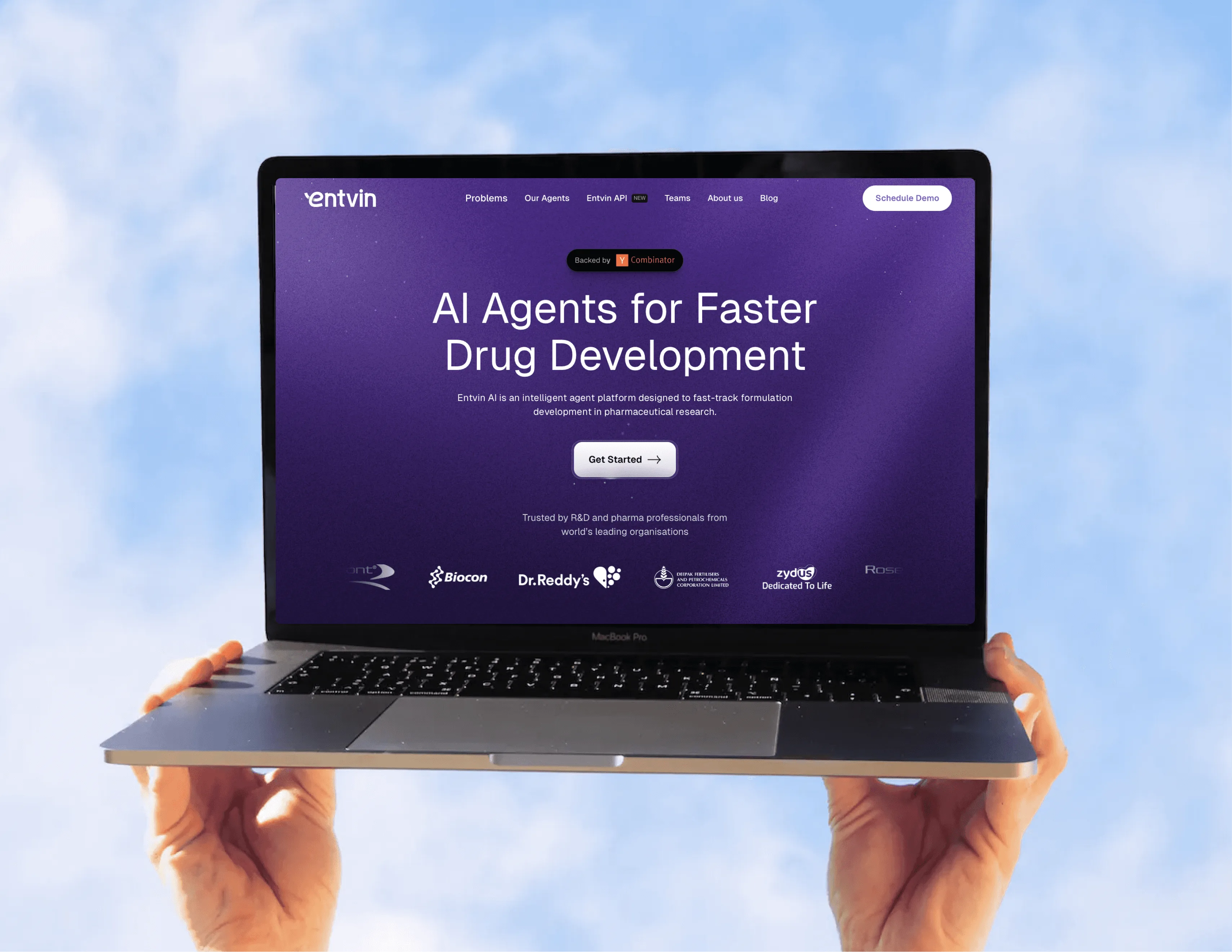
A SaaS landing page that converts answers a cold visitor's doubts in order: what this is and who it's for, why to believe it, how it works on their setup, what the approver needs, and what to do next. I give each doubt one section and cut the rest.
Start from the visitor's doubts, not a template
Most templates already put the sections in roughly the right order: hero, logos, features, testimonials, CTA. Pages go wrong when each slot gets filled without anyone asking what it's for. Before I design anything, I write down the questions a first-time visitor has, in the order they have them, and give each one a section.
B2B pages usually have two readers. The person who finds the product (a developer, an ops lead) wants to know if it works. The person who approves it (a manager, security, finance) wants to know what it costs and what could go wrong. A page that only talks to the first reader stalls at the second.
The section order, with live examples
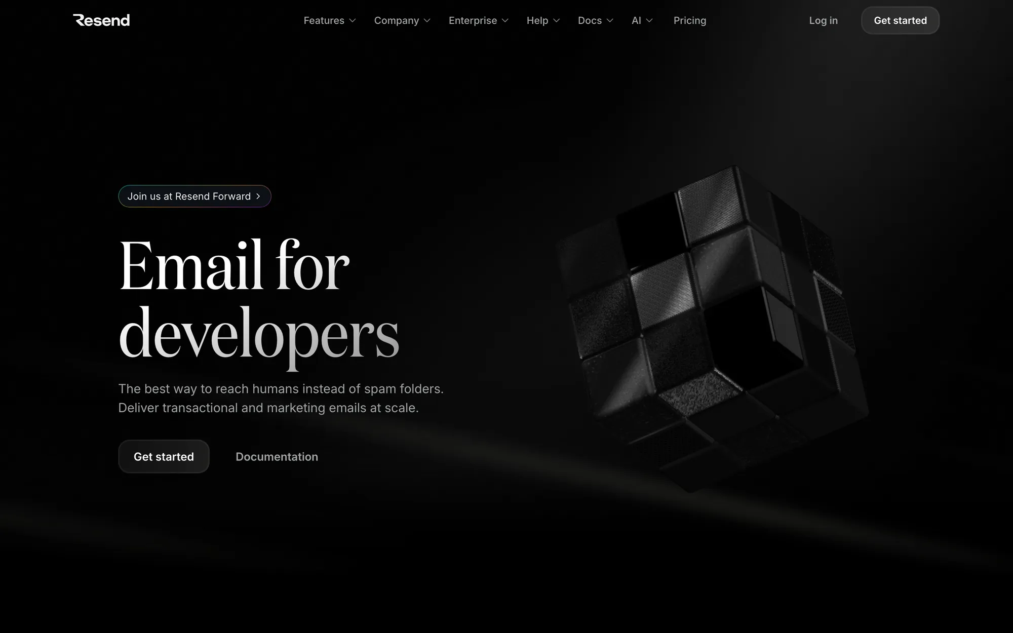
- Hero: say what it is in the buyer's words: One line naming the category and the buyer, a sub-line with the outcome, one primary button. Resend's h1 is 'Email for developers', three words that would work as a search query. Show the real product rather than an abstract illustration.
- Proof, directly under the hero: Customer logos, one hard number or a named quote, before the visitor scrolls far. Ramp puts a live counter of payments processed above its headline. CodeAnt's logo strip starts right under its two buttons.
- The problem, in one screen: Name the pain the buyer already feels, briefly. They know their problem. What they're checking is whether you understand it.
- How it works, on their setup: Three steps, with the integrations visible. Developer buyers want to see their Git provider, their framework or their CLI, and the first thing that happens after connecting.
- Features grouped by job: Name blocks after what the buyer is trying to do, never after your internal modules. Attio's sections read Build pipeline, Convert leads, Forecast revenue. Each block gets one claim, one real screen and one specific detail.
- A block for the approver: Security, permissions, the pricing model, self-hosting, switching cost. Attio's footer lists the tools you'd move from (Salesforce, HubSpot, Pipedrive) and links each to a migration guide, which answers the 'what about the tool I already use' question.
- Objections as a short FAQ: Questions lifted from real sales calls, each answer short enough to read without expanding it. Granola answers its biggest one ('without a meeting bot') before the FAQ even starts.
- A final CTA that repeats the first: The same action as the hero, with the cost of trying stated plainly: trial length, whether a card is needed, or what happens on the demo call.
One page, one primary action
'Start free trial' and 'Book a demo' compete when they look equal. Decide which buyer comes first and let the other button look secondary. PostHog leads with self-serve everywhere and keeps the demo as one small link. CodeAnt fills the Start Pentest button and leaves Book a Demo outlined beside it.
Lead with the trial when one person can get value on their own in a day. Lead with the demo when setup needs an admin, a security review or connected data. When I checked every Summer 2026 YC homepage, a demo or sales call was the first button on 67 of them and a self-serve action on 35. That's right for sales-led products, and a lost signup for anything a visitor could start using today.
What to cut
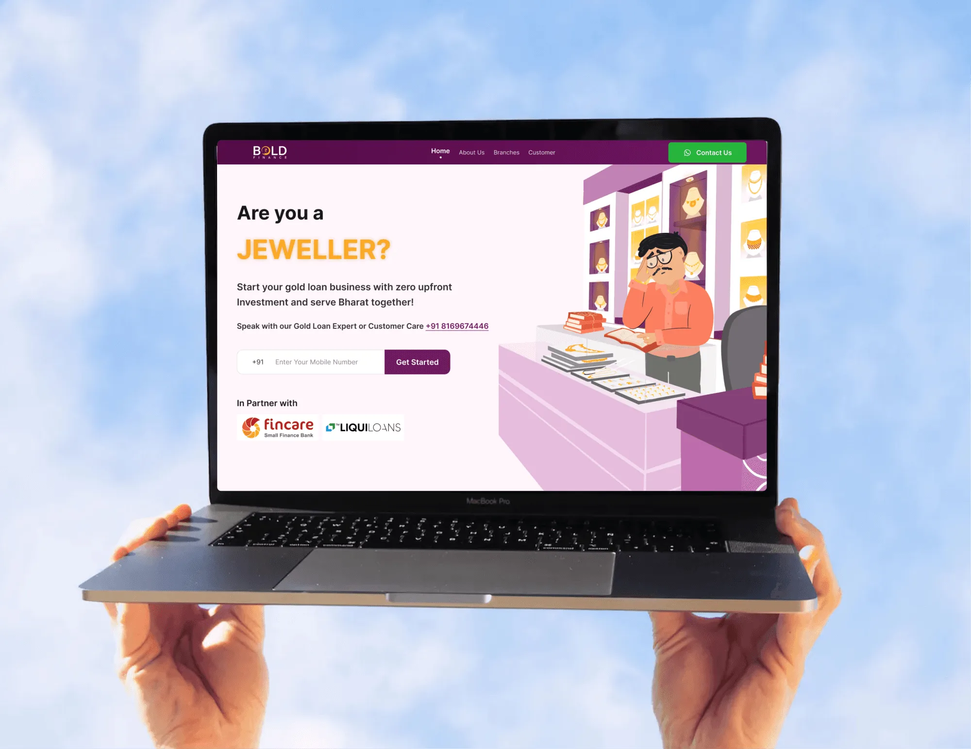
- Twelve-icon feature grids with four words under each icon. Nobody reads them.
- Testimonials that say 'great product'. Keep the ones that name a result or a specific moment.
- Autoplay hero videos that run longer than a few seconds.
- Stock illustrations of people pointing at charts.
- A second and third button in the hero.
- Copy that explains your architecture before it explains the buyer's problem.
Search structure is a separate job from page structure. One H1 that says what the page is, headings that summarise the page when skimmed, and a separate page for each separate search will help both. My Framer SEO guide covers that side.
How to tell whether the structure is working
Look at scroll depth by section and at where clicks on the primary button come from. If most clicks come from the final CTA, the hero isn't convincing anyone. If people leave at the features block, it's probably organised around your module names instead of their jobs.
Then follow the click. The landing page makes a promise, and the first screen after signup has to keep it. If someone signed up for one feature and lands on a generic dashboard or a product tour, the page did its job and the product undid it. The trial-to-paid guide covers that onboarding side at CodeAnt.
To check your own page against this order, the landing page grader runs 12 of these checks in about five minutes. If you'd rather have the page designed and built in Framer on this structure, that's my Framer website work.
Questions people ask
How long should a SaaS landing page be?
Long enough to answer a cold visitor's doubts, usually seven or eight sections. Shorter pages work when visitors already know you, for example from a launch or a referral.
Should a SaaS landing page have a demo video?
A short, silent product clip in the hero helps when the product is visual. Put longer walkthroughs further down or behind a click.
Is a homepage the same as a landing page?
No. A homepage serves everyone who types your name. A landing page serves one audience from one source, like an ad or a search, so it can drop the navigation and say one thing.
Sources
- Scrolling and Attention, Nielsen Norman Group
- How Users Read on the Web, Nielsen Norman Group
Working on this?
Tell me what you're building and where it's stuck: book a 30-minute call, email work@utkarshdesign.com or send a brief.