Developer tool website best practices, from building one
Guide · 6 min read · By Utkarsh Dhairya Panwar · Updated
A developer tool website works when a developer can judge the product alone. Put real code or the real UI in the first screen, link the docs from the hero, keep the path to a first result short, and give the approver pages for pricing, security and comparisons.
What a developer does in the first minute
Developers don't read a devtool homepage top to bottom. They read the headline, look for code or a real screen, open the docs in a new tab and check whether they can sign in with GitHub without a card. If something on that list is missing, they close the tab and try the next tool.
Behind the developer there's usually a second reader, the engineering manager or security lead who approves the purchase. At CodeAnt that split showed up in the product as the admin wall (written up in how we doubled trial-to-paid). The website has the same two readers and has to work for both.
This page is about the marketing site. For the product side (onboarding, dashboards, the admin hand-off), see my guide on designing for developer tools.
Four devtool homepages, checked on 8 October 2026
How I checked: I opened each live homepage on 8 October 2026 and noted the hero buttons, whether real code appears, where the docs are linked, and what's there for a buyer rather than a user. These are observations only; I have no data on how these pages perform.
| Site | Hero buttons | Code on the page | For the buyer |
|---|---|---|---|
| Resend (email API) | Get started, Documentation | A full send-an-email example with tabs for many languages and frameworks | An Enterprise link right under the hero |
| Supabase (Postgres platform) | Start your project, Request a demo | A React example and a CLI deploy command | A demo request beside the self-serve button; GitHub star count in the nav |
| Sentry (monitoring) | Get Started, Get Demo | An SDK picker with an install command per platform | A large customer logo wall and a security section |
| CodeAnt AI (code security) | Start Pentest, Book a demo | Product graphs rather than code | SOC 2 Type II and HIPAA badges; Trust Center and DPA in the footer |

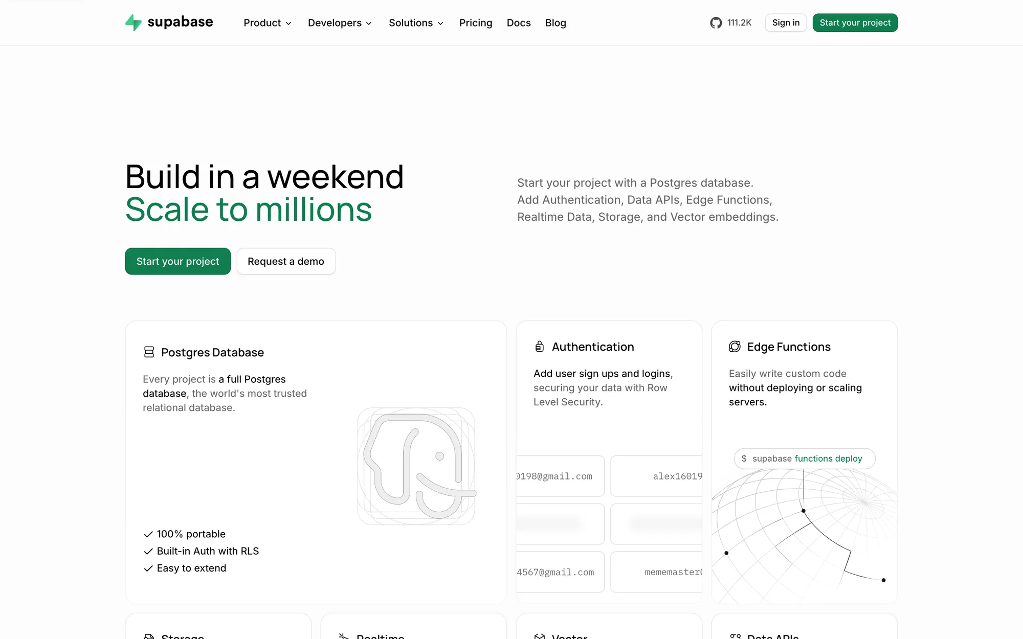
Resend is the cleanest example of docs as a hero action, with "Documentation" sitting right beside "Get started" at equal weight. All four sites pair a self-serve start with a sales path, and all four put the self-serve button first.
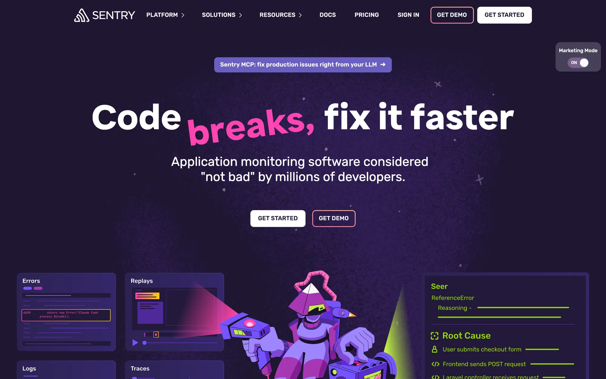

Show the product, in code or in the real UI
For an API or SDK the product is the code, so show the shortest real example that does something useful, in the language the visitor is most likely to use, with tabs for the rest. A tool with an interface, like a code review or security platform, should show its real screen, such as the review comment on a pull request or a finding with its fix.
I stay away from abstract 3D shapes, glowing gradients standing in for "AI" and illustrations of people at laptops. Developers take those as a sign the product is hard to show.
Treat the docs as part of the marketing site
For many developer tools, the serious evaluation happens in the docs, where developers check whether the thing works with their stack. That makes the docs a conversion page, usually one nobody on the marketing team owns.
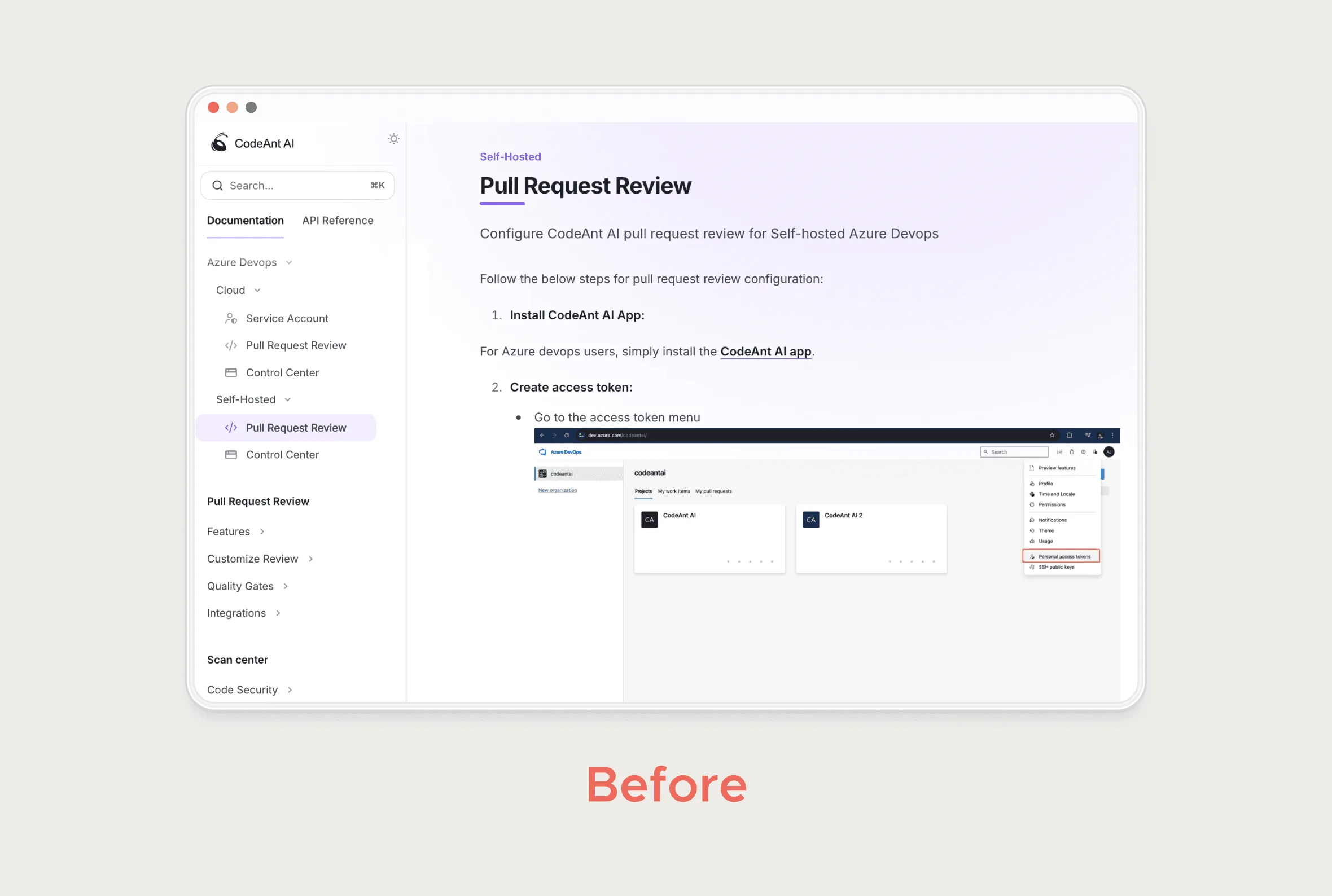
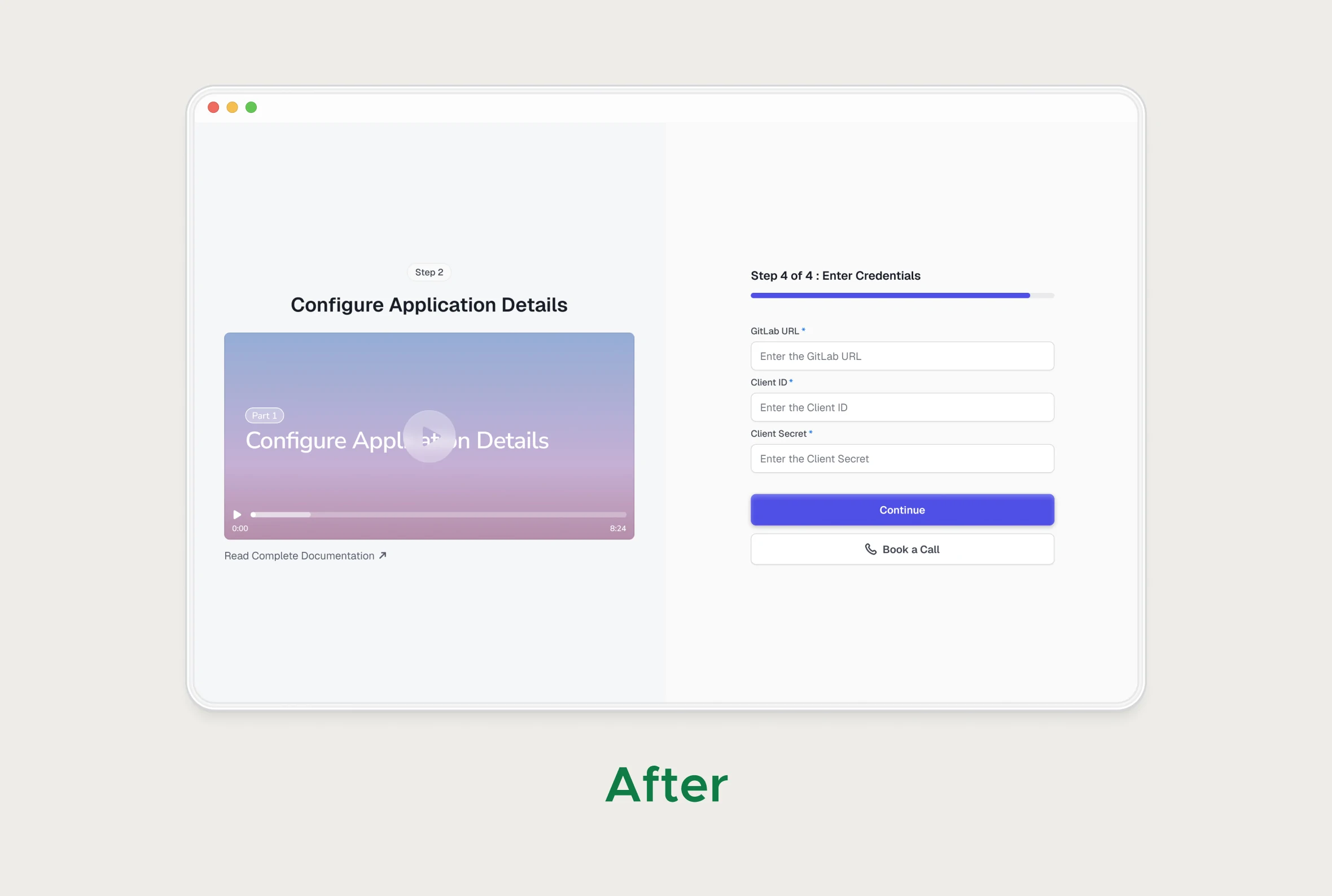
At CodeAnt the self-hosted setup lived in docs, as long pages of numbered steps and screenshots for each Git platform. I turned it into step-by-step flows with platform-specific videos inside the product, and kept the docs for reference.
- Link the quickstart from the hero as well as the nav.
- Put a "Sign up" or "Get an API key" button inside the docs, where intent is highest.
- Make the first code sample in the docs the same one as on the homepage.
A short self-serve path to a first result
The site's main button promises that you can try this now, and everything after the click has to keep that promise. Let people sign in with the Git provider they already use, skip the card for the trial, and show a first result before asking them to invite their team.
A devtool site that converts well into a broken setup flow only moves the drop-off. CodeAnt's site conversion has doubled since launch, and that counted because the steps after the click were fixed too.
Pages for the person who signs off
- Pricing that states the unit (per seat, per repo, per usage) and the enterprise terms. My pricing page guide covers this.
- A security or trust page: certifications, data handling, where code goes, a DPA. Link it from the footer and the pricing page.
- Self-hosting or private deployment, if you offer it, explained on its own page.
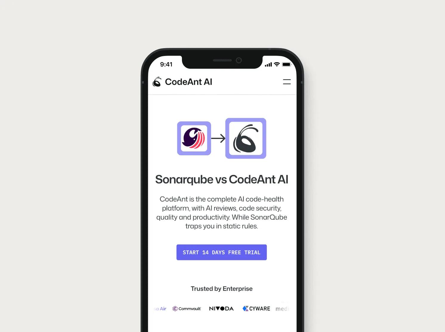
- Comparison pages against the tools buyers already know, like CodeAnt's "Sonarqube vs CodeAnt AI".
- Customer stories written for a manager, about what changed for the team rather than what the API does.
If you're building or rebuilding a developer tool site, my Framer website work is where I do this, from page structure to the published site.
Questions people ask
Should a developer tool homepage show code?
If the product is an API, SDK or CLI, yes, one short real example that runs. If it has an interface, show the real UI instead of code.
Should a devtool lead with a free trial or a demo?
Lead with self-serve when one developer can get a result alone. Keep a demo button for teams that need a security review or self-hosting.
Should docs live on the marketing site?
They can live on a subdomain, but link the quickstart from the hero and put signup buttons inside the docs. They work as a conversion page.
Do developer tools need comparison pages?
Usually, yes. Buyers already use something, and a fair comparison page answers the approver's "why switch" question before a call.
Should a devtool homepage show GitHub stars?
If the project is open source and the number is real, the navigation is a fine place for it, as Supabase does. It reassures developers; the approver will still want the security and pricing pages.
Sources
Working on this?
Tell me what you're building and where it's stuck: book a 30-minute call, email work@utkarshdesign.com or send a brief.