Do product tours work?
Guide · 6 min read · By Utkarsh Dhairya Panwar · Updated
Product tours work when there is one main path, the user starts it, and every step asks them to do something. They fail when people signed up for different things or a permission or missing data blocks them. At CodeAnt AI I skipped the tour for a Get Started screen.
What a tour assumes
A product tour is a sequence of tooltips or modals that walks a new user around the interface. It assumes that everyone wants to see the same things in the same order, and that reading about a feature comes before using it.
When those hold, a tour is fine. In most B2B products I've worked on, one of them breaks on day one. People sign up for different reasons and arrive with a task already in mind. They learn by trying things, and clicking Next teaches them very little.
The tour vendors' own data says the same. Chameleon's 2025 product tour benchmark report found completion drops sharply once a tour runs past five steps, and that tours users start themselves get about double the engagement of ones that launch on everyone automatically. Even the people selling tours advise keeping them short and optional.
Why CodeAnt got a Get Started screen instead
CodeAnt has several product lines: AI code review, code security, code quality and developer insights. A team lead evaluating security has no interest in a walkthrough of review comments. A tour would have forced one order on people who came for different things.
The Get Started screen lists each product line as its own tab. Each item links straight into its setup, so nobody has to read anything first or follow a set order. It also shows what's already done, so a returning user picks up where they left off instead of replaying a tour.
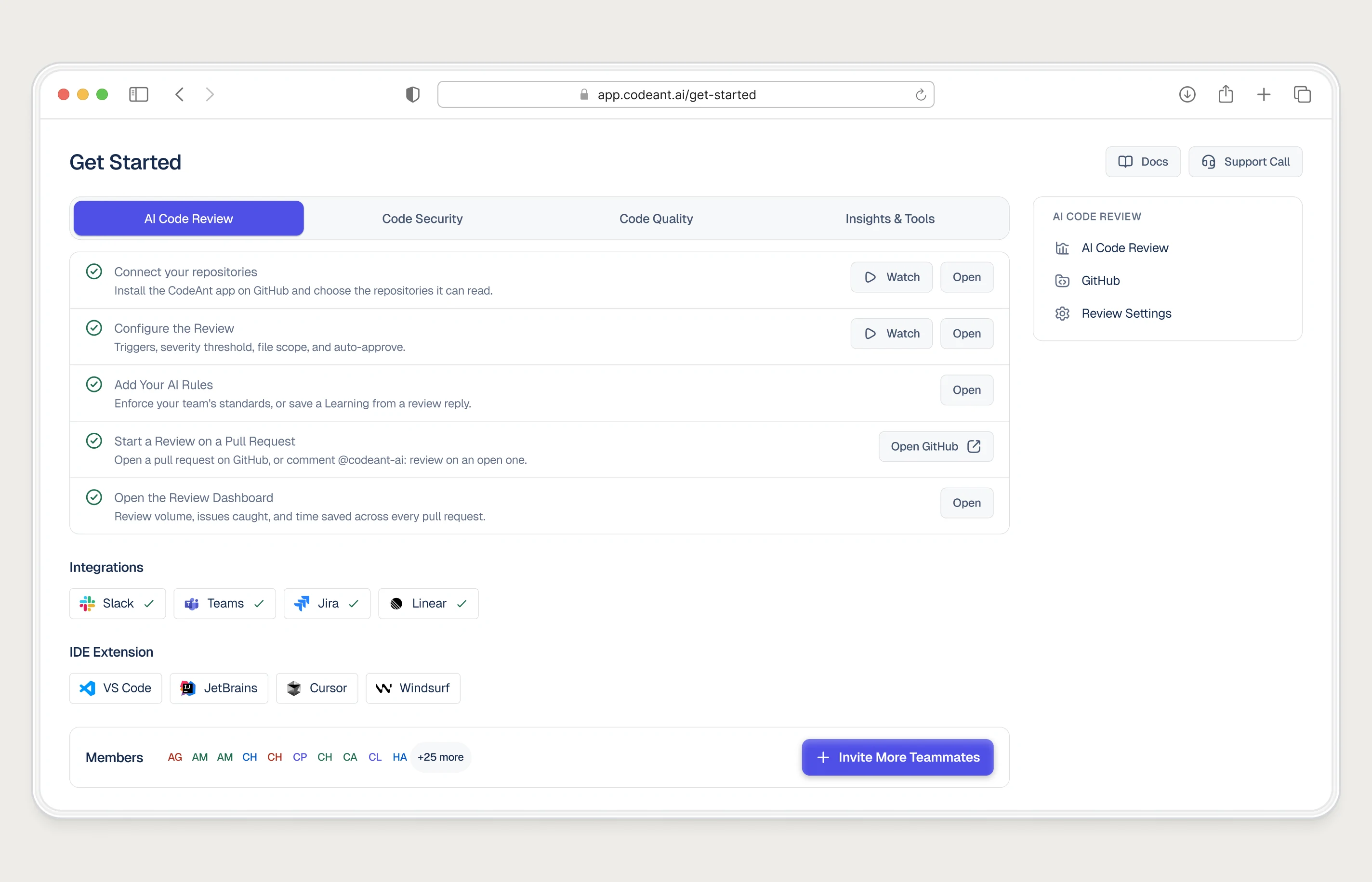
The audience mattered too. Developers skip tours. They'd rather open the thing and poke at it, and a modal in the way reads as friction. A list of links shows what exists and then gets out of the way.
What a tour can't fix
Before reaching for a tour, check whether it can touch the problem at all. Most of the onboarding drop-off I've diagnosed had nothing to do with people misunderstanding the interface.
- A permission wall. At CodeAnt, connecting a repo needed an org admin. No tooltip helps someone who can't click the button. They need a way to bring in the admin.
- An empty product. If the dashboard has no data yet, a tour of the dashboard is a tour of nothing. Sample data or a fast first import does more.
- No visible finish line. If users can't tell whether setup worked, they stall at the last step. Show what success looks like in the product itself.
- Too many steps. At CodeAnt, cutting setup steps did more for activation than any explanation of those steps could have.
When a product tour is still the right call
- There is genuinely one main path, and almost every new user should take it first.
- You've moved things around in a product people already use, and you need to show where something went.
- A new feature lives in a place nobody would look, and a single pointer is enough.
- The user asks for it. A "show me how" link that starts a short tour on demand is a different thing from one that hijacks the first session.
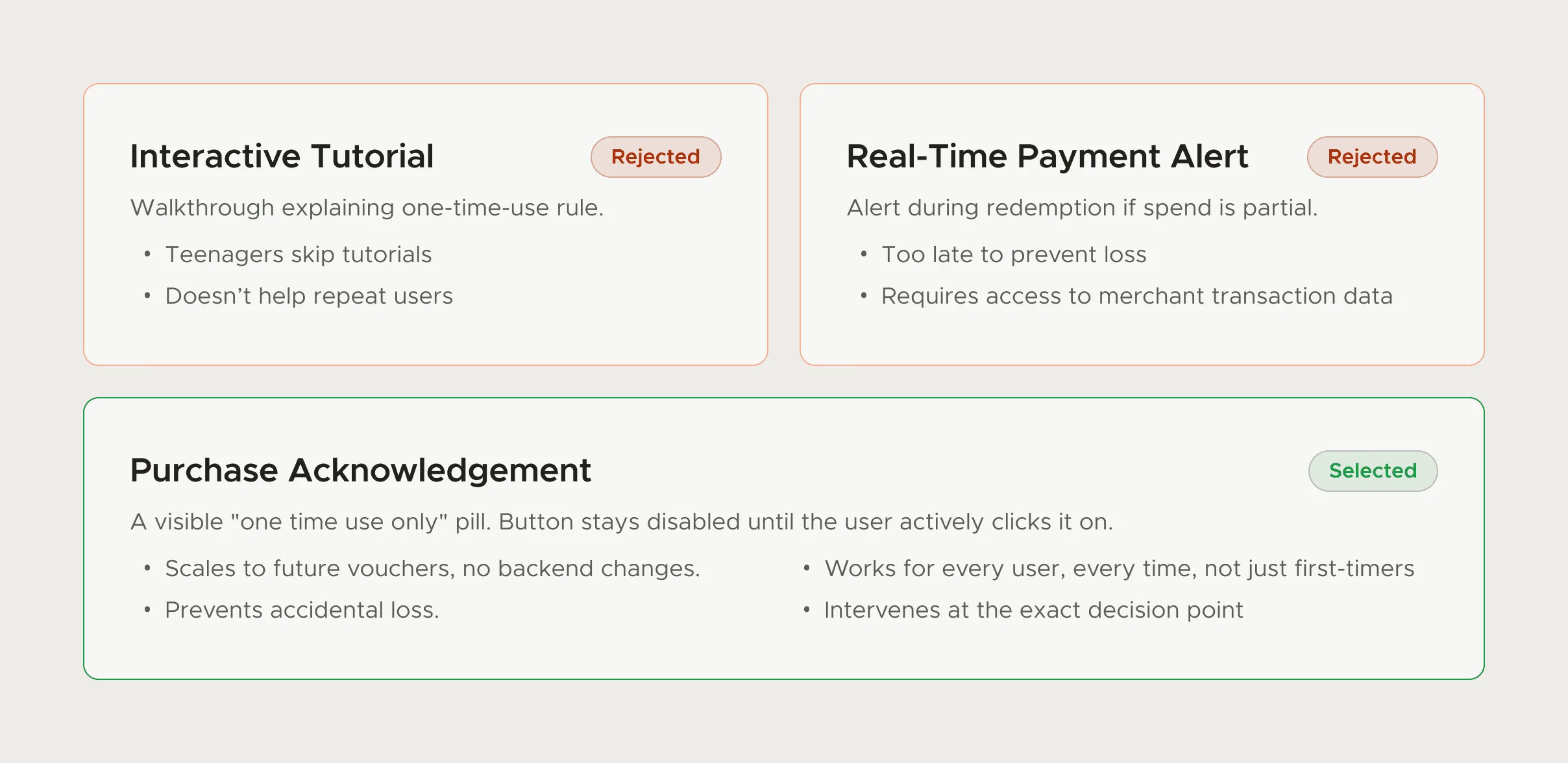
In each case the tour is short, specific and tied to something the user is trying to do right now. That's also why, at FamPay, an interactive tutorial for one-time vouchers lost out to a single acknowledgement line placed above the Buy button. The explanation arrived at the moment of the decision.
Rules if you ship one anyway
- Let people start it: Offer it instead of launching it. A link on the Get Started screen or an empty state is enough.
- Make each step an action: "Click here to connect your repo" beats "This is where repos live". If a step has no action, cut it.
- Keep it to a handful of steps: If it needs more, it's several tours, each triggered where it's relevant.
- Let people leave and come back: A skip button that also remembers progress. Nobody should have to replay steps one to four.
- Measure activation, not completion: A finished tour means someone clicked Next a lot. Compare activation for people who took it against those who didn't.
What replaced the tour at CodeAnt
The Get Started screen did the orientation. Emails and in-product nudges, triggered by what each user had or hadn't done, did the pointing later: someone who had only used reviews heard about security, and someone who had set everything up heard nothing. Between the two, onboarding ran through the whole trial without a forced walkthrough.
The trial-to-paid guide shows how that fitted into the rest of CodeAnt's onboarding. If you're debating a tour for your own product, an onboarding audit will usually tell you whether the problem is understanding or something a tour can't reach.
Questions people ask
Do product tours increase activation?
Only when the reason people don't activate is that they can't find or understand the next step. If the blocker is permissions, missing data or too many steps, a tour won't move it.
What can I use instead of a product tour?
A Get Started screen that links straight into each setup task, empty states that explain what goes there and how to fill it, sample data, and behaviour-triggered nudges for things users haven't tried yet.
How long should a product tour be?
As short as possible, ideally a few steps that each ask the user to do something. If you need more, split it into separate tours triggered where they're relevant.
Should product tours start automatically?
I'd avoid it. Tours people start themselves get far more engagement in vendor data, and an automatic one interrupts the task the user arrived with.
Sources
- Benchmark Report 2025, Chameleon
- Onboarding Tutorials vs. Contextual Help, Nielsen Norman Group
- Paradox of the Active User, Nielsen Norman Group
Working on this?
Tell me what you're building and where it's stuck: book a 30-minute call, email work@utkarshdesign.com or send a brief.