Empty state design for SaaS products
Guide · 6 min read · By Utkarsh Dhairya Panwar · Updated
An empty state is what a screen shows when there's nothing to show yet, and in SaaS the first one a user sees is part of onboarding. It should say what will appear, why it's empty now and the one action that fills it, even if that's asking an admin.
Four empty states, four different jobs
Teams tend to design one empty state, usually an illustration with "Nothing here yet", and reuse it everywhere. But a screen can be empty for very different reasons, and each calls for a different next step.
| Kind | Why it's empty | What the user needs |
|---|---|---|
| First use | The account is new and nothing has been connected or created | The fastest route to the first real content |
| Cleared | The user finished or deleted everything, like an empty inbox | Confirmation that this is good, and a light pointer to what's next |
| No results | A search or filter matched nothing | Their query shown back, and a way to loosen it |
| Blocked | A permission, plan limit or failed sync stops content from loading | The reason in plain words and who can fix it |
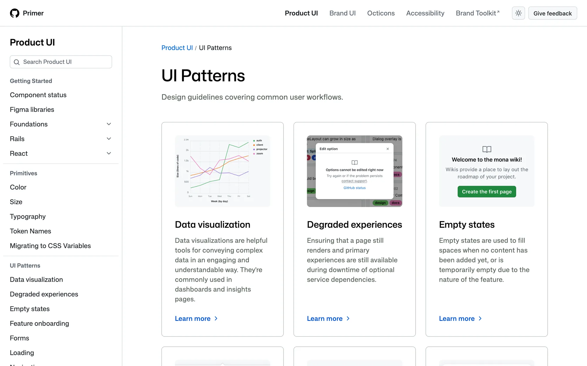
First-use and blocked states are the ones that cost trials; the other two mostly cost a bit of patience. Mature design systems treat the split seriously: GitHub's Primer lists empty states as a pattern of their own, next to degraded experiences and loading, instead of leaving each team to improvise one.
The copy rule: what, why, next
Every empty state I write says three things in this order: what will live here once it's working, why it's empty right now for this particular user, and one action named after what it does. Here it is applied to a code health dashboard, in example lines I wrote for this page.
- Weak: "No data available." It describes the screen instead of the situation and gives the user nothing to do.
- Better: "Security findings for your repositories will show here. You haven't connected a repository yet. Connect repository."
- Blocked: "Findings will show here once your GitHub org approves the CodeAnt app. Only an org admin can do that. Ask your admin."
- No results: "No critical findings match 'payments-service'. Clear the severity filter to see all 12 findings."
An illustration would add nothing to any of these. It can set a tone, but it can't explain why or point to the next step, and on a dense B2B screen it often pushes the button below the fold.
First run at CodeAnt: no blank dashboard
CodeAnt AI's dashboards (reviews, security, quality, developer metrics) have nothing to show until a repository is connected and analysed. New users don't land on empty charts. They get the Get Started screen, with each product line as a tab, every setup task linked directly and finished ones marked done.
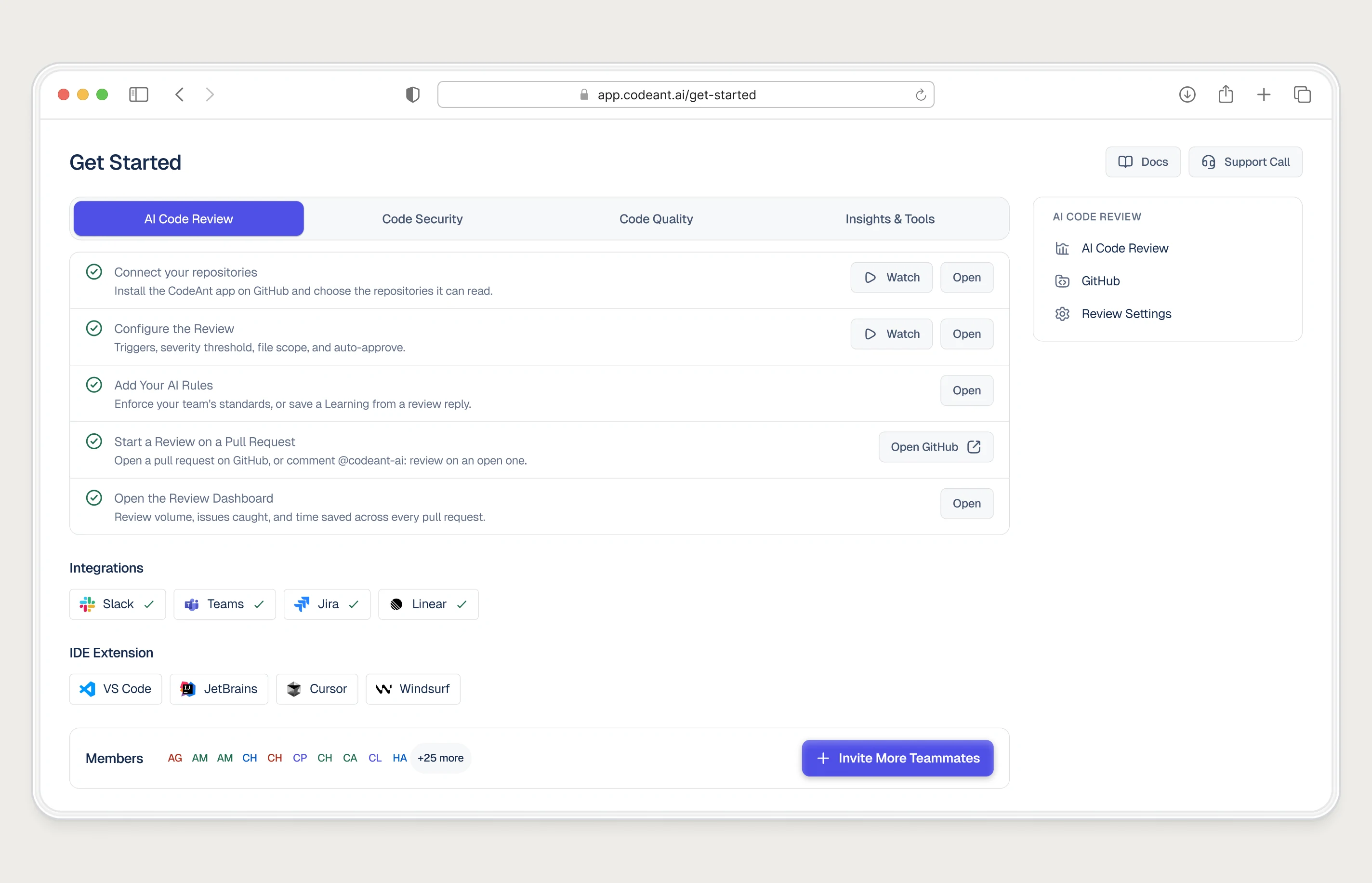
The most useful first-use empty state is barely empty at all. This one is a short, specific to-do list that goes away once real content arrives, with room for what often matters most in B2B: inviting the teammates who can do the next step.
When the next step belongs to someone else
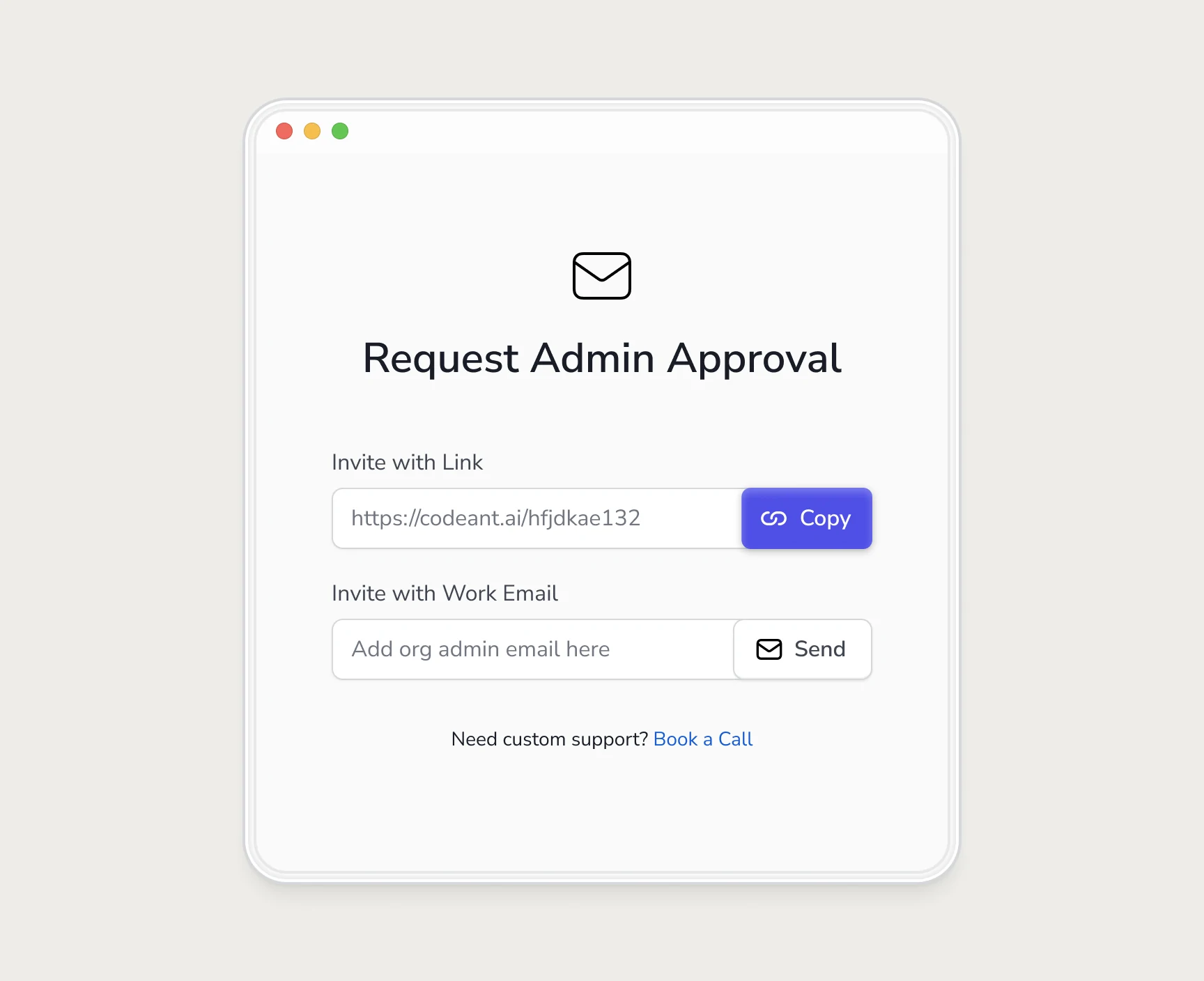
Blocked empty states do the most damage of the four. At CodeAnt, connecting a company repo needed an org admin, and developers without admin rights hit a screen with no reason and no way forward. I turned it into a request they could send to the admin (the full story is in how we doubled trial-to-paid).
Any empty state caused by a permission should do the same: name the role that can fix it, and give a one-click way to reach that person. Then tell the user what happens next, so the screen they come back to isn't the same dead end.
Fill it before the user has to
Sometimes you can avoid the empty state altogether. Each way of doing that has a cost:
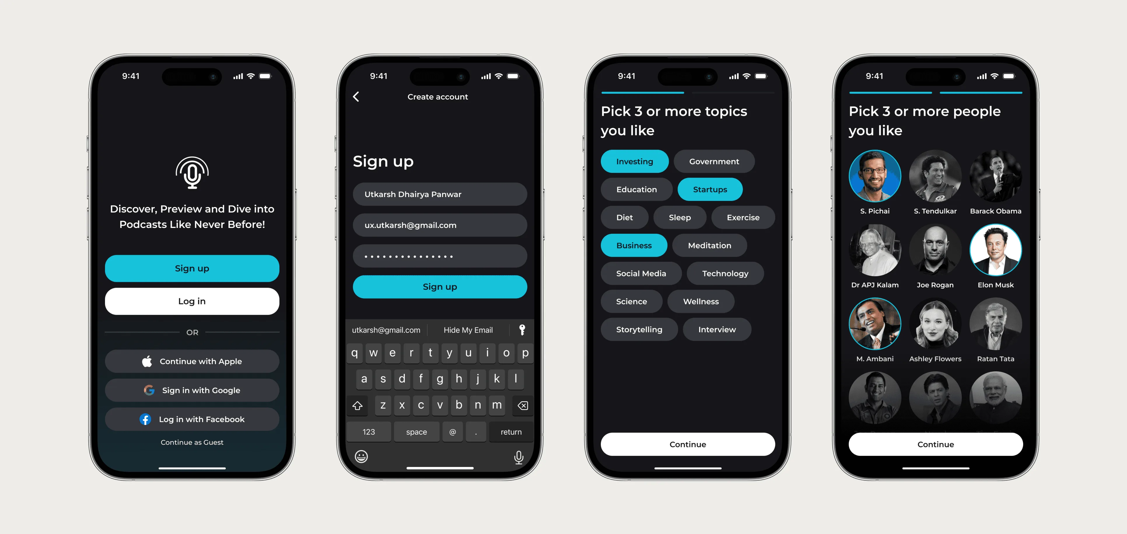
- Ask one or two questions up front and use the answers. In the Soundsphere concept, new listeners pick a few topics and people so the For You feed starts relevant instead of blank. Cost: a short extra step at sign-up.
- Show sample content, clearly labelled. Good for analytics and databases. Cost: it can be mistaken for real data, so label it and make it easy to clear.
- Start work immediately on something that already exists, such as scanning the default branch while the user waits for their first pull request. Cost: you need the permissions first.
A short checklist
- Does each empty screen know which of the four kinds it is?
- Does the copy say what goes here, why it's empty for this user, and one next action?
- Is the primary button visible without scrolling on a laptop?
- Do blocked states name who can fix it and offer a way to reach them?
- Does the empty state disappear, or change, once the first content arrives?
Empty states are one of the first things I look at in an onboarding audit, because they're cheap to fix and new users see them before anything else.
Questions people ask
What is an empty state in UX?
The screen a user sees when there's no content to show yet, such as a new account's dashboard, an empty search result or a page they don't have access to. It should explain why and offer a next step.
Should empty states have illustrations?
They can, for tone, but the copy and the action do the work. On dense B2B screens, keep illustrations small so the next step stays visible.
Is sample data better than an empty state?
Often, for products that are blank until the user's data arrives. Label it clearly as sample data and make it easy to remove.
How is an empty state different from an error message?
An error says something went wrong, while an empty state can be completely normal, like a new account. A blocked empty state sits between the two and should explain the cause without sounding like a failure.
Sources
- Empty states, GitHub Primer
- Degraded experiences, GitHub Primer
- Designing Empty States in Complex Applications: 3 Guidelines, Nielsen Norman Group
Working on this?
Tell me what you're building and where it's stuck: book a 30-minute call, email work@utkarshdesign.com or send a brief.