SaaS website design examples, and what to copy
Guide · 6 min read · By Utkarsh Dhairya Panwar · Updated
The SaaS websites worth studying each make one decision clearly. Resend and Granola name the category in a few words, Attio and Ramp answer the switching question, and PostHog leads with one buyer. Below are eleven sites I read in October 2026, three my own, with what to copy.
How I picked and read these
Galleries of SaaS homepages rarely help with a decision, because a screenshot doesn't tell you why a page is built the way it is. So I opened each live site in October 2026 and noted the headline, the first button, the first proof a visitor sees, and how far away pricing is. I describe only what the public page shows and don't guess anyone's conversion rates. For the three sites I worked on, I can also say what was decided and why.
Headlines that name the category in a few words
- Resend: the h1 is "Email for developers". Three words, category plus buyer. The page then shows a code sample, a Test mode section and a Send with Next.js link, so a developer can judge the product without signing up.
- Granola: "The AI notepad for back-to-back meetings". The meta description ends with "Without a meeting bot", which answers the biggest objection to note-takers before anyone clicks. There is a separate AI notepad vs notetaker page for people who want the argument in full.
- Clerk: "Everything you need for authentication", followed by the frameworks it supports (Next.js, React, Expo, Astro and more) right in the navigation. A developer's first question is "does it work with my stack", and the menu answers it.
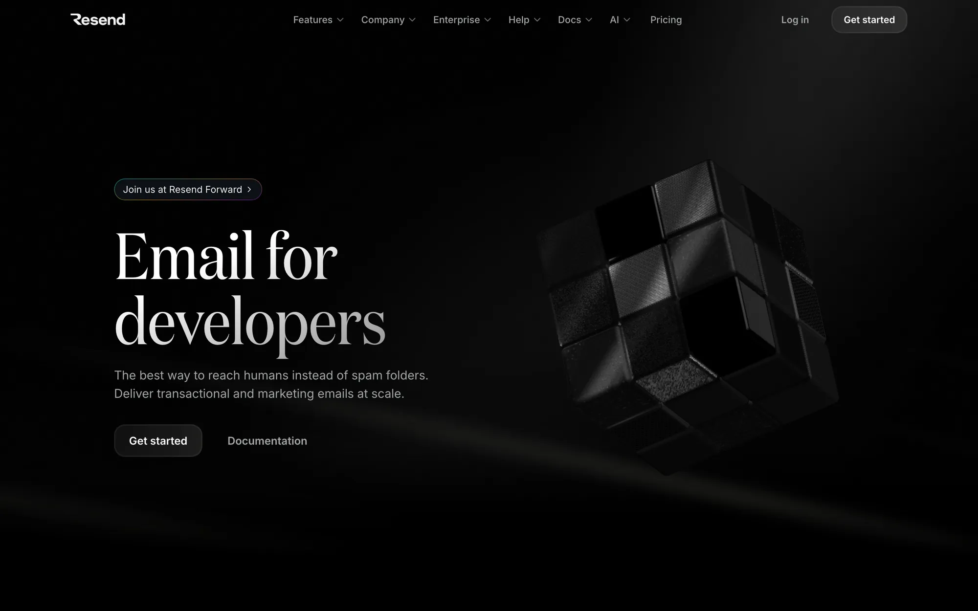
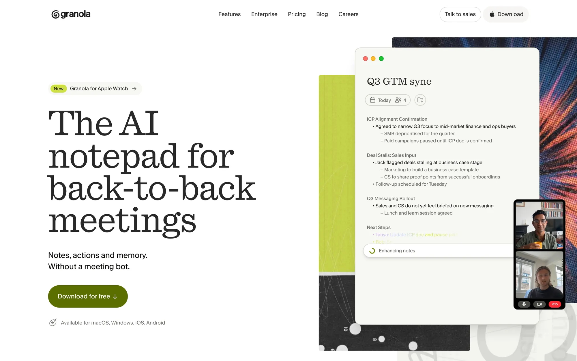
What to copy: write the h1 so it would make sense as a search query. People type "AI notepad for meetings". Nobody types a clever metaphor, and decoding one costs the visitor a second.
Pages that answer the switching question
- Attio names the competitors you'd switch from (Salesforce, HubSpot, Pipedrive, Zoho and Excel) in its footer, each linking to a help article on moving your data out of it and into Attio. Its product sections are named after jobs (Build pipeline, Convert leads, Forecast revenue) rather than module names.
- Ramp runs a live counter of corporate payments processed through it right above its headline, has a "Switch in days, not months" link, and runs a Versus section. The first two buttons are See a demo and Get started.
- Linear has a changelog block on the homepage and a Switch page in the footer for teams moving from another tracker. Existing users get an Open app link in the header, so they don't have to hunt for the login.
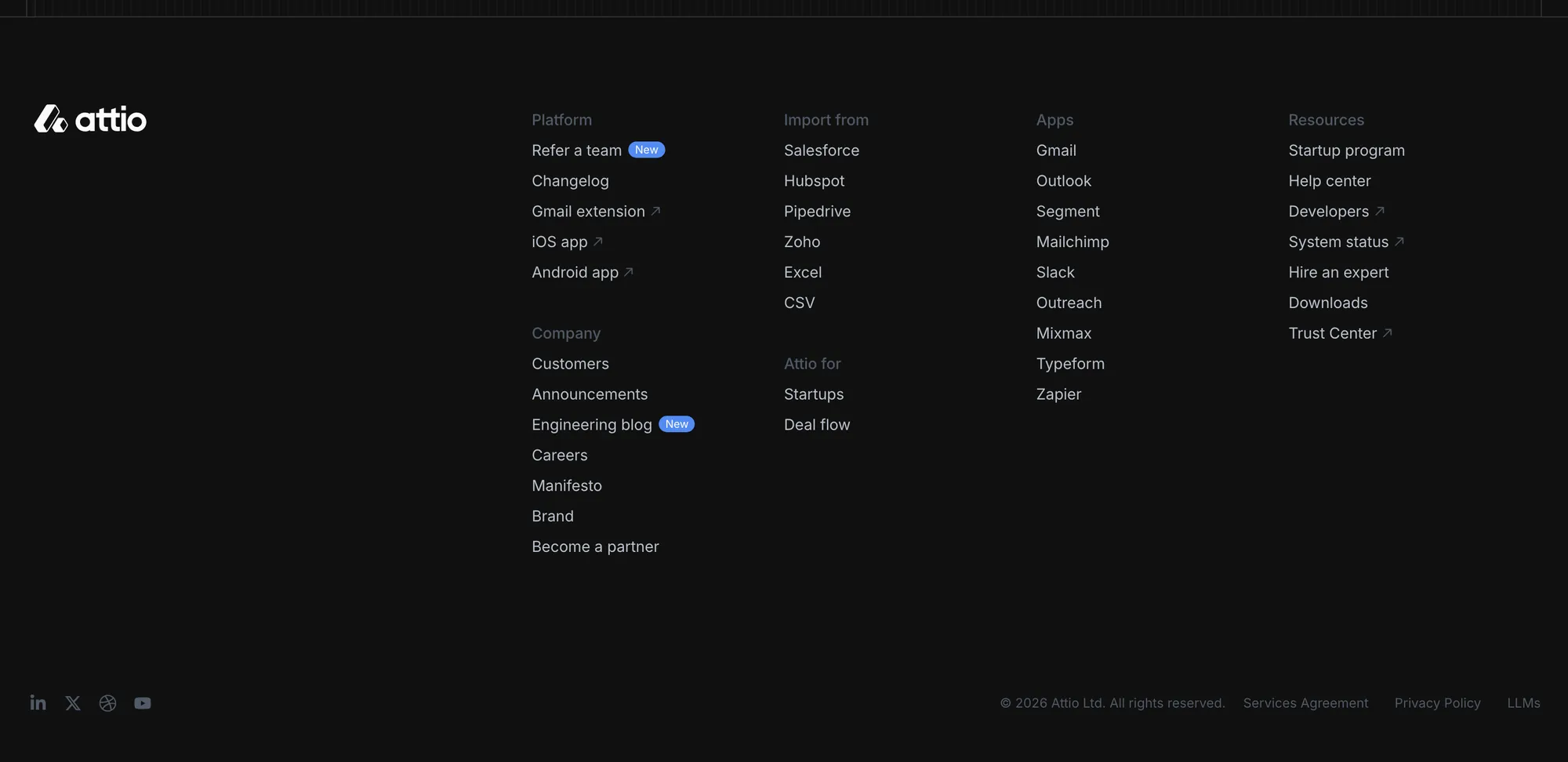
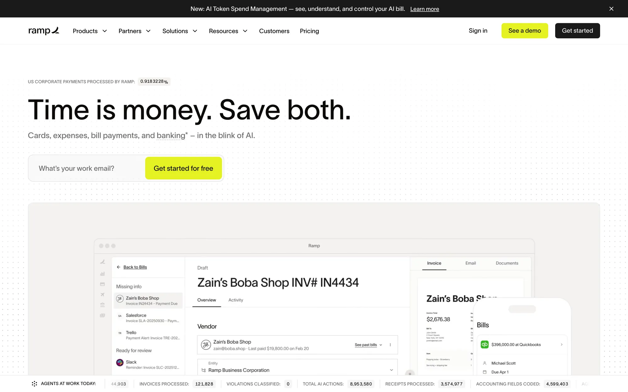
For B2B buyers the bigger objection is often the cost of switching, more than any missing feature. A comparison or migration page answers it, and it ranks for searches like "X vs Y" too.
Two buttons that don't compete
Clay puts Get a demo and Start free trial side by side in the header. PostHog goes the other way: "Get started, free" appears again and again, a demo is one small link among many, usage-based pricing sits on the homepage, and one section is headed "Shameless CTA". Both read clearly, because each company has decided which buyer comes first.
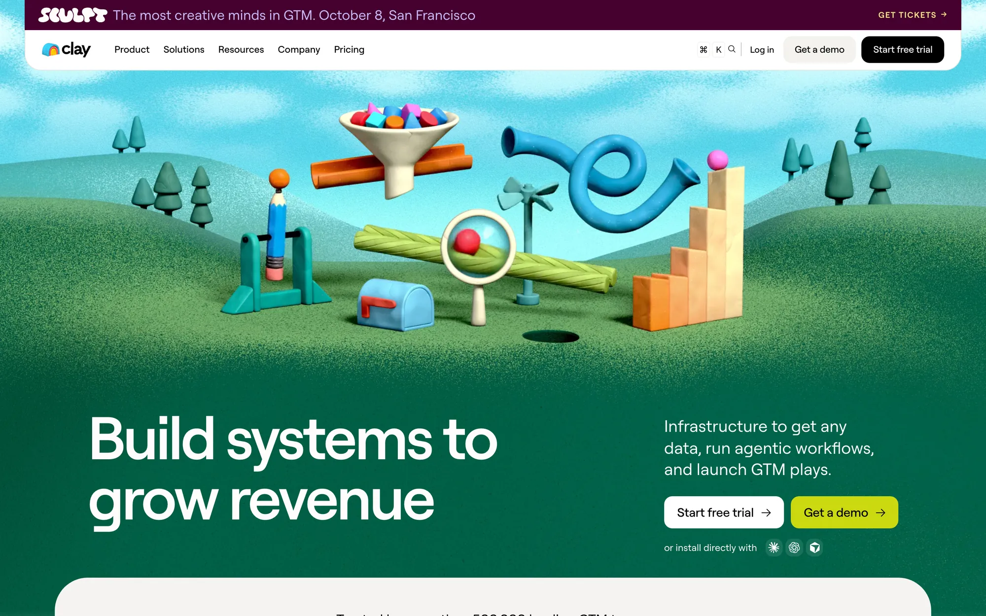
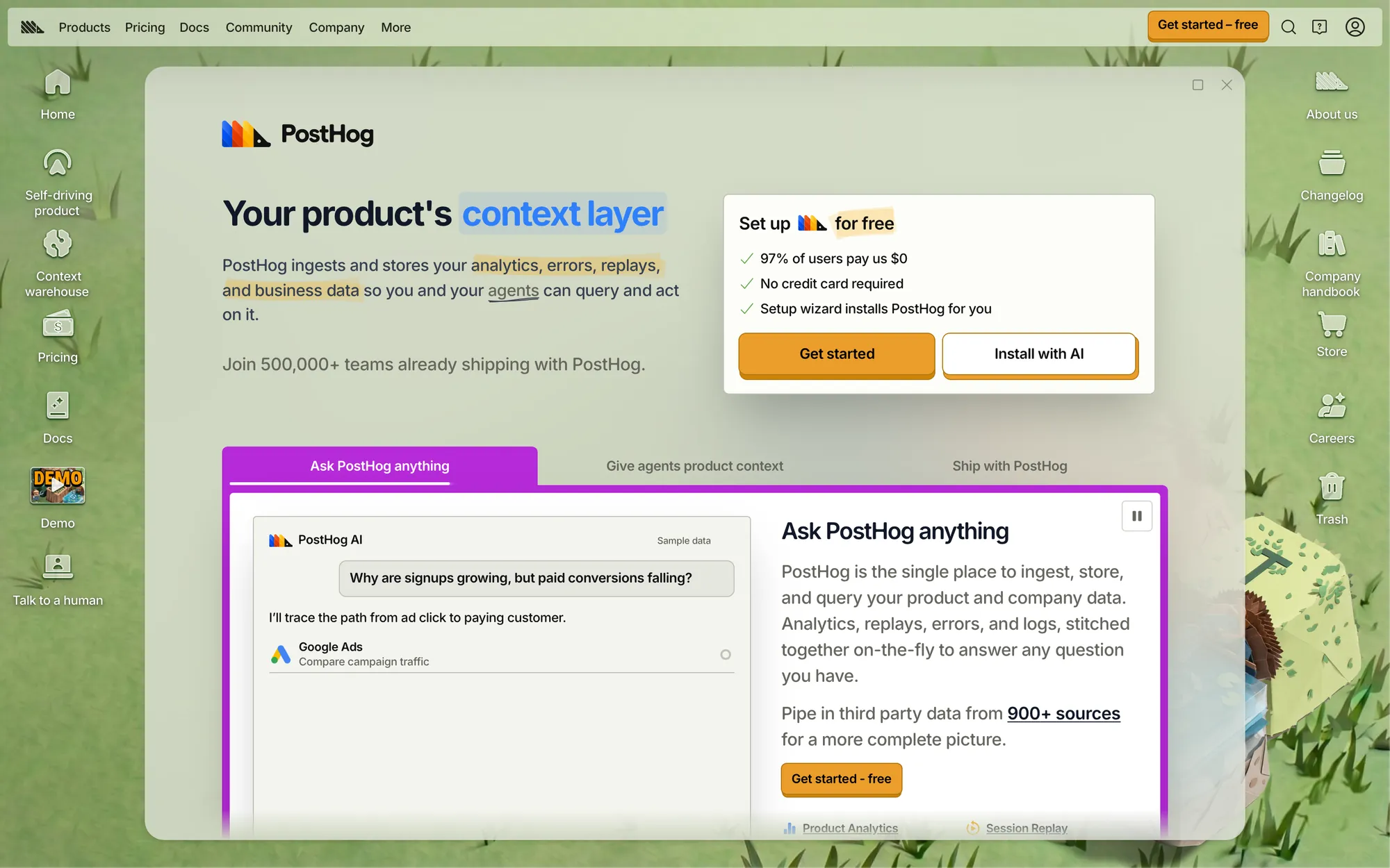
The pattern to avoid is two equally loud buttons with no reason to pick either. On the Summer 2026 YC homepages I checked, a demo request was the most common first button by a wide margin. That suits sales-led products and loses signups for anything someone could start using today.
Three SaaS websites I designed
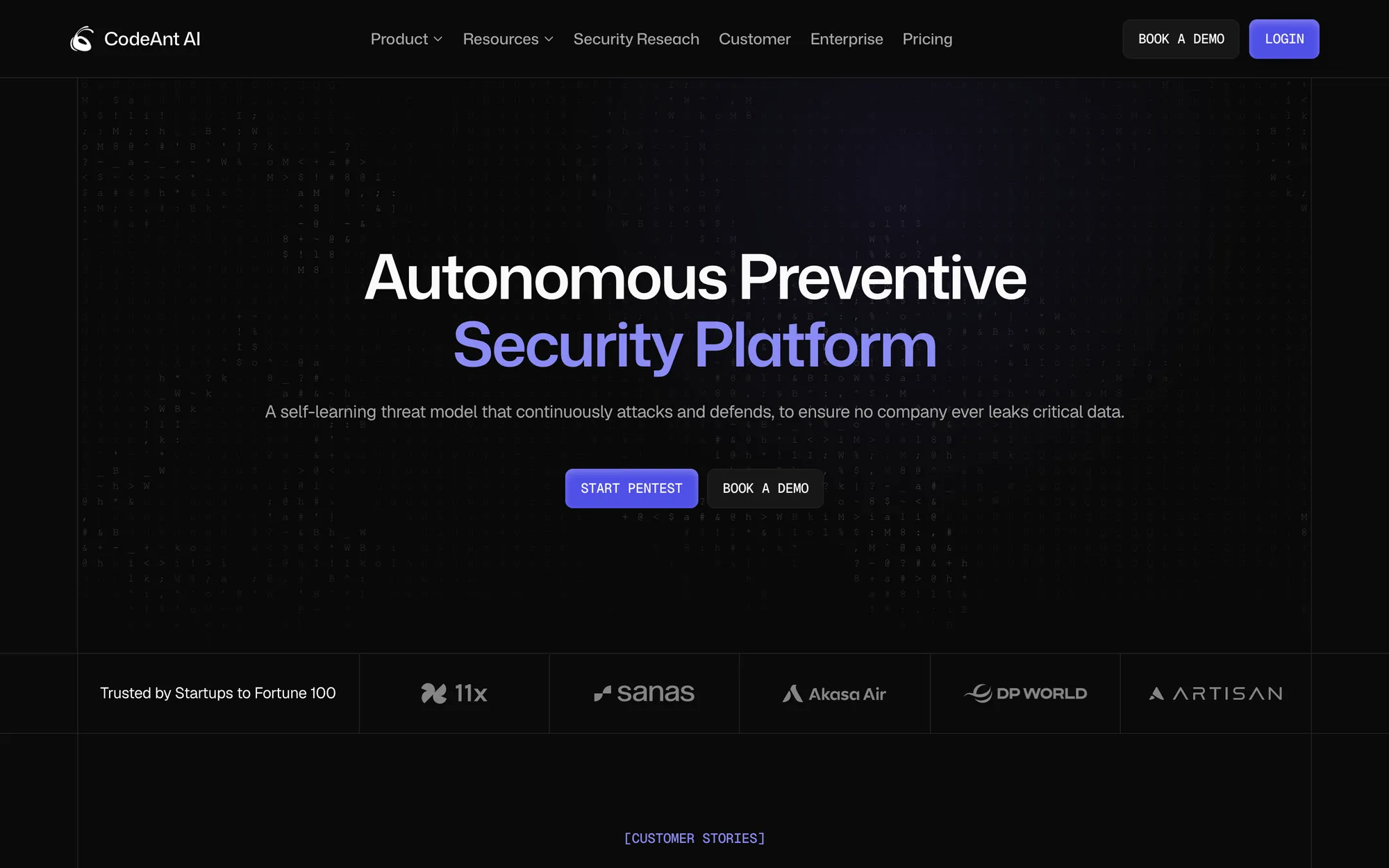
CodeAnt AI. I'm the founding designer, and I design and build the website in Framer, with conversion-optimised landing pages. The live homepage leads with Start Pentest, with Book a demo as the second action. A customer quote with the person's title sits right after the logos, and further down there is an interactive attack-surface graph you can pan and zoom. The conversion rate has doubled since the Framer site launched.
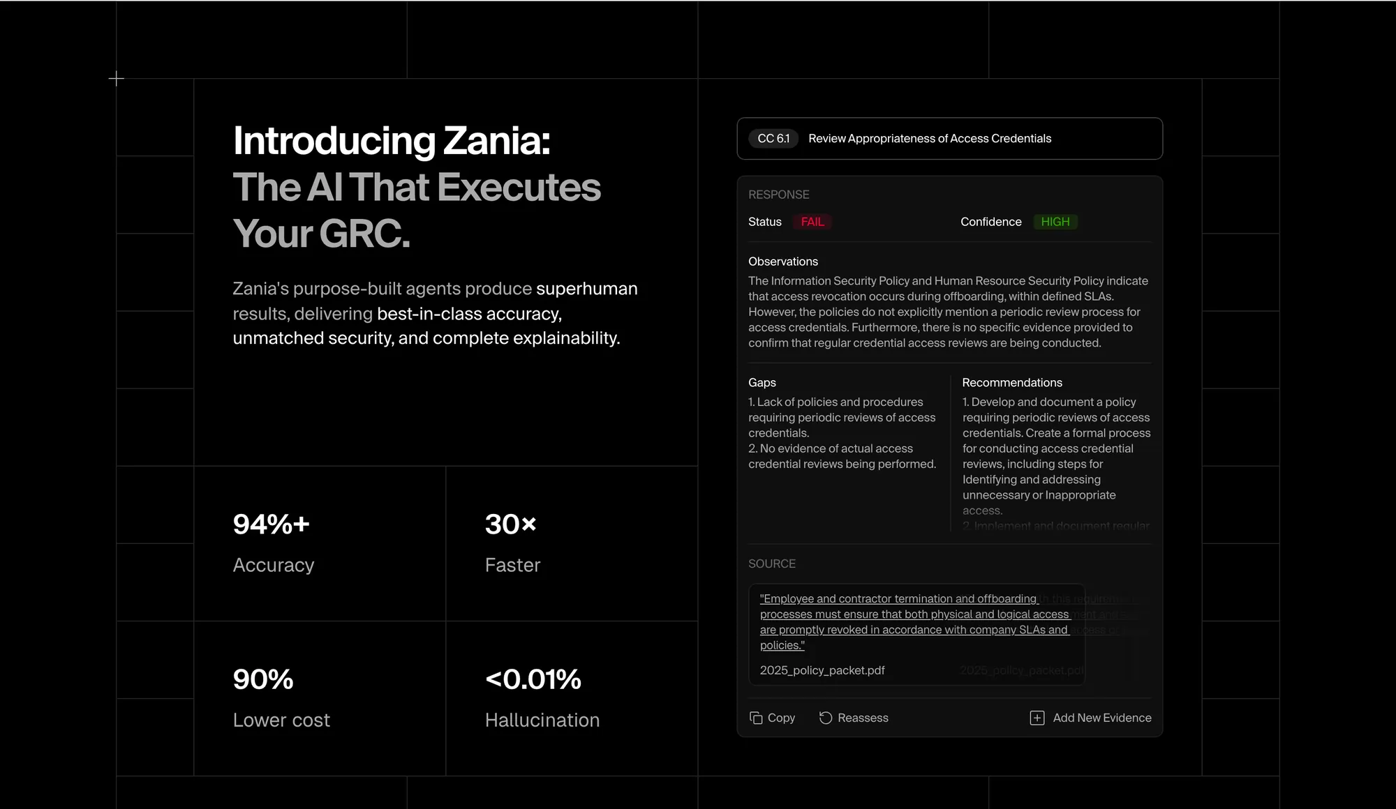
Zania. I designed and built the site in Framer end to end. The homepage shows a real piece of the product's output: an access-control test with a FAIL status, the observations, the gaps, recommendations and the policy quote it was based on. For an AI compliance product, a sample of the work does more than an adjective about accuracy. Pricing sits in the main navigation.
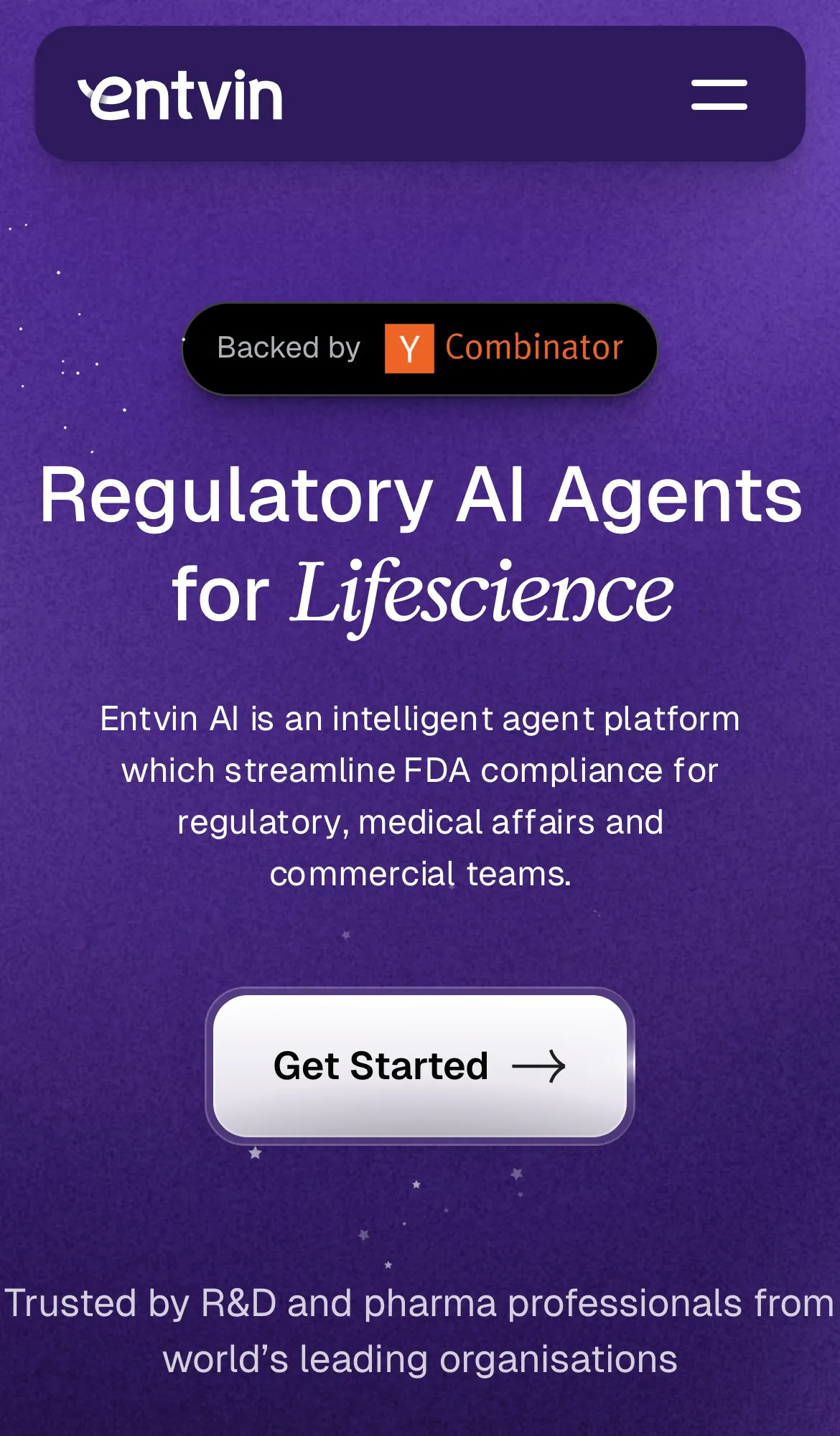
Entvin (YC S22). The work started with positioning and product storytelling, well before any visuals. When I designed it, the hero read "AI Agents for Faster Drug Development", naming the category and the industry, and each feature was named after a regulatory task a labeling team already does: reviewing promotional material against FDA rules, comparing competitor labels, tracking label versions. Today's headline, "Regulatory AI Agents for Lifescience", keeps the same idea.
A short list to check your own site against
| Decision | Seen on | Question to ask about your page |
|---|---|---|
| Category in the h1 | Resend, Granola | Would my headline make sense typed into Google? |
| Objection answered early | Granola, CodeAnt | What's the one worry that stops a signup, and is it answered above the fold? |
| Stack or integrations visible | Clerk, Resend | Can a buyer see it fits their tools without asking? |
| Switching made easy | Attio, Ramp, Linear | Is there a page for people leaving a competitor? |
| One lead button | PostHog, CodeAnt | Which buyer comes first, and does the page say so? |
| Show the output | Zania | Could I show a real result instead of describing it? |
The section order behind pages like these is in my SaaS landing page structure guide. If you'd rather have the site designed and built in Framer, that's my Framer website work.
Questions people ask
What makes a good SaaS website?
A headline that names the category, one clear first action, proof near the top, and an answer to the main objection. Visual polish matters less than those four decisions.
Should a SaaS homepage show pricing?
Link to it from the navigation at least. Zania, Linear, Attio and PostHog all do. Hiding pricing makes sense only when every deal is custom.
Should I copy Linear's website?
Copy the decisions and leave the look. Linear's dark, animated style works because its buyers already know the category. An early product usually needs a plainer page that explains what it is.
Were these sites built in Framer?
CodeAnt and Zania are Framer sites I designed and built. Most of the others in this list are built with Next.js, and Clay uses Webflow.
Working on this?
Tell me what you're building and where it's stuck: book a 30-minute call, email work@utkarshdesign.com or send a brief.