UX writing and microcopy for SaaS
Guide · 7 min read · By Utkarsh Dhairya Panwar · Updated
UX writing is the words inside a product: buttons, labels, rules, empty states, errors and setup steps. In SaaS it gets people to the next action without asking for help. Name the action on every button, and put rules before the decision they affect.
What UX writing is, and isn't
UX writing, or microcopy, is the text people read while using a product rather than reading about it: a button label, the line under an empty table, the sentence explaining why a step needs admin access. It's the shortest writing a company produces and often the most read.
| UX writing | Technical writing | Marketing copy | |
|---|---|---|---|
| Read when | In the middle of a task | When stuck or setting something up deeply | Before signing up |
| Length | A few words to two sentences | Pages | Headlines and short sections |
| Job | Get to the next action | Explain everything accurately | Make the case to try it |
| Fails when | Someone needs support to continue | It's incomplete or out of date | It promises what the product doesn't do |
I'm a product designer rather than a dedicated UX writer. At early-stage startups the words usually come from whoever designs the screen, so I treat copy as part of the layout instead of placeholder text to fix later.
Put the rule where the decision is
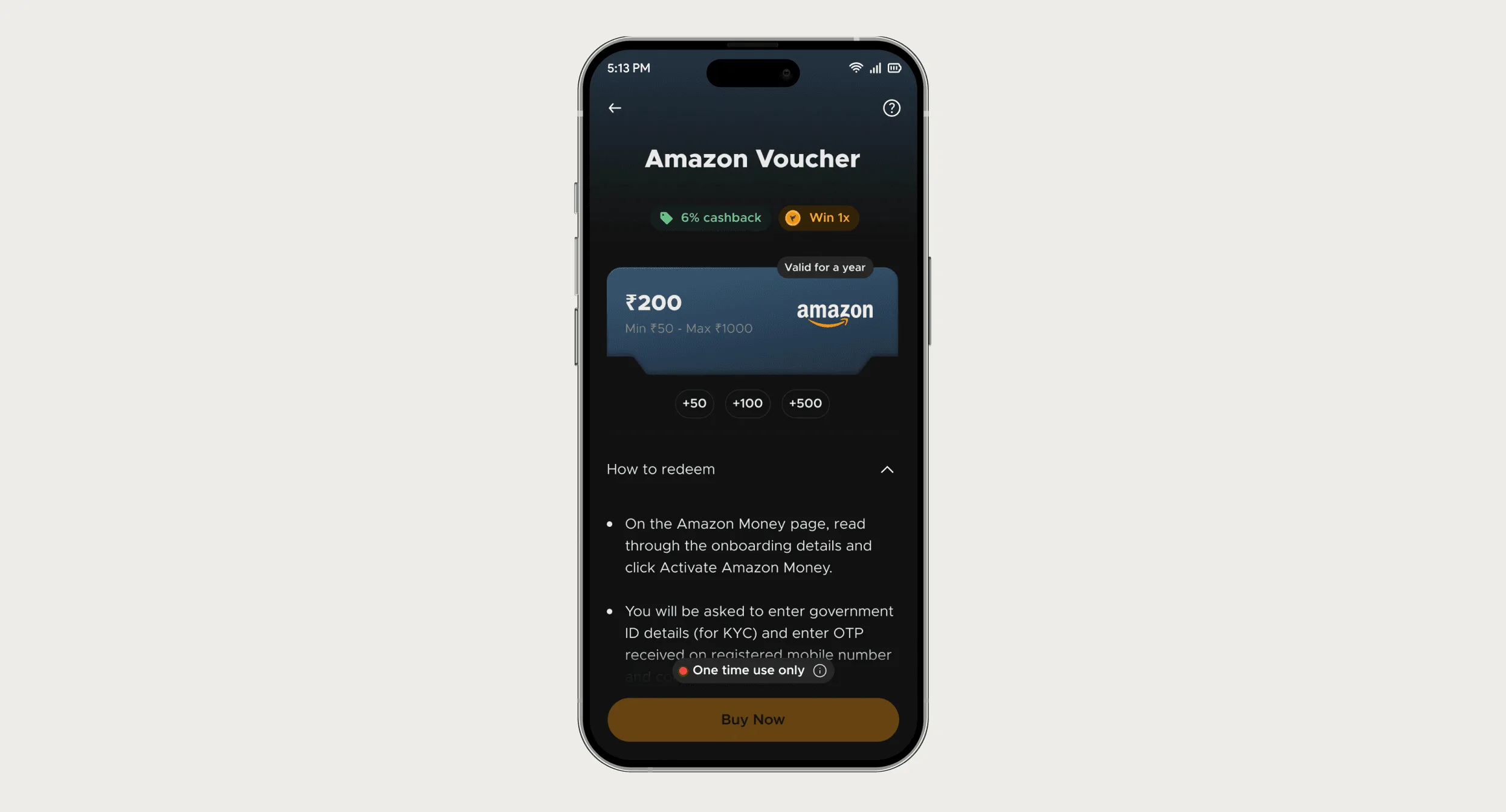
My clearest example is from FamPay. A "One time use only" pill just above Buy Now, repeated at redemption, cut voucher support tickets by 80%. The whole story is in my guide to reducing support tickets with UX.
The writing lesson: a rule belongs at the decision it changes, in the fewest words that still carry the consequence. "Terms apply" carries nothing. "One time use only" was enough because the amount chips beside it made the consequence obvious. If your rule needs a paragraph, the screen around it probably needs to change too.
Before and after: lines from SaaS products
| Where | Before | After |
|---|---|---|
| Primary button | "Submit" | "Connect repository" |
| Empty table | "No data" | "No pull requests reviewed yet. Open one in a connected repo and the review appears here." |
| Plan limit | "Limit reached." | "You've used 5 of 5 seats. Remove someone or add seats to invite Priya." |
| Destructive action | "Are you sure?" [OK] | "Delete 3 API keys? Apps using them stop working immediately." [Delete keys] |
| Trial ending | "Your trial is expiring soon." | "4 days left. Your team has reviewed 37 pull requests so far." |
| Success | "Success" | "Repository connected. Your next pull request will be reviewed." |
| Loading a slow job | "Loading…" | "Scanning 1,200 files. This usually takes about a minute; you can leave this page." |
| Settings toggle | "Enable notifications" | "Email me when a review finds a security issue" |
| Invite sent | "Invitation sent." | "We emailed Sam. You'll see them here once they join." |
I wrote these lines for this page; they aren't copied from a live product. Each "after" names the action or says what happens next, and most weak microcopy does neither. Error messages have their own structure, covered in my error message guide.
Setup copy: the words between signup and first value
In a B2B product, copy works hardest during setup, when people do something unfamiliar for the first time. At CodeAnt AI, part of the admin-wall fix was words: on one screen, the request had to tell an admin who had never heard of CodeAnt why a teammate was asking. Self-hosted setup moved from a long reference page to step-by-step screens, each with one instruction and a step count.
- Show the step count ("Step 2 of 3"). It answers "how much longer?" before anyone asks.
- Say why a permission is needed in the same sentence that asks for it.
- When a step needs someone else, write the message they'll receive as well as the button that sends it.
- Describe the finish line concretely: "your first pull request gets a review" beats "you're all set".
- Cut every word about your company from setup. People want their own result there.
A one-page style guide for a small team
- Buttons start with a verb and name the object: "Invite teammate", not "Continue".
- Use the words your users already use. For developers that means repo, org and pull request, spelled the way GitHub spells them.
- Pick one word per concept and keep it. If it's a "workspace" in settings, it isn't a "project" on the dashboard.
- Sentence case everywhere. It reads faster and ends arguments about which words get capitals.
- Write numbers as digits ("3 repos"), because people scan for them.
- After any action that takes time, say what happens next.
- Put rules and limits before the decision, never only in the terms.
- Confirmation buttons repeat the action ("Delete keys"), never "OK" or "Yes".
- Read every new string aloud once. If it sounds like a form letter, rewrite it.
Keep the list in the design file next to the components, where people will see it. When copy is behind tickets or stalled setups, a UX audit usually finds a rule shown too late or a button that doesn't say what it does.
Questions people ask
What's the difference between UX writing and copywriting?
Copywriting persuades people to try a product, usually before they sign up. UX writing helps people use it once they're inside, one task at a time.
What's the difference between UX writing and microcopy?
Microcopy is the short text itself. UX writing is deciding what it says and where it goes. In practice people use the terms interchangeably.
Do SaaS startups need a dedicated UX writer?
Usually not early on. A designer who treats copy as part of the screen, plus a short style guide, covers most of it. A dedicated writer helps once the product and team get large.
Sources
- UI Copy: UX Guidelines for Command Names and Keyboard Shortcuts, Nielsen Norman Group
- Show Numbers as Numerals When Writing for Online Readers, Nielsen Norman Group
- The 3 I’s of Microcopy: Inform, Influence, and Interact, Nielsen Norman Group
Working on this?
Tell me what you're building and where it's stuck: book a 30-minute call, email work@utkarshdesign.com or send a brief.