Mobile app UI/UX design for startups
Service · Updated
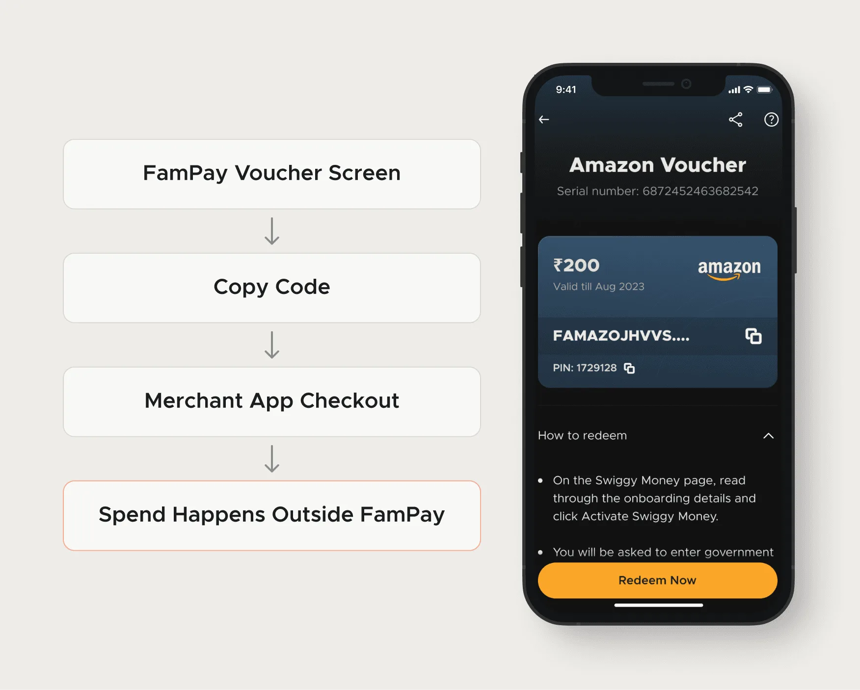
I design mobile apps for startups: flows, screens, error states and a tested prototype your engineers build from. My best work is on flows where a mistake costs money or trust. At FamPay, clearer voucher rules cut related support tickets by 80%. Your team or agency builds the native app.
Small screens, expensive mistakes
On a phone, people skim, tap fast and leave the app halfway through a task. Fine for a feed, and a problem when the task is a payment, a purchase that can't be undone, or a retry that might charge twice.
That's the mobile work I'm best at: apps where the user trusts you with money, data or time. The home screen is rarely the hard part; the moment something goes differently than expected is. So I start every app project by listing those moments and designing the calm path around them.
What it looked like at FamPay
FamPay (YC S19) is a payments app for teenagers in India. Its Cashback Store sold one-time-use vouchers: spend ₹400 of a ₹1,000 voucher and the rest was gone. Users found that out after the fact, and then they wrote to support.
I explored a tutorial and a real-time alert and rejected both. What shipped was smaller: a 'One time use only' pill right above the Buy Now button, a confirmation sheet before payment, and the same pill again on the voucher at redemption. The screens below are the shipped version.
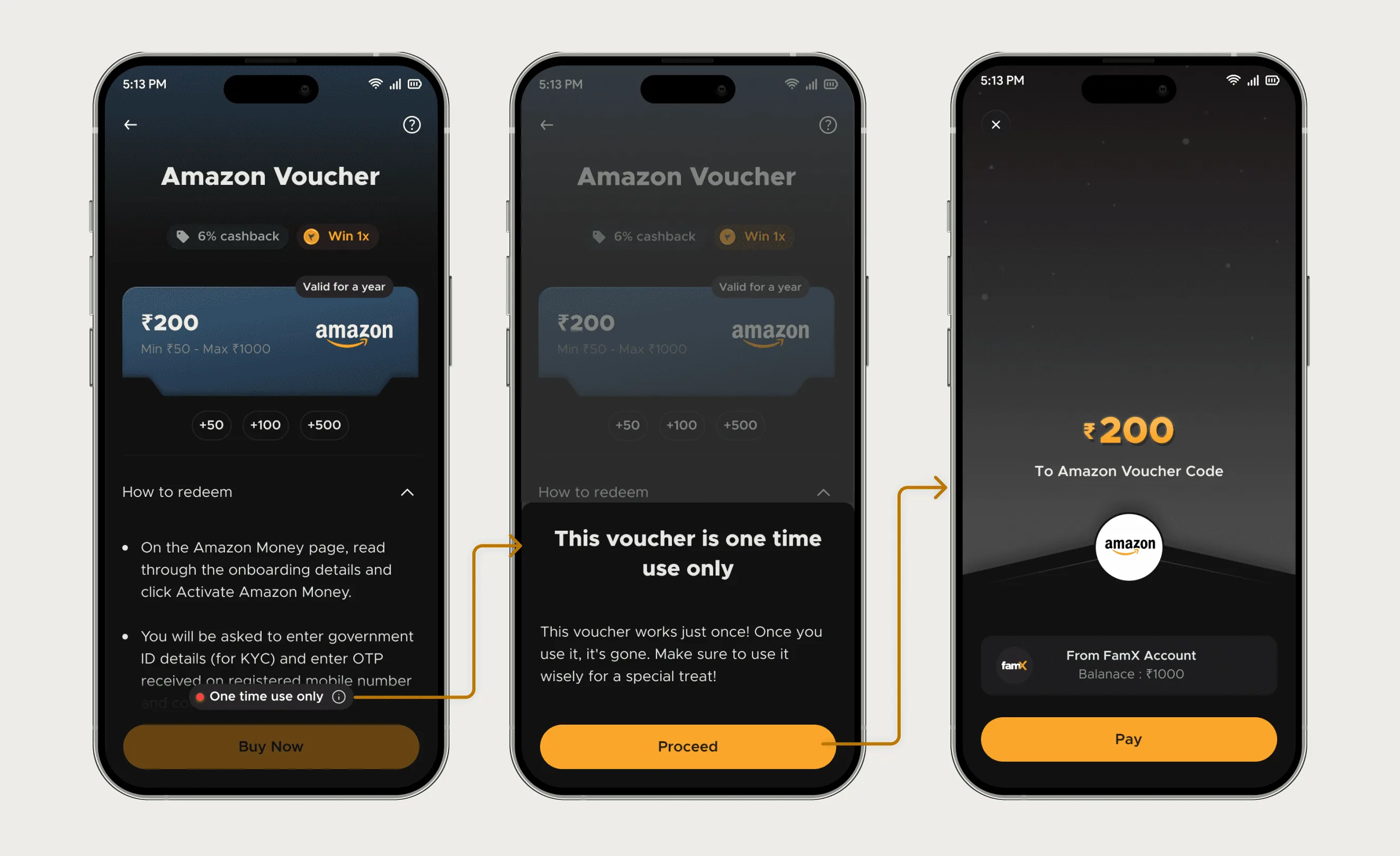
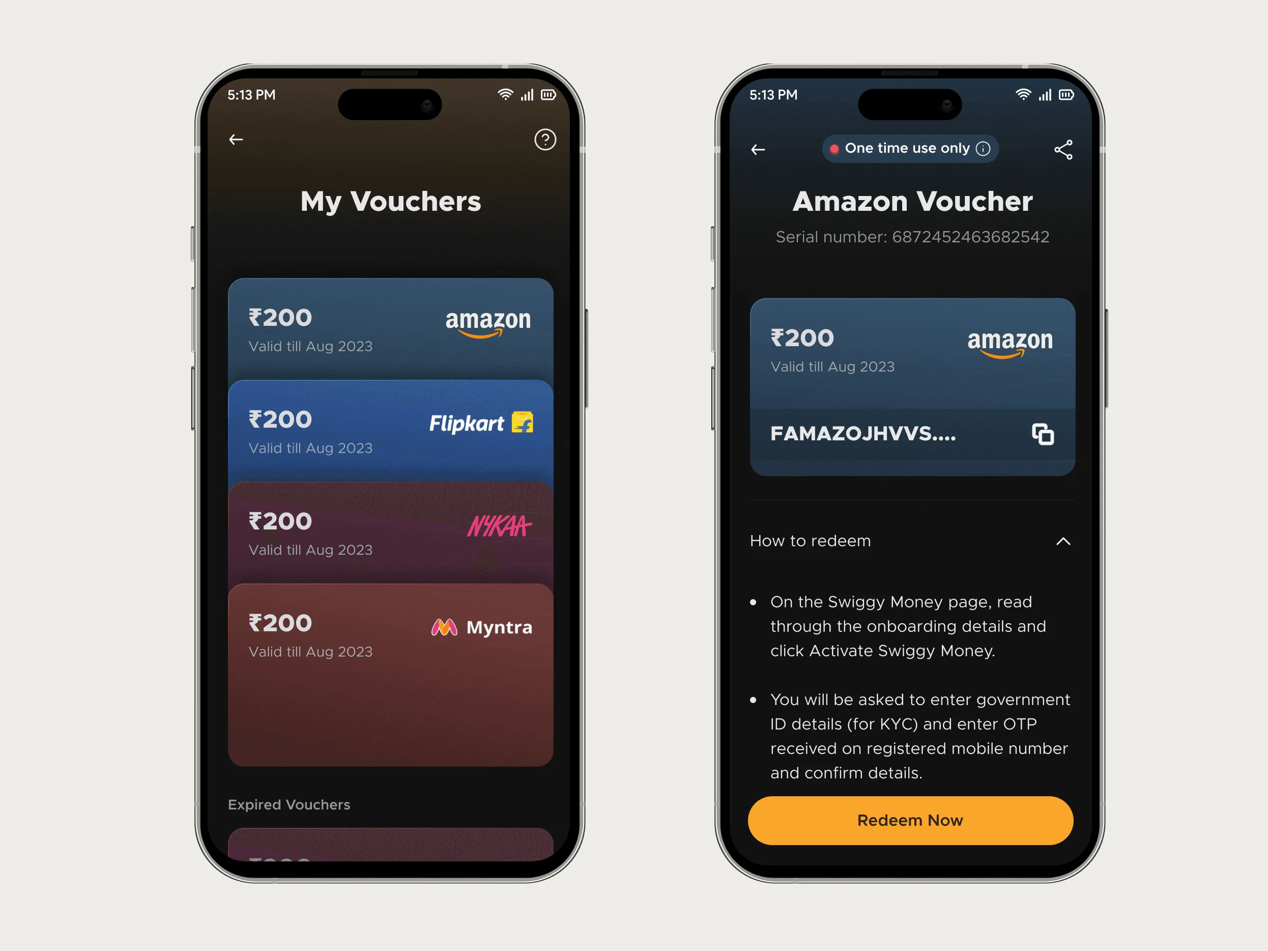
On the same app I redesigned the iOS payment error states for timeouts, bank declines and retries. Both stories, with the numbers, have their own write-ups.
Reducing support tickets with UX: The voucher rule in full: what users misread, what shipped, and what happened to tickets.
Payment failure UX: Timeouts, declines and retries on iOS, and how the error states were tested.
Utkarsh brought clarity and structure to our voucher flow. His work reduced confusion and made the experience feel more reliable.
Deliverables for a mobile app project
- Task flows for the core paths, including what happens when the network drops, a payment fails or the user backs out.
- High-fidelity screens in Figma for iOS and Android, following each platform's conventions where they differ (navigation, sheets, system permissions).
- Every state per screen: empty, loading, error, offline, success. If these are missing, engineers end up guessing.
- A small component library in Figma, so new screens after handoff still look like the app.
- A clickable prototype, tested with five to eight users on the riskiest flow before build.
- Handoff notes and a build review with your engineers once the first screens are coded.
How a project runs
- Week 1: flows and risk list: Map the core tasks and list the moments where users can lose money, data or progress. Agree what the first release must include.
- Weeks 2 to 4: screens and states: Wireframes for the flows, then high-fidelity screens with every state. Weekly reviews, async in between.
- Week 5: test: A prototype session with real users on the riskiest flow, then fixes.
- Week 6: handoff: Final files, components and notes, then a review of the first built screens with your engineers.
Six weeks is typical for a first version of a focused app. A redesign of one flow in an existing app can take two or three.
What I don't do
I don't write Swift or Kotlin. You need an engineer or a development partner to build the app, and I work alongside them. I'm also not the right pick for games, or apps whose main job is heavy illustration or 3D. And if you don't know yet who the app is for, start with interviews before screens.
Send the app (or the idea) and the flow that worries you most to work@utkarshdesign.com.
Questions people ask
Do you design for both iOS and Android?
Yes. Most flows share one design, and I adapt the parts where the platforms behave differently, like navigation patterns, bottom sheets and permission prompts.
Can you build the app too?
No. I design and prototype it, then work with your engineers or agency during the build. For websites I do build, in Framer.
How long does mobile app design take?
About six weeks for the first version of a focused app, two to three weeks to redesign a single flow in an existing one.
Can you redesign an app built with AI tools like Lovable or Bolt?
Yes. I fix the design and UX of apps founders built with AI tools, working in those same tools, so the changes don't need a rebuild.
Do you test the designs with users?
Yes, with a clickable prototype of the riskiest flow, usually five to eight people, before anything is built.
Sources
- Human Interface Guidelines, Apple Developer
- Material Design 3, Google
- Why You Only Need to Test with 5 Users, Nielsen Norman Group
Start a project
Tell me what you're building and where it's stuck: book a 30-minute call, email work@utkarshdesign.com or send a brief.