Developer tools UX lessons from CodeAnt
Guide · 7 min read · By Utkarsh Dhairya Panwar · Updated
Good developer tools UX starts from the org. The developer who finds your tool often can't install it, so design the hand-off to whoever can. Then guide first setup step by step, keep docs for reference, show a map instead of a tour, and use the words developers already use.
Where this comes from
Since June 2024 I've been the founding designer at CodeAnt AI (YC W24), a code health platform for engineering teams. I own the UX for AI code reviews, developer insights, code quality and security scans, which 40,000+ developers use every week across 800+ companies.
Developers are demanding in a particular way. They'll put up with an ugly screen if it's fast and correct, and they won't put up with a pretty one that hides what it's doing or wastes their time. Most of what follows comes back to that.
1. Design for the org chart
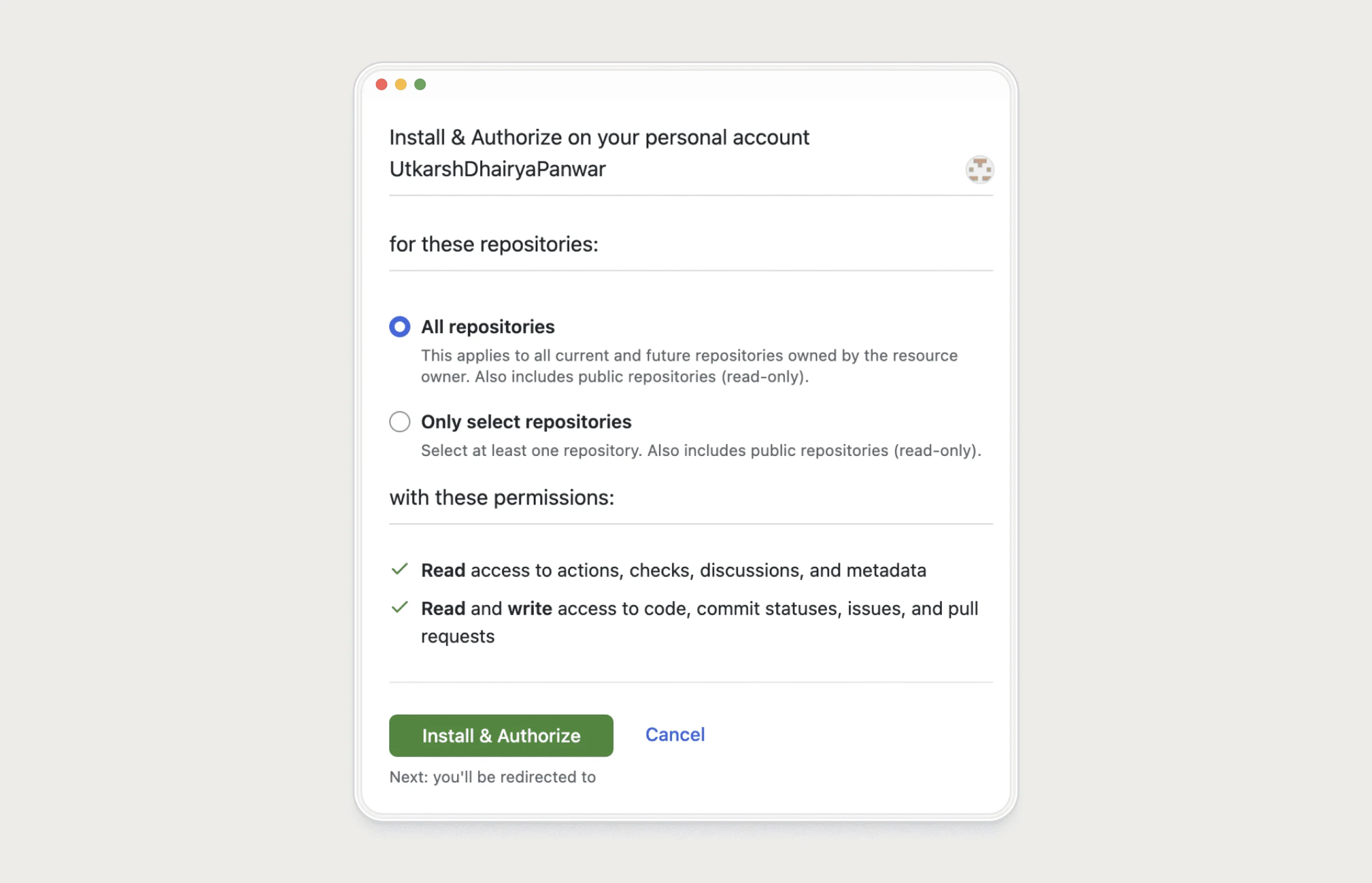
Consumer onboarding assumes the same person decides, signs up and does the setup, which is almost never true for developer tools. At CodeAnt, connecting a repository meant installing the GitHub app on the company org, which needs admin rights. The developer who found CodeAnt usually didn't have them, and the install fell back to their personal account without saying so.

So at CodeAnt we stopped treating that developer as the end of onboarding. At the permissions step they can now email the admin or share an invite link into team chat (the full before and after is in how CodeAnt doubled trial-to-paid).
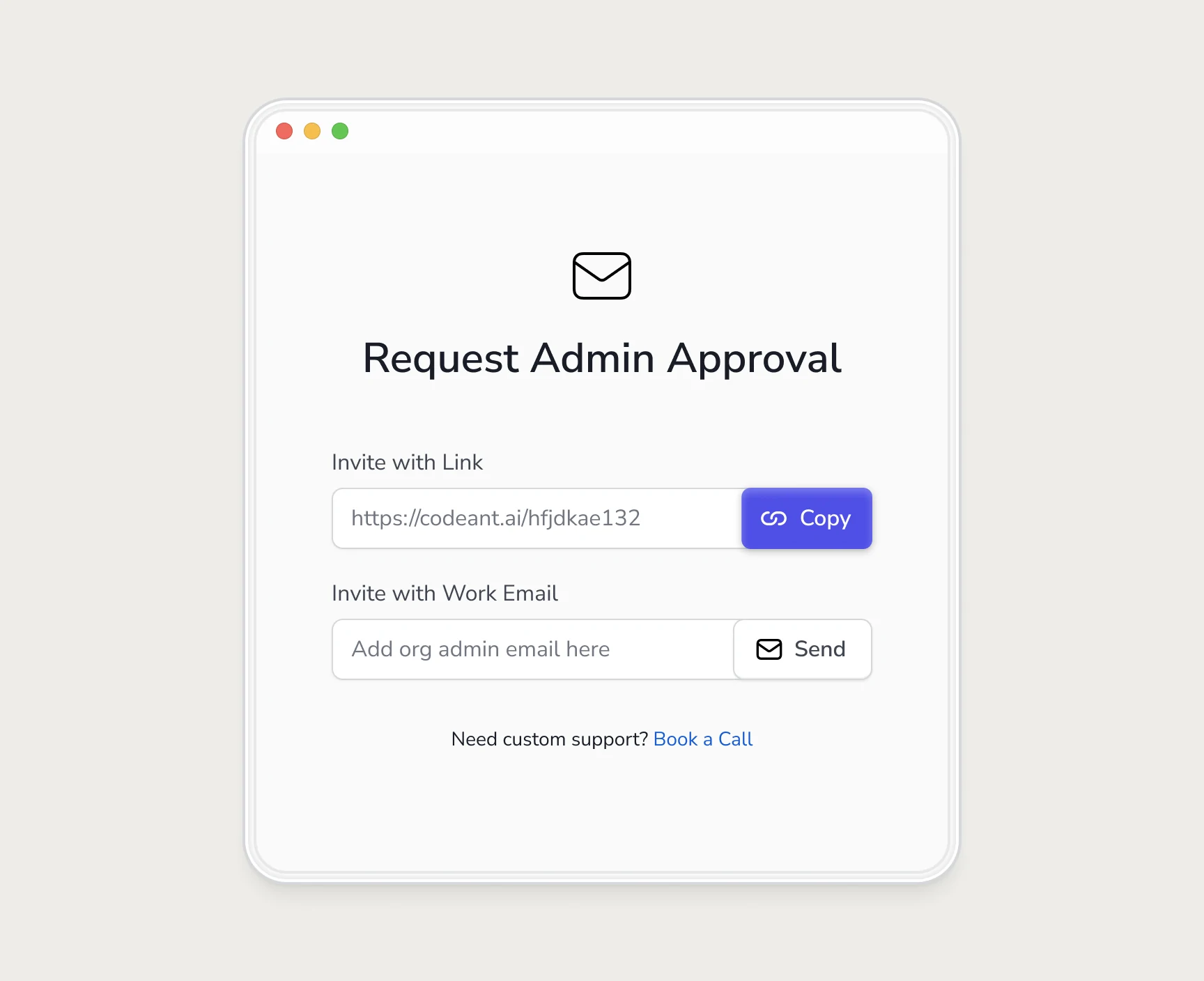
Before designing any devtool onboarding, I now list every permission the setup needs and who in a typical team holds each one. Any step the signer-up can't do alone needs a designed hand-off.
2. Docs for reference, guided flows for first setup
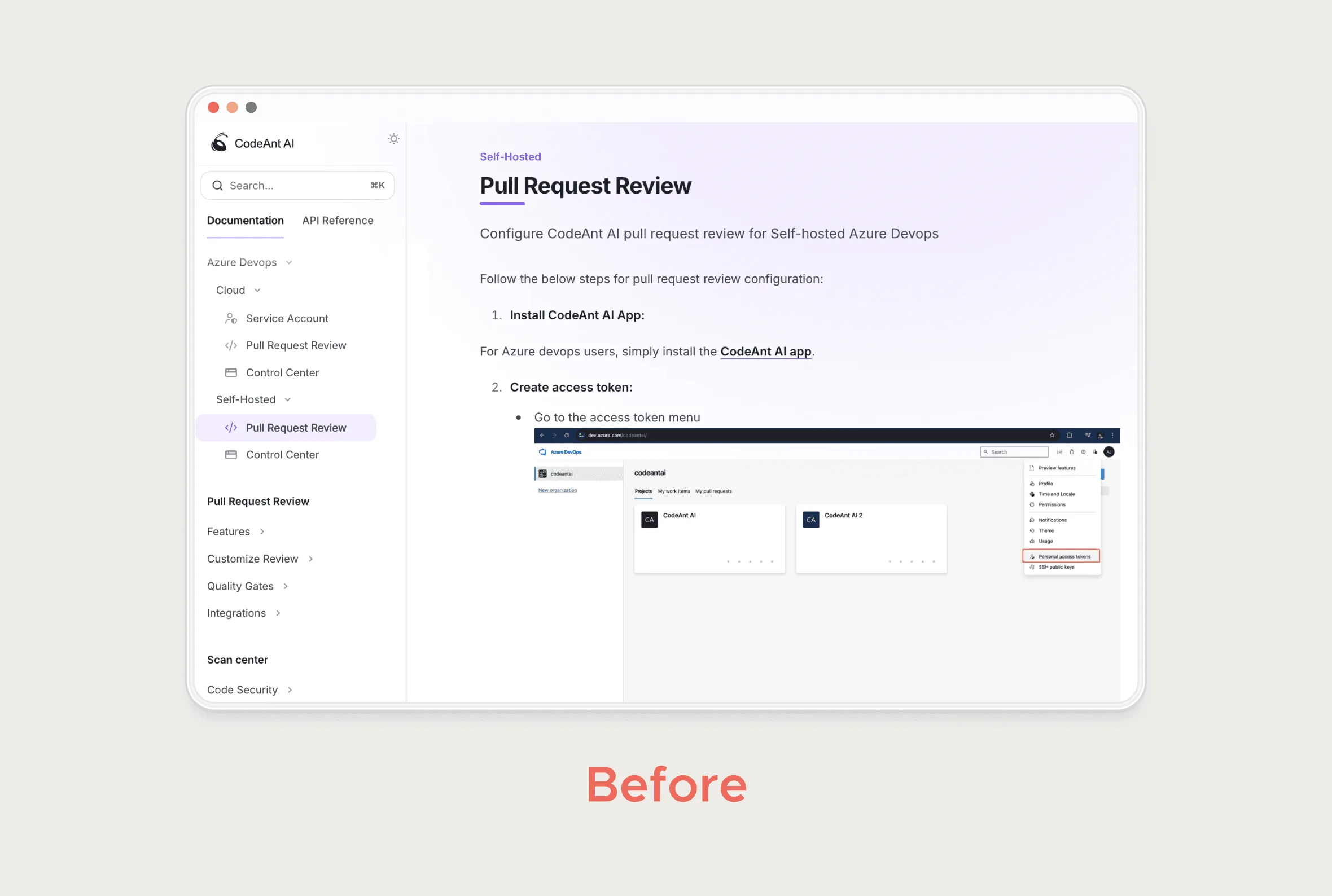
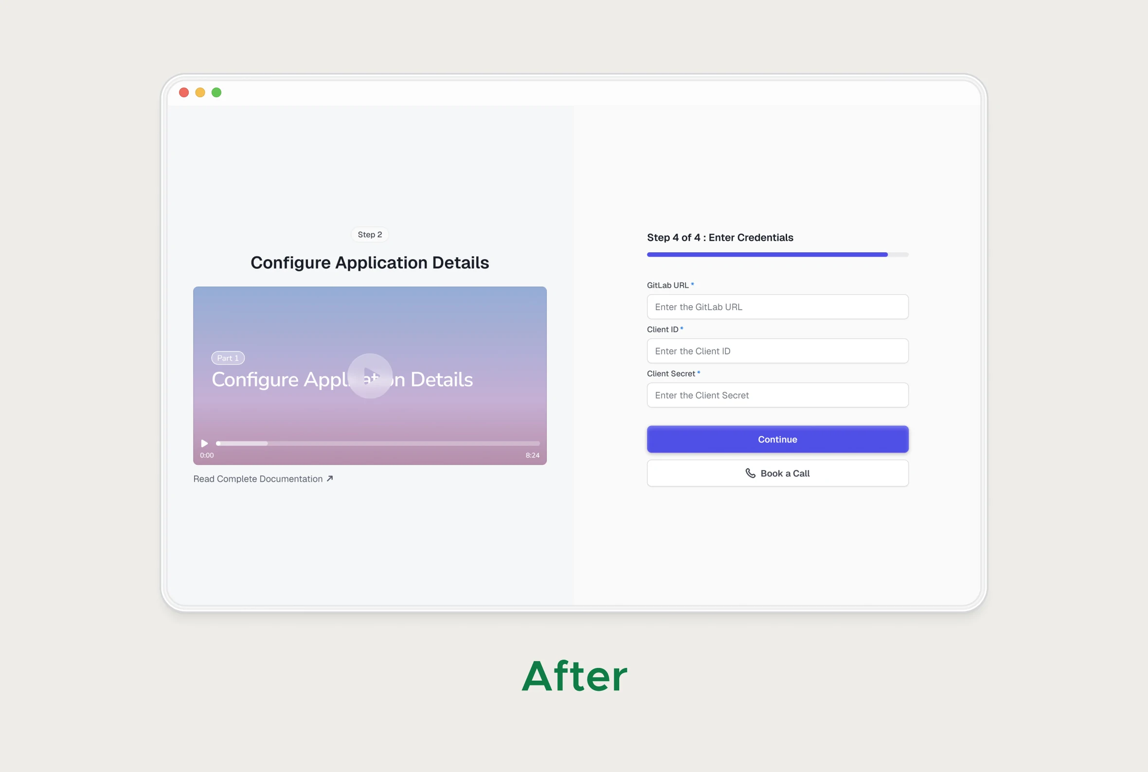
Developers do read docs, and good docs are part of the product. But a setup doc written for every environment leaves each reader to filter out what doesn't apply. For self-hosted teams, CodeAnt's setup lived in that kind of document.
I rebuilt it as step-by-step flows, one per platform, each with its own short video. Readers see only their own steps and can check what each one should look like. The docs stayed, for edge cases and for anyone who prefers them.
| Use a guided flow when | Use docs when |
|---|---|
| It's a one-time setup most users go through | It's reference material people return to |
| The steps differ by platform or environment | The reader is debugging an unusual setup |
| Getting a step wrong silently breaks later steps | The reader needs every option beyond the common path |
3. Show a map, skip the tour
Developers close product tours. They'd rather see what exists and go straight to the part they came for. CodeAnt's Get Started screen lists each product line with a direct link into its setup, so there's no sequence to follow and nothing to dismiss.
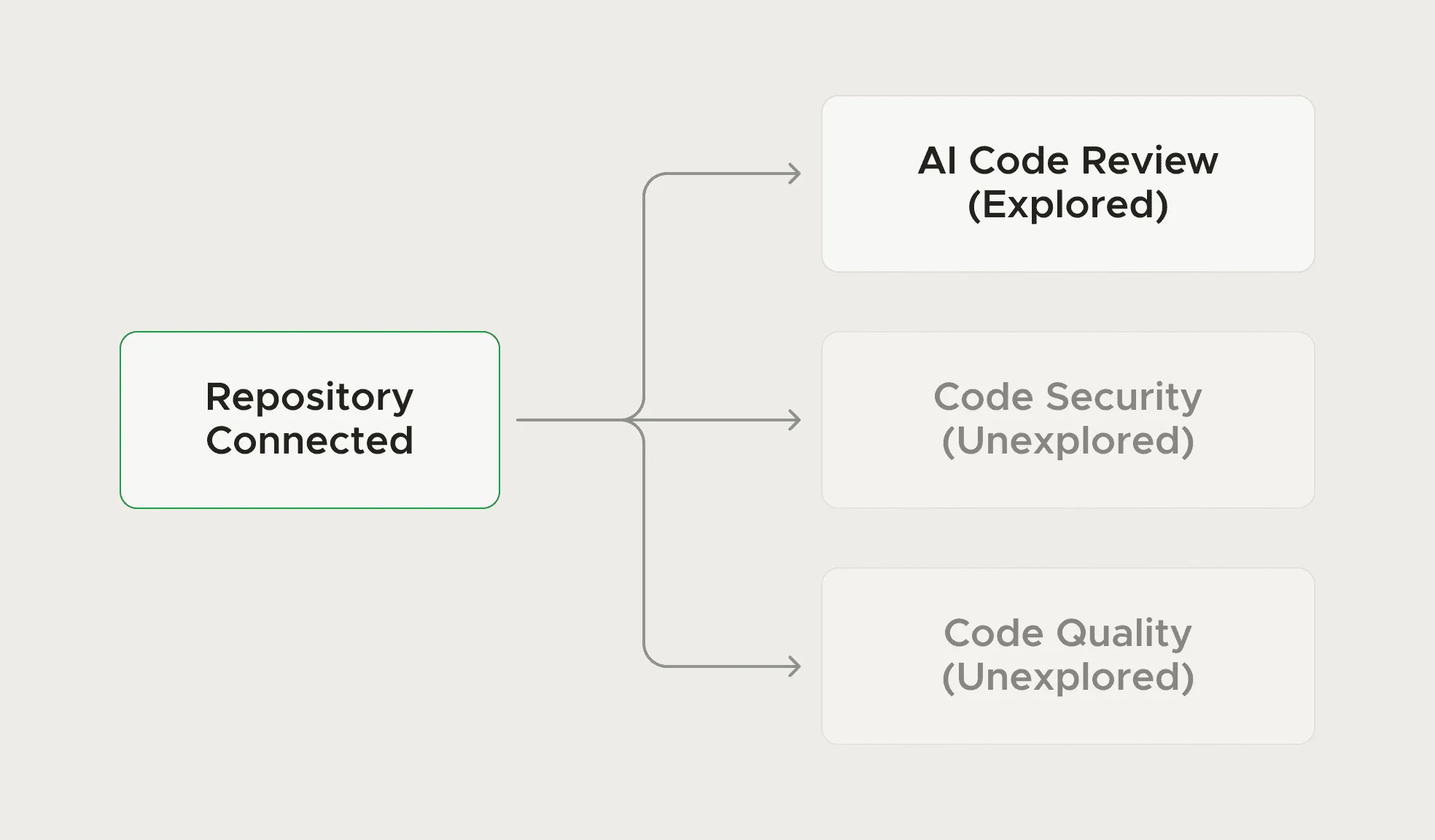
After that, prompts should respond to behaviour. CodeAnt's emails and in-product nudges were triggered by what each user had and hadn't set up, so a developer only heard about the parts they hadn't touched.
4. Use their words, and define success in their units
Repo, org, pull request, quality gate, secret leak. Developers already have exact meanings for these words. Rename them to sound friendlier and the product gets harder to trust. If GitHub calls it an organisation, so should you.
Success should be measured in their terms too. CodeAnt's onboarding tests made the first reviewed pull request the clear success point. A developer reads "my PR got reviewed" as proof the tool works, which a progress bar can't give them.
5. Density for developers, a different view for managers
Developers and engineering managers both cope with a lot on one screen, but they want different things from it. A developer wants the issues in their own repo. A manager wants to know where across the org to act first. CodeAnt's manager dashboards put code analysis and secret leaks in one view, and org-level triage time dropped 35%. A devtool also has many surfaces (scan centre, code review, security flows, metrics), so a table, a severity label or a filter should behave the same on every one of them. That's why I pulled CodeAnt's repeated patterns into one system.
6. Trust comes from showing your work
A code health tool reads private code and posts opinions about it, so it gets very little benefit of the doubt. In practice that means being explicit about what access is requested and why, pointing every finding at the exact place in the code it refers to, and making it easy to disagree with a result.
The last point matters even more with AI features. I've written about those separately in designing AI features users trust.
CodeAnt AI case study: Onboarding, the admin wall, self-hosted setup and the Get Started screen, with the before and after flows.
If you're building a developer tool and want this kind of thinking on your product, see my AI and developer tools design service.
Questions people ask
What makes developer tools UX different from other SaaS?
The person who discovers the tool often can't install it, so onboarding has to involve several people. Developers also expect exact terminology, high information density and fast paths over guided hand-holding.
Should a developer tool have a product tour?
Usually not. At CodeAnt we used a Get Started screen with direct links into each product line instead, and kept follow-up prompts tied to what each user had or hadn't done.
Are docs enough for onboarding developers?
Docs work well as reference. For one-time setup that differs by platform, a guided step-by-step flow with platform-specific help gets more people through, and the docs can stay for edge cases.
Sources
- Installing a GitHub App from a third party, GitHub Docs
- Onboarding Tutorials vs. Contextual Help, Nielsen Norman Group
Working on this?
Tell me what you're building and where it's stuck: book a 30-minute call, email work@utkarshdesign.com or send a brief.