How to get a logo for your startup
Guide · 6 min read · By Utkarsh Dhairya Panwar · Updated
Most B2B startups should start with a wordmark: the company name set well, in light, dark and one-colour versions. Get it from a designer who tests it at favicon size and inside your product, and hands over usage rules and a full file set. A symbol can come later.
Four ways to get a startup logo
| Route | Good for | Watch out for |
|---|---|---|
| Make it yourself or use an AI generator | A placeholder while you validate the idea | Generic marks, and no rights clarity on generated output |
| Contest or marketplace | Lots of options quickly | Many concepts, little thinking; usually no rules or file set |
| Freelance designer | A considered mark with usage rules, often as part of a small identity | Check they show past logos in use, not only on artboards |
| Branding agency | Naming, strategy and a large identity programme | Overkill before your positioning settles |
A free logo is fine for the first months if you treat it as a placeholder. Keep it simple so it's easy to replace, and don't print a thousand hoodies with it.
Wordmark, symbol, or both
A wordmark is the name set in type. A symbol is a mark that stands without the name. A lockup puts the two together. A new B2B company needs people to remember its name and type it into a search bar, so the wordmark carries most of the load. A symbol only means something after people have seen it next to the name many times.
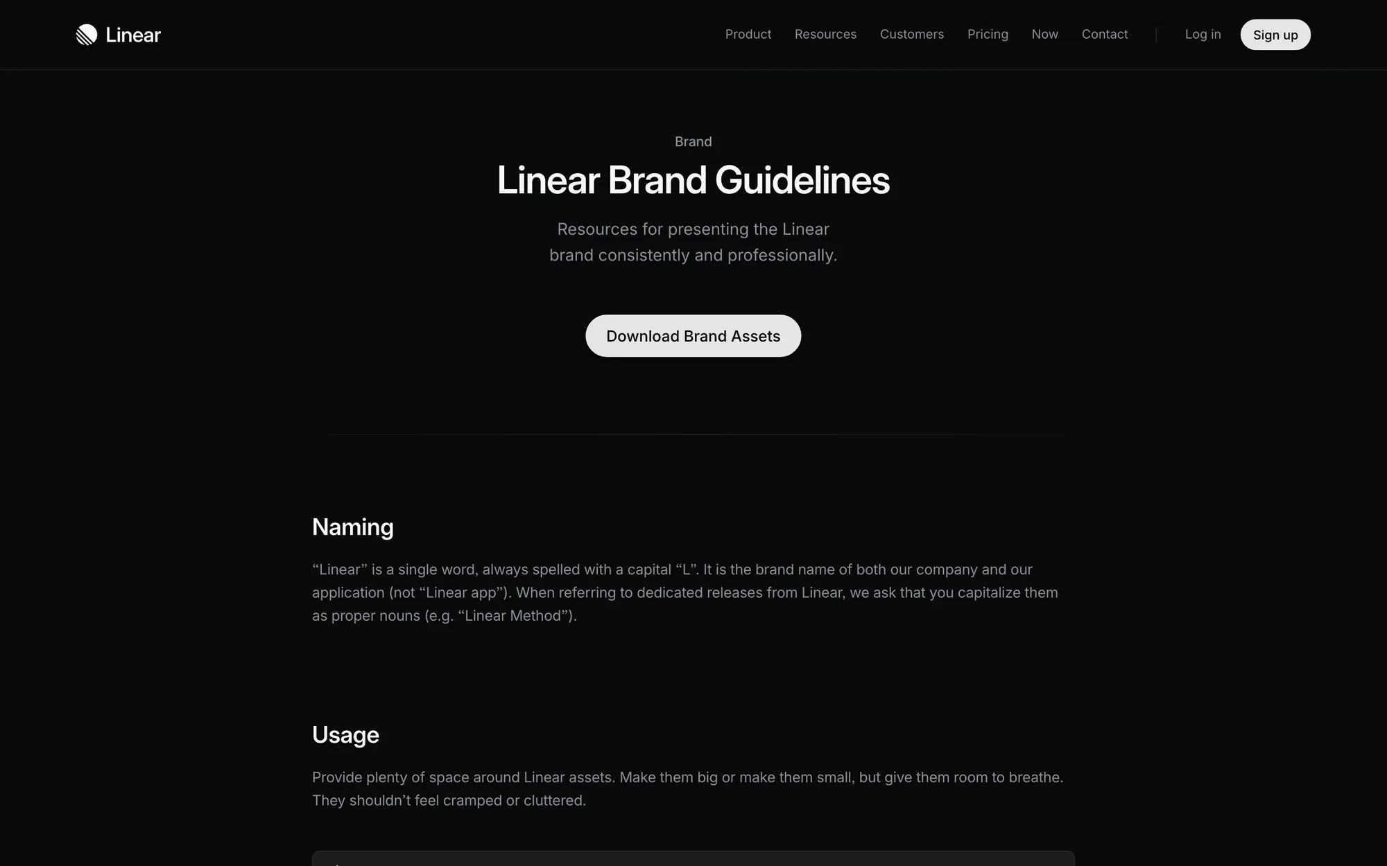
Linear's public brand page is a tidy example: the wordmark is the primary way to reference the company, a logomark is for tight layouts, and an icon is for social and chip-shaped spots.
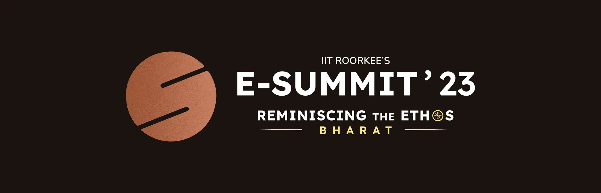
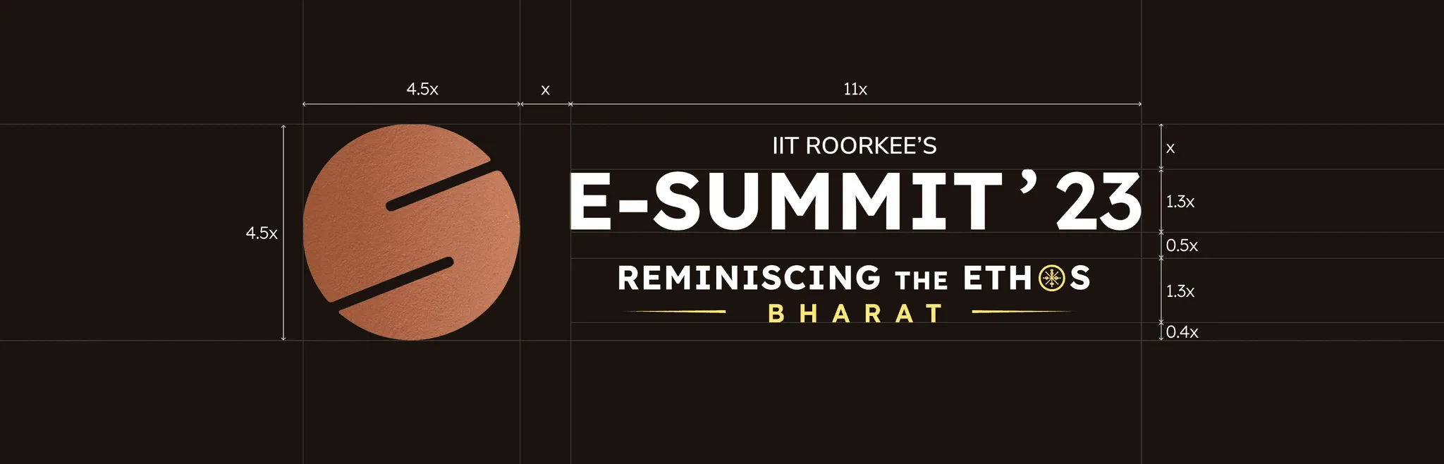
The E-Summit logo I worked with at IIT Roorkee (the lockup at the top of this page) goes the other way: a combined E and S mark that stays the same each year, with only the colour changing, locked up with the edition's theme. That works for an annual event people already know by name, which a new startup isn't yet.
- Pick a wordmark first if your name is short, unusual, or you sell to businesses who'll look you up.
- Add a symbol when you need a square: app icons, avatars, favicons, the GitHub app install screen.
- Avoid literal symbols, like a shield for security or a bracket for code, because every competitor already has one.
What to put in the logo brief
- Who you sell to: 'Engineering managers at 50-person software companies' produces a different logo from 'developers who try tools on weekends'.
- Where it will live first: Product UI, website, pitch deck, socials, swag. List them in order of how often people will see them.
- Three words, and three you want to avoid: 'Calm, exact, quick' is useful. So is 'not playful, not corporate, not crypto'.
- What you're keeping: The name, a colour already in the product, a mark people know. Say so up front.
- Logos you'll sit next to: Your competitors and the customer logo strip on your homepage. Your logo has to stand apart in that row.
Tests a startup logo has to pass
- Legible as a 16-pixel favicon in a browser tab full of other tabs.
- Works in one colour, white on dark and black on light.
- Holds up in a grey row of customer logos on someone else's website.
- Sits in your product's top bar without looking louder than the content.
- Survives print: on a hoodie, a lanyard, a standee seen from across a room.
- Still makes sense if your positioning changes next year.
The files you should get
- SVG master files for the wordmark, the symbol (if any) and the lockup.
- Light, dark and one-colour versions of each.
- PNGs at a few sizes, plus a favicon and an app or avatar icon.
- Clear-space and minimum-size rules, and two or three examples of misuse.
- The typeface name and licence, so your team can set matching text.
If a logo arrives as a single PNG, you'll pay someone later to rebuild it. Ask for the list above before the work starts.
A logo is the smallest part of the brand
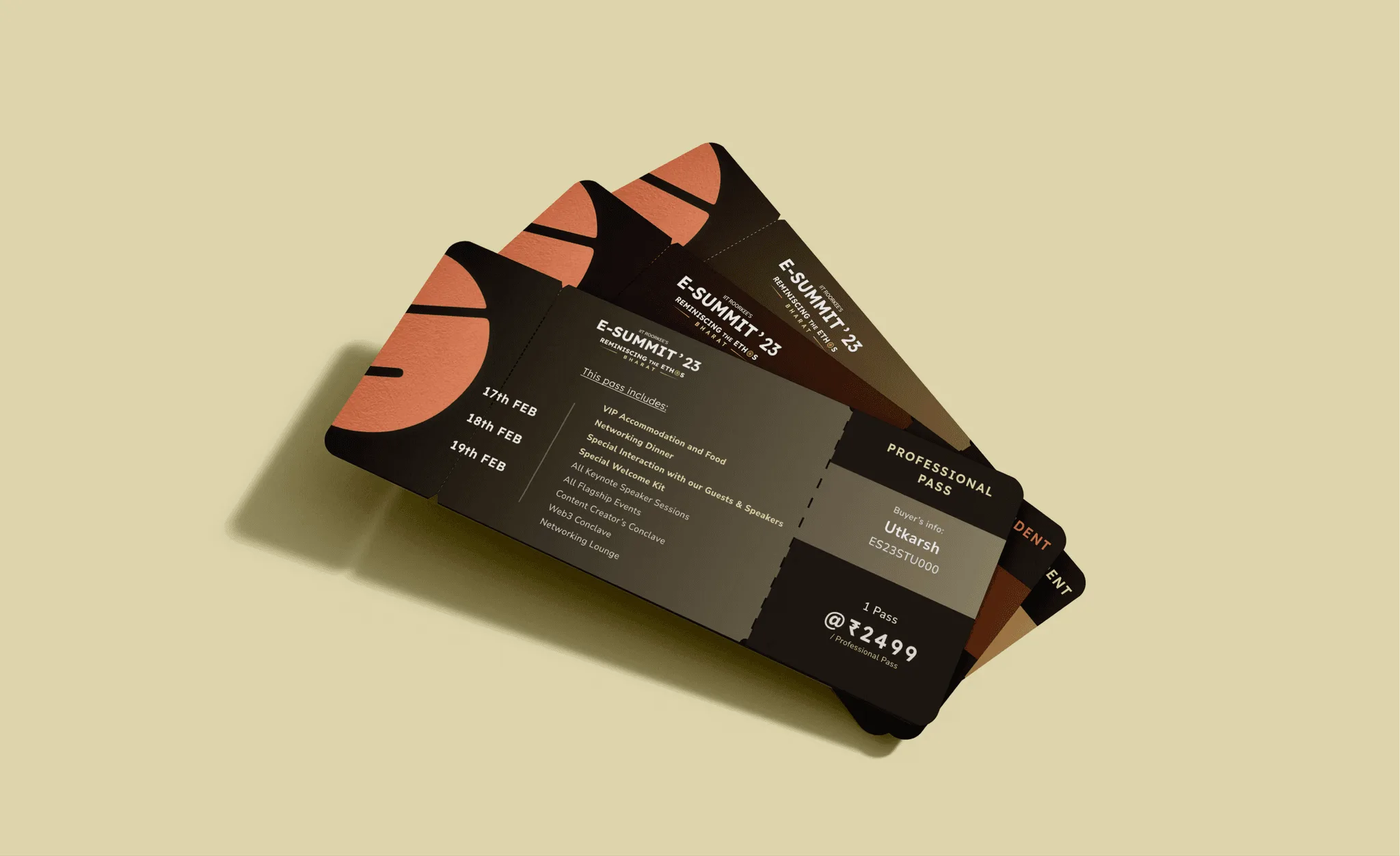
Logo work has mostly taught me how little a logo does alone. For E-Summit, most of the identity's strength came from the palette, the compass motif and the typography around the mark. At CodeAnt AI I built the identity together with the component library and guidelines, because people meet a SaaS brand in the product far more often than in the logo.
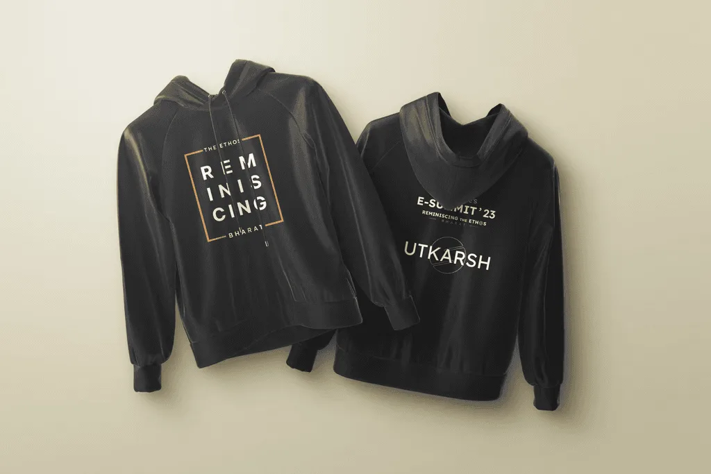
So when you brief a logo, brief a small kit around it too, with colours, a typeface and a few rules. That kit is where my own brand work starts, and my guide to brand identity for startups covers what goes in it.
Questions people ask
Can I use an AI logo generator for my startup?
As a placeholder, yes. For the long term, generated marks tend to look generic and rarely come with usage rules or a proper file set, so plan to replace it.
How much does a startup logo cost?
Public ranges vary widely by country and provider. My startup branding cost guide lists published ranges with their sources.
Do I need to trademark my startup logo?
Trademark questions are for a lawyer. A designer can help by avoiding marks that look like competitors', but cannot clear a name or logo legally.
Sources
- Brand Guidelines, Linear
- Copyright and Artificial Intelligence, U.S. Copyright Office
Working on this?
Tell me what you're building and where it's stuck: book a 30-minute call, email work@utkarshdesign.com or send a brief.