Brand identity for startups
Guide · 6 min read · By Utkarsh Dhairya Panwar · Updated
At seed stage a startup's brand identity needs four things: a wordmark that works small, a short colour palette with roles, one type family, and a few written voice rules. Illustration, motion and long guidelines can wait. For software, I build the brand for the product UI and website together.
What a startup brand identity is for
Early on, a brand has a few jobs. People should recognise you the second time they see you, and your website, product, deck and LinkedIn posts should look like one company. Most identities fail the last job: people who aren't designers, usually the founders, have to be able to make new things without breaking it.
A beautiful logo with no rules turns into five versions within a quarter, because someone needed a white one for a dark slide and made it themselves.
Building the brand in the same weeks as the product
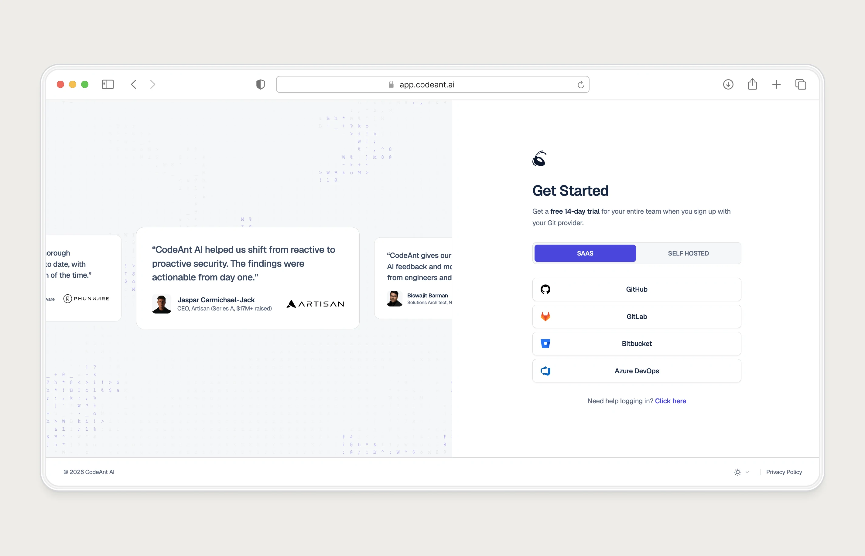
I joined CodeAnt AI as founding designer in June 2024 and built the visual identity, component library and design guidelines in parallel with the product, alongside the Framer website. Often in the same week I was on a dashboard, a landing page and an ad creative.
Working on them together changes what you end up designing. A colour chosen only for a homepage hero often fails as a button on a dense table. A brand typeface that looks great at 64px may be unreadable in a code review comment. When the identity is tested inside product screens from day one, those problems show up before anyone prints anything.
Working with Utkarsh is like compressing five years of design into a single month. His speed, taste, and craft consistently push our brand to new heights.
The brand identity design process I use
- Collect what exists: Every surface with your name on it: site, product, deck, socials, swag. List what repeats and what contradicts. Keep what already works; changing it costs recognition.
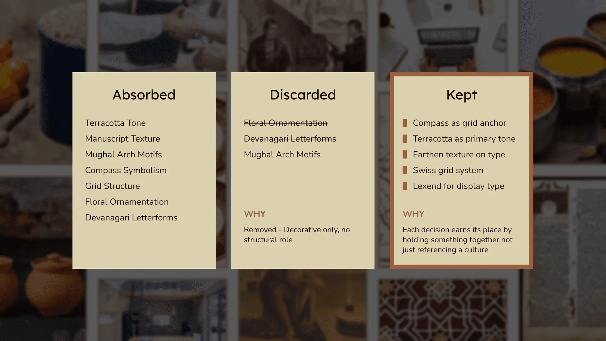
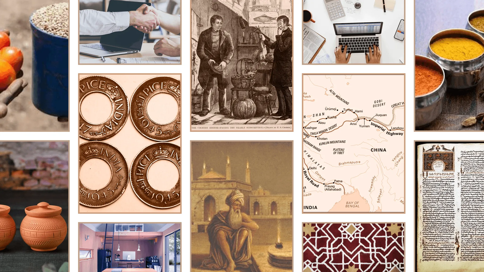
- Gather references, then sort them: For E-Summit 2023 at IIT Roorkee the theme was 'Reminiscing the Ethos: Bharat'. The moodboard had coins, spice bowls, clay pots, trade-route maps. I sorted it into three piles: absorbed, discarded, kept. Floral ornament, Devanagari letterforms and the Mughal arch were discarded as festival clichés. A compass grid and the Lexend typeface were kept.
- Show directions on real surfaces: Two or three directions, each applied to a product screen, the homepage and a social post. A logo on an empty artboard tells you almost nothing.
- Write the rules while you design: Clear space, colour roles, type sizes, what not to do. If a rule is hard to write, the element is probably too fiddly to survive.
- Hand it to non-designers and watch: Ask a founder to make a slide with the kit. Whatever they get wrong is a missing rule or a missing template.
What a seed-stage brand needs, and what can wait
| Element | Build now | Leave for later |
|---|---|---|
| Logo | A wordmark that reads at favicon size, plus a light and a dark version | A standalone symbol, animated logo |
| Colour | One brand colour, neutrals, and roles for success, warning and danger | Extended palettes for campaigns |
| Type | One family with clear weights for headings and body | A custom or licensed display face |
| Voice | Five or six written rules: words you use, words you don't | A full messaging framework |
| Imagery | Product screenshots, framed consistently | Illustration systems and mascots |
| Guidelines | One page, linked from your Figma file | A brand site |
| Product UI | Tokens for colour, type and spacing | A full component library, once screens repeat |
The items in the 'later' column still matter. They're just expensive to get right and easy to get wrong while you're still finding out who buys from you. (Why the wordmark comes before a symbol is covered in my guide to getting a startup logo.)
Startup branding for SaaS products: the UI is the brand
Most people meet a SaaS brand inside the product. Your users spend hours in the dashboard and seconds on the homepage, and that puts real constraints on the identity.
- The brand colour can't double as an error or warning colour, or every alert looks like marketing.
- Type has to work at 13px in tables, not only in hero headlines.
- Both light and dark themes need to feel like the same brand.
- The website's claims and the product's labels should use the same words. At CodeAnt I design both, so 'code review' means the same thing on the homepage and in the app.
When to refresh and when to rebrand
A refresh keeps your name and the core of your logo, and fixes everything around it: palette, type, how the product uses them. Choose it when people already recognise you and the problem is inconsistency or an identity that looks dated.
A rebrand replaces the core. It's worth it when you've changed category or customer: you started selling to developers and now sell to security leaders, or the old name is tied to a product you've stopped making. If you can't say in one sentence what changed about the business, you probably need a refresh.
E-Summit, IIT Roorkee: A full identity built from a small set of elements and used by a team of 5 designers across posters, passes, the stage and the website.
If you want the brand and the product UI built together, that's how my brand and design systems work runs.
Questions people ask
How long does a startup brand identity take?
A seed-stage kit takes weeks, not months. The bigger time cost is applying it to every surface, which is why I design the product UI and the identity together.
How much does a startup brand identity cost?
Public ranges run from a few hundred pounds for a freelance logo to five figures for an agency identity; my startup branding cost guide lists them with sources. My own brand identity work starts from $2,000, with starting prices on the pricing page.
Can you build a brand identity for a startup outside India?
Yes. I work remotely from India with teams in America, the UK, the EU, the Middle East and APAC, and run reviews async when time zones don't overlap.
Working on this?
Tell me what you're building and where it's stuck: book a 30-minute call, email work@utkarshdesign.com or send a brief.