Startup brand identity examples
Guide · 7 min read · By Utkarsh Dhairya Panwar · Updated
The startup brands worth studying each get one thing right: Linear restrains colour almost to nothing, PostHog specs its mascot down to the eyebrows, Supabase forbids recolouring its wordmark, and Vercel treats its grid as brand. My CodeAnt AI and E-Summit work does the same with a few strong elements.
How I chose and checked these
I picked software startups whose brands show up in a product, on a website and on merch, because that's the hard case. For each one I read its public brand or design-system page in October 2026 and noted only what the page says, without guessing at process or results. For my own two, I can also say why decisions were made.
Linear: almost no colour, lots of space
Linear's brand page offers three assets: a wordmark as the primary way to reference the company, a logomark for tight layouts and logo grids, and an icon for social and chip-shaped placements. The named colours are two near-neutrals, Mercury White (#F4F5F8) and Nordic Gray (#222326), with a desaturated blue for backgrounds.
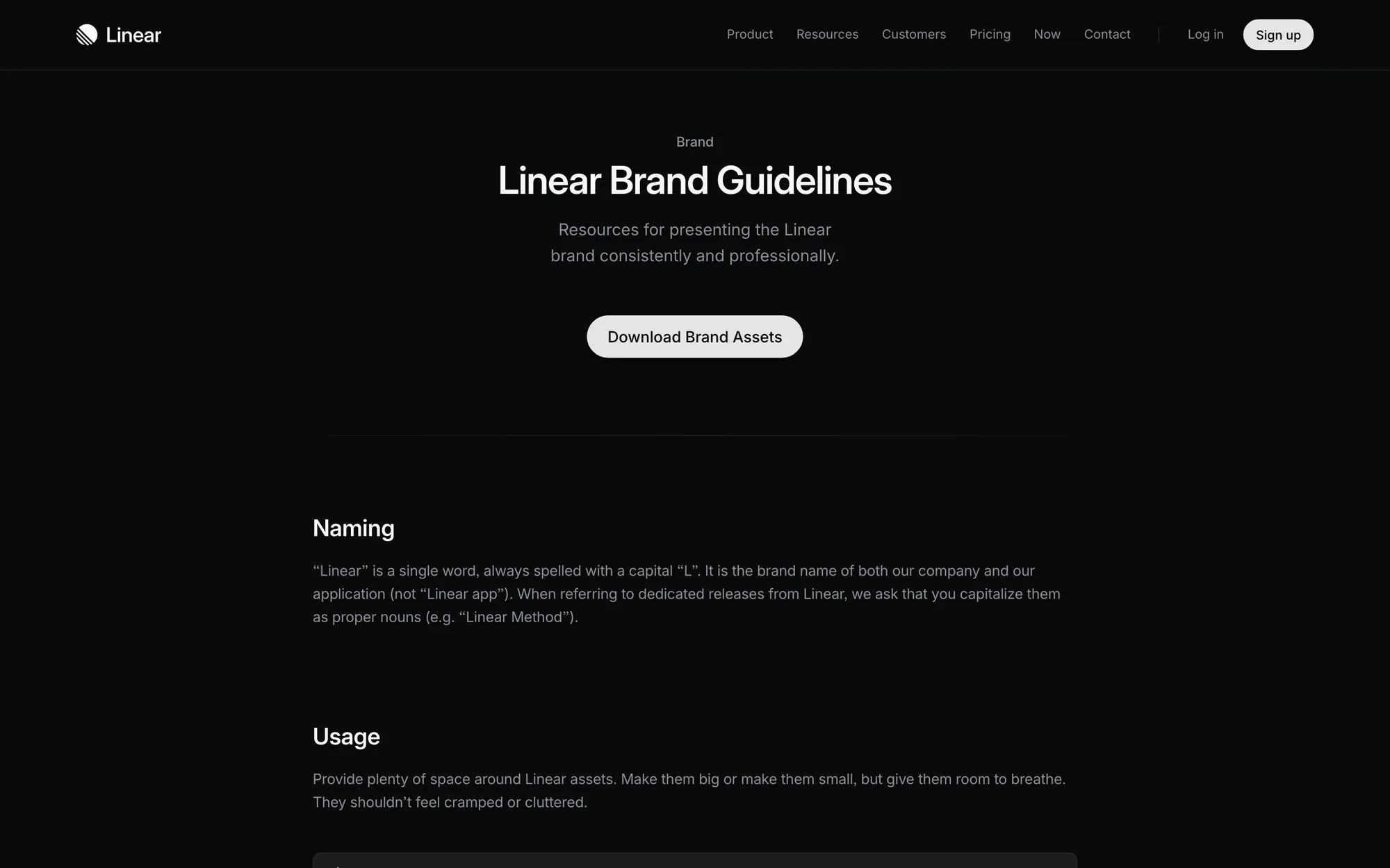
The rules are about restraint: always write 'Linear', not 'Linear app', and give the assets plenty of space. What to borrow: if your product is a tool people stare at all day, a quiet palette ages better than a loud one, and it leaves colour free for status.
PostHog: a mascot with a spec
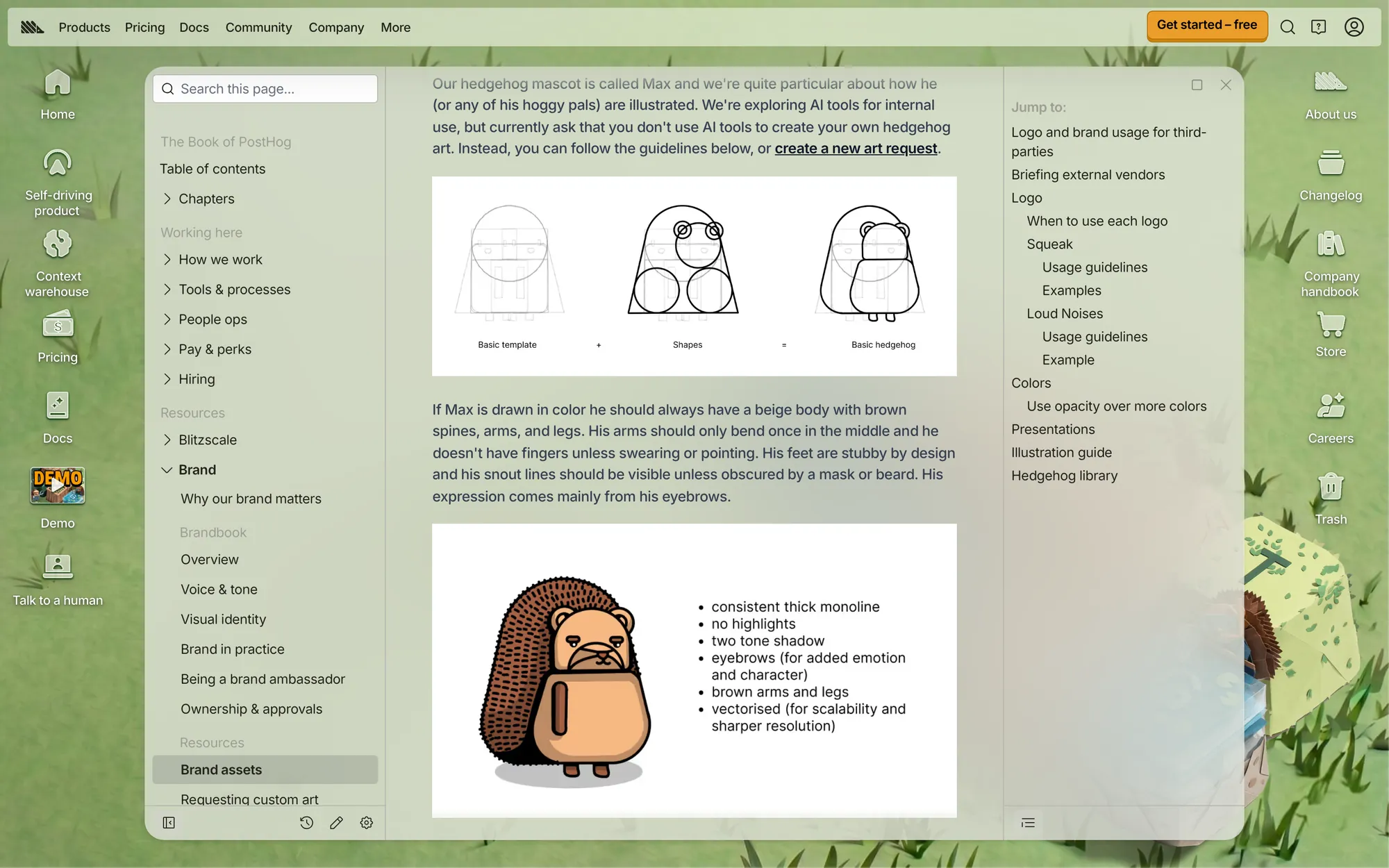
PostHog's brand handbook lists seven logo formats, from a full-colour standard logo to a square logomark for avatars and a 4-colour print version. The palette is four hues (a red, a blue, a yellow and a grey) with separate light and dark values, and it suggests changing opacity rather than adding new colours.
The memorable part is the hedgehog. Its rules cover beige body and brown spines, arms that bend only once, expression carried by the eyebrows, a strong black outline, and facing only left, right or straight on. It also asks people not to use AI art for it. What to borrow: a character is only an asset once it has rules tight enough that a stranger could draw it.
Supabase and Vercel: the logo is not up for discussion
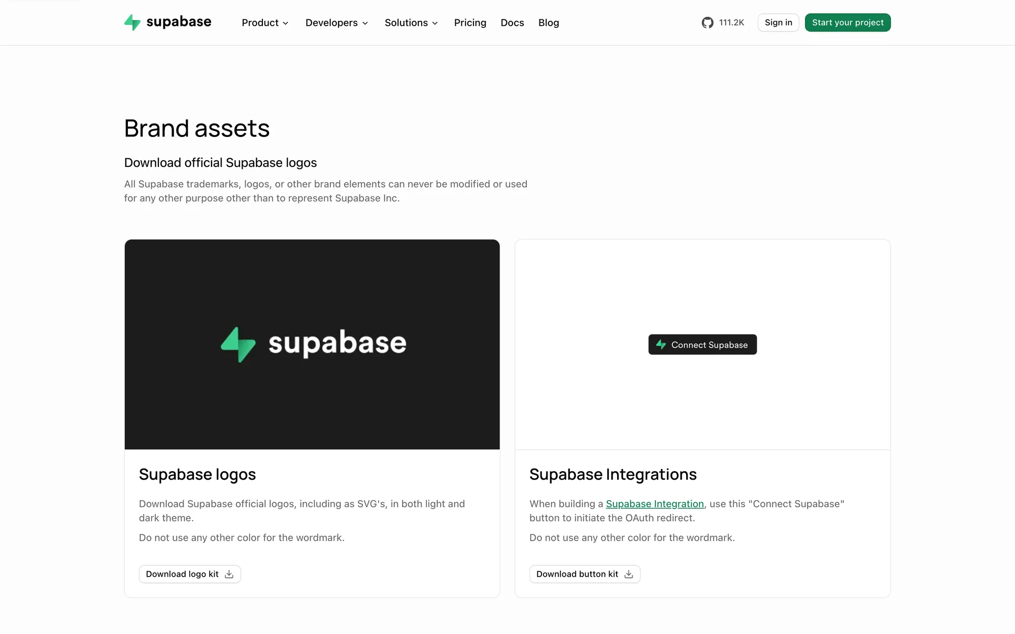
Supabase's brand assets page is short: logos as SVG for light and dark themes, a 'Connect Supabase' button for integration partners, and a rule that the wordmark never gets other colours. Shipping a ready-made button is smart. Partners will put your brand in their UI anyway, so give them the correct version.
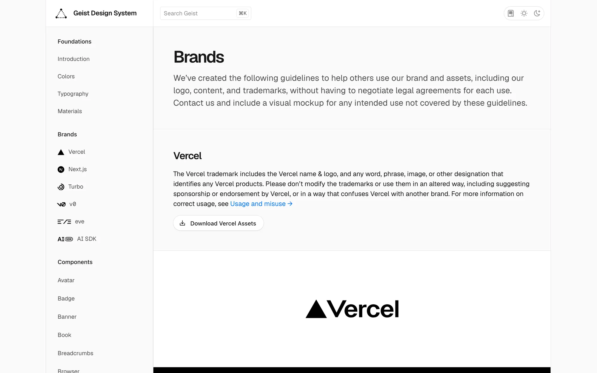
Vercel's Geist pages publish black and white logotypes for different backgrounds, two typefaces (Geist Sans and Geist Mono), and describe the grid as 'a core part of the Vercel aesthetic'. What to borrow: a developer brand can make its typefaces and layout grid the identity, and the logo can stay simple.
CodeAnt AI: one identity across product, site and swag
At CodeAnt I built the visual identity, the component library and the guidelines in parallel with the product and the Framer website. The brand had to work on a security dashboard, a sign-in page, comparison landing pages and team hoodies, and it had to keep working while the homepage message moved from code review towards security.
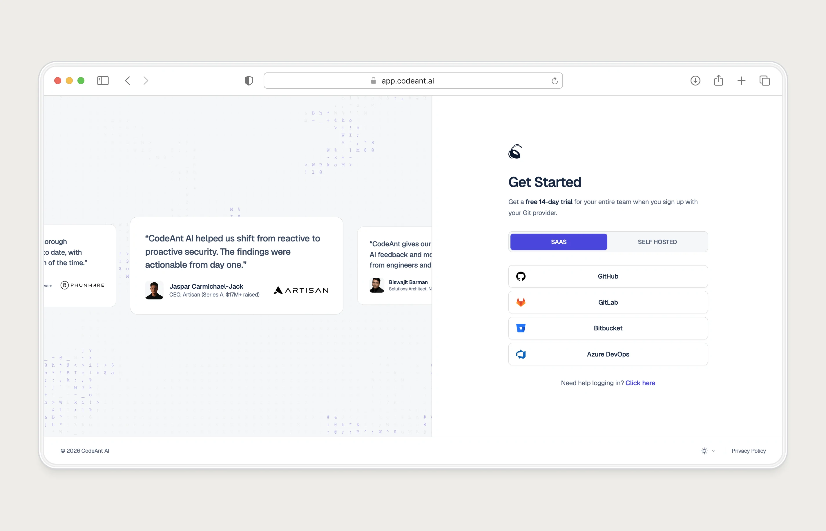
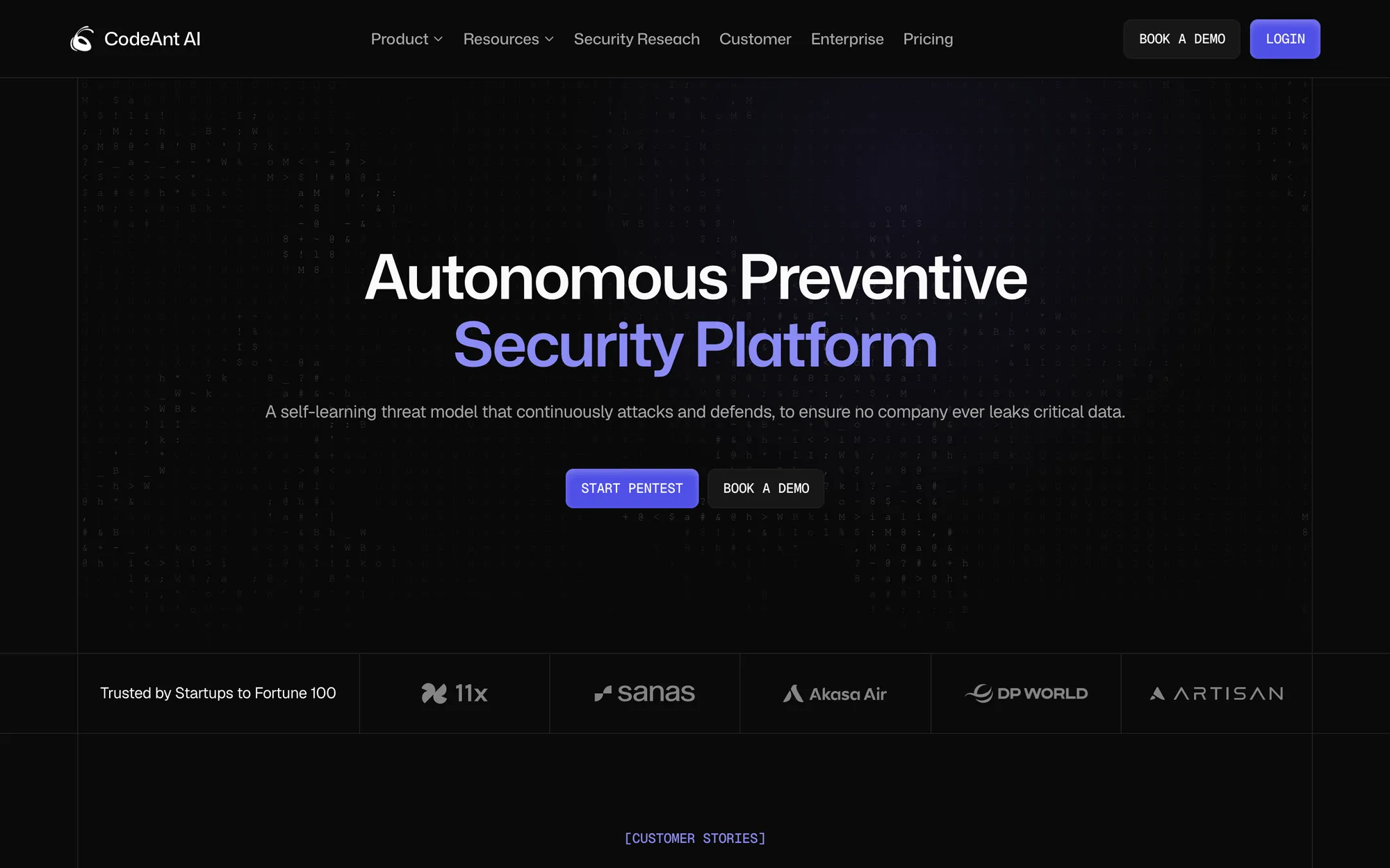
What to borrow: design the brand on product screens first. If it holds on a dense dashboard, the homepage is easy.
E-Summit IIT Roorkee: an event brand with the same lesson
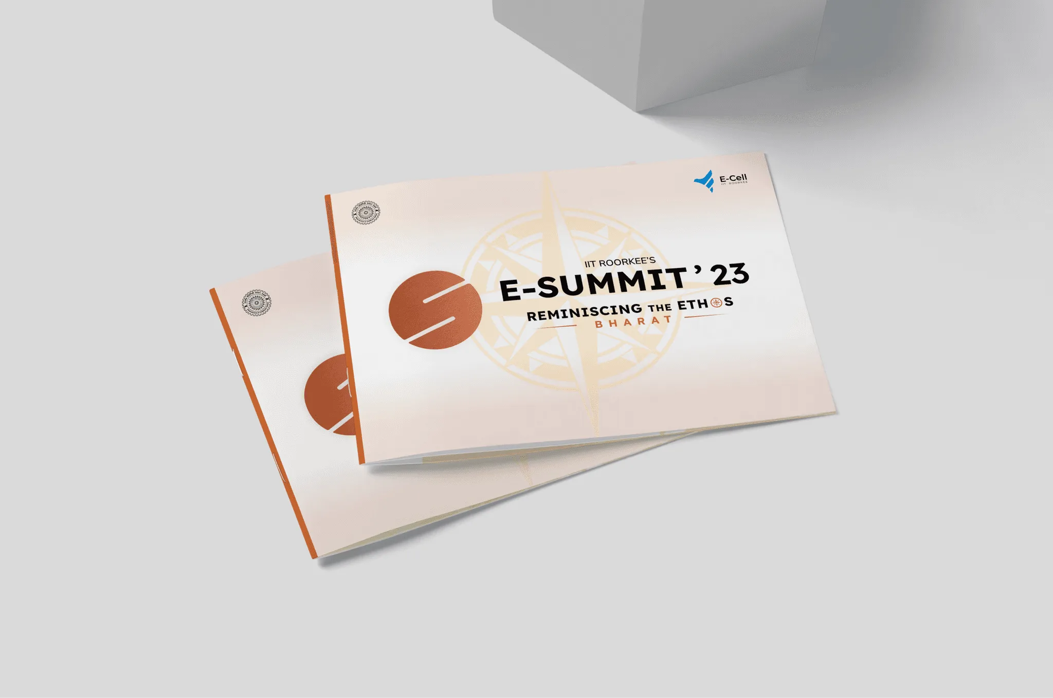
E-Summit is an event. It still had the startup problem in a compressed form: many people making assets fast. The 2023 theme was 'Reminiscing the Ethos: Bharat', and the obvious route was festival ornament. I led a team of 5 designers and 3 developers away from it, towards pre-industrial Indian craft: a compass motif, a terracotta and brown palette, and Lexend with Nunito Sans. The logo combines an E and an S, and only its colour changes from edition to edition.

What the strong examples share
| Brand | The one strong element | The rule that protects it |
|---|---|---|
| Linear | Near-neutral palette | Plenty of space around every asset |
| PostHog | The hedgehog | A drawing spec, and no AI art |
| Supabase | Green wordmark | Never recolour it |
| Vercel | Grid and Geist typefaces | Black or white logotype by background |
| CodeAnt AI | One system for product and site | Identity and components built in parallel |
| E-Summit | Compass motif | Only the colour changes each year |
None of them relies on the logo alone. Each has one memorable element and a written rule that keeps it from being diluted, which makes a better brief for your own identity than any moodboard of logos.
For the steps behind building one, see my guide to brand identity for startups, or the brand and design systems service if you want it built.
Questions people ask
Where can I see a startup's brand guidelines?
Many publish them: search the company name with 'brand' or 'brand assets'. Linear, PostHog, Supabase and Vercel all have public pages.
How do I write brand rules for my own startup?
Pick your one strong element first, then write the two or three rules that protect it, the way Supabase protects its wordmark colour. My guide to brand identity for startups walks through the rest of the kit.
Should my startup have a mascot?
Only if you'll write rules for it and use it often. PostHog's hedgehog works because it has a spec and shows up everywhere.
Sources
- Brand Guidelines, Linear
- Logos & hedgehogs, PostHog Handbook
- Branding, Supabase
- Brands, Vercel Geist
Working on this?
Tell me what you're building and where it's stuck: book a 30-minute call, email work@utkarshdesign.com or send a brief.