How to measure UX in a SaaS product
Guide · 7 min read · By Utkarsh Dhairya Panwar · Updated
Pick one metric per problem you're fixing, record it before you change anything, and check it again after release. The metric is the behaviour the design should change: activation for onboarding, support tickets for confusion, time on task for a workflow. Satisfaction scores alone rarely prove a redesign worked.
Start from the problem, not a list of metrics
Most articles on UX metrics hand you twenty acronyms. I've never needed more than one or two per project, because the metric follows from the problem: if users get stuck, measure where; if they're confused, measure what that costs; if they're slow, measure time.
Here is every metric my work has moved, next to the problem it measured. Each is a behaviour the business already cared about. None is a UX score.
| Problem | Metric | What moved |
|---|---|---|
| Trials stalled at a step only an admin could finish (CodeAnt AI) | Drop-off at that step; trial-to-paid | 40% less drop-off at the admin wall; trial-to-paid doubled |
| Setup felt long and success was unclear (CodeAnt AI) | Activation; number of setup steps | Steps cut from 7→3; activation doubled |
| Managers triaged code issues and secret leaks in separate places (CodeAnt AI) | Time to triage at org level | Triage time down 35% |
| Users lost voucher value they didn't know about (FamPay) | Voucher-related support tickets | 80% fewer tickets; 20% of support bandwidth freed |
| Payment errors left users unsure what to do (FamPay) | Failure-related drop-off; repeated mistakes | Drop-off down 20%; repeated mistakes down 25% |
| Advertisers didn't understand ad formats (Sportskeeda) | Campaign click-through rate | CTR up 10% |
| Sales demos took too long to explain checkout (xPay) | Sales walkthrough time | Down 30% |
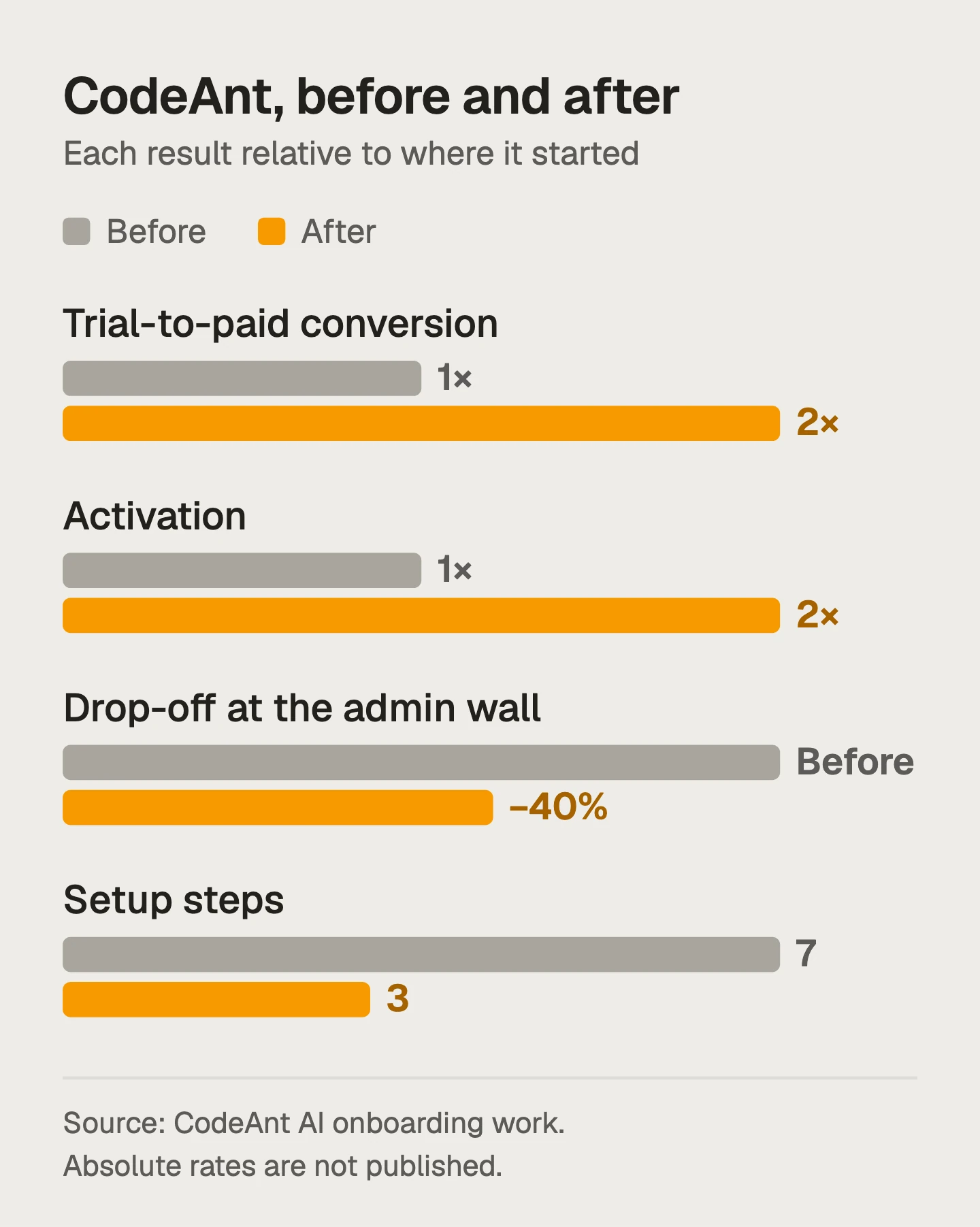
The CodeAnt and FamPay numbers are written up in their case studies. The xPay and Sportskeeda ones come from my internships there and are listed with those roles.
Four families of UX metrics, and when each earns its place
- Outcome metrics (activation, conversion, retention) for problems on a path to revenue. They're noisy, so give them a few weeks.
- Task metrics (success rate, time on task, error rate) for workflows people repeat, like triage or checkout. Measure them in usability tests or with event timestamps.
- Cost metrics (support tickets, sales time, internal hours) when confusion has a price someone else pays. Often the number a founder finds most persuasive.
- Attitude metrics (CSAT, NPS, SUS) to spot problems and track the general mood. They won't prove a specific fix worked.
Instrument it before the redesign
When a team can't say whether a redesign worked, it's usually because nobody wrote the number down before it shipped. Baselines are boring to collect and impossible to recreate later.
- Write the problem as a behaviour: "Non-admins abandon the repo connection step" instead of "onboarding is confusing".
- Pick the event or source that shows it: A product event, a ticket tag, a timestamp pair. If it doesn't exist yet, add it now.
- Record a baseline over a normal period: A few weeks if traffic is low. Avoid launch weeks and holidays.
- Decide what change would count: Agree it before release, so nobody moves the goalposts after.
- Check the same number the same way after: Same window length, same definition. Note anything else that shipped at the same time.
Support tickets are the easiest baseline to forget. A ticket count only works if you can separate tickets about this problem from the rest, so ask support for a tag per problem area before the redesign starts.
Three examples, three different metrics
At CodeAnt AI I measured the onboarding problem on the funnel: where trials stopped, and whether they paid. The admin-wall fix was judged on drop-off at that one step, the whole programme on trial-to-paid. Time in app would have said nothing.
At FamPay, users lost voucher value to a rule they hadn't understood. A satisfaction score would have been slow and vague; voucher tickets were fast and specific, so they became the metric. My guide to reducing support tickets with UX tells that story.
At Sportskeeda, the advertiser landing flows were measured on campaign click-through rate, which rose 10%. The live-score tables, read by 20M+ monthly users, had a different goal: how fast very different readers could scan them. That's a task-level question, answered by watching people use the tables.
Showing design ROI without inventing numbers
When a founder asks what a redesign is worth, I convert the metric it moved into something they already count, using their own figures:
- Tickets: fewer tickets per month, times the time each one takes, gives support hours back. FamPay's fix freed 20% of support bandwidth.
- Conversion: extra trials that convert, times what a customer pays. A step like CodeAnt's admin wall sits directly on that line.
- Time: minutes saved per task, times how often the task happens, times who does it. Triage time down 35% matters more when managers do it every week.
Be honest about attribution. If pricing and onboarding changed in the same month, say so. A smaller number that holds up does more in the next budget meeting than a big one nobody believes.
Mistakes that make UX metrics useless
- Measuring everything. A dashboard of thirty charts gets looked at once.
- Choosing a metric the design can't move, like overall retention for a small settings fix.
- Reading time in app as good. For a triage tool, less time is the goal.
- Skipping the baseline, then arguing about the result.
For an onboarding redesign, my SaaS onboarding audit starts by agreeing the metric and the baseline.
Questions people ask
What are the most important UX metrics for SaaS?
The ones tied to the problem you're fixing. For onboarding that's usually activation and drop-off at specific steps; for confusing flows, support tickets; for repeated workflows, time on task and error rate.
Is NPS a good UX metric?
It's a useful general signal, but too broad and slow to prove a specific design change worked. Pair it with a behavioural metric per fix.
What is the HEART framework?
Google's set of five UX metric categories: happiness, engagement, adoption, retention and task success. Use it as a checklist and track the one or two that match the problem you're fixing.
How do you calculate the ROI of UX design?
Convert the metric you moved into something the business already counts, such as support hours, converted trials or time saved, using the company's own figures, and be honest about what else changed.
Sources
- Measuring the User Experience on a Large Scale: User-Centered Metrics for Web Applications, Google Research (CHI 2010)
- Net Promoter Score: What a Customer-Relations Metric Can Tell You About Your User Experience, Nielsen Norman Group
Working on this?
Tell me what you're building and where it's stuck: book a 30-minute call, email work@utkarshdesign.com or send a brief.