SaaS product design examples, by screen state
Guide · 7 min read · By Utkarsh Dhairya Panwar · Updated
The SaaS screens worth studying are the working states that Dribbble shots skip: guided setup, the blocked user, a triage queue, an issue detail page, test mode and the danger zone. I picked examples from CodeAnt AI, Linear, Sentry, Stripe, Vercel and GitHub, each with one decision to copy.
How I picked these
Galleries of SaaS UI mostly show dashboards on their best day, full of data. Real products spend much of their time half set up, waiting on someone else, or full of things to sort, and users quit on those screens. The CodeAnt examples are screens I designed as founding designer. The others come from each company's public documentation, read in October 2026; I describe only what those pages show.
Setup: one platform, one step at a time (CodeAnt)
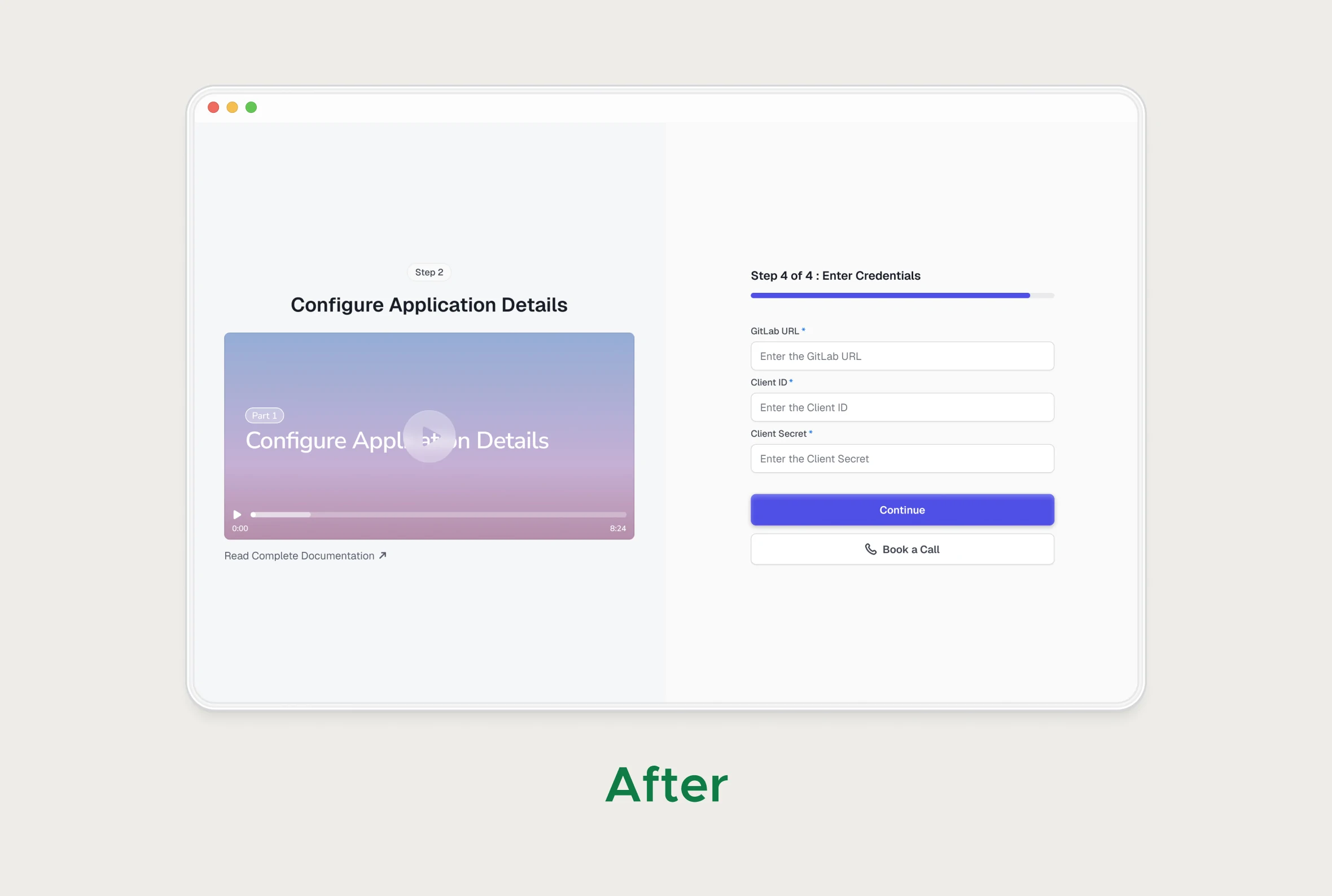
Self-hosted setup at CodeAnt used to live in one dense doc covering every Git platform. I rebuilt it as a sequence: pick your platform, see only your steps, with a short video beside each one showing what it should look like. The screen above is the last step for GitLab.
What to copy: split setup by environment before you write a single instruction. Nobody should have to skip paragraphs meant for someone else.
Blocked: hand the step to someone who can finish it (CodeAnt)
Connecting a repo needs the GitHub app installed on the company org, which needs admin rights most people signing up don't have. The permissions screen is where they got stuck. The fix was a Request Admin Approval modal: email the admin from inside the product, or copy an invite link into team chat. The trial-to-paid guide covers what that did to drop-off.
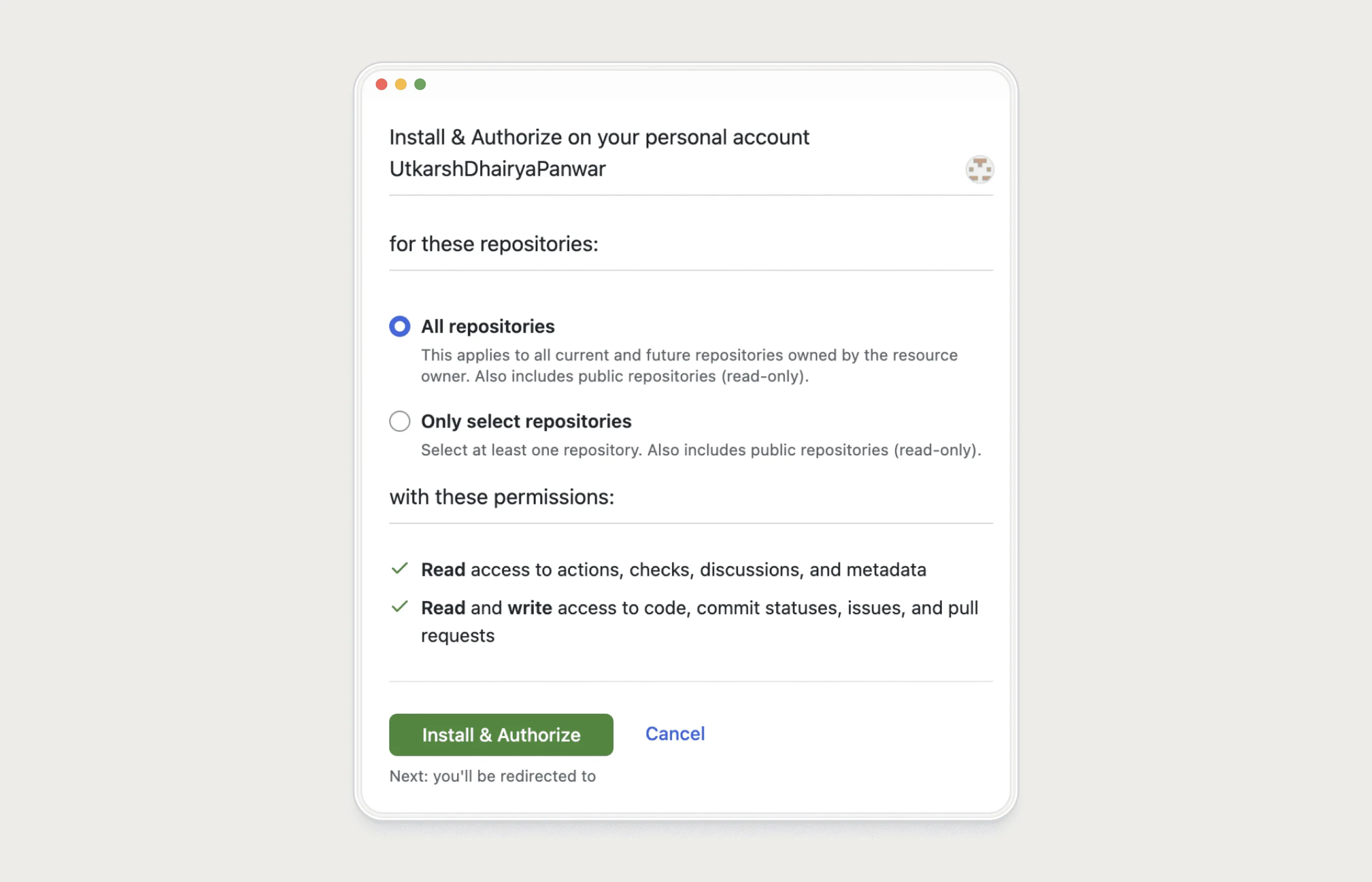
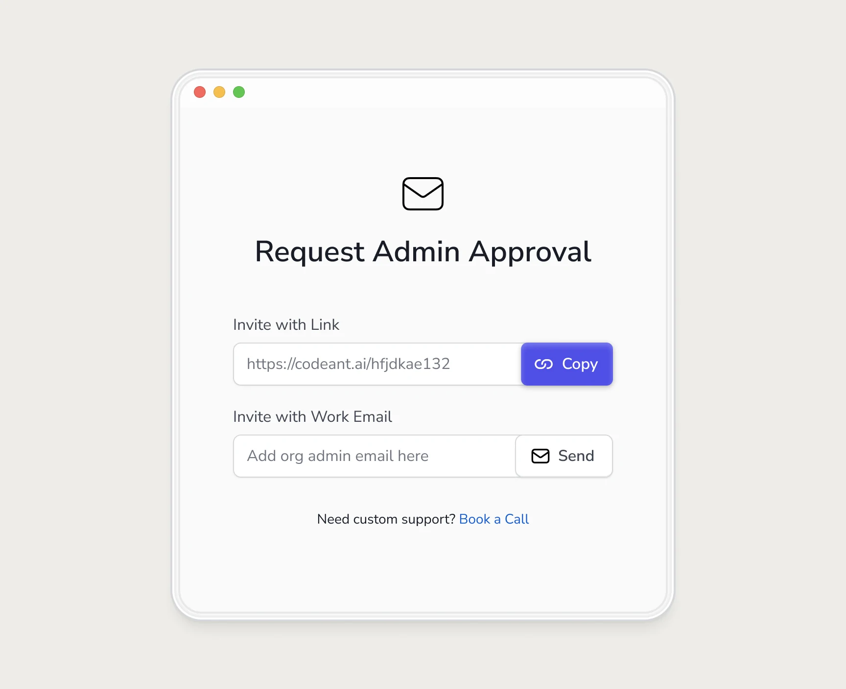
What to copy: every state where a user lacks permission should name who has it and give a one-click way to ask.
Triage: a queue with a few clear exits (Linear, CodeAnt)
Linear's Triage is an inbox for issues that arrive from integrations or from people outside the team. Its docs list four actions, each on one key: accept (1), decline (2), mark as duplicate (3) and snooze (H). Every incoming item has to leave by one of those doors.
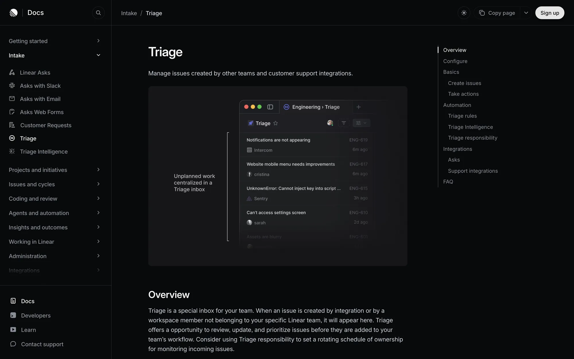
CodeAnt works the same way. The attack surface dashboard leads with a Fix These First list rather than a wall of charts, and the manager dashboards I designed pull code analysis and secret leaks into one view instead of two tools.
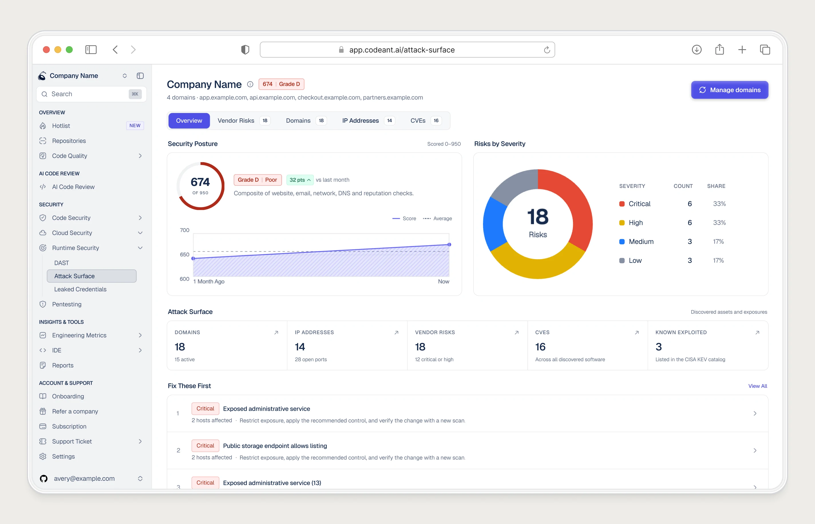
What to copy: decide the small set of outcomes an item can have, and make each one a single action.
Detail: open on the most useful example (Sentry)
Sentry's issue details page opens with a header showing the error, how often it has been seen and how many users it affected. Workflow actions sit right below: assign, set priority, resolve, archive, subscribe, share. The part I like most is that out of possibly thousands of events, it shows a 'Recommended' one by default, picked on recency, relevance and how complete its data is, with jumps to the first and latest.
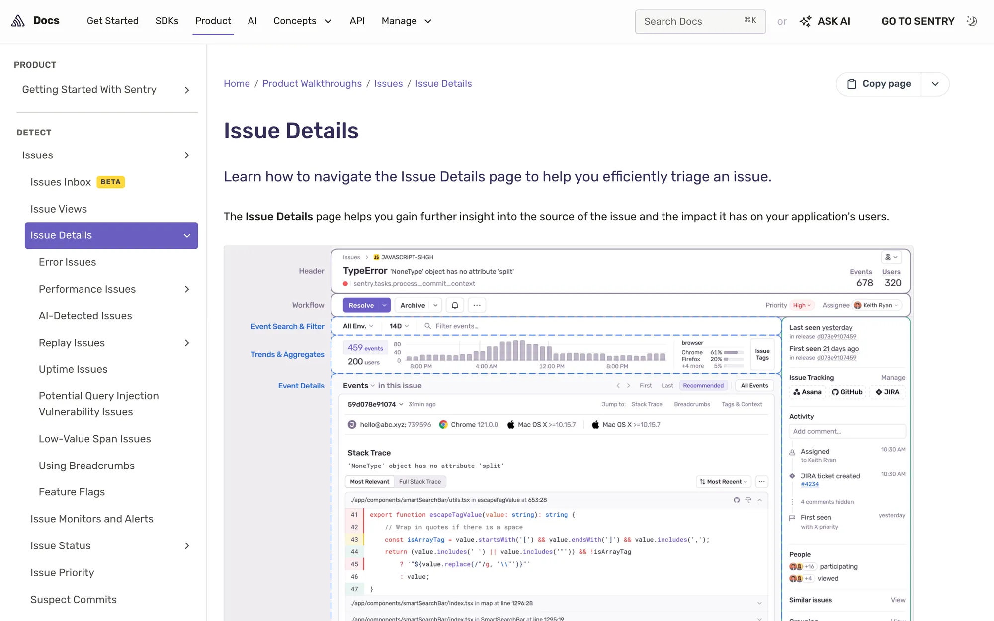
What to copy: when an object has many instances, choose a good default for the user instead of showing the newest or an empty selector.
Test mode: make the stakes visible (Stripe)
Stripe separates sandboxes from live mode through an account picker, and its docs describe a test data banner. In the shared test-mode sandbox, many Dashboard pages show a notification box and disable settings that would also change live mode. Stripe's own advice is blunt: if you don't see the notice, assume your change affects live.
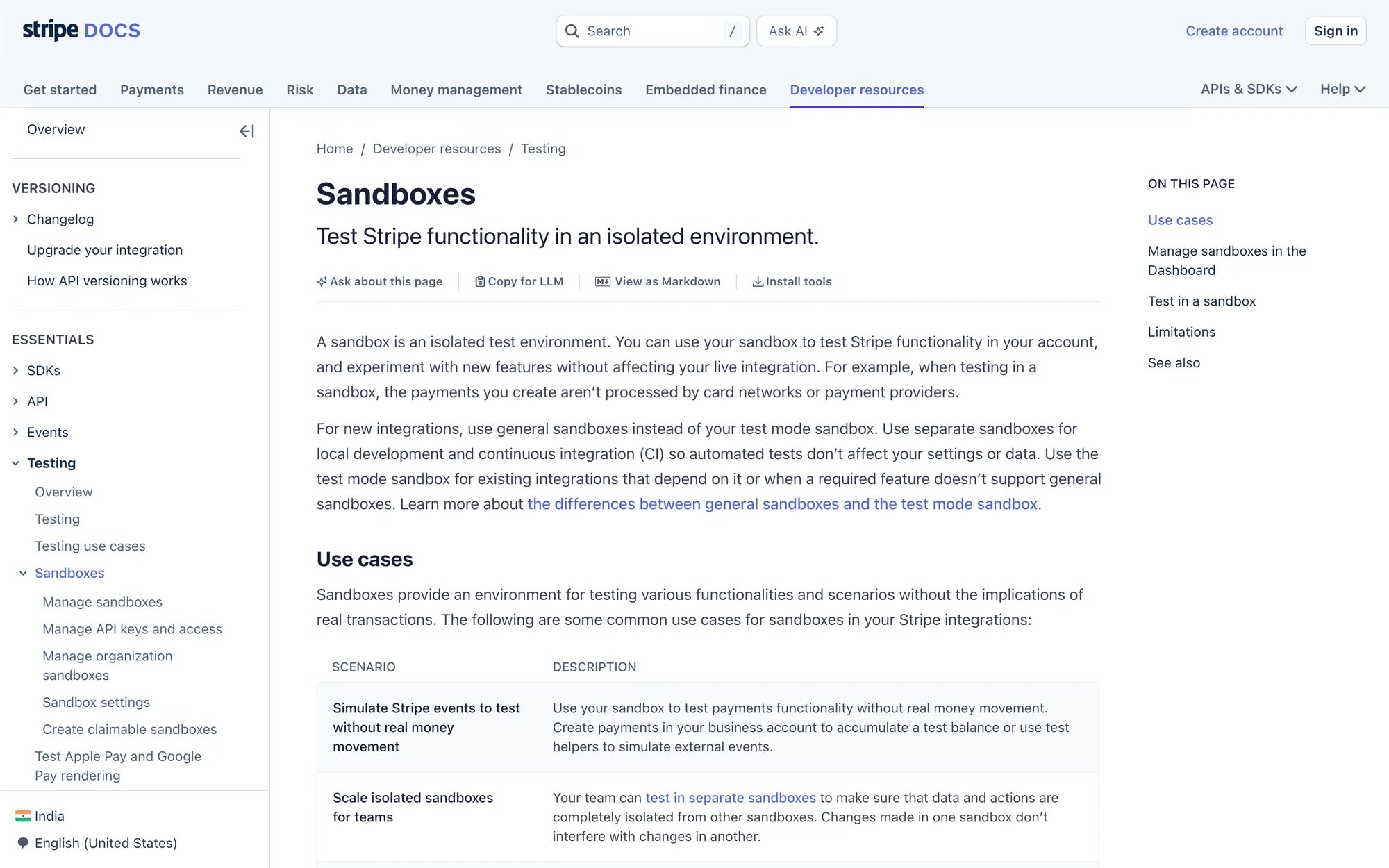
What to copy: wherever a mistake costs real money or real data, the mode should be impossible to miss, and dangerous controls should switch off rather than rely on users noticing.
History and danger zones (Vercel, GitHub)
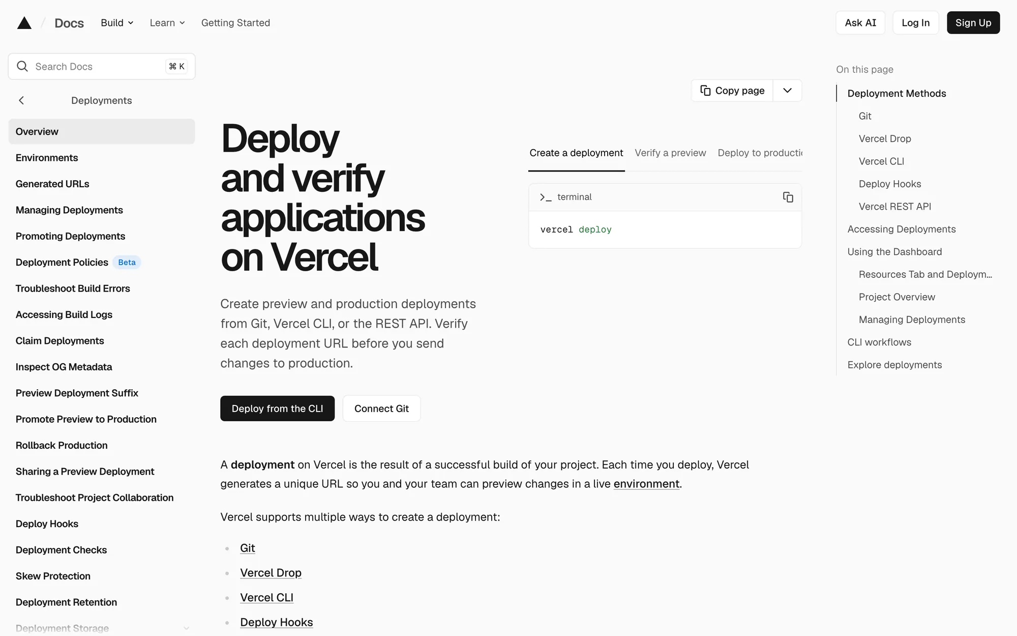
Vercel's docs describe every deployment as its own object with a unique URL, split into Preview and Production, with Redeploy, Inspect and Promote to Production as actions on each one. History stops being a log and becomes something you can act on.
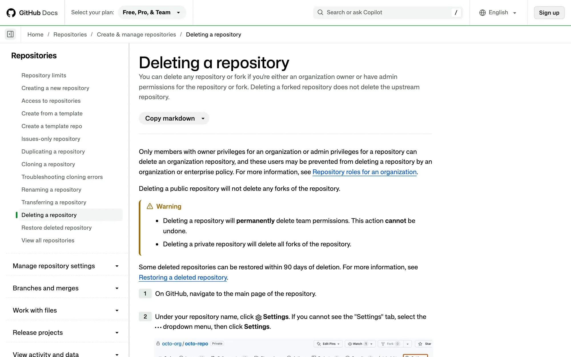
GitHub puts repository deletion at the bottom of Settings in a section called Danger Zone. Its docs list three confirmations: 'I want to delete this repository', 'I have read and understand these effects', then typing the repository's name. Here the friction is deliberate.
Using examples without copying the wrong thing
Copy the decision behind a screen rather than its pixels. Linear's single-key actions work because its users live in the keyboard, and yours may not. GitHub's three-step delete is right for a repository and absurd for a draft. Before borrowing, write down which state you're designing and what goes wrong in it today. The CodeAnt setup work came from knowing which state was failing, not from a gallery.
CodeAnt AI case study: The setup, admin-wall and Get Started screens in context, with what changed after each.
If your product needs these states designed properly, that's the work in my SaaS product design service.
Questions people ask
Where can I find good SaaS app design inspiration?
Galleries are fine for layout ideas. For behaviour, read the public docs of products your users already know, like Linear, Stripe or GitHub, because docs describe states and rules that screenshots hide.
Which screens matter most in a B2B SaaS app?
The ones where users get stuck: setup, permission walls, empty states and errors. They get the least design attention and decide whether a trial turns into a team.
How many screens does a typical SaaS MVP need designed?
Fewer than founders expect, but with more states each. A handful of core screens, each with its empty, loading, error and no-permission version, beats twenty happy-path screens.
Is it fine to copy another product's UI?
Copy the decision and adapt the execution. Patterns like type-to-confirm are common ground; a competitor's exact layout and visual style are not.
Sources
- Triage, Linear Docs
- Issue Details, Sentry Docs
- Testing use cases, Stripe Documentation
- Deleting a repository, GitHub Docs
Working on this?
Tell me what you're building and where it's stuck: book a 30-minute call, email work@utkarshdesign.com or send a brief.